Friday 30 September 2011

Agi&Sam SS12

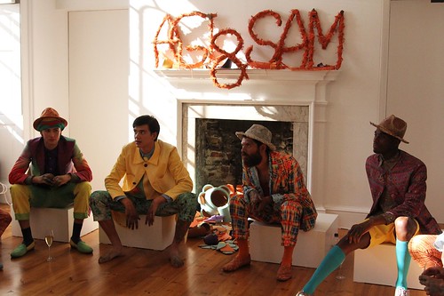
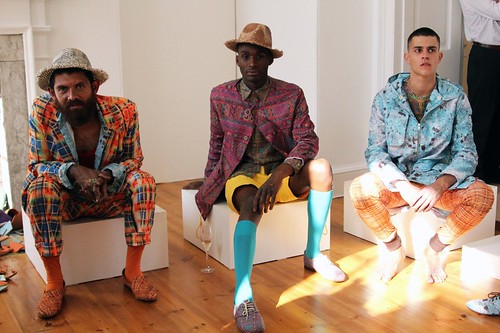
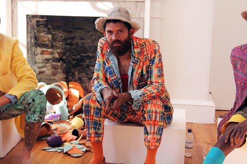
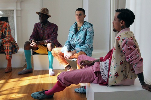
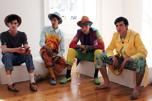
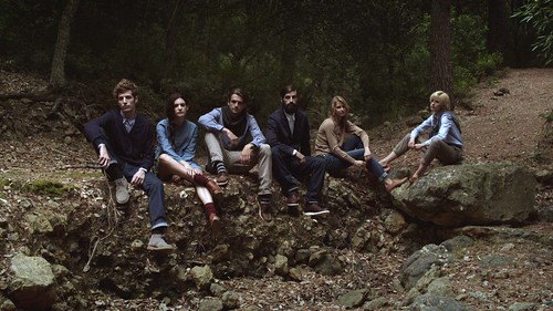
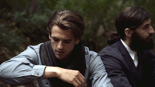
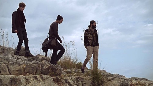
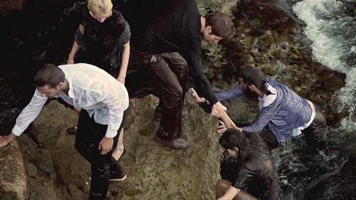
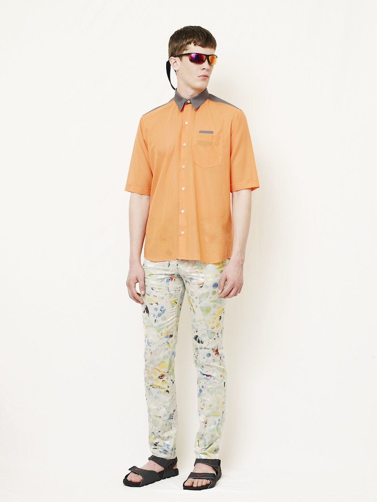
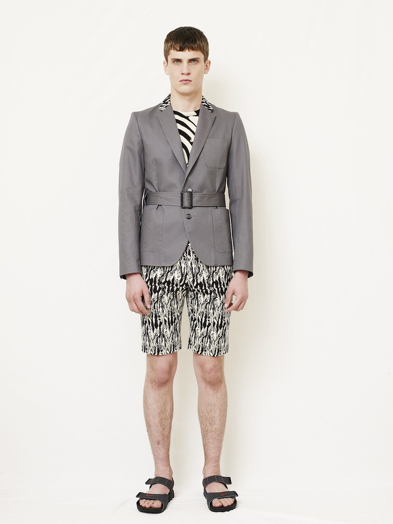
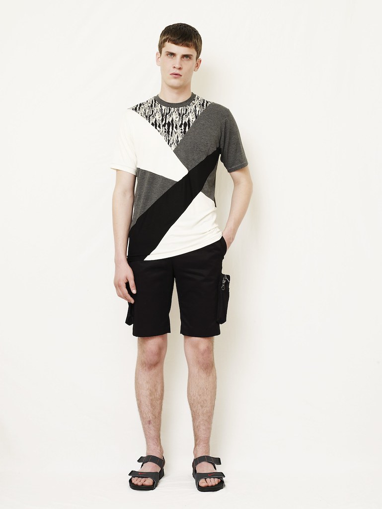
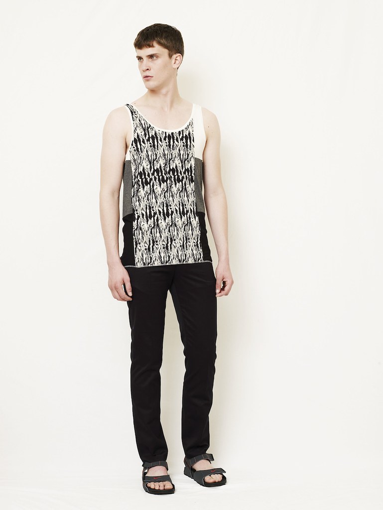
After the initial excitement of the opening round of shows, the adrenaline of Menswear Day began to be replaced with fatigue and fashion weariness. Just when I needed a pick me up, Agi&Sam offered a shot of Tobasco, Tequila and Tomato Juice. This was not served in a glass but instead thrown in my face. Weary onlookers like myself were given a visual shock as the exciting design duo took our outstretched hands and led the way on a sartorial journey across Central America. The sights, sounds and smells of a cacophony of cultures and festivities whizzed by and merged before tired eyes deep in the East Wing of Somerset House.

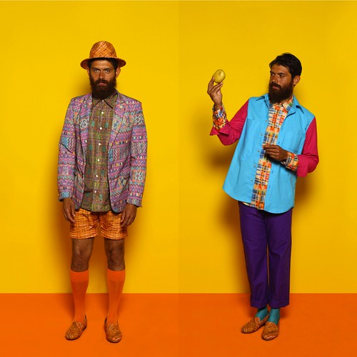
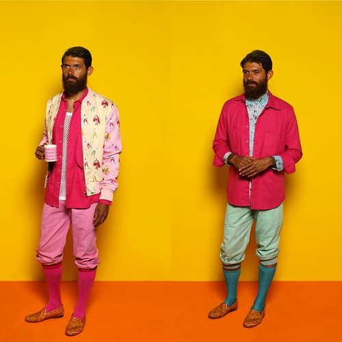
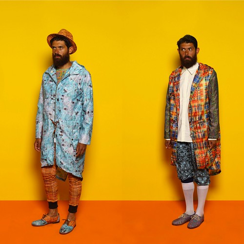
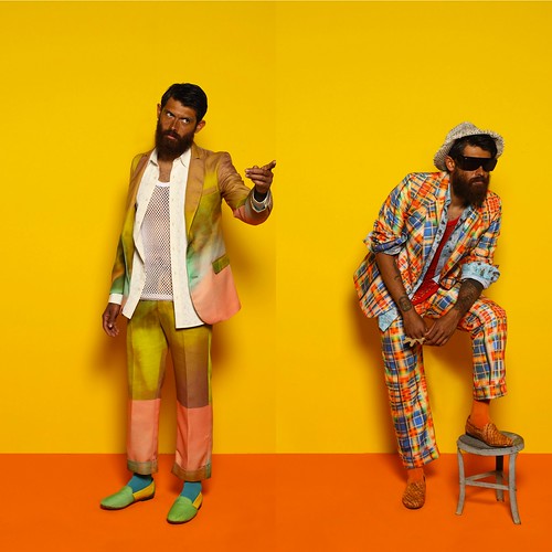
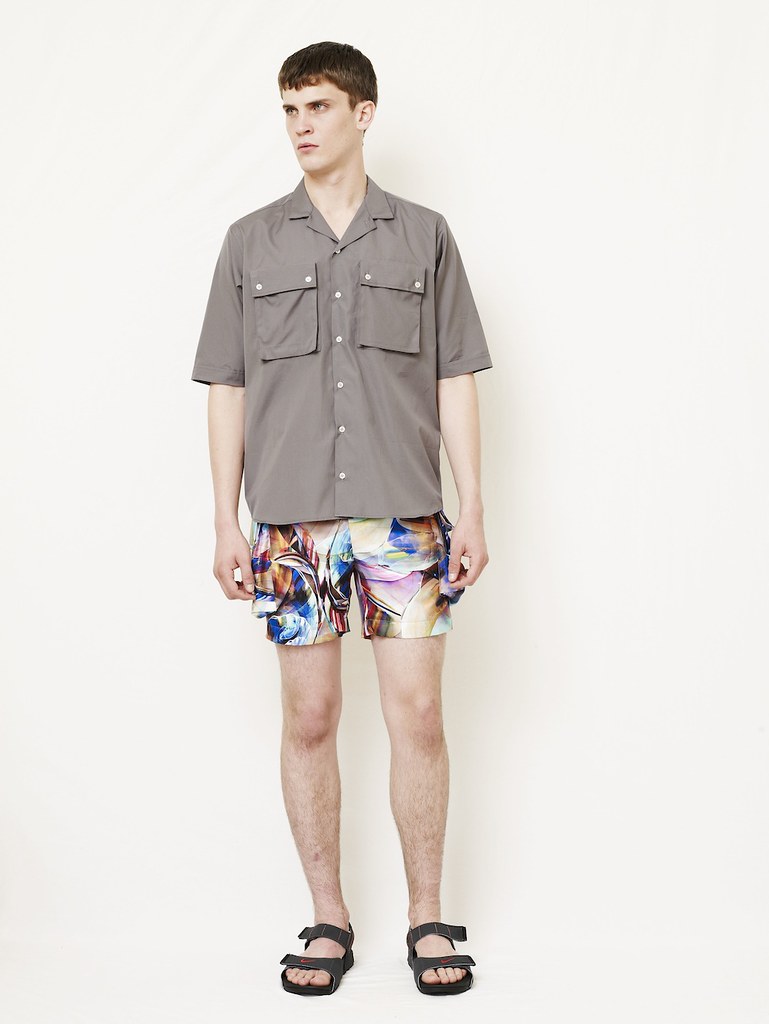
Thanks to their penchant for clashing and layering print upon print, the design duo once again opened my mind to print possibilities. Much like the shooter that inspires the SS12, the duo threw a number of unexpected ingredients together to create something intoxicating yet tasty. In most pieces, references are torn apart, manipulated and reassembled to create eye-catching yet ultimately wearable clothes...

IMG_0740
IMG_0743
IMG_0746
IMG_0749
IMG_0750
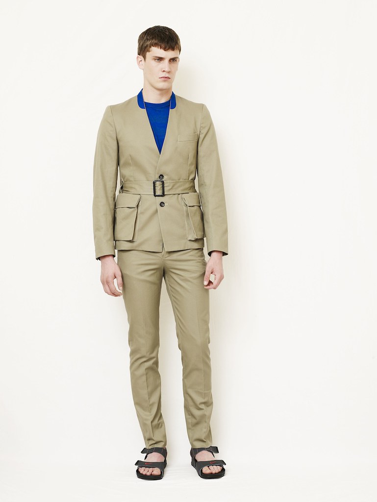
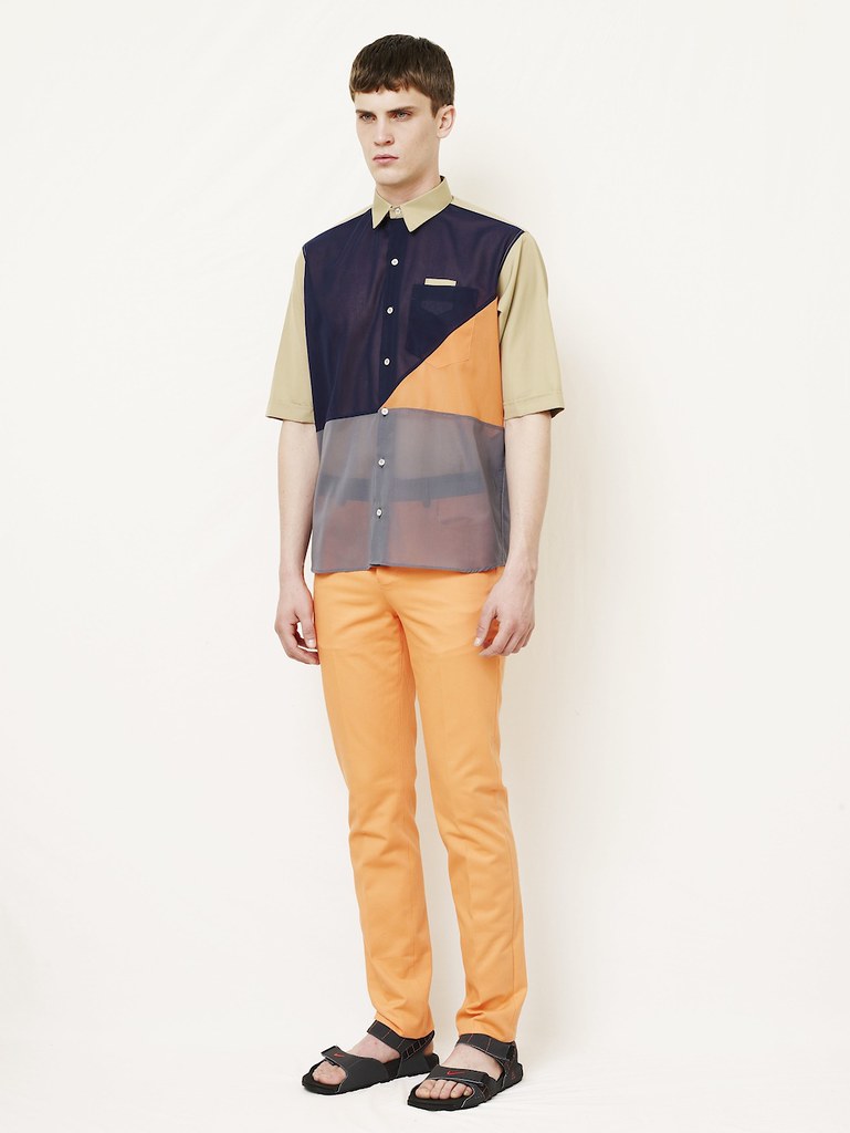
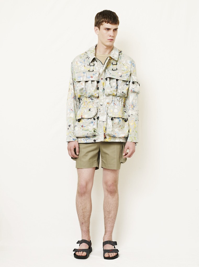
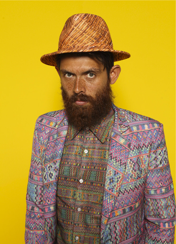
Agi&Sam's cross section of Mexican characters brought some much needed colour to the SS12 presentations.
Shots from the many I took throughout a snap happy day.

As the hangover of Menswear Day subsides and the weekend arrives, we could not help ourselves from ordering another shot of tobasco, tequila and tomato. Here we talk through the collection with Sam Cotton as we devour another hit of the hard, colourful print stuff with the help of their look book...

agiandsam ss12 1

SS: Tabasco, Tequila and Tomato Juice takes us on a a journey through a colourful patchwork quilt of influences from Central America. What was the starting point point, what drew you to this region?
Sam Cotton: Tabasco, tequila and tomato juice. It’s a great shot that was introduced to us by one of our friends. It entails the same methods of a tequila slammer but changing the salt and lemon for tabasco and tomato juice, respectively. After one too many we then began waffling on about tequila and its uses within Mexican society. Strangely this led on to thinking about Mexican 'Day of the Dead' and its social significance, the collection evolved from there.

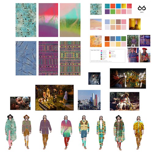
Agi&Sam_SS12_moodboard

SS: What was your mood board like for SS12?
Sam Cotton: For the first time we actually developed a colour palette which was quite unusual for us. Normally we tend to throw things together and see where it takes us, although it has worked in the past we felt this time we needed more cohesion in the collection. When we research we tend to cover an entire gulf of cultural and social influences; artists, photographers, filmmakers, criminals, heroes etc. From this we are able to get a feel or how societies cross over and why. Especially important to our colour palette were the works of architect Luis Barragan; regarded as being arguably the most important Mexican architect of the 20th century. His bold and unashamed use of colour within architecture showed us a way of tying the collection together without compromising the colour scheme too much and risking it looking too safe.

agiandsam ss12 2


SS: How did these Central American influences evolve in to the collection we see today?
Sam Cotton: We tried looking at a cross reference of the traditional Mexican man. Firstly we began looking at the labourers and farmers of Central America, in particular their sartorial requirements and the functionality of their work wear. From there immigration became a key point of our research, in particular the Bisbee deportation where 1300 Mexican American mine workers were illegally deported by vigilantes on July 12 1917. The workers were kidnapped at a local baseball park and transported 200 miles for 16 hours through desert without food or water before being unloaded in New Mexico without money or transportation.

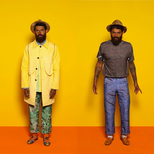
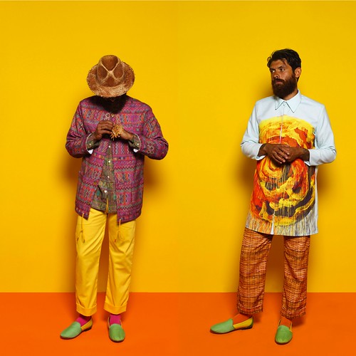
Delving deeper we headed into the underworld, happening upon those living below that acceptable line; those that create their own rules and live under their own guidelines, the gangsters, ‘gangbangers’, drug barons and prisoners. The underbelly of society being the catalyst that propels ‘normal’ life is what really pushed this collection into its reality, and in tow, the idea that one cannot live without the other. We wanted each of the looks to hold characters taken from each of these sub sectors, we like the look book to have character and personality. Some of the shots are of the Agi&Sam Farmers and Labourers, where as others are of the Agi&Sam Columbian drug barrons and prison gang members.

agiandsam ss12 3


SS: You've experimented heavily with texture and colour, stretching the boundaries of digital printing. In most pieces, references are torn apart, manipulated and reassembled to create eye-catching yet wearable clothes. Could you talk us through a selection of the prints. How were they manipulated and clashed?
Sam Cotton: We like to play with texture and the whole process of printing, were able to experiment a bit more of certain safer fabrics such as canvas and even plain t shirt prints which in some ways is harder than working with the kind of techno fabrics we worked with last season. As stated earlier we always think big when gathering inspiration for a collection. Having very eclectic tastes can sometimes be a hindrance because you begin to dissect and develop every little bit of inspiration, and this is why our research becomes so wide. Its not always a bad thing as it gives you a lot more scope to play around with but I think this is why a lot of our prints, colours, silhouettes, and details are clashed. For example, one of our prints is a lumberjack, usually seen on ‘the lumberjack shirt’ and the idea of using this came from looking at early 20th century workwear and the photographs of Mike Disfarmer. From a distance this is how it appears but in reality, the lumberjack itself is taken from traditional Mexican blanket weaves, dissected, and placed into an irregular check. This check is then placed over another layer of print, which appears like wood. This is a wooden fence print we designed, and is to signify the barrier between Mexican workers and the land of opportunity; an idea highlighted when we were researching immigration; in particular, the Bisbee Deportation where 1300 Mexican American mine workers were illegally deported by vigilantes on July 12 1917. We did put this print onto a shirt, but instead of following strict rules of expectancies, we smartened it up, and put it on a more classic, tailored shirt as opposed to a work shirt. On top of this we spread the print out over even more garments, such as a tailored suit, a parka, jersey, and within our shoe collaboration. We do this because we believe a print can become more accessible this way, and challenges the way one should look at it, rather than it always being the norm. This is similar to the way we did a Fairisle knit in our ss11 collection to look like knitwear but when you come close you realize its actually a print.

agiandsam ss12 4

SS: If at all, how has the design dynamic that exists between the two of you developed for this season?
Sam Cotton: We don’t think that the dynamic has necessarily ‘changed’, more that it has developed, and maybe hopefully matured. This is our third season together and it feels like now we are really beginning to understand exactly what it is we are doing or trying to establish as a brand. In the beginning we were literally like ‘okay lets make some interesting clothes that contain our own prints and can inject humour into fashion’. Now we are reading between the lines, tweaking things, and playing off each others strengths and weaknesses, so that we can develop in the best possible way, and with a clear direction and vision. We want the brand to have some kind of longevity, so we are purposefully tackling it from all angles.

The last two collections we did were all out of Agi’s living room floor and we had no stockists so this was never in our heads. Since AW11 was released in Feb, we’ve picked up six stockists, a joint business account, a proper studio, interns, and dealt with factories and production. So with this, came quick responsibility, and I guess this is what pushed us to think more intelligently and maturely about Agi&Sam. In a way its amazing to see it progressing, but sometimes you take a step back and realise, ‘its not just making clothes with your friend anymore’ its an actual business. And that is ridiculously scary.

agiandsam ss12 6


SS: This season marks the debut of two new collaborations to provide the accessories for the collection. Printed oxfords and slip ons with New York shoe brand Osborn and fedoras and straw hats with J Smith Esquire. How did these collaborations come about? How was it working with both of them? Who would you like to work with in the future?
Sam Cotton: Accessories and shoes are something we’ve always wanted to do, and when Agi was at uni he always thought of complete ‘looks’ rather than individual separates. We’ve done them in some way or another in past seasons but they’ve always been done in house, and, to be honest, not that well. So in keeping with our wanting to mature and grow as a brand, we thought now would be the perfect time to collaborate with people that could actually do it properly. We actually stumbled across Osborn shoes through a friend during the research stage, and were instantly awe struck with they’re amazing designs and how similar they were to the kinds of shoes we’d imagined in our minds. The fact that they are all fair trade and cobbled together in Guatemala almost felt like fate so we simply got in touch with them began the collaboration process.

The same thing happened with Justin Smith Esquire, we had been looking to collaborate with a milliner for a while especially with this collection in mind and our friend mentioned he was a nice guy and he might be up for collaborating. He certainly was for both of those things and even on a last minute deadline of about two weeks he was able to produce these incredible hats, both printed and made from straw.

It’s hard to tell for the future of collaborations. We don’t like working with the obvious as its all a bit too easy and safe. It’s more exciting to work with a brand that is either new or a bit left field. Although the idea of someone like Nintendo or FILA would be quite exciting but it would have to be relevant to the seasons direction. We tend to mix up our influences for every season and not stick to a certain type of design, one season we could be inspired by sportswear and FILA would then be relevant but then the next we could be doing worker wear like this. Although saying that maybe it would be interesting to approach FILA in a worker wear way. So scrap that last paragraph, haha.

agiandsam ss12 7


SS: Finally, what's next for Agi&Sam?
Sam Cotton: Another season, another collection. We are working on production for the second time which we feel a lot more comfortable with now after the first year. Our first stop will hopefully be Paris again with the BFC at London Show Rooms in January. It was such an eye opener for ourselves, especially for the kind of quality you need to be producing in our position, it was also great to stand back and almost hold a retrospective on what we had designed for SS12. It didn’t change the initial design ideas we had but it gave us a chance to add key things into the collection and start polishing the entire thing.
agiandsamss12_feature
Look book credits:
Styling by Rose Forde, photography by Luke Stephenson and 
modelled wonderfully by Jerome Robeiro
----------

Always aiming to be revolutionary in their approach to print design, Agi&Sam once again experimented heavily with texture and colour. Stretching the boundaries of digital printing and pushing me to consider unexpected print combinations. As colourful and dazzling the collection certainly is, I'm most excited by the design duo's continued evolution. Having brought so much to the Fashion East Menswear Installations for two seasons now, I'm in little doubt that this pair have a bright future. 

ASOS Urban Tour - Berlin

The continued rise of ASOS is nothing short of remarkable. Launched over a decade ago as a small online retailer catering for people who wanted to dress like celebrities, the store has evolved in to an online retail powerhouse. World domination is certainly on the cards and with their latest campaign for AW11 they are sowing the seeds. Titled ‘The ASOS Urban Tour’, the campaign is an interactive digital experience which aims to uncover subcultures from across the globe and highlight the latest trends in culture, music, art and fashion from seven cities around the world―London, New York, L.A., Berlin, Paris, Tokyo and Shanghai. The simple idea behind it is that people draw sartorial inspiration from what they see around them and the site creates a digital hub of urban culture. However, the result is mind blowing with the seamless integration of entertainment, editorial and shopping. Having launched earlier this month, I'm sure you've all watched, interacted and bought the odd item by now. If this is all news to you, then check out the skaters of Paris.

On the flip side of the theatrics and awe inspiring nature of the films, a much more lo-fi element of the campaign sees me wake up in Berlin this morning. I'm afraid that there will be no dancing or in-line skating. After the buffet breakfast and having received some great tips from Sharpened Lead, 1972 Projects and Anastasia Duck on Twitter, I'm ready to explore the city in the sunshine.

Thursday 29 September 2011

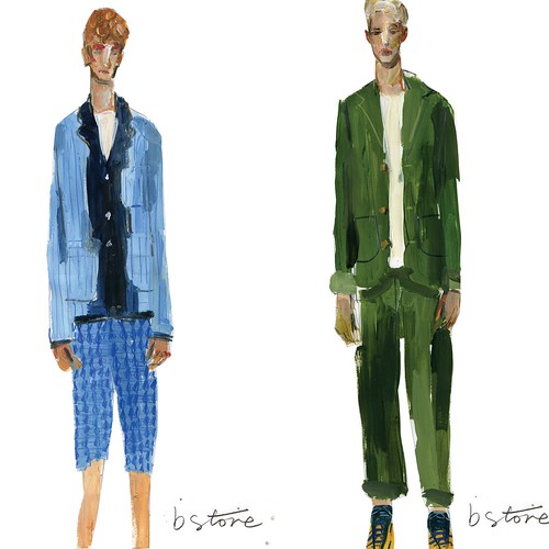
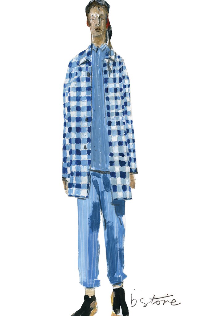
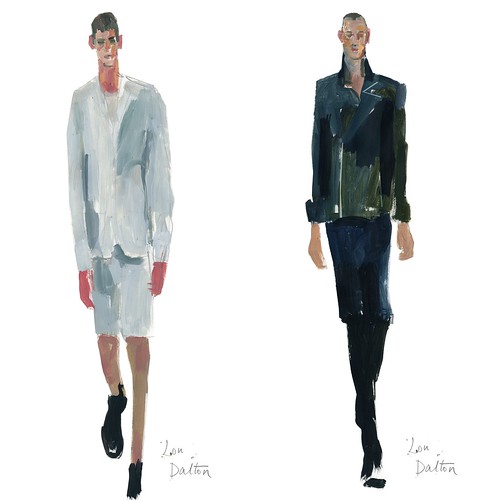
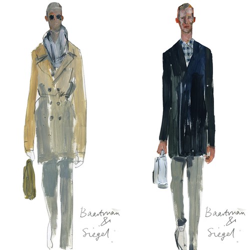
Menswear Day SS12 Illustrated

Just over a week ago I was curled up in front of the computer in a foetal position slowly rocking and talking gibberish about designers and collections to myself in a darkened room. Once more I was overcome by the menswear sights seen and indeed unseen during an extremely hectic and action packed Menswear Day. The entire bulging schedule helped cause a sartorial stir or two whilst collectively flying the flag of great British menswear and tiring us all out out in the process. Over the last few seasons the day has continued to grow and evolve. Now, it close to outgrowing itself as presentations, catwalk shows, both on and off schedule and screenings all celebrated the exciting diversity of menswear design talent which uniquely exists in this capital of ours for SS12.

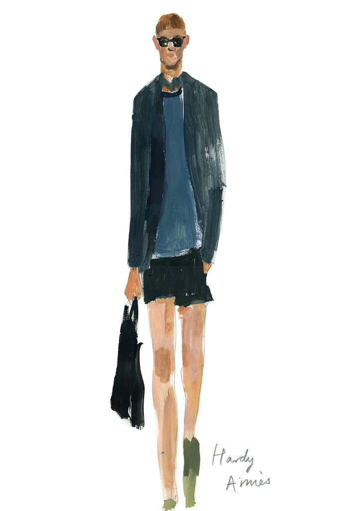
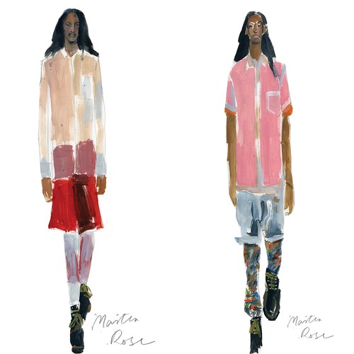
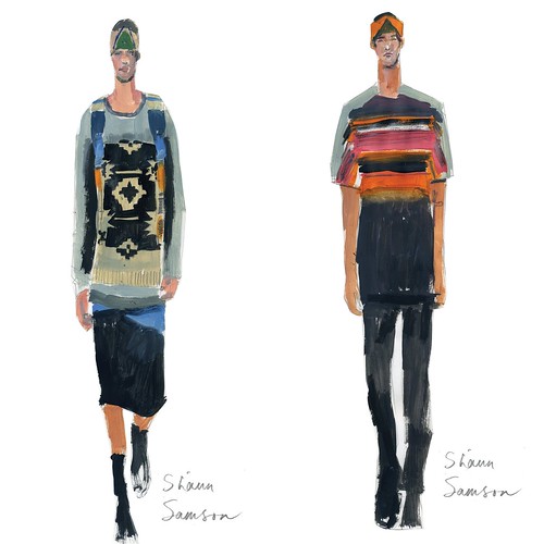
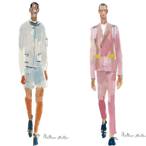
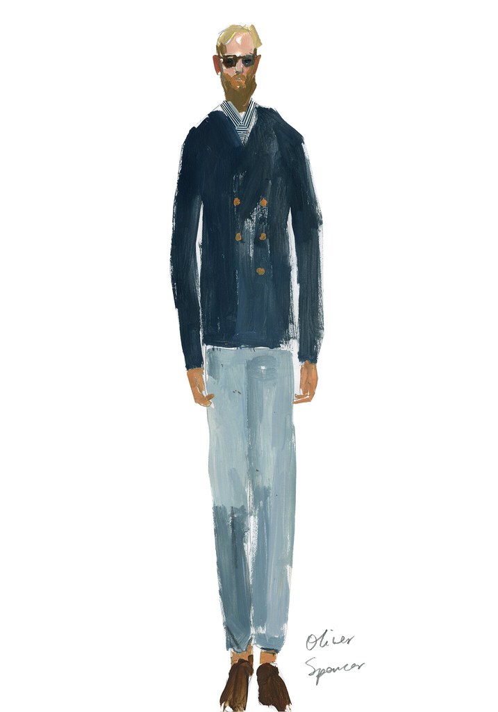
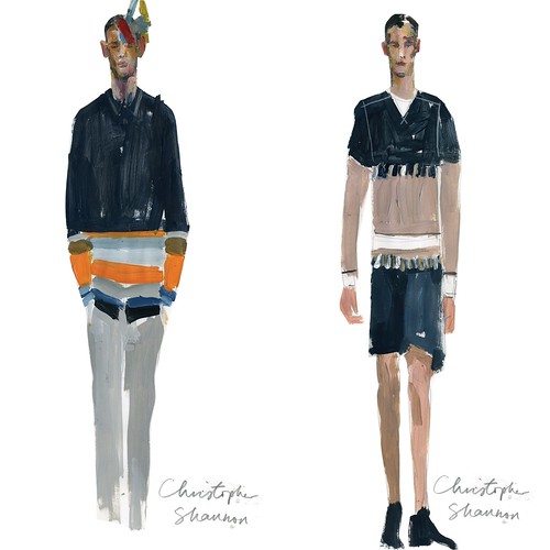
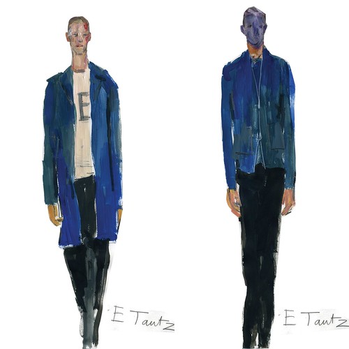
Now that the dust begins to settle on the day itself and I've suitably recovered from fashion flu, it is time to take another look at the day. Over the coming weeks we will take our time to explore and examine our favourite collections but first we'd like a quick visual reminder. Now, going to the shows is a wonderful experience but looking over catwalk photos afterwards can be a bit mind numbing. So, to help bring the day to life we enlisted the help of recent graduate Anne-Marie Jones (check out her blog if you can) to illustrate our favourite moments from LFW. From Lou Dalton managing to create wearable beauty from the harshness and desperation of the 1984 Miner's Strike and Matthew Bourne's menacing male ensemble in Swan Lake  to Patrick Grant introducing each of his wonderfully cut sportswear clad gentleman in the opulence of The Savoy. From the best MAN show ever to b Store's voyeuristic presentation of their idealised wardrobe of a modern English privileged colonial. There were so many highlights to choose from. After a great deal of thought, we selected our favourite looks and the talented Anne-Marie spent the weekend reimagining them in paint. Let the beauty of the season wash over you...


bstore_MenswearDay
bStore3
LouDalton_MenswearDay
B&S_MenswearDay
HAmies
MartineRose_MenswearDay
ShaunSamson_MenswearDay
MatthewMiller_MenswearDay
OSpencer
ChrisShannon_MenswearDay
ETautz_MenswearDay

The immediacy of Anne-Marie's artwork brings back a real sense of each show and captures just why each look was selected. The day might have flashed right before my excited eyes but these moments (in addition to many not illustrated) confirmed how special the day was. If this has whet your appetite for more detail about the collections, prepare for more meatier posts in the coming weeks.  

Wednesday 28 September 2011

Discovering Medwinds

IMG_0972

It is all to easy to be seduced by images of faraway catwalks and the like clockwork reveal of look book shots. As we fall for the aspirational and currently unavailable, we can forget to praise the simple and procurable. I often shake myself out of this state and look to the high street but as mentioned in a recent post, the high street plays in my everyday wardrobe has been in steady decline in recent years. Aside from the odd splurge on basics in Uniqlo and even then I've recently come to bemoan the quality, I've found myself leaving each well known store frustrated and a tad confused. The harder I try to unearth a bargain in the forgettable fluorescent light filled spaces the more I question and bemoan what the high street has become. Surely it should offer more than just throwaway fashion and poorly made staples? The antidote might well be found online.

Launched back in February, Medwinds is a fashion brand that offers its own quality clothing and accessories designs at reasonable prices and exclusively online. Since its inception, Medwinds aims to evolve season upon season with an admirable focus on quality over quantity. It sounds so simple but it is disappointingly rare. Whereas many on the high street become lost whilst chasing the elusive mistress that is fashion, Medwinds offers a succinct reimagination of neglected successes. There’s a hint of Gap, Mango, American Apparel, Uniqlo all with a dash of the Med. There's little that will shock but plenty that will pleasantly surprise. Customers will flock to the online store for every day wardrobe items.
Medwinds AW11 campaign - 2
Medwinds AW11 campaign - 3
Medwinds AW11 campaign - 5
Medwinds AW11 campaign - 8
Medwind's AW11 look book 

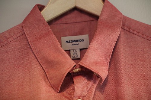
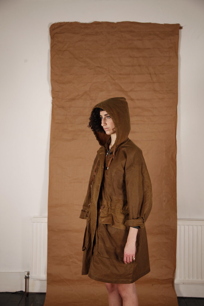
For AW11, the men’s collection features all of the essentials, from soft shouldered blazers, sharp shirting and fine knits to desert boots. All use the best fabrics available including merino wool and cotton cashmere. Throughout London Fashion Week, what usually can only be purchased with the click could be found in the ever changing pop up space at Cube on the charming Lamb's Conduit Street. The well curated space offered the opportunity to inspect the designs up close and become a little more familiar with the brand. Of course I grasped it with both hands. Below are just a few of the well made items that caught the eye...

IMG_0967
IMG_0081
IMG_0084
IMG_0075
IMG_0112
A selection of AW11 highlights

With the emergence of Medwinds, the high street giants might just get the waking call it so sorely needs. It is time to get back to basics.

Tuesday 27 September 2011

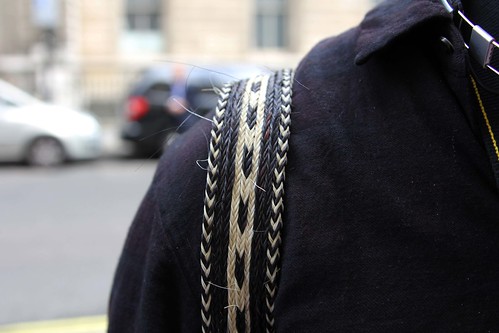
Details... Braided horse hair straps

IMG_0569
Tommy Ton and that Patrik Ervell backpack from SS11. Butter soft deerskin leather and braided horse hair straps ageing beautifully.

Unpicking the seams... Ally Capellino's Parker

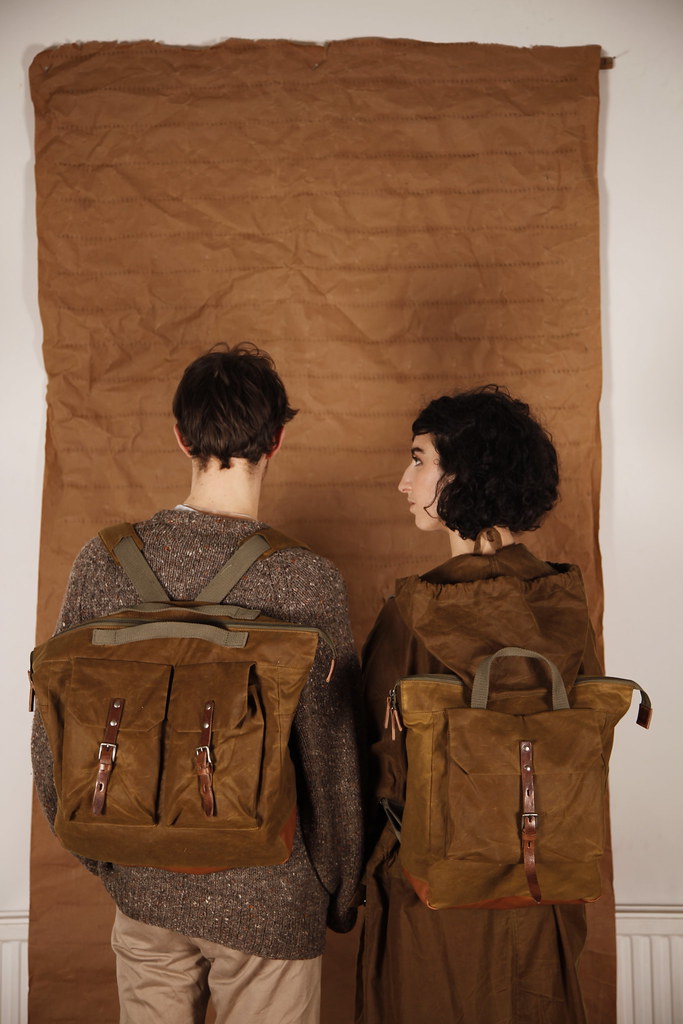
Earlier this year whilst we were enjoying a rare spate of warm weather, Ally Capellino's AW 11 look book dropped and instantly reminded me just why Autumn is my favourite season. It instantly transported me to those mornings from late September through to early December where you can layer, wrap and protect yourself in an assortment of comfortable and practical fabrics; wool, tweed, cashmere, waxed cotton and anything else you can get our hands on are all layered on to envelop and comfort. With their roots in decaying industrial buildings and institutions, the colours of the collection were shadowy and dark and the perfect antidote to a hit and miss Summer. The much loved waxy group had grown and was especially strong in a WW1 warm khaki colour. whilst soft olives and browns predominated, but there were rich reds and putty colours to balance the collection. Alongside a new addition to the waxy group in the form of a handy rucksack, my eyes were drawn to a parka in matching Autumnal hues. With the product now in store, I just had to follow up and take another lustful look at it whilst talking through the design over a cup of tea and a biscuit with Ally Capellino's very own Alison Lloyd.

_MG_2001

Now, when I think of Ally Capellino my mind is full of covetable bag classics for men and women, satchels made from canvas and leather with names like Vanessa, Lionel and Jeremy. All timeless and modern. However, the accessories line that I am most familiar with was not launched until 2000. The label has a past spanning twenty years that I had absolutely no idea about until I explored the impressive thirty year retrospective at the Wapping Project. As I walked around the wonderfully well curated space I followed the progression of the label, right from it's first womenswear collection in 1980, to the launch of Hearts of Oak in 1983 to designing Girl Guides and Brownie Uniforms in 1999. The area that obviously interested me most though is the launch of its menswear line in 1983. At the time, Alison Lloyd declared "I'm very proud of the men's clothing that we did at Ally Capellino between 1985 and 1995. Our reputation for tailoring started by breaking rules blossomed under Juno's careful skills. Our fabrics were subtle in colour and cut and he always wore them well. We began with five button jackets and anchor sweaters and worked through linen shorts, suits and shirts." 

Having built up a strong accessory offering over the course of the last decade, Lloyd has slowly been reintroducing a few key apparel pieces into her collection over the last couple of seasons. Dipping in to her archives, the aptly named Parker is the perfect example. "When we offered clothing previously, we almost always did them. I took one of our old one's from the 1980s, I could tell you the exact date of it now but pictures of it were included in the exhibition last year. It was white and I think it was shot for Vogue Traveller. I took it and graded it down for today. Garments were so much bigger in those days. Arm holes in the 80s were way down there and it was huge. For the pockets, I've reproduced this Swedish army storm pocket." Intently examining the sample and picking out aspects which were improved for the final design, Lloyd took another sip of tea and was satisfied.

This generous waxed cotton parka comes in two sizes for men and women. There are draw string ties at the waist and on the hood. A weather proof button fly covers the zip-up opening and there are two capacious front pockets with storm flaps as well as an inside breast pocket. The instant attraction of the Parker is its waxed cotton foundation of British Millerain. "It is exactly what we used for the bags this winter, the greasy wax. It needs to have those tiny touches of leather to tie it now. It should age beautifully and it would be nice to see it hanging on the back of the door in twenty years time with a few cobwebs." The Parker would certainly age better than I will.

_MG_2007

Having slowly evolved the range of bags, accessories and collaboration over the last ten years, she is drawn to the challenge that clothing presents. "The way in which clothes are constructed and the fit of them is a great deal more interesting in a way than bags. There's a limit to bags, it doesn't have to fit anybody other than a shoulder or a hand. Clothing is more of a challenge and therefore more interesting to me again." Lloyd is approaching the addition of garments to her offering in much the same way as she would a new bag. "The reason I have kept away from clothing is this idea of creating a total look. If I were to do clothing again, I would like to do it like this, it is items instead of fashion, I don't want to make a collection for the catwalk anymore. I used to love doing it but I've done that and I'm not after a fashion trend. Classics are more interesting to me now." Lloyd will no longer be rushed by the expectations and demands of fashion. It is all too easy to be sucked in to the cycle of fashion seasons but having done it all before, the designer is ready for a change of pace. "I think it is because we have slowed down and because our bags change in an evolutionary way rather than themed collections. There are of course influences but you have to be rather subtle with bags. As we have slowed down we can perfect things. I can stay satisfied with items much longer than I used to which means they get better rather than discarded for something new. This is precisely how the clothing will work." I look forward to the fruits of Ally Capellino's sartorial evolution.

Friday 23 September 2011

Details: Carrying show invites in style

IMG_0555
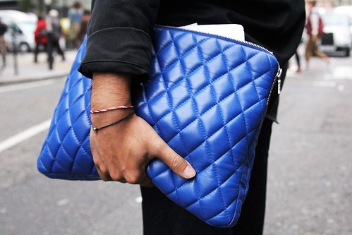
Whilst my LFW show invitations were stuffed in an inadequately sized envelope, Dal Chodha opted for a quilted haven. The H by Harris Q1 Skin Diamond in blue served him well during Menswear Day

Thursday 22 September 2011

Satyenkumar SS12

Satyen_Feature Button

Satyenkumar is a designer who has always quietly gone about his business of creating quality tailored causal wear for us modern eccentric English playboys. After graduating with an MA from Central Saint Martins and honing his craft with Versace and Ashish, the design talent decided to go it alone for AW06. Having long admired his work from afar, it was not until I took my seat at his SS10 show, Reflection through a lens, that my eyes were really opened to the designer. In a season where so many designers delivered a surprisingly dark, industrial, almost sombre colour palette, Satyen dazzled with his kaleidoscopic travel through a lens. It might have been a typical September afternoon in London but examining Satyen's colourful craftsmanship transported me to an Ibiza beach at sunset. Seemingly weightless outwear, jean inspired trousers and pyjama shorts, sheer/dense mix shirts, rainbow patch worked vests and featherlight unlined blazers in Swiss Voile, Habotai and Tulle. A true celebration of colour and lightweight tailoring. I was hooked. However, this addict was only treated to one more season before the designer took a couple of seasons out. Despite not being the loudest of designers, his absence was noticed. Thankfully, Satyenkumar makes his welcome return for SS12 and I can exclusively offer the first glimpse of it.

Satyenkumar customarily begins his design process with a character and for SS12 he looked to the British explorer, Percy Fawcett, who disappeared in 1925 during an expedition to uncover Z. "The collection was actually pre-visioned last Summer. It was inspired by David Grann's 'The Lost City of Zed'. I found this book over a year ago, just before I began to think about last summer and then of course I decided to take some time out. I still kept the book in my mind and still thought it relevant for this collection." Inspired by this tale, Satyen wanted to do something that was even more detailed than previous seasons, playing with military, adding more layers and pushing himself. "I have always done tailoring but wanted to move my aesthetic forward." SS12 certainly marks the return of an evolved Satyenkumar.

Building on the character of the lost explorer and having had the book playing on his creative mind for some time, Satyen turned to his obsession with murano glass which then led him to marbles. Everything clicked in to place. "The idea of losing your marbles and Percy Fawcett in the Amazon, going with the intent of exploring but then becoming trapped within the craziness, colour and tropics." The prints developed from this mental state and follow the process of losing your mind. "It is fantasy that is grounded in real clothing which dictated this idea of print, colour, detail and contrasting. A lot of my pieces tend not to be 100% one fabric but there's often a twist where two fabrications are used or a poppy colour has been changed to alter the silhouette for example a more military piece can be transformed by a flash of royal blue or coral." The collection takes the observer through the imagined phiscal and mental journey of Fawcett. The darker side of the collection was inspired by the idea of this character having to integrate in to his environment, this takes you in to the more subdued, black monochrome pieces. However, despite the strong literary influence this is not a theme collection. It is grounded in style and the beauty of menswear in general. Satyen teamed up with long term stylist Jason Hughes to help bring the collection to life in the look book. Rather than wax lyrical about the collection, allow me to do the polite thing and share it with you...

SS12_LK01
SS12_LK02
SS12_LK03
SS12_LK04
SS12_LK05
SS12_LK06
SS12_LK07
SS12_LK08
SS12_LK09
SS12_LK10
SS12_LK11
SS12_LK12
SS12_LK13
SS12_LK14
SS12_LK15
SS12_LK16
Exclusive SS12 look book shots courtesy of Satyenkumar.

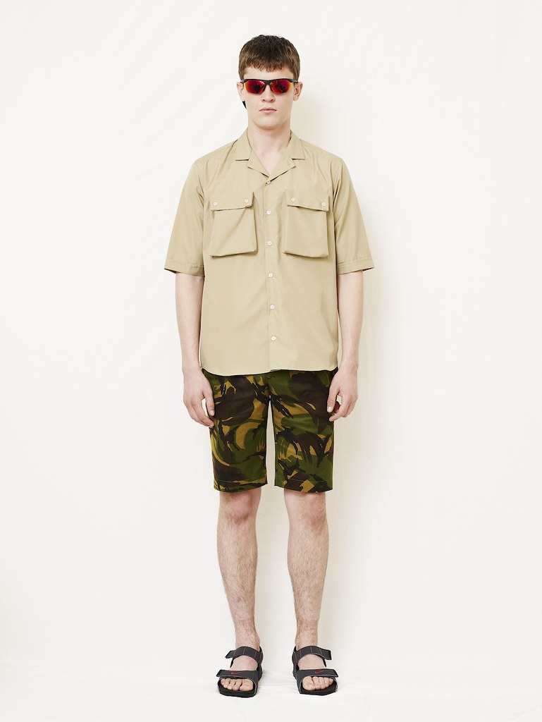
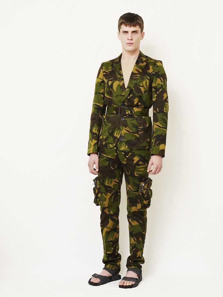
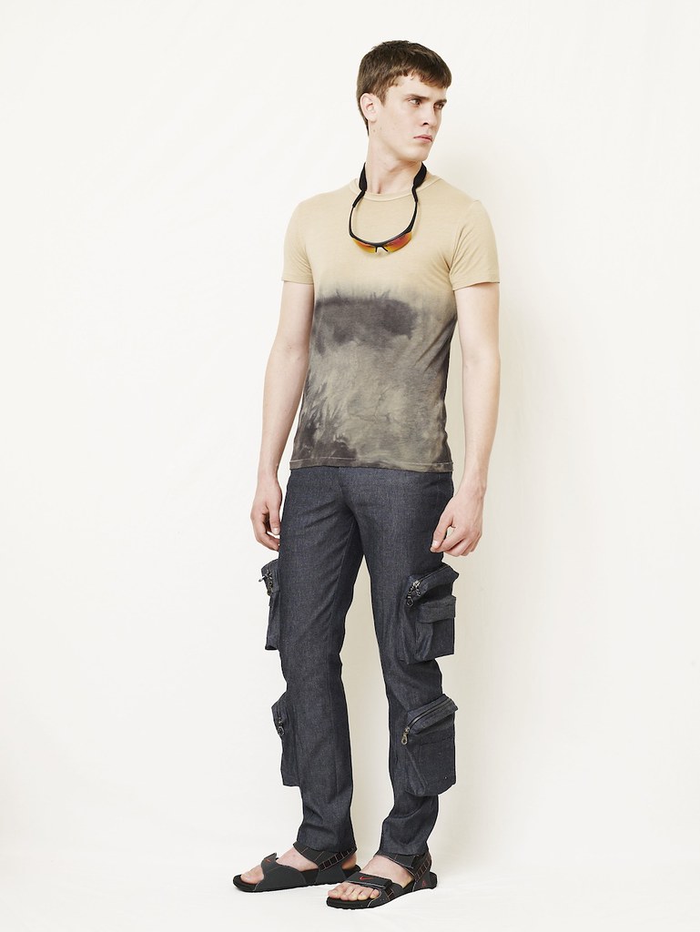
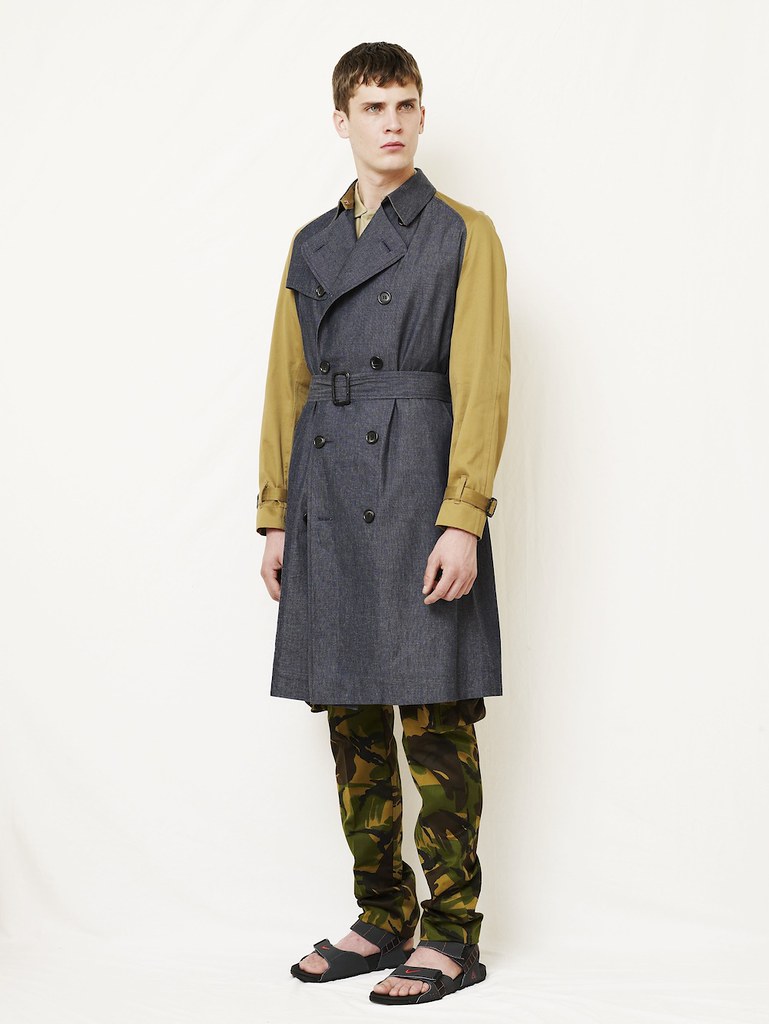
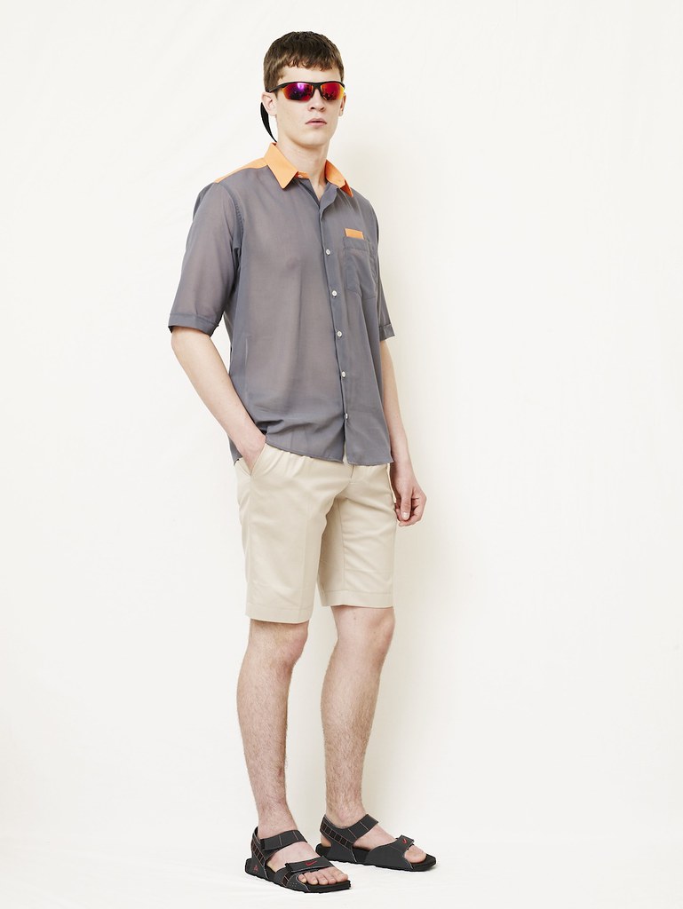
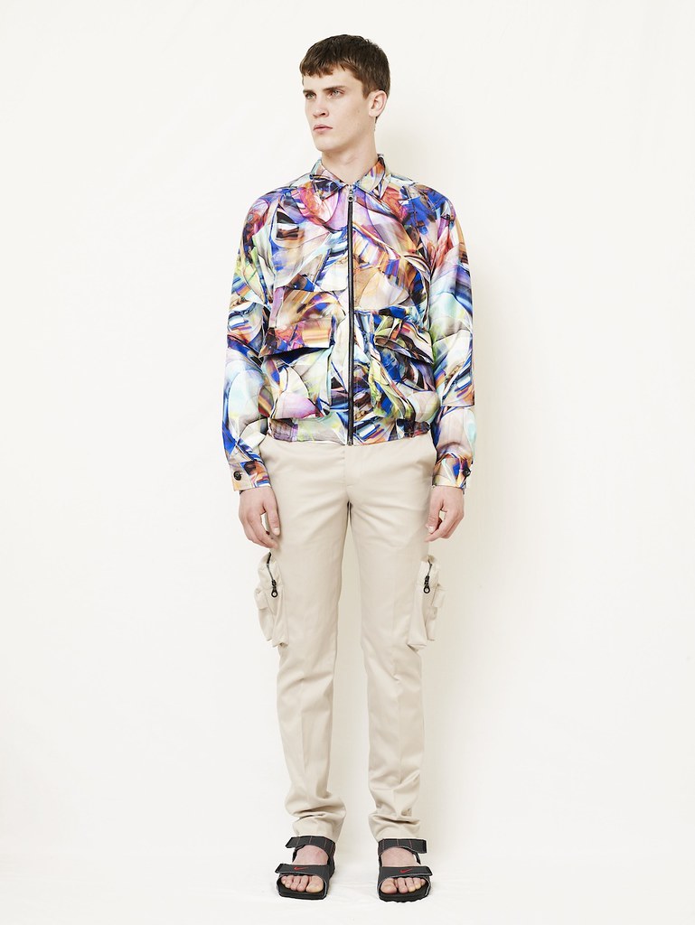
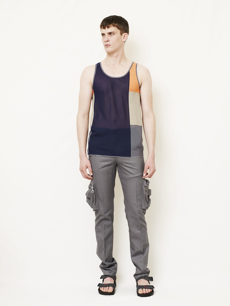
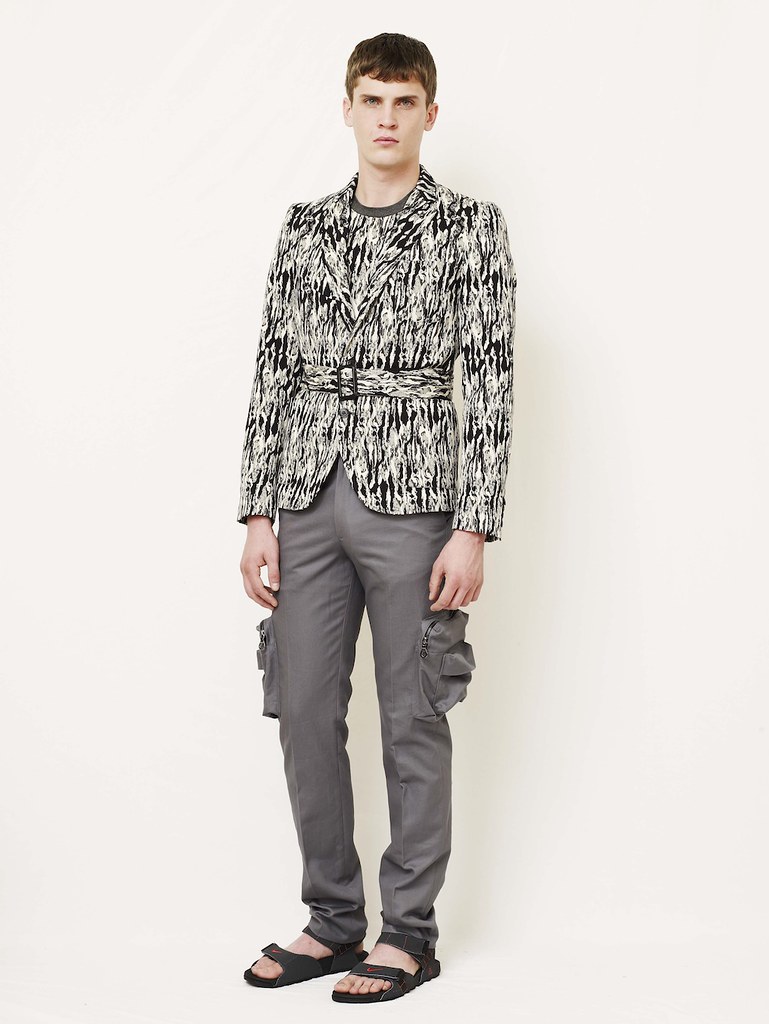
As ever with Satyen, the SS12 collection showcases exquisite, timeless tailoring and modern hybrid classics in an assortment of fabrics that long to be touched and prints that daze and hypnotise. For me, the piece that provides the best summation of Satyenkumar as a designer are the tailored combats. "They are a tailored trouser with combat pockets. When you put them on, they feel nothing like a combat pant. They've gone to another level." However, the designer has challenged himself throughout but it is in the outerwear where we see just how far he has  pushed and evolved. The denim trench with twill, the belted suiting,  the multi pocketed bomber jacket in printed silk. Throughout, Satyen wants the looks to feel relaxed in places and restricted in others. The combination of these two elements is ever present.

Having bounced my way across the capital yesterday and seen countless SS12 collections as part of LFW, I have to confess that few left me as excited as this one. The return of Satyenkumar is a welcome one. Having been away from the spotlight for a couple of seasons now is Satyen's time to shine. The recovering menswear addict has a new hit.