Wednesday 30 June 2010

Discovering Pitti: CP Company

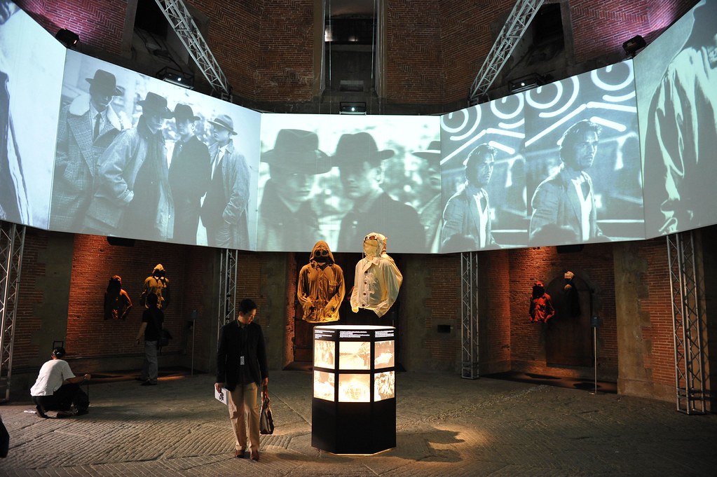
CP Company's exhibition space at Pitti Uomo. Image from Pitti.

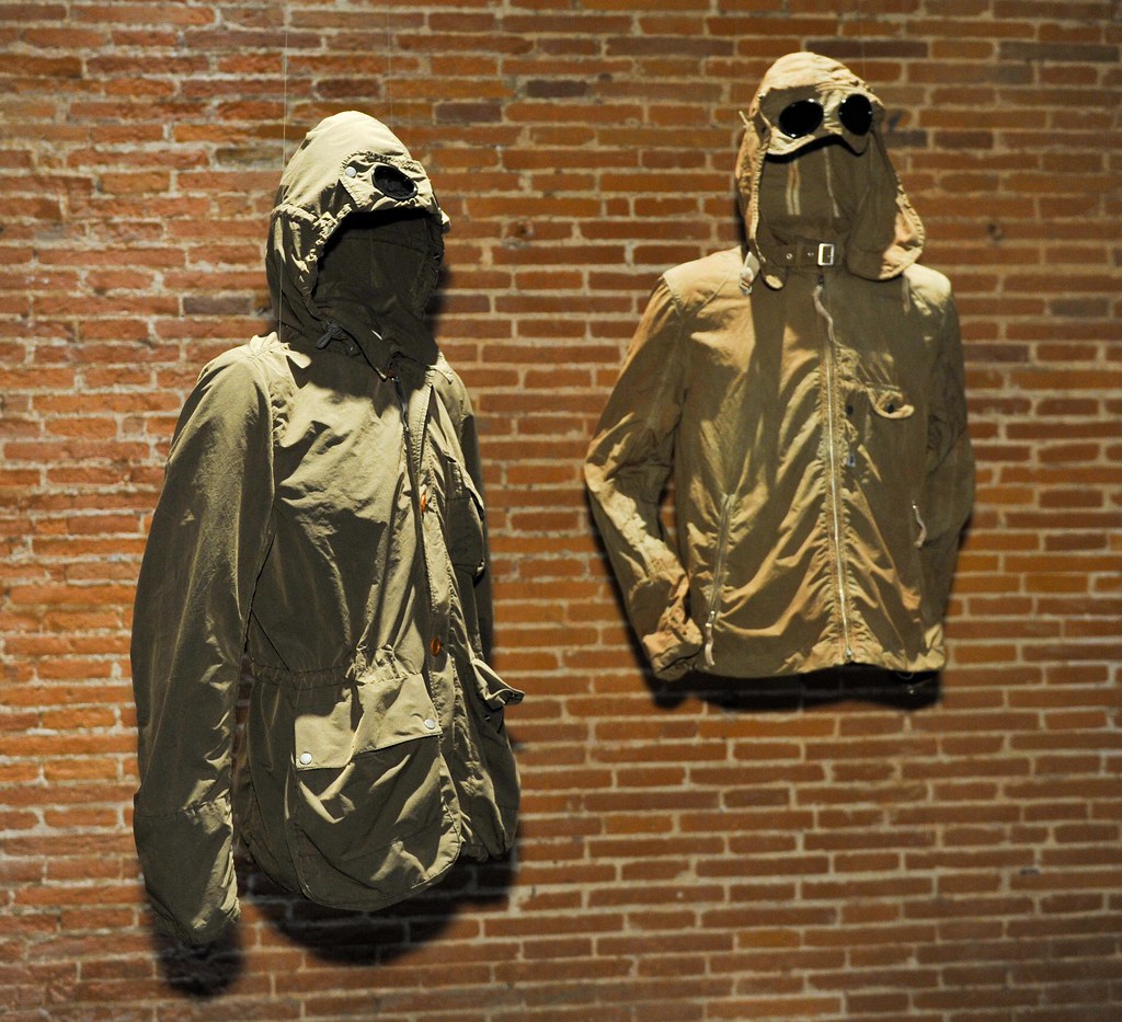
After last February's change of ownership, with CP Company passing from Sportswear Company to Enzo Fusco's FGF Industry, the future for this Casuals favourite brand was far from clear. The new direction began not on the catwalks of Milan but in Florence. Participation at Pitti Uomo marks a milestone in the life of the brand as it presented its fascinating story at Fortezza de Basso's Sala Ottagonale alongside the new collection. For SS11, the focus is on the soul of the brand, it sees a return to experimentation. A casual concept generated and developed to seek innovative materials and technological advances to create a selection of iconic goggle jackets.

Two of the latest designs of that iconic jacket. Image from Pitti.

The new CP Company is firmly rooted in the great tradition of the iconic designer sportswear brand. Kicking off with outdoor work and military apparel, the SS11 collection develops materials and technological studies, with garment treatments that offer unique, inimitable aspects to give clothing a new, contemporary flavour without losing echoes of memory. Flax has been blended with nylon for a new techno look, using a special resin coating that conjures up memories of the oilskins used by seamen of yesteryear. Nylon has been completely transformed and evolved with metameric treatments that gives the fabric a colour changing effect. Inserts of cotton and other material add new dimensions, combining to create a balance and depth of colour, textured effects and various sheens. There is a special focus on a navy style, with a treatment that gives the fabric a slightly crumpled look, as if it had been consumed by sea salt and left to dry in the sun. The collection offers models with such authentic details and fabrics that the garments could be mistaken for real vintage.

A close up, detail shot I took of the Goggle jacket as the film plays on in the background.

The Italian clothing designer Massimo Osti (1944-2005) created groundbreaking fashion works during the 1980’s and 90’s by combining his revolutionary textile innovations and painting techniques, with functional ideas from mainly military clothing. The story of this iconic piece of outerwear began when the great Massimo Osti exclusively designed and produced the very first Goggle Jacket as a promotional piece for the competitors of Mille Miglia in 1988. Last October I was able to visually document the narrative of the jacket at the Past, Present, Future exhibition at the RCA. From the very first, special edition jacket to the special edition created in collaboration with Aitor Throup last year, C.P. Company’s journey was told through the different steps of this iconic item which, season after season, has been subject to continuous transformation and experimentation. For Aitor Throup the brand has not had the respect and attention that its iconic designs deserve but this exhibition changed my perceptions and understanding of the brand. I hope the new look CP Company continues on the path set by Massimo Osti, creating garments through experimentation and innovation.

Tuesday 29 June 2010

Discovering Pitti: Leitmotiv

The one thousand, four hundred and seven exhibitors who decided to preview their new collections and projects at Pitti Uomo and Pitti_W was an unprecedented record. The sartorial Disneyland of menswear trade shows that is Pitti introduced me to countless pulse raising brands. Italian menswear, womenswear and accessories brand Leitmotiv was undoubtedly among them...

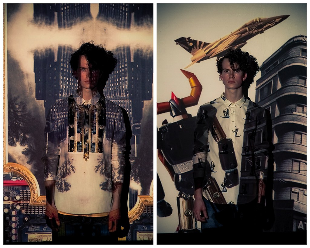
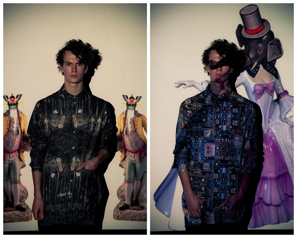
Leitmotiv AW10. Photographs by Danielle Mari and modeled by Hannes at Urban.

The two minds behind Leitmotiv were both studying in Bologna when they met by chance. Fabio Sasso was studying art and following private tailoring classes, Juan Caro had moved to Italy from his native Bogotá to study art. Realising they shared many interests they started collaborating together. Leitmotiv is an artistic project with a bright and colorful language on the edge of dreams and theater. For their AW10 collection they chose to concentrate on the shirt as a means to communicate the style of the entire collection.


Sasso's passion for tailoring and constant Baroque thoughts combine with Caro's passion for art and all things Gothic. This fusion of these seemingly disparate styles create clothes and accessories that contain the most fantastic stories. They are stories that have fascinated us throughout childhood. Today we relive these through this duo...


There is a constant play of opposing references
. Hot and cold, chaos and order, past and future, light and dark. From the beautiful cityscapes that when seen from a closer look reveal a set of microchips to the faces of the forties that are surrounded by baroque frames to fairytale figures with the heads of robots.


These Leitmotiv creations encompass both the ancient and the modern. All the while creating an eclectic, ironic, visionary array of designs
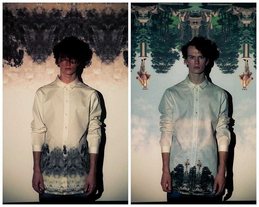
. The seemingly simple white shirt becomes the canvas that unfolds a tale of dreams and the poetic whims of the design duo.


The shirt designs are both elegant and whimsical. By looking to past centuries and different worlds, these prints provide a smile inducing collection. Leitmotiv is a label that references art and fashion while showcasing great craftsmanship. I'm glad I've discovered it.

Leitmotiv AW10. Photographs by Danielle Mari and modeled by Hannes at Urban.

Dunhill SS11

In the midst of fashion week it is quite easy to become a little bewildered by it all. There are just so many collections to view, designers to discover and pieces to add to your dream shopping list. Of course there have been a number of highlights already from Christopher Bailey revealing his darker design aesthetic to Dries Van Noten's graffiti covered quayside to Lanvin's body con knitwear. There is just so much to say, so for the start of SS11 I've decided to take stock of the season before jumping in with show reports and roundups. As with last seasons First Look series, I have really enjoyed Another's Menswear Confidential Milan and Paris coverage. In Menswear Confidential, top designers share the visual references and making of stories behind their latest collections. This type of coverage taps in to our inquisitive nature and really helps see the collections in a new, brighter and altogether more agreeable and understanding light. None more so than Dunhill...

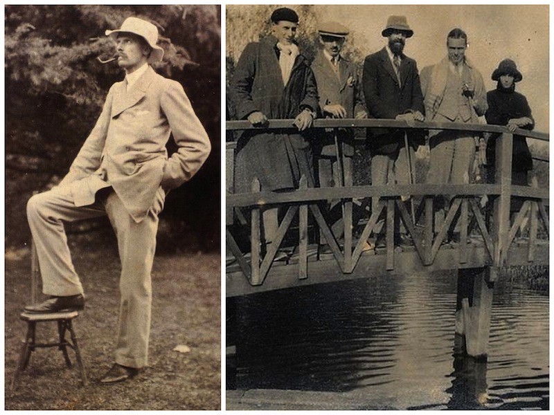
Two snapshots of the Bloomsbury Group

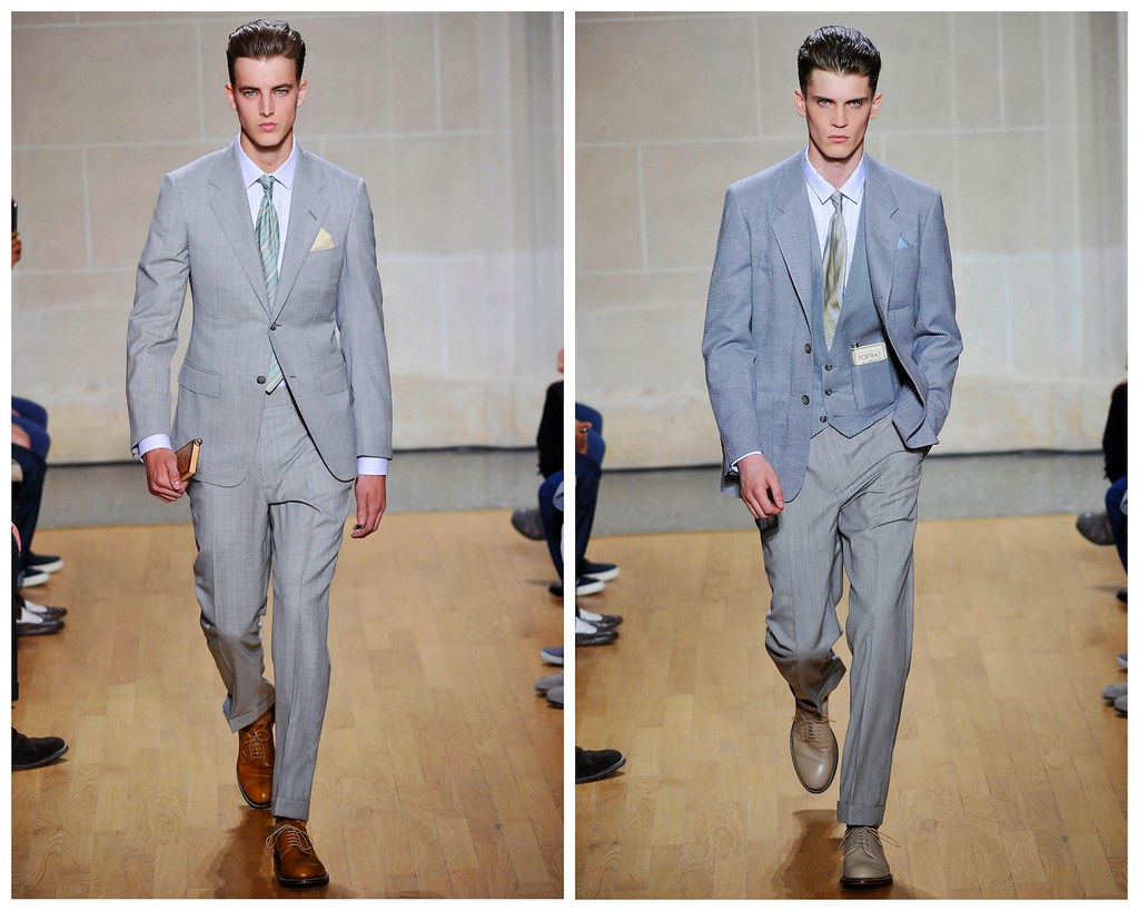
Dunhill's SS11 collection was once again a fusion of heritage with modern day luxury. It confirms what I have previously said about Jones, he obviously takes great delight in investigating the brands archives before adding his own innovation to create the Dunhill of today. The heritage of Dunhill is so broad and so darn British, from its beginnings with the birth of the car to creating luxury accessories for motorcycling, aviation and the oh-so-fashionable smokers in the Roaring Twenties. For AW10, the central inspiration was the journey of Dunhill's very own Clement Court but for SS11 Jones looks at the similarities between Alfred Dunhill and the Bloomsbury group of artists in the 1920s and 30s. Experimentation and English Modernism are the core themes.

"Both Alfred and the Bloomsbury circle were forward thinking, challenging the norm. The Bloomsbury group's work influenced literature, aesthetics, criticism and economics as well as challenging modern attitudes."
Kim Jones speaking to Another

The Bloomsbury Group provide the chief inspiration, both in terms of an ease of dress and a distinctly English take on tradition and subversion combined with an artistic experimentation in the detail and attitude of the clothing and the wearer. There is also a notion of subversion and tradition that is inherited by other English groups post-Bloomsbury and this collection is a nod to them as well, particularly to McLaren and Westwood. So whether it is the 1920s or the 1970s or right now there is always a maverick spirit in Englishness, and this is something that always applies to Dunhill.


Ever since he took over the reigns at Dunhill, Kim Jones has looked a man at home but with this collection you get the sense he really is enjoying himself. For a brand with such strong roots, any steering by Jones has been to emphasise them – those being the characteristics of classicism and understatement but his challenge was to present these with a wholly modern personality too which he has surely done with this collection...


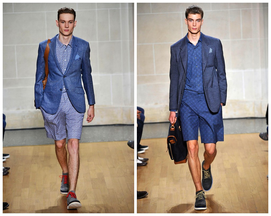
Jones is skillful at fine detail. A stylish etched rosewood brief case containing artists’ tools took inspiration from a cigarette lighter etched by Picasso with an image of Dora Maar. Throughout, he developed the artistic and aristocratic Bloomsbury Group, updated in suits and jackets that were double-breasted but with a single breast-bone button. The revised blazer made the strongest statement and gave that touch of eccentricity. Many of the key items of clothing in the collection are inspired by garments worn by Bloomsbury members such as the economist John Maynard and a jacket worn by the artist and critic Roger Fry in particular. The flannel blazer, wide lapelled, high double breasted with a single set of buttons and almost a flared shape is a recurring motif in the collection. There is a concentration on soft, unstructured tailoring throughout, often double-faced and unlined. Whether this is in jackets inspired by artist’s smocks with big patch pockets or in soft collared shirts and roomy straight legged trousers, there is a feeling of fluidity and elegance throughout the collection. Clashing print inserts are placed subtly in the shirting as a nod to the make-do-and-mend attitude of the British artistic elite. It is also a reminder that Dunhill clothes are for life, to be passed down to successive generations. Such precious items as signature sterling silver buttons should reinforce this point.


Ever since we featured E. Tautz's SS10 collection, I have been obsessed with the idea of an Englishman abroad. For SS10, E. Tautz were inspired by just this very idea but not just by any Englishman, the Duke of Windsor to be precise. When Patrick Grant and his team were creating the collection they were thinking about what the English like to do during the Summertime; they like to go to the Mediterranean, sit on beaches and wear hankies on their heads. However, with this Dunhill collection I get a strong sense of celebrating the great British summertime. Who needs the sand and sunshine of the Med when you can enjoy our very own sporadic sunshine at a garden party in Bloomsbury? Tea and cucumber sandwiches anyone?


Alfred Dunhill's heritage is never far from Jones' references as the designer is committed to creating a contemporary wardrobe for the modern Dunhill customer. Once again, Jones has been strongly influenced by the Dunhill archive and the pieces that Alfred himself created. Alfred Dunhill himself was obsessed with innovation and new technology, which means that there are pieces in the archive that are just as relevant today. When Jones trawls through the extensive archive with his excited eyes, he sees there is little ‘old’ about it but rather it is wonderfully modern.


Alfred Dunhill himself was an innovator and had a very modern approach to life and Jones undoubtedly brings a similar feeling to the Dunhill of the future. When thinking about moving the company forward and how he fits into that process, Jones always consider what would inspire and drive Alfred Dunhill if he were alive today. Here he has has picked out key inspirations from the past and repackaged them for the new era of luxury. One hundred years might have passed since they were first designed but for Jones they are as relevant and exciting now as they were then, made all the more so by Jones' touch...


A good example of this is the captive clock - for which ornate, beautiful shutters were designed in order to protect the watchglass beneath it was worn with eveningwear. It is a classic and well-known piece from the late 1920s. This image represents what is great about Dunhill — the attention to detail and beautiful workmanship is still evident in the watches and pens that they produce today. As ever, with function comes great aesthetics.


This is a collection that celebrates Dunhill's golden era while forging a new one at the hands of the latest innovator, Kim Jones.

Saturday 26 June 2010

Floaty light accessory

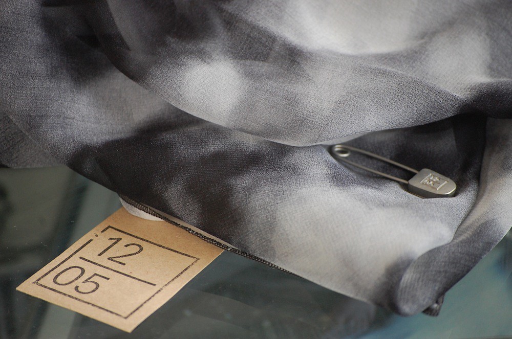
1205's Silk Georgette Scarf

With 1205 Paula Gerbase offers a unique concept of a functional unisex wardrobe. Carefully considered pieces for men and women that can be worn effortlessly by either. Regardless of gender the debut collection for SS10 showcases Gerbase’s now trademark sensitive use of luxury fabrics and erudite pattern construction for a modern-contemporary muse. While admiring the collection a few months back, I took the opportunity to sit down with the designer to discuss the label in more detail. Comfort, playing with colour and mixing fabrics were all key themes running through this collection. As well as falling head over heels for her design I started to imagine Gerbase's imagined androgynously tailored world. The combination of this glorious spell of warm weather and the generous oki-ni sale finally played my hand and now I'm a proud owner of one of Gerbase's designs...

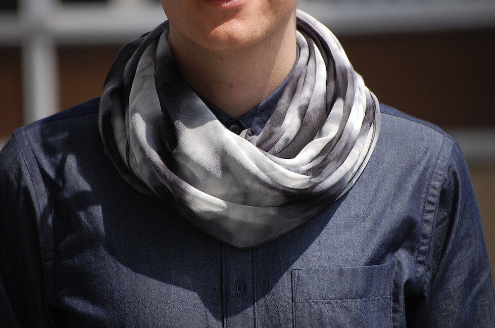
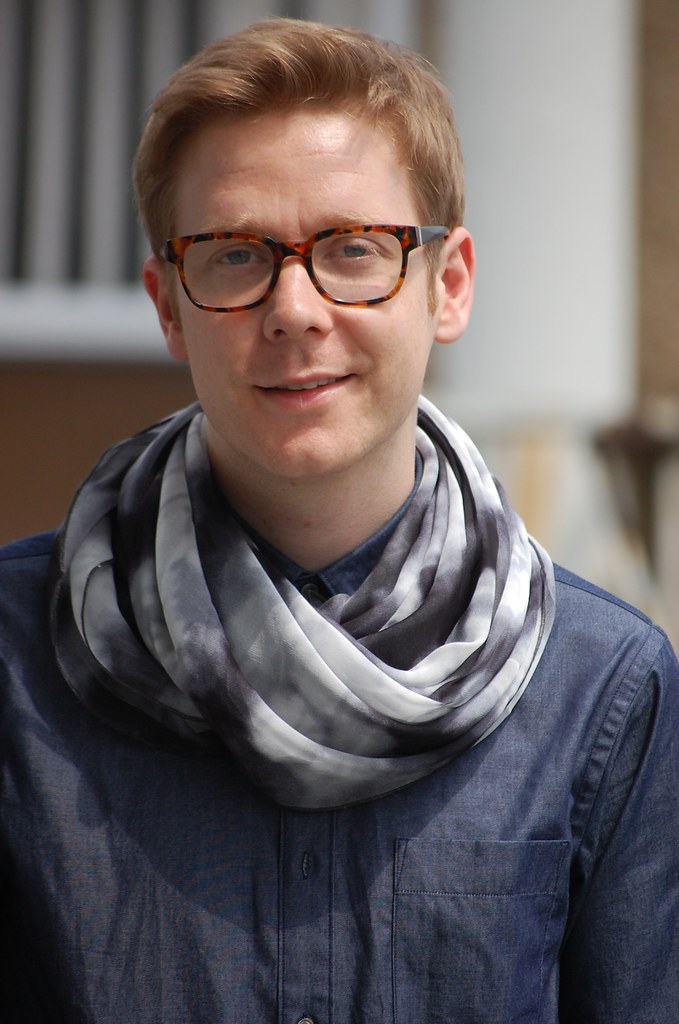
A close up...Silk Georgette scarf worn with J+ Uniqlo chambray shirt

Despite being a huge admirer of the unstructured cardigan I decided my wardrobe needed lightening up a different way so plumped for the Silk Georgette Scarf. The printed silk appears to depict a floaty light cloud scene but during my studio visit I learned how Gerbase had photographed wool before blowing it up. The fact that she has integrated such a masculine fabric in wool and feminised it in such a way sums up the label quite beautifully. Now, all I need to do is experiment with the different ways of wearing it.

Silk Georgette scarf worn with J+ Uniqlo chambray shirt.

Friday 25 June 2010

Discovering Pitti: 10a

It might just be time to brace yourself with 10A

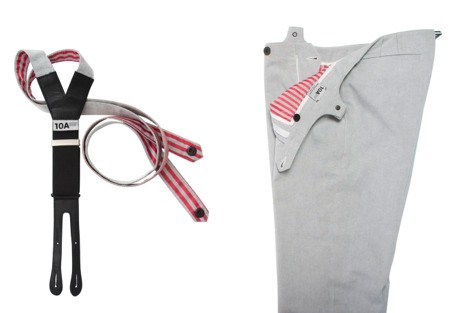
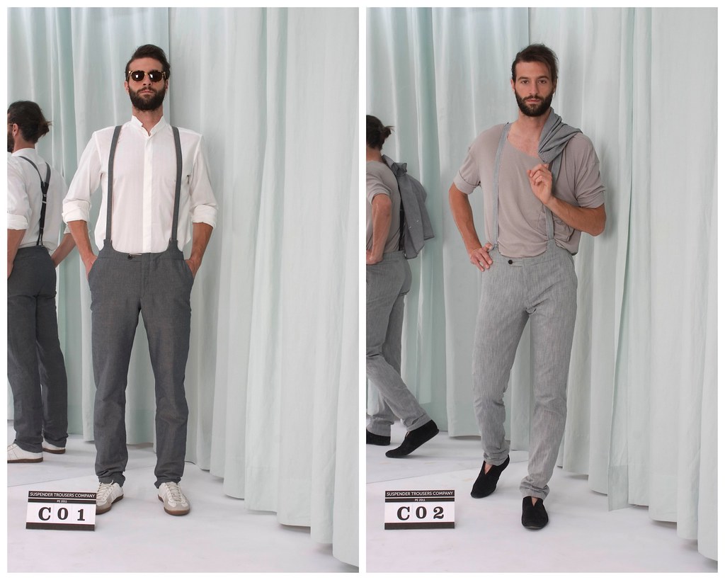
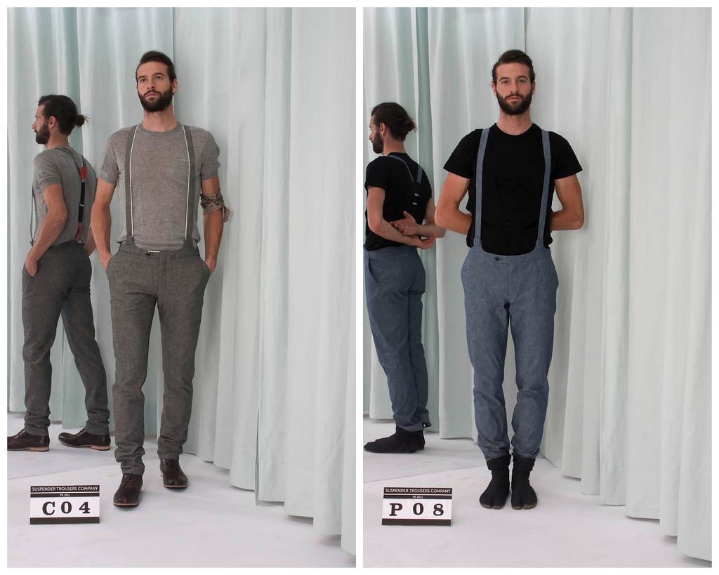
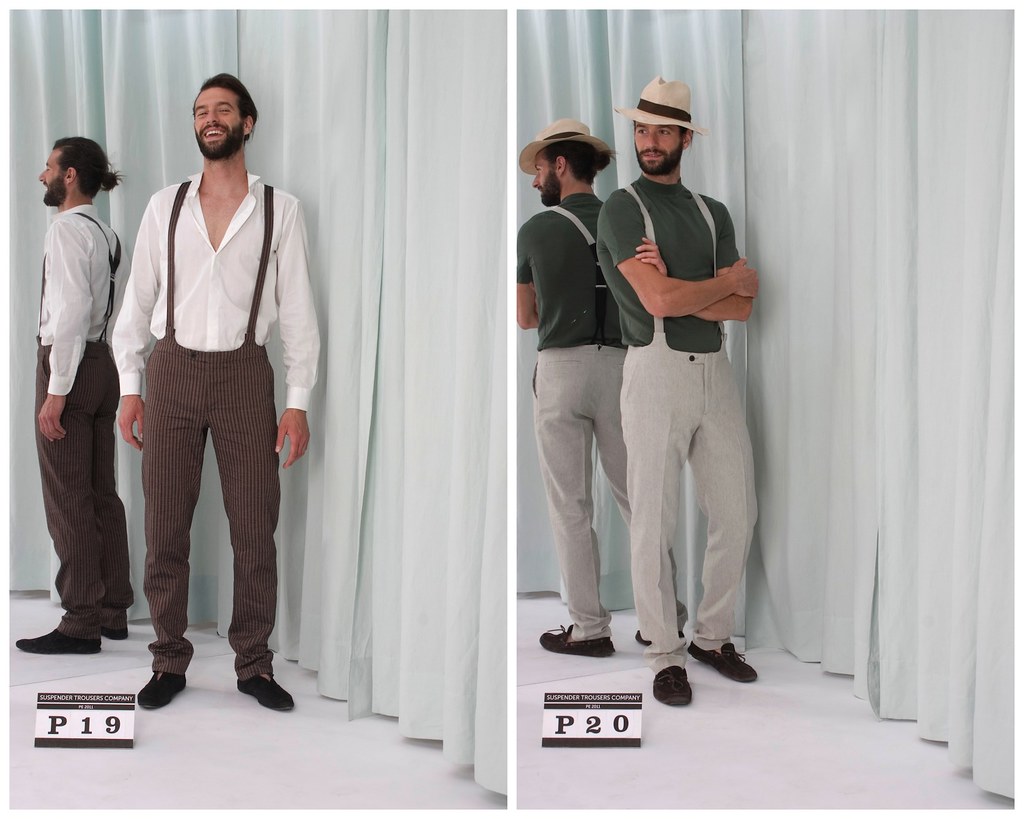
Last month, after becoming tired of adjusting his trousers throughout any given day, The Sartorialist opened a discussion around suspenders. As I was contemplating the idea of bracing myself for the first time in my life, I stumbled across 10A at Pitti Uomo. No, this was not a copy of my GCSE results (damn you Maths and Design Technology for blemishing my results card) but rather a well crafted trouser and braces company. Daria Dazzan, an Italian-born 24-year-old former student at Antwerpʼs Royal Academy of Fine Arts, and her boyfriend, the product designer Matteo Cibic, recently unveiled their clothing line with the sly moniker and the brand has quickly gone from strength to strength. As I pinged the braces on the model I was able to talk through the concept and craftsmanship behind the brand with Daria Dazzan...

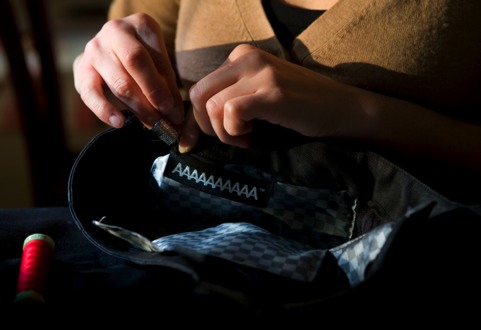
Stitching in one of the labels by hand

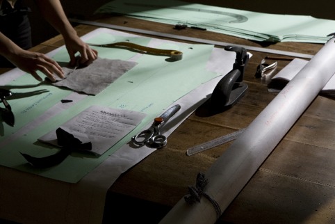
In 2008, 10A created only ten pairs of trousers each month, on request of the pairs friends and through word of mouth. After two years, the success verified the brand, Daria and Matteo then decided to produce a collection of trousers in six sizes. 10A was born. Following a long search to sharpen the quality of the details, the refinement of the materials and the formal, a union between classic taste of the brace and the contemporary style of the trouser...

Focusing on the details.

We have long declared that the real beauty of menswear is in the details and Daria Dazan agrees but her line introduces an often overlooked detail. When creating each item the design duo focus on creating it slow and well. The distinctive elements of 10A are the contrast linings of the trousers and the inside of the braces. The line has two main fits: Slim and Classic. The Slim fit is determined from a tapered cut and low rise. The Classic fit is characterized from its more comfortable style and a straight cut. Both are produced in Italy with Love. Below are a few of the key looks...


10A Suspender Trousers Company unsurprisingly keeps it simple by producing trousers with braces for the sartorial man. The preparation is focused on the small details and the woven quality. Daria and Matteo have sourced the best textile manufactures located in Northern Italy, seeking almost forgotten, traditional textile methods of production where possible. It might just be time to brace yourself...

Thursday 24 June 2010

Ravensbourne BA Graduate Showcase: Bobby Charles Abley

Earlier this month I took my seat to watch what the current crop of talented BA students showcased at Graduate Fashion Week. I was fortunate enough to see a large number of shows but one in particularly sticks in my memory, Ravensbourne. Ravensbourne’s was a graduate collection of beautifully tailored menswear. A trio of graduates forced me to sit up and take notice with stunning collections from Thomas Crisp, Jade Rozenbroek and Bobby Charles Abley.

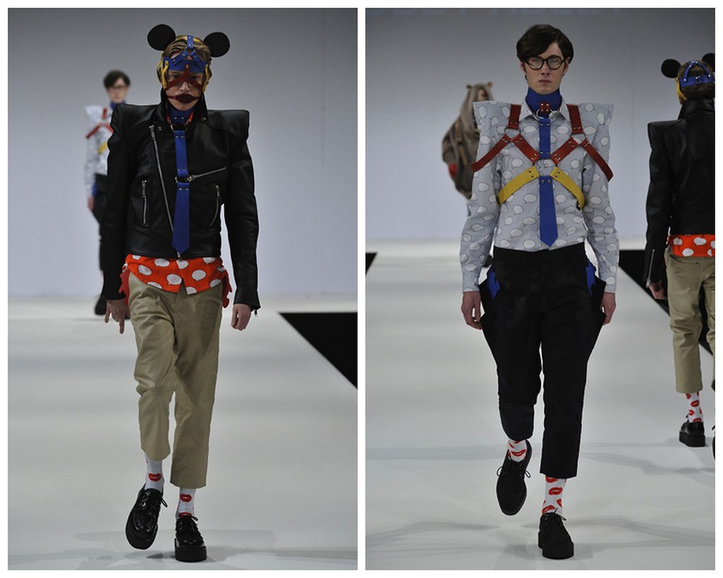
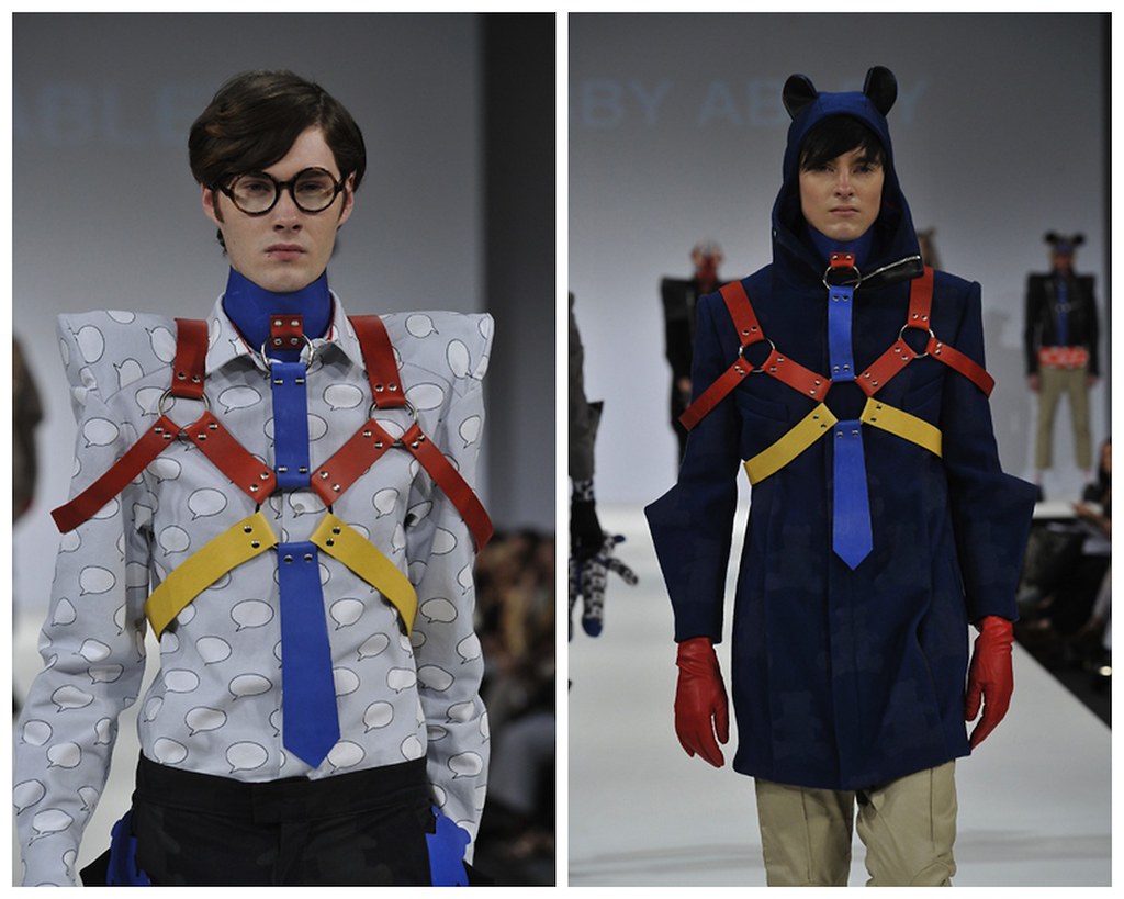
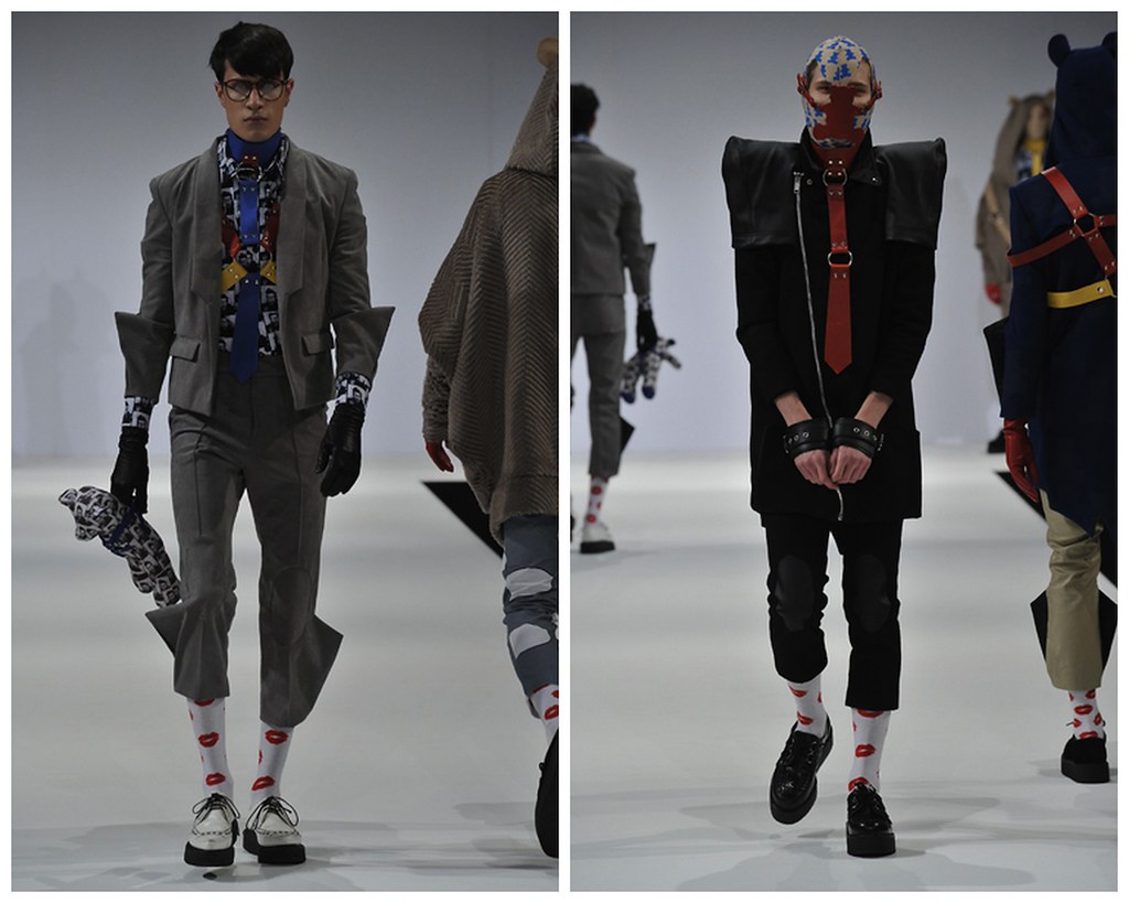
As I wiped the early morning sleep from my eyes, Abley kicked start the show and instantly brought a smile to my face with his well executed care free, carnival like tailoring. Abley looked to comic book heroes to create a fun collection of empowered, primary coloured pieces which would brighten up any grey day. Here we catch up with the young designer to peer in to his sketchbook, learn more about his time at Ravensbourne and discover that we weren't the only ones impressed with his collection as a certain Dame took a keen interest...
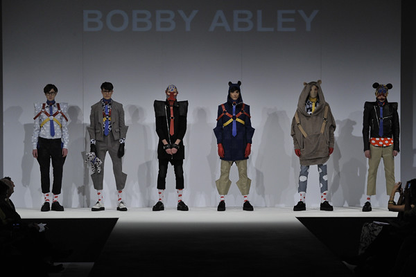
Abley's collective of comic book heroes. Image courtesy of catwalking.com

SS: Congratulations on more than playing your part in a dazzling Ravensbourne show. How did it feel seeing your finished designs on the catwalk?
Bobby Charles Abley: Thank you very much for the compliments. People tend to say there is a line with menswear that you can't cross and that it is more restricting than womenswear. I agree...to a certain extent but I also think menswear needs a push. It’s the modern world, we are a much more open minded generation that is always searching for something new and exciting, so starting my final collection was a chance to push menswear, play a little... and it ended up on the catwalk!! It's amazing to have your work exposed at something as big as GFW, it makes you feel like you made all the right choices.

SS: What attracted you to the Ravensbourne BA course in particular? What was the best thing about your course? And the worst?
Bobby Charles Abley: I knew it had a good menswear reputation and I knew that is what I wanted to specialize in. Also I had one of my friends from my hometown studying fashion there, so I heard good things about the place. One of the best things for me was having guest tutors like Peter Jensen, Todd Lynn and my favorite David Frizzell, I learned so much from him. He really opened me up creatively and helped me how to express myself in a mature way, he’s an amazing teacher. Sorry, I know that’s not really about the course itself, but when I was there I just got on with it, I did my job the best I could.

One of Abley's sketches, TV Rain

SS: Can you talk us through the inspiration for your collection?
Bobby Charles Abley: I could go on and on about this... I’ll try not to give you a headache. The inspiration came from many angles, but I started with myself!!! I have stories to tell about my life so I chose to do that with this collection. I wanted to express the evolution of a personality, a person, their appearance, their change in confidence, most people go through these changes, everybody evolves, people go from weak to strong etc... so I based it around that. I went through phases of feeling like I don’t fit, being bullied, kids at school are threatened by someone who is different, so they choose to attack. Much like the lives of the superhero characters like Peter Parker and Clark Kent. So I started to pull together a lot of comic book references and created this theme of “make me a Superhero”... which is a child growing up with the comfort of these superhero characters and how it helped him evolve.

I wanted to include a lot of child like references because I think artists should be both adult and child. As a child you see magic in things that you don’t any longer see as an adult, adults become cynical or we don’t have time for things. I think its important not to loose touch with who and what you were otherwise you then you become a bit dead in a way because you pretend to yourself, consciously or unconsciously that you weren’t a child, that you didn’t have the anxieties that every child goes through. Sitting down and making something for myself when I was little was like “I can change the world for the better, for me” I was just living… I was working things out in the most extraordinary ways artistically. I used a lot of old pop references too, for example Mickey Mouse and teddy bears and primary colours because it is hard for people not to like it. What I wanted to do with this collection, and in all my future work is to always use these elements because I think or I like to think something will trigger some sort of nostalgia and take people back to when they were a free child with the world at their feet.
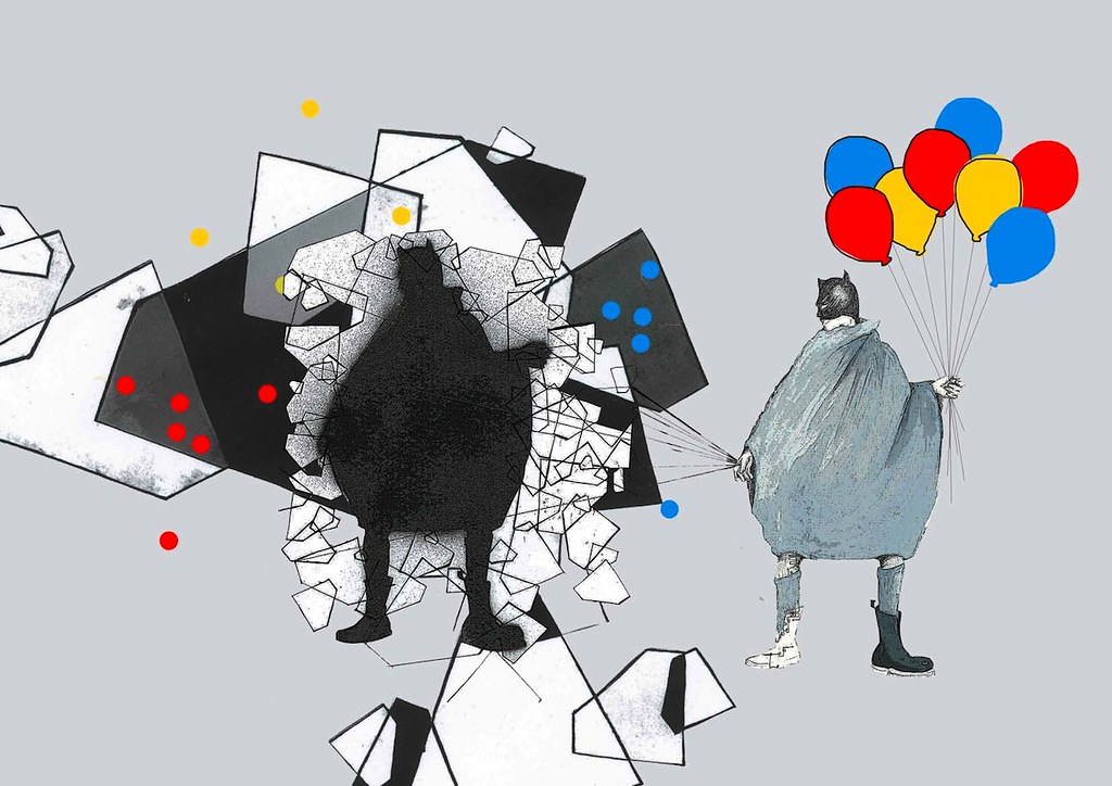
Balloon

SS: What was your starting point and how did the the collection evolve in to what we saw at GFW?
Bobby Charles Abley: Lots of strong imagery, I carry a notepad around with me jotting down things I overhear people say, my own thoughts, song lyrics. Last summer I was working at an exhibition at the Truman Brewery, there was little to attend to so I would sketch and get my ideas on to paper, cut out teddy bear silhouettes from different papers and create different prints, there was on of those retro photo booth’s there as well so I took advantage of that, it was a good way to express my mood and ideas everyday, and the result were these great black and white photo strips. I would bring in props related to my concept and take it into the booth. It was good fun. I actually went back to a lot of my original ideas when it came to finalizing the line up and fabric selection. I did do a lot of in depth research but my earlier ideas worked better. The bear print and the photo booth pictures from a year ago were brought back in and turned into digital prints for some of my shirts. I went back to a lot of my original fabric choices that I used from pre-collection, they were much more individual and new for menswear. I started going down a dark route, lots of black, and things had more of a grungy vibe, but then I took a step back from it all and thought “this is already out there, its currently being done by everybody. So I brought in a lot more Pop from earlier research and sketches...
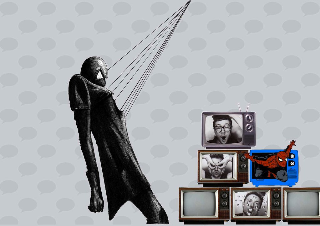
Spider hung up

Spider Arms

SS: How would you describe the collection in your own words?
Bobby Charles Abley: It is chapter one of many. Strong, fresh, new, inspirational, suggestive.

SS: It looks as though you had a lot of fun making this collection, what was your highlight and what were you most proud to see walk down the catwalk?
Bobby Charles Abley: I had so much fun doing this collection, the imagery and everything I was working from was amazing! I never got tired of it, and working with primary colours just made me smile. And as I mentioned earlier I used a lot pop references that triggered a lot of nostalgia, I shut my eyes and I could see myself as a child again. It was really fun to take the piss a bit as well, by using a repeat print of my face yawning on some of the shirts. I would say I am most proud of the short leather jacket. I was worried about sewing a garment out of very expensive upholstery leather, but it worked in the end and it has a lot of impact coming down a catwalk. I'm also really proud of the hanger appeal I gave to each individual garment, they are all immaculately bias bound in red blue and yellow.

Two of my favourite looks. Show images courtesy of catwalking.com

SS: What type of man can you see wearing it?
Bobby Charles Abley: I aim for the underground scene of the major cities, they are more creative when it comes to dressing themselves.In places like London and New York, there’s a really good vibe like nowhere else. I know my designs won't appeal to the masses. I don’t want to go mainstream, it doesn’t suit me, even though when I design I do think about function. I know clothes have to be wearable, when you separate the looks for this collection and remove the styling you’ll see that they are all very wearable, but make a big statement. Which is exactly what the less commercial market go for. People like Jeremy Scott and Jean Charles De Castelbajac aim for the same market and I'm a huge fan of both, which helps me.

Show images courtesy of catwalking.com

SS: Aside from your own, which graduate collections did you love?
Bobby Charles Abley: Amy Addisons collection. I'm not just being bias because she’s one of my best friends. I genuinely loved it, the print, the colour. Very pop and at the same time lovely womenswear.

SS: What advice would you give a prospective menswear fashion student?
Bobby Charles Abley: Be prepared to work really hard, you have to live, love and breath what you are doing. Its important to have a good work ethic, laziness will get you nowhere. Make sure you explore, learn to understand yourself, find your own style and develop it. Always stay true to what you believe in and stand for as a designer. A lot of people are quite naive about fashion design. Some people treat it like it’s a joke, but there is a lot of creative thinking and hard work that goes into it. Its not a shopping trip. You need to get your creative head on and bring something new and fresh to the table, or no one will be interested.

Show images courtesy of catwalking.com

SS: Finally, what's next? What would you like to achieve in latter half of 2010 and beyond?
Bobby Charles Abley: After the show at GFW Vivienne Westwood came backstage and asked to meet me, she spoke to me about using my collection and mixing it in with her menswear with some design changes so the collection flows as one. So I think I'm going to try that out, its not everyday you get the queen of fashion telling you they love your work. That was better than winning for me, I think it will be interesting to see what direction my collection will go in. I'm also going to start work on another small collection under my own name. I'm bursting with ideas and I want express another side of myself. This will be accompanied by a short film/inspirational video based around the trend, so I'm looking forward to collaborating with my boyfriend on that. Can I just say a huge thank you to him as well for helping all the way on this collection. I’d like to go back out to L.A to see my friends at Jeremy Scott and maybe help him out while I'm there. Then its CSM for Masters….. hahah…..I'm not stopping!!
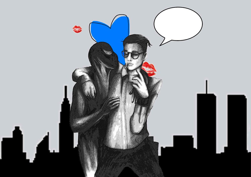
Spider Love.

----------

After a number of somewhat disappointing menswear collections at GFW, I was blown away by the Ravensbourne show and Bobby Charles Abley's offering in particular. I for one am looking forward to seeing Abley's subsequent design chapters.
RCA MA Graduate Showcase: Damion Le Cappelain

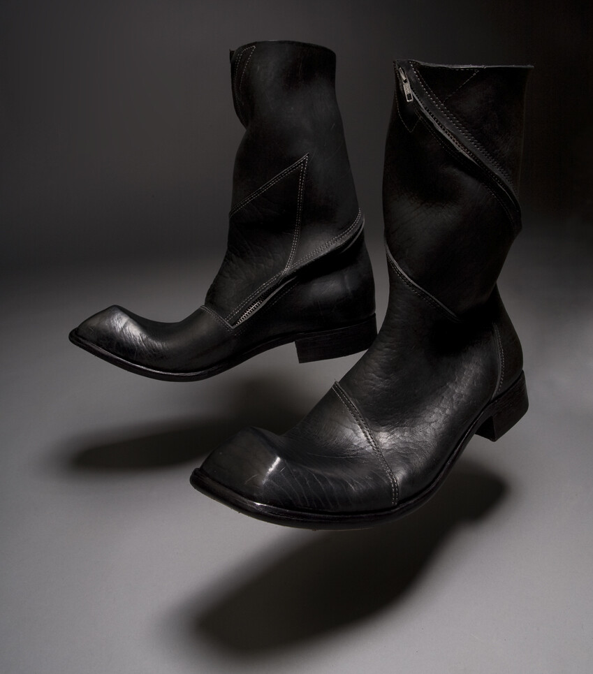
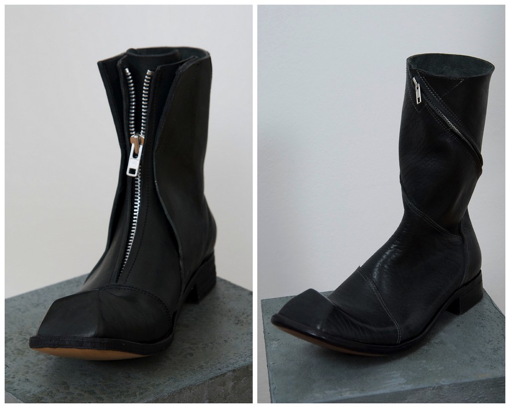
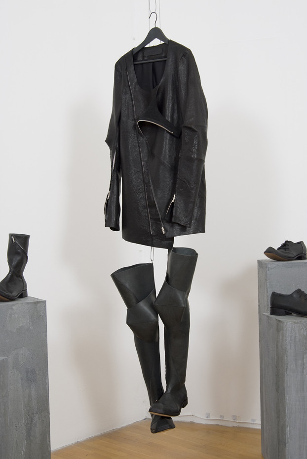
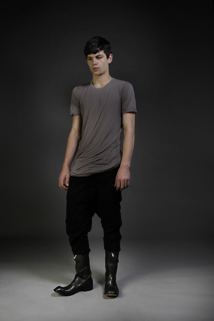
Damion Le Cappelian's spiral zip boots forced me to rethink square toes...
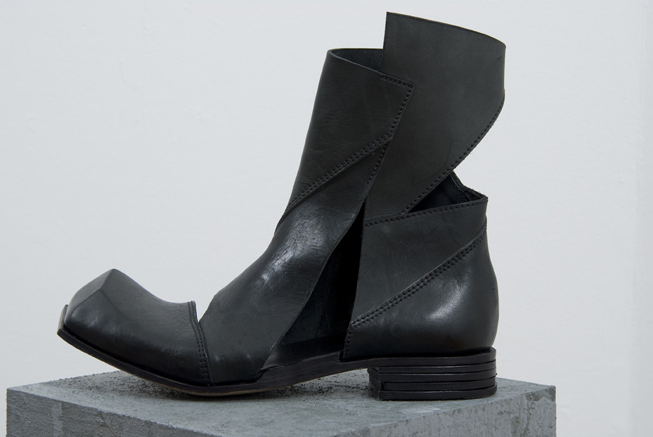
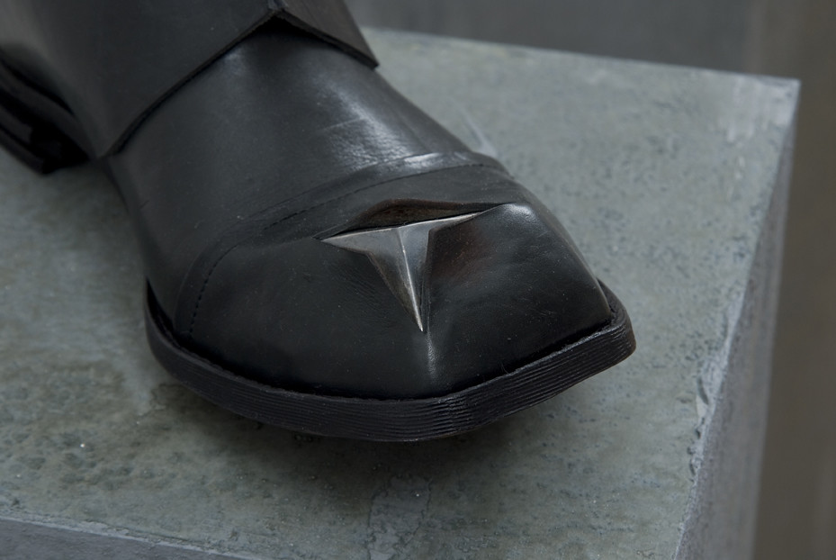
RCA's MA graduate show is undoubtedly one of the most exciting places to discover the fashion stars of the future. The press show took place at the College in the Henry Moore Gallery on 10 June 2010 and I was able to admire a gathering of some of the best menswear design talent to be be unleashed this year. Damion Le Cappelain’s footwear caught the eye – and raised a smile to many visitors including myself. Now, I normally run a mile when I catch sight of a square toe. I have far too many memories of Margate 'geezers' wearing sharp rectangular toe loafers with their ill fitting jeans and tight, unbuttoned party shirts. Shudder. However, Le Cappelain's designs were different, they were strangely intriguing. Perhaps it was the exploding nature of the toe. After waltzing in and out of his exhibition space I began imagining myself wearing his creations..


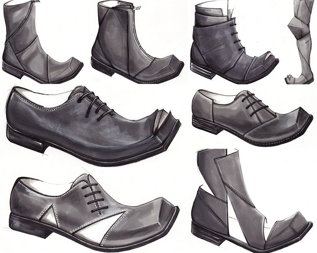
Le Cappelain's entire collection in sketch form

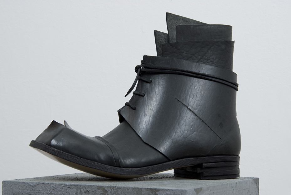
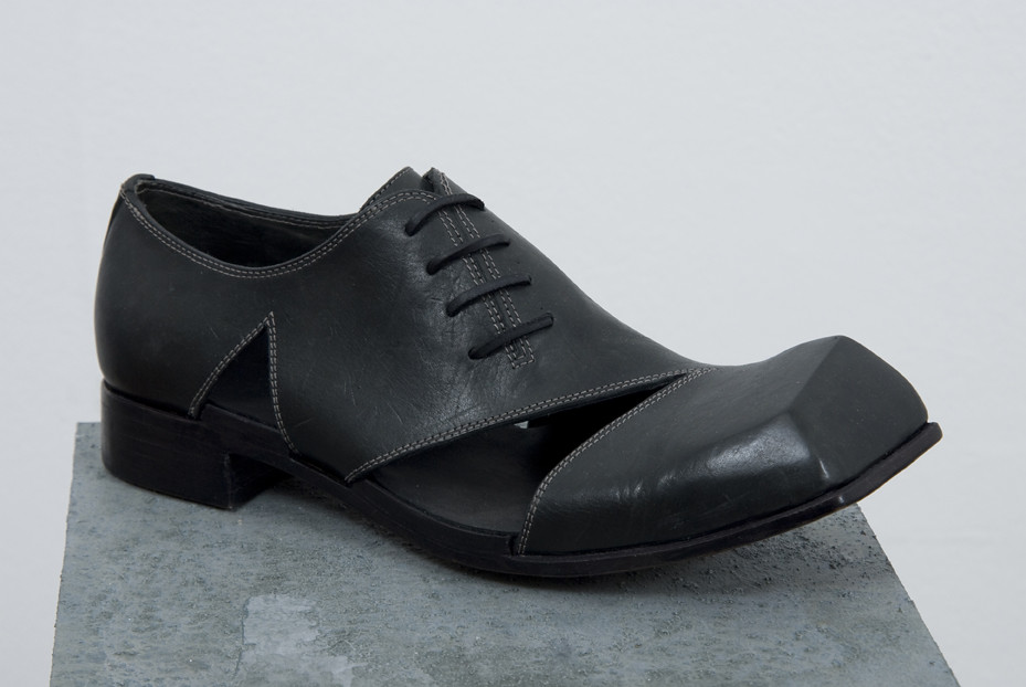
Le Cappelain has a graphic design background, having designed websites and music packaging for various bands including Basement Jaxx. He earned a diploma in Footwear from the London College of Fashion before studying Menswear at the RCA where he specialised in footwear design. Last year we reported on the Brioni and RCA award where Le Cappelain was rewarded for his tailoring. Now his ambition is to develop new concepts in footwear, such as footwear creations designed for an art space or exhibition. Here his chunky, uncompromising shapes for men featured emerging, exploding square toe cap details and cutaways – adding a fun, almost ‘cartoon’ element to the designs.

Two of my favourite designs, including the spiral zip boot.

Gladiator Zip boot.

A close up on an exploding toe.

Three layer boot.

One cut Oxford.

A complete look showcasing the thigh boot.

Another look at those spiral zip boots.

Ordinarily, the thought of wearing square toed shoes turns my stomach but Damion Le Cappelain, through his experimentation and disfiguration, has forced me to rethink my stance.

Wednesday 23 June 2010

Discovering Pitti: AI_

The Who's/On/Next? 2010 accessories winning collection by AI_.

As previously mentioned this week, the finalists for this seasons Who's/On/Next? 2010 were a particularly strong design collective showcasing the diversity of the very best of Italian craft and design. However, AI_'s lightweight, sturdiness and simplicity combined with a passion for shape and surface textures saw Andrea Incontri’s designs deservedly scoop the accessories award. A number of Andrea Incontri's buffalo leather creations left my pulse racing and my shoulders wanting...


I am particularly fond of this super soft newspaper bag

The project is the brainchild of Andrea Incontri, a designer and an architect. Incontri has worked in the stylistic consulting and design field for the leather goods and textile industry aince 2000 His training in the field of architecture and his experiences with Fratelli Rossetti for leather goods, Pontoglio for textiles and Alessi for product design, reflect his interest in shape and material research influence the development of his own collection.


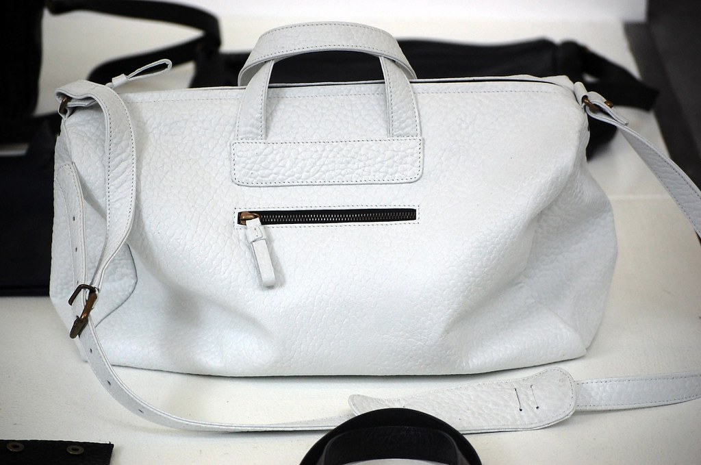
A stunning shoulder bag in chalk white buffalo leather.

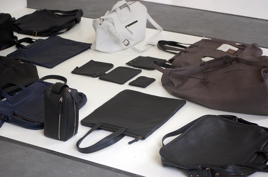
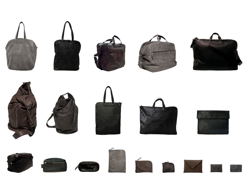
AI_'s products showcases materials and basic shapes and are dedicated to both the feminine and the masculine. Lightness, transversal easy in his use. Bags, cases with different use functions, double stitched seams, with sartorial values to determine unlined and internally resined volumes. Lightness, resistance and simplicity are the main features of AI_'s collections. The surfaces explore the matter in a primary dimension: buffalo and calf leather in different textures, natural waxing, mat finishing refer to retrò atmospheres. Incontri uses buffalo hides and stamped calfskin to create a new concept of “classic” inspired by the look of Italian leather goods from the 1950s.

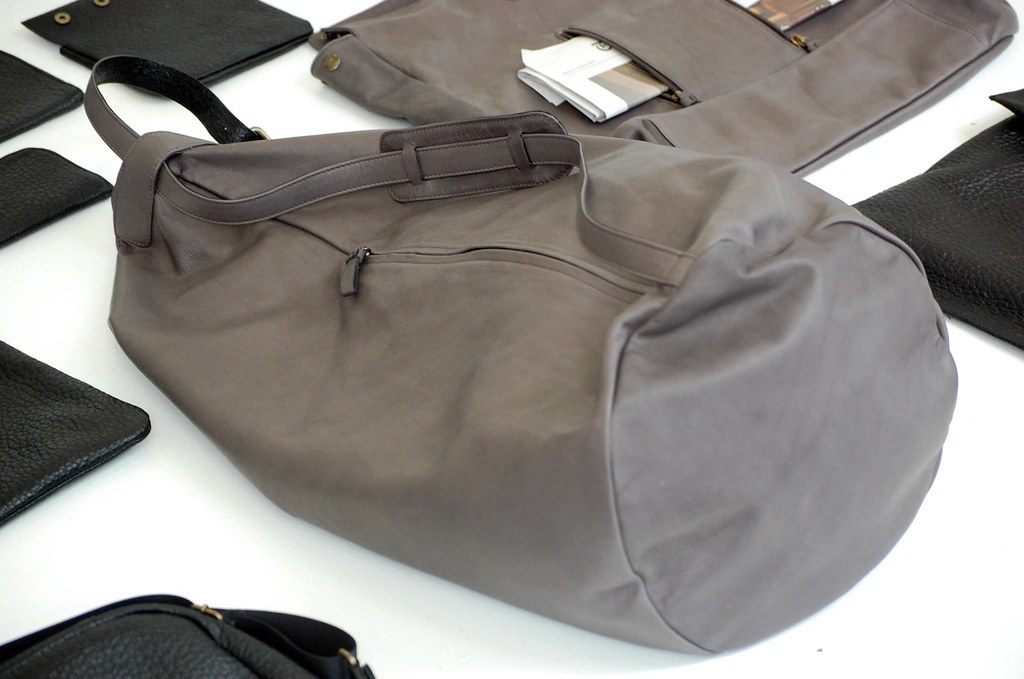
Grey oversize backback.

Hobos, shoulder bags and backpacks describe a summerish idea of man while folded bags form the shape of their contents as the new seasons projects unfolds. For SS11 bags do not have linings but instead have an inside coating and hidden double stitches to create light, almost fluid shapes ideal for the warmer seasons. AI_ ultimately showcases excellent materials and Italian craftsmanship.


The complete AI_ range of accessories