Showing posts with label Colour. Show all posts

Saturday, 21 December 2013

Treasured items... Will Hudson

Few items of dress are as necessary yet neglected than socks. Far too often they are an after thought that all too easily can become undervalued and mismatched before the odd hole, wear and tear forces them to hide in embarrassment inside their leather incarceration. The festive season is one of the few occasions in which socks are given a stage to perform. Wrapped up in all manner of finery and fanfare, watching cousins hang proudly above fireplaces and prominently positioned on the edges beds, socks are presented to hard-to-buy-for friends and they-have-everything-already family members. Just when they think they're about to receive the recognition that they truly deserve, they are met with indifference, scrunched up and used as a protective cotton shield around more valuable items. Dependable yet derided, I feel for socks at this time of year. Thankfully, there are a few people out there who cherish them and Will Hudson, founder and director of It's Nice That, sits amongst them with Paul Smith's iconic, spectrum showcasing stripes peaking between the creative camouflage of his everyday uniform. With an eye ever scanning for niceties it pauses over the festive go-to gift. Here, he tells us why... 

----------

Will Hudson and the striped splash of something unexpected


"For anyone that knows me, you're probably surprised to find me invited to contribute any thoughts about fashion. For anyone that doesn't know me I should explain – I wear the same jeans and grey T-shirt or white shirt most of the year (even when not at work). This isn't because I'm not interested in fashion but because I sit slightly outside the average percentile that most clothes are manufactured for. I'm 6'4 and 'heavy' (this isn't the place to reveal certain information) and find it difficult to find clothes I feel comfortable in, let alone I'd leave the house in.

As a result I have always opted to play it safe. The little luxury I do have though comes in the 'one size fits most' category and the smallest of things can make a difference. As a result, Paul Smith socks, with all their colour, bring a smile even when paired with the plainest ensemble." Will Hudson
----------

Friday, 23 August 2013

COMMON SS14

"We have known each other for a number of years and have been working together for the past four," Saif Bakir reminds us as he talks through the continued evolution of COMMON. Having met in the classrooms of LCF, a fruitful friendship between Bakir and Emma Hedlund has harvested a dynamic label that celebrates contractions, delights in dualism and cherishes clashes. "Our design process is very much integrated. On many occasions we end up thinking about the same thing or draw reference from same source of inspiration. It could be because we know each other so well or also because we both know what Common’s aesthetic is all about," he adds. Whether it's well tailored telepathy or just plain COMMON sense, the merged minds of Bakir and Hedlund create designs that are beautifully balanced, bouncing between minimal and maximal, tailored and casual, simple and complex. "A fusion of London edge, Paris chic and Scandinavian minimalism,’ is how the pair themselves describe the heady cocktail. Drink up.

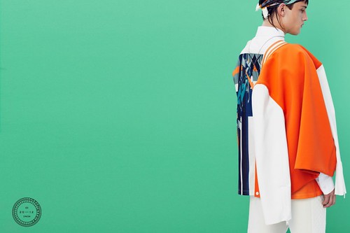
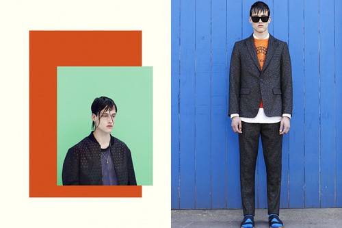
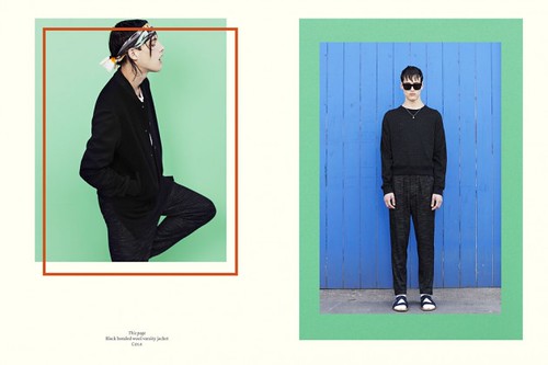
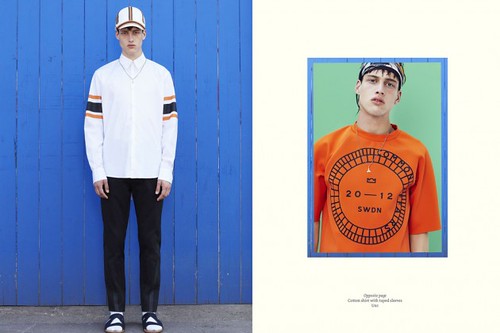
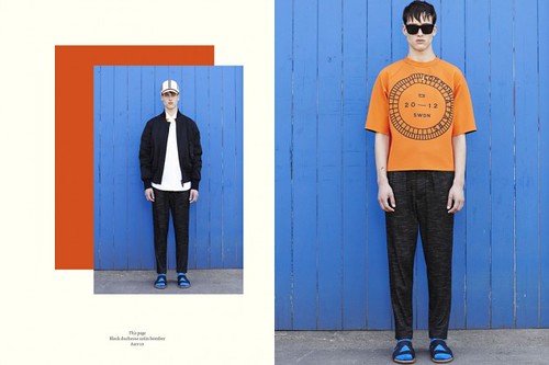
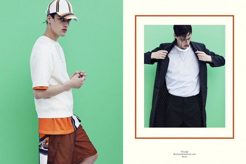
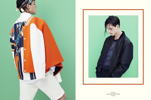
Very few debut collections cause such a well deserved flutter as COMMON'S did for autumn/winter 12. Without doubt, the Lars Jonsson collaborative sparrow print exquisitely applied to bomber jackets set pulses soaring but it was the their mix of design cultures and desire to showcase local manufacture and craftsmanship that really captured our imagination. From this accomplished debut, the princely pair have pushed forward with a trio of collections that continue their narrative. "We want our collections to be able to sit together as one," adds Bakir. Their story is one under constant development and refinement and spring/summer 14 is the latest chapter to captivate. Entitled Let The Games Begin, the collection introduces us to a vibrant squad of athletic daydreamers clad in a hyper modern team uniform.

"Unlike our previous collection, we wanted to create something that felt lighter and brighter, we were influenced by an active season and lifestyle. We looked at friends and colleagues around us and we were inspired by their active way of life. We then looked into sports and drew inspiration from American sportswear and youth culture. We loved the idea of creating our own team colour and uniform.

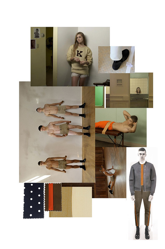
Our mood board was based around Rubins colour pallet mixed with images from Luke Smalley body of work including Gymnasium and Sunday Drive.  We took note from Smalley’s colour palette in Sunday Drive in particular. There were clippings from reference fabrics; perforated fabrics, Lightweight tech cotton, Mesh, Loop back Terry, Bonded neoprene, Boiled wool. Trims like heat seal tapes, press studs, water repellent zippers. During our design process we looked at textiles and techniques used in technical sportswear. We wanted to create the same effect and utilise some of the benefits these high-tech material. We also looked at different finishes in garments such as heat-sealed seams which we applied in a more decorative way making it part of the aesthetic of the garment as seen on our taped seam trouser Jurg..."
SS14 Mood (1)
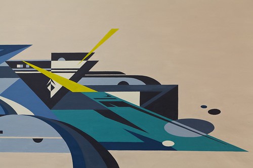
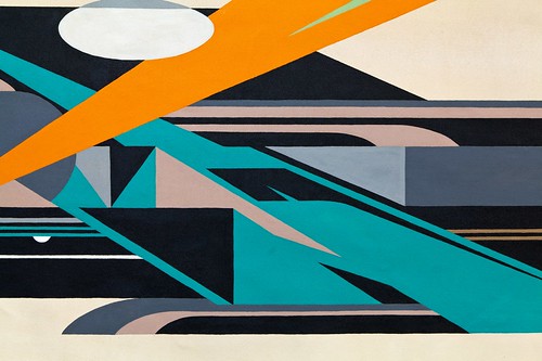
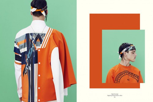
"From looking into youth culture and American sports we then into street art and current artists. We stumbled upon some of Rubin's work and we were immediately drawn to its modern, futuristic and abstract shape and style, it felt so right and perfect for want we wanted our SS14 collection to communicate. As Rubin is based in Brooklyn, NY we started off by sending him an email and he showed immediate interest in a collaboration. There was a constant exchange of mood boards and ideas during the following weeks. We sent him a colour pallet to work from but he had free reign to sketch and create two walls for us, which we later reworked into the current print."

_MG_7795-Edit-Edit
_MG_6961-Edit

"The highlight colours were then picked up from Rubin’s signature use of pop colours. The result is a mix palette of muted, saturated colours of chalk white, cream, bronze and matt black combined with highlight of bright orange, azure and chroma green. We combined Rubin’s artwork with this season’s colours and stripes. The outcome is a futuristic print for a hyper modern team uniform. Rubin’s complex and futuristic shapes works perfectly with this seasons theme and mood and are a great complement to the modern and technical fabrics featured throughout the collection."

Ultimately, it's the label's real sense of collaboration in COMMON, both between the dynamic between the design duo themselves, their relationships with Swedish manufacturers and creative talent that they work with each season that really excites. From the Lars Jonsson collaborative sparrow print to Hans Krondahl's reimagined gallop design a creative coming together has pushed the label forward. For spring/summer 14 Common shines an abstract spotlight on street artist Rubin. Now, his majestic murals surface regularly in NYC on the streets of Brooklyn and the Bronx but his journey began in Gothenburg. Inspired by Beat Street, the concrete projects of Sweden were his first canvas and his latest are COMMOM's uniforms.

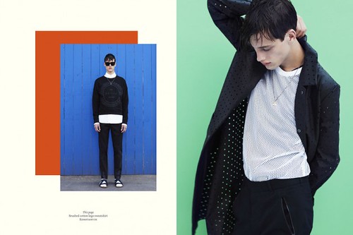
Throughout Let The Games Begin, Hedlund and Bakir balance their modern, sartorial elegance with sportswear fused and and technical focused elements. Muted minimalism is matched with vibrancy, simple lines with complex geometric shapes. Delve deeper into this season's duality with the Patrick Lindblom shot look book (just previewed on Highsnobiety)...

SS14 Sketches
COMMON-Spring-Summer-2014-lookbook-premiere-highsnobiety-07-630x420
COMMON-Spring-Summer-2014-lookbook-premiere-highsnobiety-02-630x420
COMMON-Spring-Summer-2014-lookbook-premiere-highsnobiety-08-630x420
COMMON-Spring-Summer-2014-lookbook-premiere-highsnobiety-04-630x420
COMMON-Spring-Summer-2014-lookbook-premiere-highsnobiety-03-630x420
COMMON-Spring-Summer-2014-lookbook-premiere-highsnobiety-05-630x420
COMMON-Spring-Summer-2014-lookbook-premiere-highsnobiety-06-630x420
COMMON-Spring-Summer-2014-lookbook-premiere-highsnobiety-01-630x420
COMMON-Spring-Summer-2014-lookbook-premiere-highsnobiety-09-630x420
Look book shot by Patrick Lindblom courtesy of Highsnobiety
----------

Collecting fans and players along the journey, this COMMON collection will continue to drive this enthralling label forward. Let the real games begin...

Sunday, 12 May 2013

LCF BA Showcase.... Patrick Um

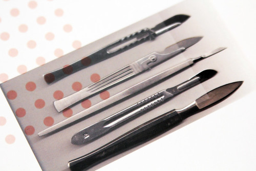
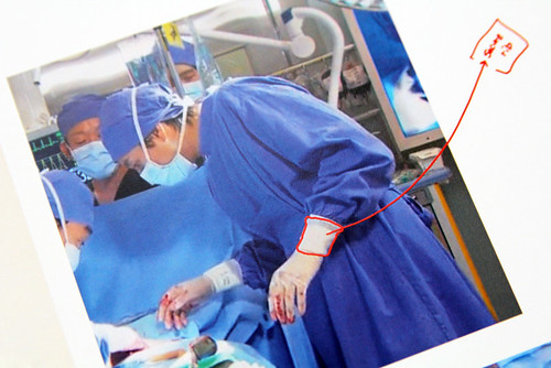
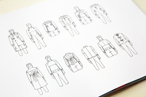
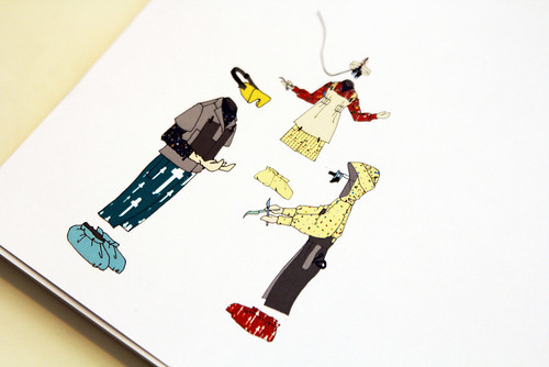
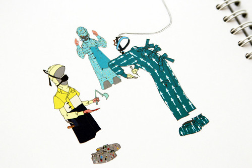
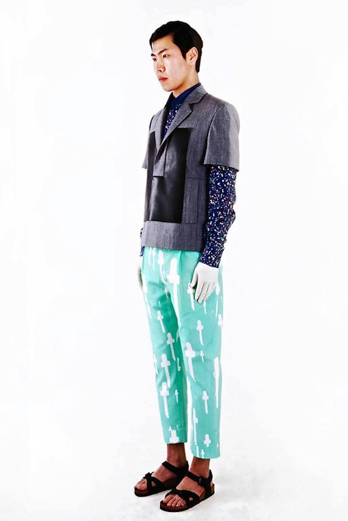
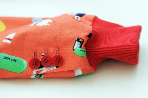
"When I was interning at Duckie Brown in New York I watched a lot of Korean dramas in the evening and one of my favourites was set in an emergency room," London College of Fashion BA soon-to-be-graduate Patrick Um explains in his soft but excited manner. As we stand in his adopted East London home-turned-studio, surrounded by all manner of analytical artifacts and his colourful clothes, excitement echoes throughout the cosy space. "It was at a time when my mind began to wander through various subjects for my final collection," he admits before dashing off for a moment and returning with a cup of coffee. "To be honest I struggled to choose one and it was only when I was relaxing that the idea came to me as I watched the drama. I was intrigued by the instruments and intensity of the hospital." Now, the mere mention of the words 'hospital' and 'surgery' can be enough to encourage daydreams of dread, an aura of anxiety giving way to despair but Um pressed his stethoscope to the clinical, cold body of the theatre room and his eager ear tuned in to a different beat. A remix of function and fun, a chromatic concerto of capsules, contraptions, confections, cures and curiosities.

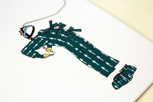
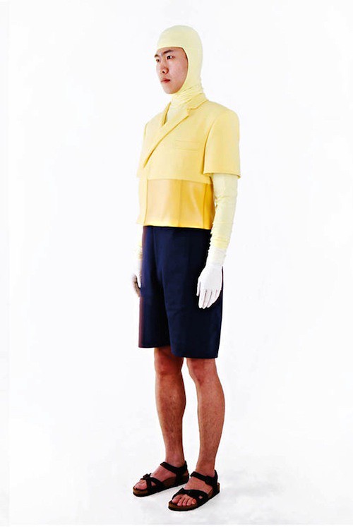
Having interned for the colourful crew of Cassette Playa, Trine Lindegaard, Peter Jensen, Gareth Pugh and most recently Duckie Brown, it was obvious that this emerging talent would avoid the obvious. "I intentionally refrained from making the collection too cold and chic. I wanted to create my own complete version of a surgeon's uniform, presenting them from top to toe in my own way." The grey, sterile and muted world of the surgeon is transformed under Um's skilfully wielded scalpel.

IMG_2459
IMG_2465
IMG_2477
IMG_2478
IMG_2476
IMG_2489
IMG_2486
SurgicalCollection
IMG_2481
The patient's charts. A look inside Patrick Um's research portfolio.

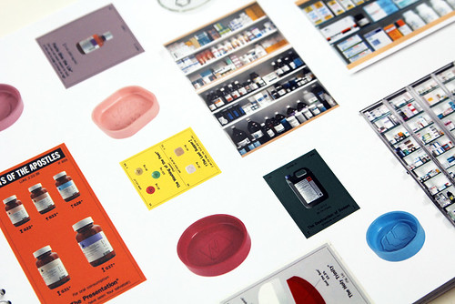
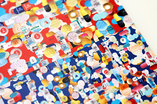
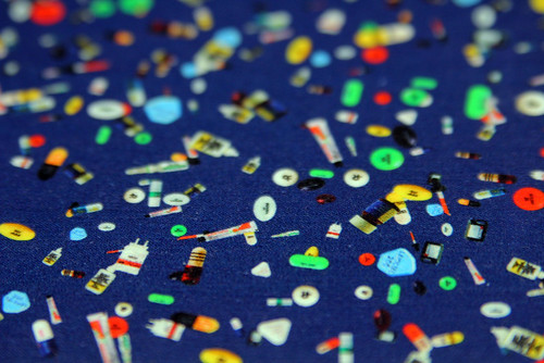
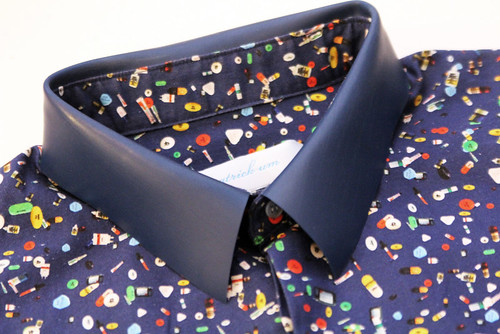
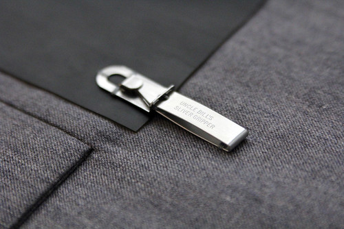
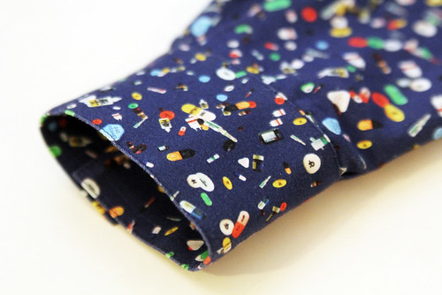
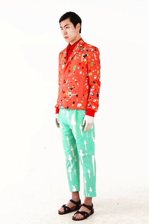
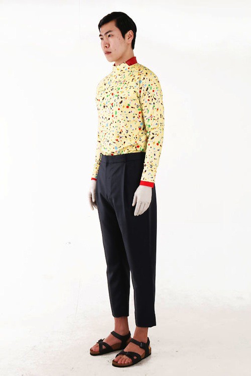
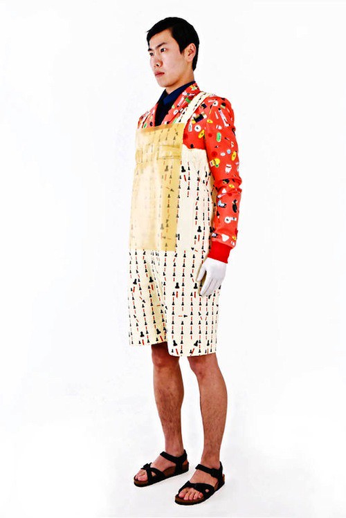
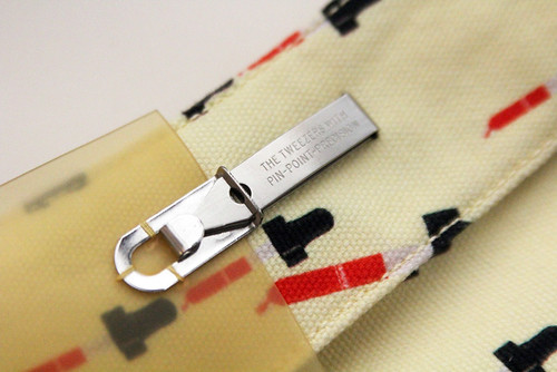
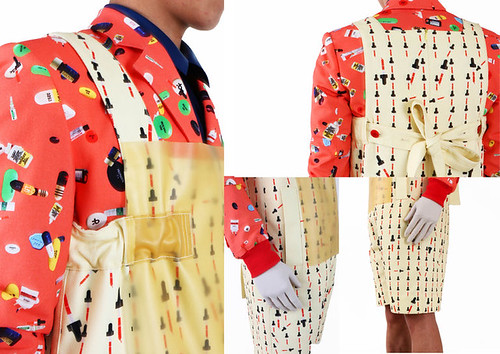
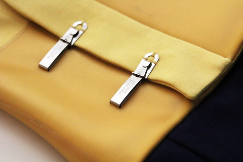
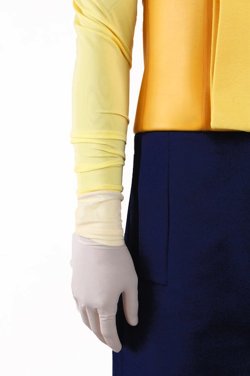
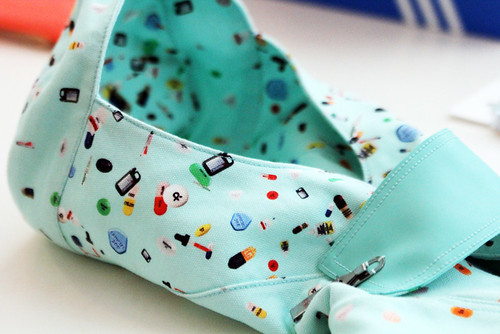
Undressing and redressing the surgeon, the surgeon's uniform is translated into boyish, playful, contemporary menswear. This is a collection that revels in the beauty of details, both the familiar and the fantastical (tweezers as clip fastenings, an inspired idea!). From head to toe, garments reference and evolve from specific details from the workwear. Back loop fastenings, tight cuff bands and special seam closures are just a vinyl gloved handful of details that are stitched in to the final collection. With prints rich in the iconography of the trade carefully balanced experimental constructions and textiles, a precise yet playful beauty is achieved. The resulting garments are drenched in designed details just longing to be discovered but it is the nine prints that instantly capture this viewer's imagination.

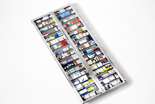
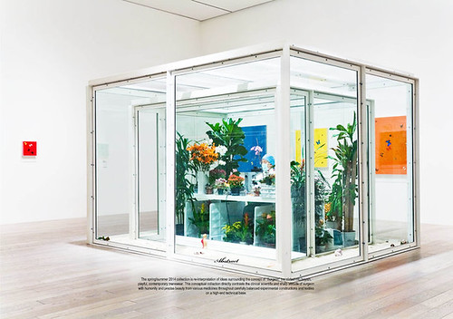
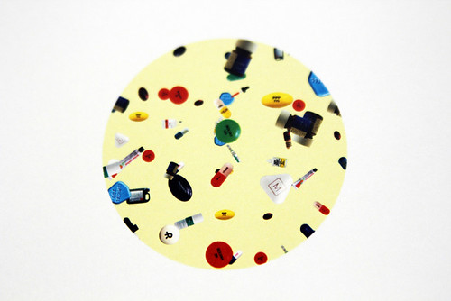
"This is the first time that I've created my own prints. It's a difficult process but one that I very much enjoyed and would like to explore further." The prints were initially inspired by Damien Hirst's Pharmacy Restaurant. I searched the Internet and scanned images of medicines before rearranging them to create intricate and colourful designs. Medicines can be beautiful."

Are you ready for your prescription? Dr. Um's team will see you now...
IMG_2498
IMG_2491
IMG_2494
IMG_2496
IMG_2504
IMG_2506
IMG_2508
IMG_2461
IMG_2513
PatrickUm_10
IMG_2556
IMG_2518
PatrickUm_1
IMG_2524
PatrickUm_2
IMG_2552
PatrickUm_3
IMG_2540
PatrickUm_Details2
IMG_2544
PatrickUm_5
IMG_2530
PatrickUm_details
PatrickUm_6
IMG_2537
PatrickUm_detail
Look book images courtesy of Patrick Um, detail shots our own.
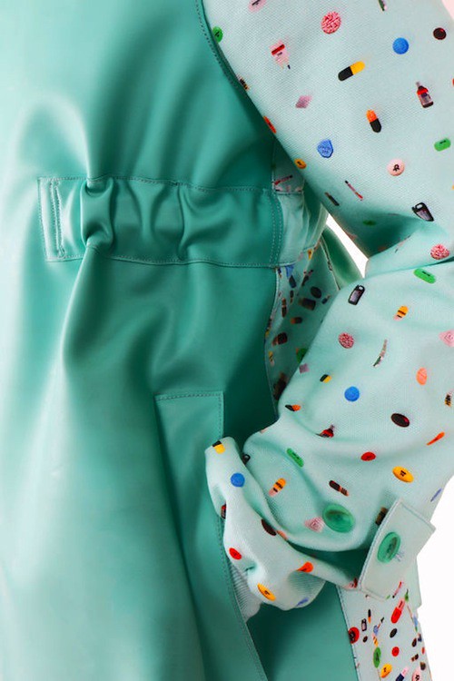
Having watched on in awe as surgeons performed intricate miracles on Korean television and rifled through Damien Hirst's medicine cabinets, Patrick Um manages to inject his own emotion in to the emotionless, add warmth to the cold and bring life to the quiet. If only we could peer through this emerging talent's kaleidoscope every time we visited the doctors surgery, accident and emergency or anything else for that matter.

Monday, 29 April 2013

Trine Lindegaard AW13

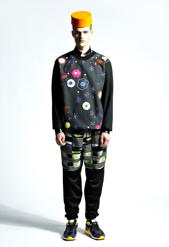
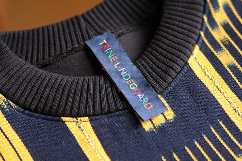
Peering through Trine Lndegaard's ever dazzling prism of print, colour and texture, you could be forgiven for merely admiring her lighthearted and playful approach to menswear but you would be missing a hidden beauty. Beyond the embellishment, deeper than the innovative textile techniques and behind the beaming smiles, there's so much more to discover. There's a substantial seriousness, honesty and integrity past the fanfare. For me, that's the real beauty of her work. This weekend I delved past the showy surface by dropping by her East London home-turned-studio.

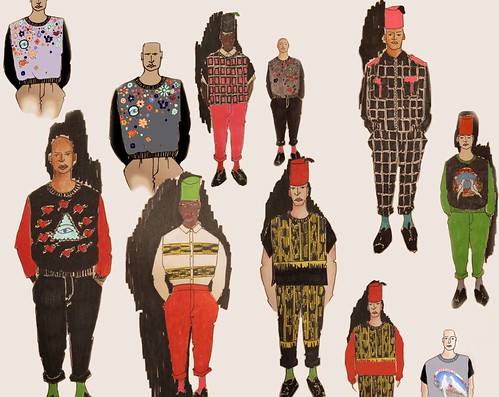
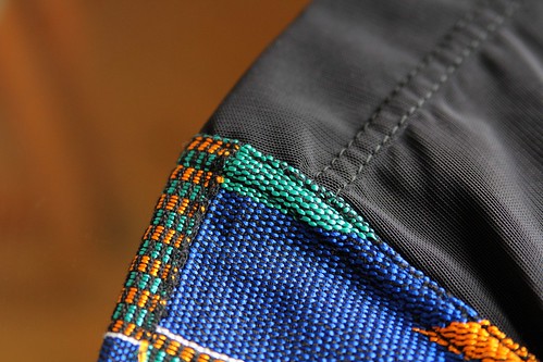
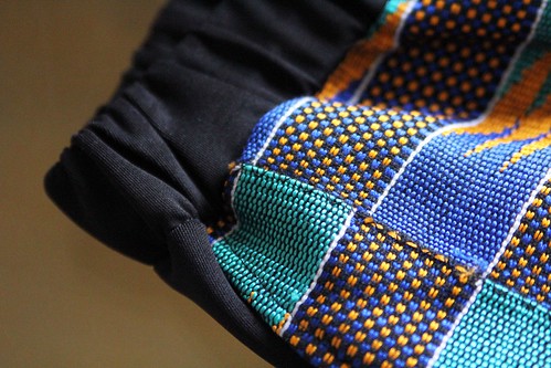
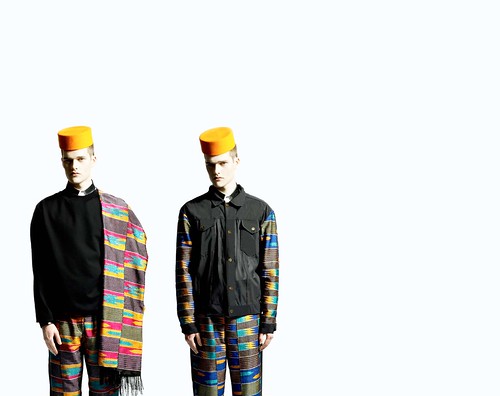
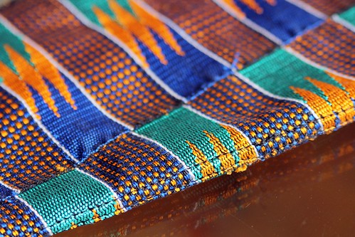
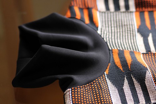
"I'm really inspired by working with different people and growing relationships," Lindegaard purrs as she quietly but excitedly introduces her autumn/winter 13 collection. "It's important that the relationships are beneficial for all parties involved, they need something out of it, more than simple commerce." In her spring/summer 13 collection, we were introduced to the first harvest from the carefully cultivated relationship with West African textile artisans and manufacturers. To this kaleidoscope of Kente which has been explored and developed even further, the passionate talent adds equally colourful and intricate textiles from the Ivory Coast and embellishment hand embroidered by prisoners here in the UK. It is a heady and heart warming mix. In some hands such a combination could jar but in Lindegaard's it's an intriguing and inspiring ménage à trois of craftsmanship. 

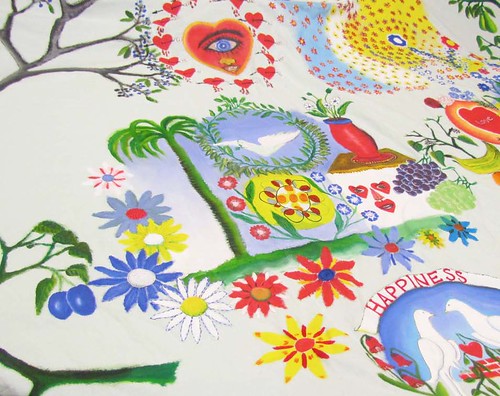
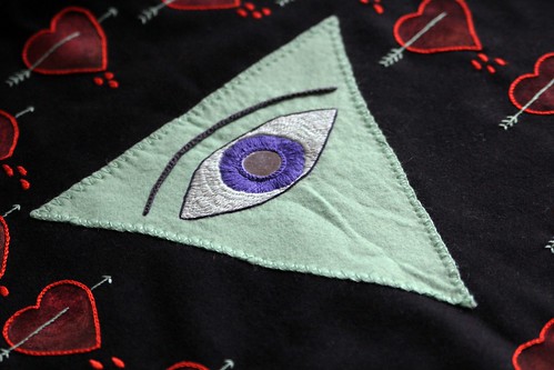
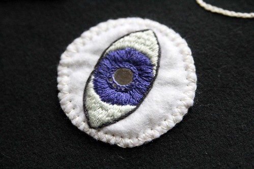
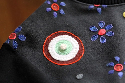
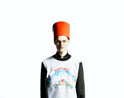
Entitled Happiness, the collection is firmly rooted in the embroidery of Fine Cell Work, a social enterprise that trains prisoners in paid, skilled, creative needlework undertaken in the long hours spent in their cells. Up until my last chat with the Danish born, Dalston based designer, I had no idea that  in prisons all across the UK, inmates are filling their hours embroidering highly-crafted cushions, bags, pictures and patchwork quilts. Lindegaard explains:

"They've been around for fifteen years or so, they do amazing cross stitching with prisoners. Wonderful work. Their lives are so basic and Fine Cell Work offer a distraction, a purpose and the opportunity to discover a more constructive and reflective side to themselves. As you'd expect all of the guys are young and tough but they hand embroider cushions and are in complete awe of their teaching aunties, the volunteers from the Embroiderers and Quilters Guild. It's so strange and surprising. I've visited a group at Wandsworth and it is such a rewarding experience going in to the prison and seeing their pride and excitement in what they're doing. It's refreshing and I'm pleased to be a part of it.

Right from the very beginning I wanted the inmates to be part of the process. I wanted it to be really free for them. The first workshop centred around happiness and I wanted it to come from their point of view, evolve out of their interests which are so mixed."

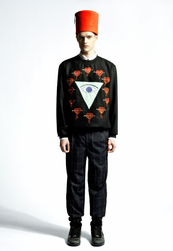
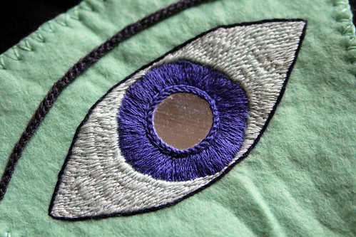
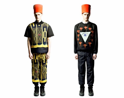
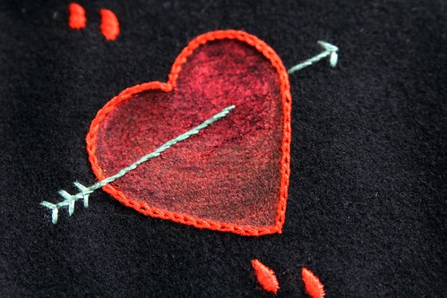
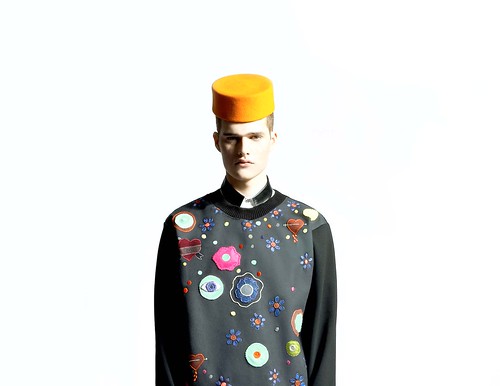
The work and interests of one inmate in particular, Ziga, a keen painter, helped inspire the collection. For someone confined to such a small cell, cut off from the outside world, his sketches were amazingly imaginative. Naive yet confident. Familiar yet surreal. Uplifting yet a little dark. "It was love at first sight," Lindegaard fondly recalls and she strokes an embroidered bleeding heart that now adorns one of her sweatshirts but was dreamed up by Ziga. Developing elements of this artwork, working closely with the talented Jessica Ball from Yours Sustainably for the first samples and integrating the embroidery work with the developed African textiles, autumn/winter 13 is a colourful concerto. Listen with your eyes below...

TLAW13_2
TLAW13_3
IMG_1820
post743
IMG_1830
TLAW13_7
IMG_1835
post747
IMG_1842
IMG_1848
TLAW13_5
IMG_1889
IMG_1841
post741
IMG_1932
IMG_1903
TLAW13_6
IMG_1869
IMG_1872
post746
IMG_1876
IMG_1961
post7441
IMG_1957
TLAW13_8
IMG_1946
post742
IMG_1936
My own detail shots alongside... 
sketchbook shots from Trine and look book photography by Ivona Chrzastek.

"At the beginning of the season I wanted there to be an obvious link between the continuation of the work with Kente and the introduction of the embroidered pieces with Fine Cell Work but logistically that was quite difficult. In a way, I like that I don't have complete control. It's the same with the work that comes from Africa when I was working from London, sending images and notes which were sometimes lost in translation. For examples the colours at times differ wildly from what I had envisaged because of how my sketches have been printed out over there but it's fun! I'm going to Ghana next month though which will help push things forward. This initial work has remained quite traditional but having just had a little dialogue with them and researching it from here, I'm beginning to realise just how varied and detailed they can be. So we will really push it next season, I'm very excited."

Trine Lindegaard is always excited and with good reason. Always pushing and hungry to learn, season on season we are treated to a surprising evolution. Whilst savouring this collection, our excitement for the next enthralling stage is already beginning to grow.

LinkWithin

Related Posts with Thumbnails