Showing posts with label Trainers. Show all posts

Sunday, 27 October 2013

Minimal metamorphosis

IMG_9745

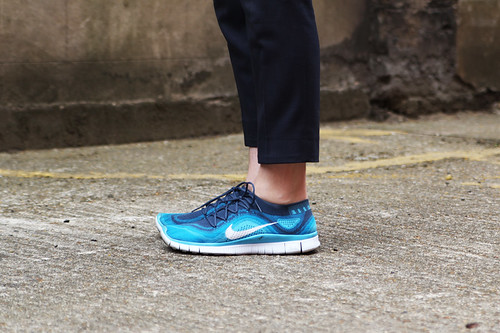
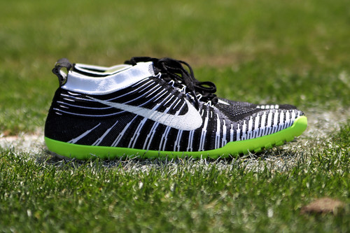
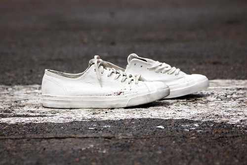
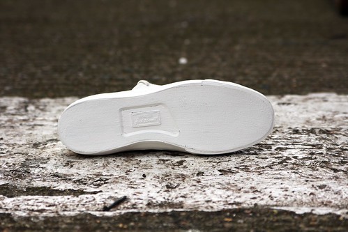
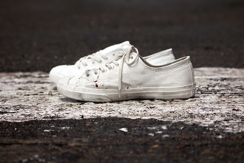
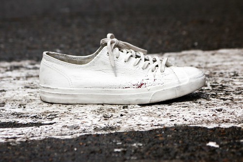
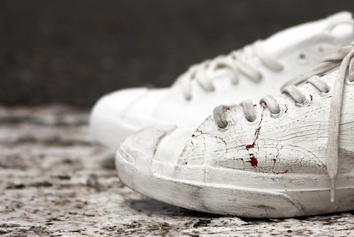
As our eyes prepared to focus on the spring/summer 14 catwalks of New York, Converse and Maison Martin Margiela treated us to teasers of their much publicised creative coming together. For their first confident stride forward, Converse Chuck Taylor All Star and Jack Purcell trainers were drenched in Maison Martin Margiela's iconic white paint. Covering all canvas, eyelets, laces and soles, the old favourites are altered simply yet radically. All white everything. A palette and sole cleanser. For me, the French writer and aviator Antoine de Saint-Exupéry best defined minimalist design as being “not when there is nothing more to add, but when there’s nothing left to take away.” This is a makeover from a true minimalist iconoclast. However, what interests me most is that the white washing is just the start. As soon as the paint filled brush leaves the Converse classics, they naturally crack and shed their outer coat to reveal their original selves beneath. So simple and transformative, the hand painted act is the beginning of a unique dialogue between both brands. As they advance with age with each step forward and evolve in the everyday, they reveal their true selves in their own way. Wear and tear is rarely so intriguing and so obvious.

From well loved wallets to beautiful brogues, the gentle ageing of leather is a an ever absorbing process but it takes its time. The blank Converse canvas encourages change. Thankfully, after following fashion's conveyor belt through from London to Milan and Paris, two pairs of ice white Jack Purcells were waiting for me at the office. A few weeks of pacy peddling, puddle plummeting and pavement pounding has seen a rich burgundy hue peek out from beneath the cracks on one pair (black, blue and an exclusive yellow are also hidden behind the white wash) whilst the other is still perfectly wrapped in its thick blanket of white. Minimal metamorphosis. Using a recent paint tin spill in the car park as the ideal backdrop, I couldn't resist documenting their difference.

IMG_9758
IMG_9786
IMG_9768
IMG_9751
IMG_9767
IMG_9775
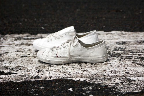
New new and old new. 
Converse and Maison Martin Margiela
----------

Tuesday, 20 August 2013

Just doing it, again and again

"Innovation is not about creation for its own sake, it's about creating something better, designing with a purpose," Mark Parker, President and CEO of Nike explained to an assembled audience of international press as he introduced the Nature Amplified design ethos and unveiled four running enhancing innovations last month. With pens perfectly poised and dictaphones desperate to document, this simple statement might have been lost in the pleasing product parade that delighted and dazzled over the course of my stay in Oregan. They weren't. As we were all enveloped and inspired by the all inviting swoosh during our tour of its campus, Parker's words grew louder as they echoed across each and every inch of their impressive HQ.

It had been half a decade since Nike had gathered journalists from all over the world together at their Beaverton base. Having heard countless tales of awe inspiring visits to Nike's state of sportswear, expectations were high and as they unveiled a quartet of products designed to enhance runners’ natural abilities and offered glimpses inside their Nike Sport Research Lab with air bubbles of innovation, we weren't disappointed. A princely pair of running shoes were introduced in the Nike Free Flyknit and Nike Free Hyperfeel along with a dynamic duo of apparel technologies in Aeroloft and Dri-FIT Knit, all guided by Nike’s Nature Amplified design ethos, an approach that is focused on designing for the body in motion and fuelled by scientific data and athlete insights. "Nature Amplified means designing for bodies in motion and creating products that work intuitively with the human body,” Trevor Edwards, NIKE Brand President divulged. “The footwear and apparel we’ve unveiled today is based on insights from athletes and runners at every level, combined with extensive research in our lab. These innovations are data-driven, but body-led," he continued.

After introducing the revolutionary (in production terms atleast) Flyknit last year and receiving widespread acclaim, you'd forgive them if, like many other leaders of industry do, they spent the next year or two subtlety tweaking the concept but they haven't. They're now pushing this technology and applying it to other models, for all kinds of potential applications and two were unveiled last month. The Nike Free Flyknit is the fusion of two of Nike’s most iconic footwear technologies — the compressive Nike Flyknit upper has been teamed with the flexible Nike Free outsole. The shoe provides the benefits of natural motion and a snug, supportive fit in a single shoe. 

IMG_7577
IMG_7582
IMG_7536
IMG_7561
IMG_7541
IMG_0580
The evolution of the Flyknit

With the above pair of Nike Free Flyknits myself, I can testify that shoe fits snugly, it's hugs your feet. Also loving the feet of runners and getting that bit closer, the Nike Free Hyperfeel is designed to feel like an extension of the body by minimising layers between the foot and the ground. The ultra-thin waffle outsole uses strategically placed waffle pistons for grip and feel, allowing the foot to get closer to the ground. Drawing directly from the Nature Amplified doctrine, the shoe that mimics the intricate workings of the human foot: Lunarlon foam replicates cushioned pads under the foot. The outsole protects like hardened skin on the sole. Dynamic Flywire flexes and contracts, inspired by ligaments. 

IMG_7528
IMG_7515
IMG_7885
IMG_7884
IMG_7876
Feeling the Hyperfeel

Over the course of the summit, I was fortunate enough to sit down with Trevor Edwards and I asked him what constantly drives the brand forward. Given that he been an integral part of the company for twenty one years and seen tremendous growth and all sorts of innovations, he was perfectly placed to detail how and why Nike are never satisfied and to explain the latest developments:

"This mindset was embedded into the company at the very beginning by Phil Knight and Bill Bowerman. As Bill was a coach and Knight an athlete, the mentality of constantly struggling to be better was there from the start. Bill used to say innovate or retire. That statement rings true today. Mark (Parker) is just the same. It is an everyday pursuit. We all come to work every single day thinking how we can help athletes get better, there's always this hunger to improve. If something's not better then why are we doing it? From this, it allows us to remove any sentimentality about a product that was great at a particular moment time and instead we're thinking of solving new problems in a fresh way.

In many ways Nature Amplified is a disruptive way of thinking in terms of product creation because the common viewpoint is to add things to product but instead we're now taking anything that fails to enhance performance and experience. It's a purist approach. The HyperFeel is a pure form of product, we're using Flyknit but we're developing this idea of being close to the surface. The body knows, it can feel that sensation and it reacts accordingly. Nature has created the way we are, we look to add to that by making the product more personal to you, the athlete, you the consumer. Over time we can apply our knowledge and ability to innovate against specific problems, we're always looking at fresh ways to improve products and to innovate.

To reach that point, there's always a great deal of work behind-the-scenes. We are amassing years and years of knowledge that continue to build up and innovation can only occur when technology catches up with the knowledge, it's a case of being able to deliver. Knowledge, design and technology need to be at the same level That's what we were able to do with Flyknit. We had researched where and how the foot required support an to stretch itself out when it is performing naturally and the Flyknit technology helps us produce stitch by stitch. It changed how footwear is made. It has so many benefits. From a consumer perspective, it allows us to engineer the product to their specific needs in a mass way. From a manufacturing perspective, it reduces waist and brings digital knowledge into the creation of a production."

IMG_8028
IMG_8009
IMG_7943
IMG_7939
IMG_7922
IMG_7925
A teasing look inside the lab

As we bounced from room to room inside the all consuming campus, I lost count of the times I heard the word innovation. "Innovation is everything at Nike. It's the core of our character. We use innovation to serve human potential. It's the answer to limits," Parker stated in his opening summit speech. It was impossible not to swoon over the sportswear giant as it flexed its research and design muscles by opening white boxes containing next level products which were duly promoted by pulse racing presentations but it was Nike's insatiable appetite to improve, to be better that left the greatest impression on me. Mirroring the efforts of the superstars that they work with each and every day, they are always pushing forward, striving to beat previous personal bests and helping their sponsored and supported talents to do the same. Laurels or heels are never rested on in Beaverton as Edwards explains.

"Being here for twenty years, the great thing is that we come to work every single day trying out how to innovate, how to make something better. We're not interested in new for the sake of newness, it has to be better. Certain product innovations are a journey, we launched Free and we're now at this point, we envision that products will be based on nature - how can we continue to improve our basis by thinking along this ethos. That doesn't mean less technology, it means taking away the negatives and only adding to the positives, finding the purest essence of the product and stripping away everything else."

Monday, 3 June 2013

A swoosh and three lions

Two weekends have come and gone without an Arsenal game. Two long, enjoyable and stress free weekends but there's been an undeniable void. Non football fans might think I'm weird to admit to this but weekends just don't feel the same without looking forward to Football Focus, anxiously checking live updates and wincing or celebrating (delete as appropriate) through MOTD. Having waved goodbye to another season of consistent inconsistency before dancing into the top four, I have to wait ten more weekends until it starts all over again. Thankfully, there are a few distractions, the odd sporting appetite whetter and they rarely get any odder than international friendlies. The white noise emitted from the media fanfare, egos ricocheting across the pitch and fans chanting the likes of "I'm England till I die" and "Ingerland, Ingerland, Ingerrrland" to the beat of an ever over enthusiastic band. As England gained two relatively insignificant draws agains Republic of Ireland and Brazil, there was one significant change on show and it was an aesthetic one. Nike had rolled up its socks and effortlessly tackled kit design duties from Umbro. To mark the occassion, the sportswear giant tweaked two of its ow icons to encapsulate the story of one hundred and fifty years of English football heritage. With sartorial nods going back to the birth of the Football Association and the beautiful game itself, Nike unveiled the limited edition England NSW Destroyer and England Nike Air Max 1 iD. Thanks to the generous folk at Nike and Exposure I am one of the lucky few to sport them...

IMG_2482
IMG_2510
IMG_2501
England NSW Destroyer worn with... 
silk shirt by Tim Soar (with a football badge worn as a button) and cropped trousers by Christophe Lemaire.

Since its introduction in 2006, the Destroyer jacket has become one of Nike's most recognised pieces. Staying true to its varsity jacket roots, it is often a beautiful blend of sports heritage with youth cultures from practically every decade since the 50s. With the first letterman jacket being designed for an imaginary team called the Dunk High Destroyers, the latest brings hope to national football's great underachievers and is suitably drunk on detailing. The addition of rich English heritage design cues including sleeves and pocket trims crafted from the finest rainproof British Millerain waxed cotton, subtle embroidery and embellishment, four bespoke gold pin badges – a star, an England Crest, a patch crest and vintage football - that represent the past and present for an additional level of personalisation and play. For a closer look of the gold pin badges I photographed detail shots on my Subbuteo pitch... 

IMG_9962
IMG_9968
IMG_9954
IMG_9951
IMG_9947
Detail shots of the pin badges. 
Some have already been appropriated in to my everyday wardrobe and have been used to replace missing buttons.

On the subject of everyday wardrobe, the special edition England Nike Air Max 1 iD have confidently stepped in to my uniform.  It is a NIKEiD customisation of one of the most famous footwear styles. Since 1987 the Air Max 1 silhouette has transcended its running origins to become a wardrobe staple for a myriad of subcultures in England and beyond. Designed by Tinker Hatfield, the shoe turned things inside out and blew our minds by making the invisible visible, exposing the world to Nike Air. I've not worn a bubble since I was fourteen years old. It feels right returning to the original. This understated black-on-black version features discreet details that once again reference the history and culture of football in England. Linking to the NSW Destroyer Jacket, a gold star has been embroidered onto the back of the shoe while the eyelet features in bold red, in honour of the St. Georgeʼs Cross. They are perfect...

IMG_2528
IMG_2540
England Nike Air Max 1 iD worn with cropped trousers by Christophe Lemaire

"Catch me if you can
'Cause I'm the England man
And what you're looking at
Is the master plan"

Wednesday, 5 December 2012

Details: Textured Tracks

IMG_9301
IMG_9321
IMG_9308
Christmas came early last week when these Auckland Racers were left in my stocking one night last week. Missoni and Converse is a match made in dreams and the fruits of their latest creative coming together were previewed on the runway in Milan earlier this year. The unique textured upper made from black Missoni space-dyed wool is highlighted by metallic copper lamé thread for a festive feeling.

Friday, 3 August 2012

Details... Stitched Obsessions

IMG_9614
Two of my current obsessions, the Olympics and Nike Flyknit running shoes, combine to help outfit the four athletes competing at the London 2012 games as Independent Olympic Athletes (IOA). Taking advantage of the Flyknit technology, the entwined yarns and fabric variations are inspired by the Olympic rings.

Tuesday, 5 June 2012

Inspired... William Richard Green SS13

Over the course of this series I've been fortunate enough to encounter all manner of studio and approach to designing a collection. Of course there are some similarities but I've been amazed by the differences. Throughout my visit to William Richard Green's studio in Whitechapel, the design talent apologised for the lack of visual inspiration multiple times but I didn't care a jot because the space is a treasure trove of true symbols of the labels. What it might lacks in wall adornment, it more than makes up with artifacts of experimentation, polka dot fabrics, military paraphernalia and a hectic desktop. From initial rough sketches to plaster cast body parts, fabric samples to market buys, the studio is littered with an inventory that is entirely personal to the label. 

As one of the designers headlining a new era in British menswear, William Richard Green continues to fuse his British influences with a willingness to celebrate the diversity amongst the well sourced manufacturers and suppliers of these isles. Over the last few seasons, each collection has showcased the craftsmanship of home grown British manufacturing whilst feeling anything but heritage. As so many have talked up the British-ness of their products, the label has quietly and assuredly gone about its business of crafting pieces that are decidedly British, both inside and out. "One of my points is that the collections are British made and predominantly use British fabric. It has been a case of building relationships over time and the quality improves," confirms the designer whilst sipping a well deserved beer at the end of a long day spent at the studio. With several factories manufacturing the collections, Green works with specialist producers for each garment and product type, to guarantee the best techniques and machinery are used for the job. For SS13, the design talent has grasped the opportunity of London Collections: Men to celebrate the places that combine to make his label great as forgotten provincial towns scattered throughout the country are immortalised in garments. Here the designer talks us through his approach and introduces the collection far better than I can...

"Now that everyone now knows about my use of British manufacture and production, I started looking at the different areas of where everything is made or in the case of the studio, where everything is designed, and tried to draw things that either I felt were uniquely British or were an interesting point of place reference. Ultimately I wanted to continue along with aesthetic of previous seasons because I think that is how menswear works but I wanted to make it more personal and even more focused. I was looking at Whitechapel where the studio is based and one of the things that I feel is unique about the place is the mix of religious communities, some of which have a particular way of dressing but because this country is so f'ing cold, they wear it teamed with a bomber jacket or large overcoat - that feels inherently British to me. Also, I was looking at Yorkshire and just the other day there was this film about the six soldiers who went out to Afghanistan and died practically straight away, so I started referencing a lot of military details. I didn't want to make too much of a thing about it because ultimately fashion is something people enjoy and it's a sensitive subject with a serious story but I felt it had to be referenced in some way.  Ultimately, the theme of the collection is celebrating the different areas and this idea of 'home is where the heart is' and what it is that makes home important, the family and everything around it. I was drawn to the Shane Meadows film Dead Man's Shoes, I liked its setting which is an amazing rural landscape, its attitude and how the idea of going home and getting revenge was so important to the central character. It celebrates the best and worst aspects of Britain. Similarly, I'm trying to offer something that is British but not in the same way of Paul Smith, the Jubilee or Foot Guards. I didn't want to go down the chav route again this season because it is trending a fair bit. I'm happy that I explored football hooliganism last season as opposed to this given the Panorama show I watched last week.

I don't work with a strict mood board, I probably should do but my desktop ends up always being covered in icons, saved images and screen grabs take the i-mac over instead of the walls. We're just a little tight for space in this current studio and given its classroom feel, I feel a little uncreative but I'm looking at a couple of new studios at the moment and if we move, I'll start doing a full mood board because I would like to. This season I've been drawn to military details and polka dots as always. I looked at an archive of army jackets for details. Also, I went on a trip to Sri Lanka and saw the traffic police wearing these amazing olive uniforms which had a button on white sleeve that are used to help signal and that's a reference for this collection. Every season I go back to this amazing book of photographs of the people who built the Channel Tunnel and the utilitarian nature of the uniforms..."  

This season the desktop is an organised chaos of technical drawings and beautiful landscapes which are broken up with road signs whilst the studio is littered with items at varying degrees of experimentation. It is the combination of man made and nature that really interests the designer...

IMG_0527
IMG_0518
IMG_0524
IMG_0475
IMG_0471
IMG_0480
IMG_0483
IMG_0502
IMG_0504
IMG_0508
IMG_0489
IMG_0491
IMG_0503
IMG_0499
IMG_0522

"We've given more thought to the presentation this season. We're building an installation with Veriform and inspired by the artist Mathilde Roussel, we're making mannequins with a rural feeling to them. We initially tried using plaster for the mannequins which is why there's my hand randomly in the studio but the Veriform is better, not sure what I'll do with the hand now…I'll give it to my Gran maybe...


I'm excited to share my collaboration with Walsh, a running shoe label that are based in Bolton. I used to wear them as a kid when I ran around the Peak District which links back to the idea behind the collection. The fact that I used to have them really ties in with the collection. I've been spending a bit of time in the Midlands because of Walsh, Brady Bags and Acorn buttons and there are so many interesting ties, for example my Granddad who was a lawyer up there and worked with a few of them,. There are so many stories like that."

There's a definite sense that this season is both a sartorial continuation of previous William Richard Green collections and an introduction of even more personality. It is my kind of flag waving. The design talent has revelled in researching the label's unique map and I cannot wait to see the fruits at his presentation later this month. 

LinkWithin

Related Posts with Thumbnails