Saturday, 10 December 2011

Treasured Items... Mr Hare

There are few occasions where my two passions, Arsenal and menswear, collide. Today, as our other obsession celebrates its one hundred and twenty fifth birthday, we're pleased to share a fitting treasured item with you. Regular readers will know just how much we love Mr Hare. As you should all know by now he makes beautiful shoes but we love him that bit more as he's a fellow Gooner. As statues of Arsenal legends were being unveiled to press and fans alike outside of the Emirates Stadium, Hare revealed his most treasured possession, a customised NSW Nike Destroyer jacket. Now, as we have said before, every item has a story to tell and this jacked is packed full of personal narrative. With his choice of customisation for the sportswear giant's most iconic piece of outerwear, our favourite shoe designer has celebrated his passions... 

----------

Mr Hare and the customised Nike Destroyer Jacket

IMG_8896
IMG_8907
IMG_8911
IMG_8918
IMG_8906

"I wanted an Arsenal Destroyer jacket, just like the one you have actually.  I had been looking for the perfect black bomber jacket everywhere for ages. The only one I had seen that I liked was a Hermes one but that was something like £5,000 and it got to the stage where I was contemplating giving the credit card a bashing but I'm so glad that I didn't. After the Hermes incident where I practically had to slap myself out of being stupid, I was drawn to a Givenchy one but they were just so damn small. When this came out, I was just over the moon. It's just so perfect. However, I was away when they were released and I missed out. I went in and pleaded with them but then they said 'don't worry, we can do something much better' before leading me off to the customisation room. An awesome surprise. It was then the case of choosing all of the added features that I wanted. I could do almost anything. The only limitations that I encountered involved the positioning of the embroidery work due to their grid system which is why the double exclamation mark Mr Hare logo on a patch, along with the A. In all it only took a few days.

I've had it two weeks now and it is already my most treasured item. I don't have many treasured possessions but this is one of them. It is so personal to me. The line on the back is my favourite feature. As it is a Destroyer jacket, I thought about what I'd like to destroy and the one thing it came down to was racism in authority. This line is the best description of defeating it. It comes from Dead Prez, you'll know the track as soon as it plays but you might not necessarily be familiar with the line...Mr Hare

On Hare's strict instructions we just had to share the video with you. Watch it.
----------

It might only be a recent acquisition but there can be little doubt that this jacket is a most treasured item. From the embroidered official Arsenal 'A' above his initials to an official unveiling of his new double exclamation mark logo to a sentenced spat by Dead Prez adorning the back, this jacket could only be worn by Mr Hare. Come on you reds.

Thursday, 8 December 2011

Martine Rose SS12

MartineRose_SS12_FeatureButton

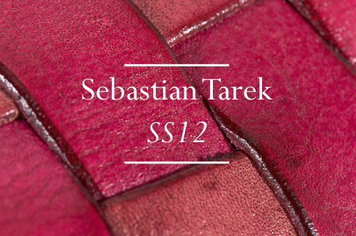
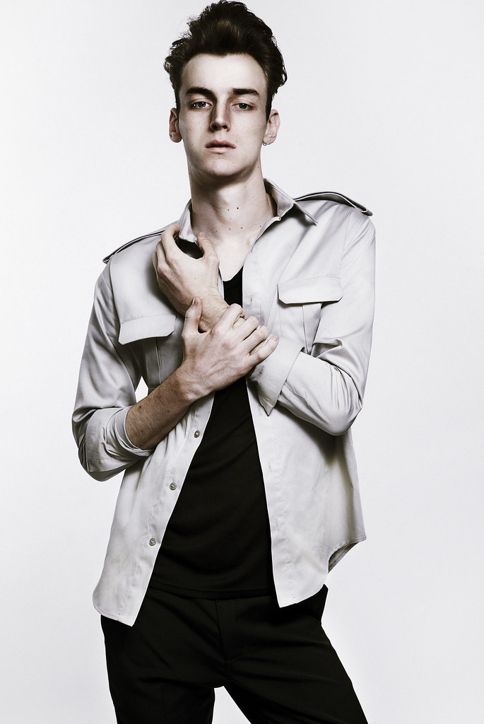
The relentless pace of fashion, with its waves of shows, unveilings and releases can be somewhat bewildering. Each season passes in such a way that for those of us immersed in it all, we can often lose all sense of time. There is little opportunity to take stock. However, today's announcement of NEWGEN sponsorship for AW12, affords a welcome chance to see just how far the smorgasbord of emerging menswear design talent has developed. The menswear sponsorship, courtesy of Topman, was awarded to Christopher Shannon and J.W. Anderson for catwalk shows whilst Lou Dalton, Martine Rose and Matthew Miller all receive well deserved salon presentations and the likes of blog favourites Bunney, Christopher Raeburn and Sibling all have a place in the heady design cocktail that are the installations. Like many of the designers themselves, this blog has grown up with this band of names. It gives me great pleasure to see this talented take the next step on each of their labels journeys. The announcement made me realise just how much 
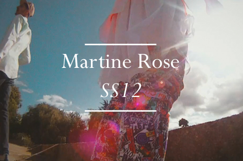
Martine Rose has evolved. 

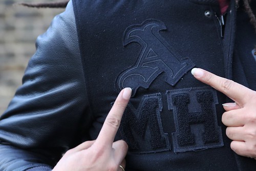
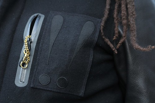
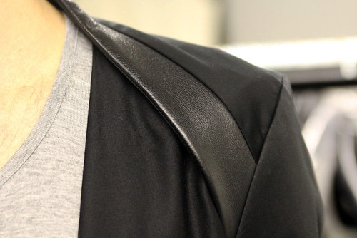
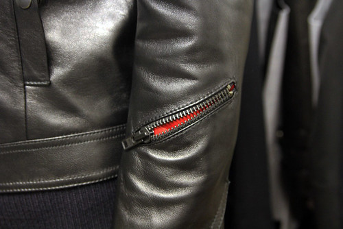
In the space of seven seasons, Rose is a design that has worked hard to craft solid foundations for her eponymous label and cement her place in the competitive menswear scene and with much success. She has collaborated with Wallpaper Magazine and Timberland, CAT boots and was one of the designers selected to take part in Selfridges 'Bright Young Things' project, which saw designers produce a window display for the exclusive store, design and exclusive product, and stock one-off pieces in store. Her previous collections have included ambitious installations at Blacks members club before the days of her sponsorship, Somerset House and most recently as part of MAN and all have been well received by press and the industry alike. Fantastic Man's very own Charlie Porter has described her as "one of the most exciting designers working in London right now. The way she brings originality with her colour and choice of cloth to traditional menswear staples is ingenious." This season, her obvious talent was showcased in one of the strongest MAN lineups to date back in September for SS12. For her seventh collection, Rose was drawn to the 70s skate scene and many of the boys that walked the show were skaters themselves. It was one of the most talked about collections of the season so it should come as little surprise that she has now been awarded her own salon presentation. Her advancement is so well deserved and I'm looking forward to the coming seasons and beyond.

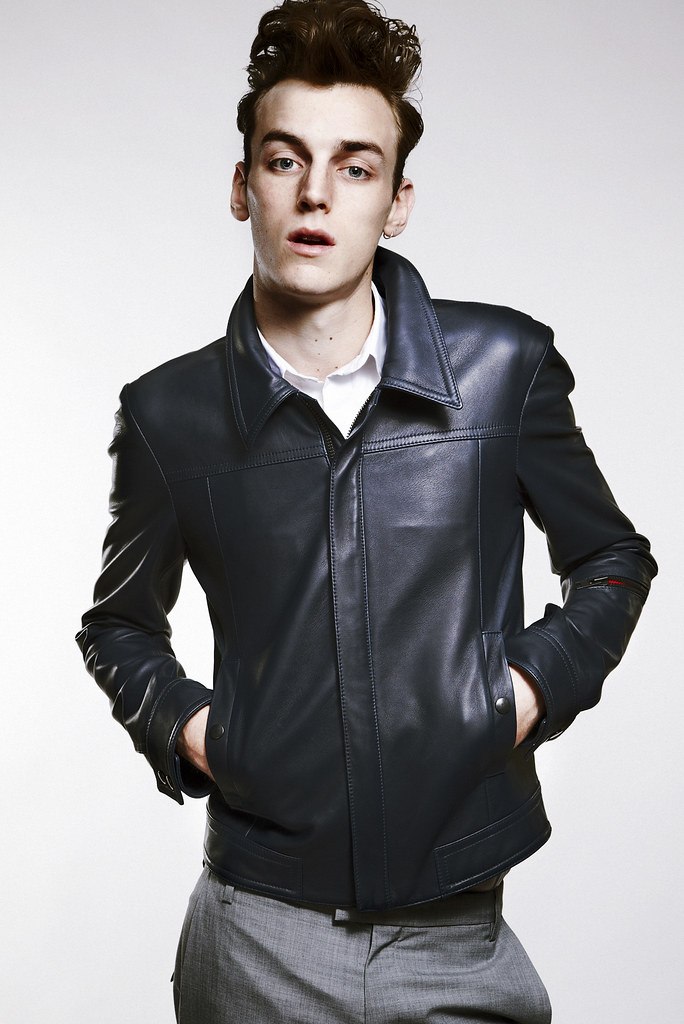
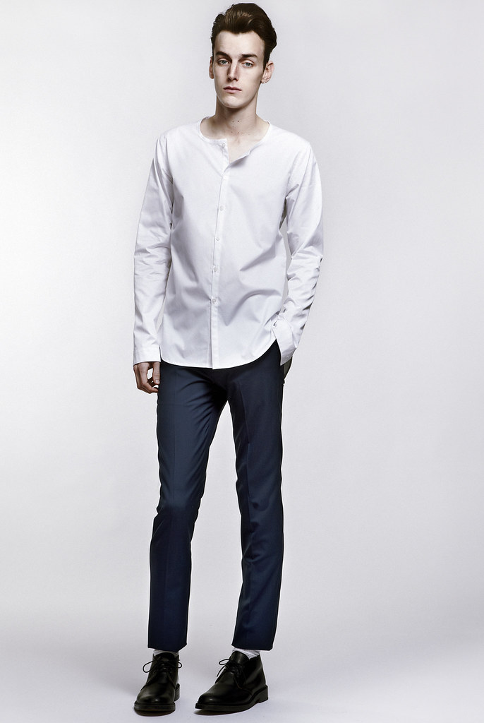
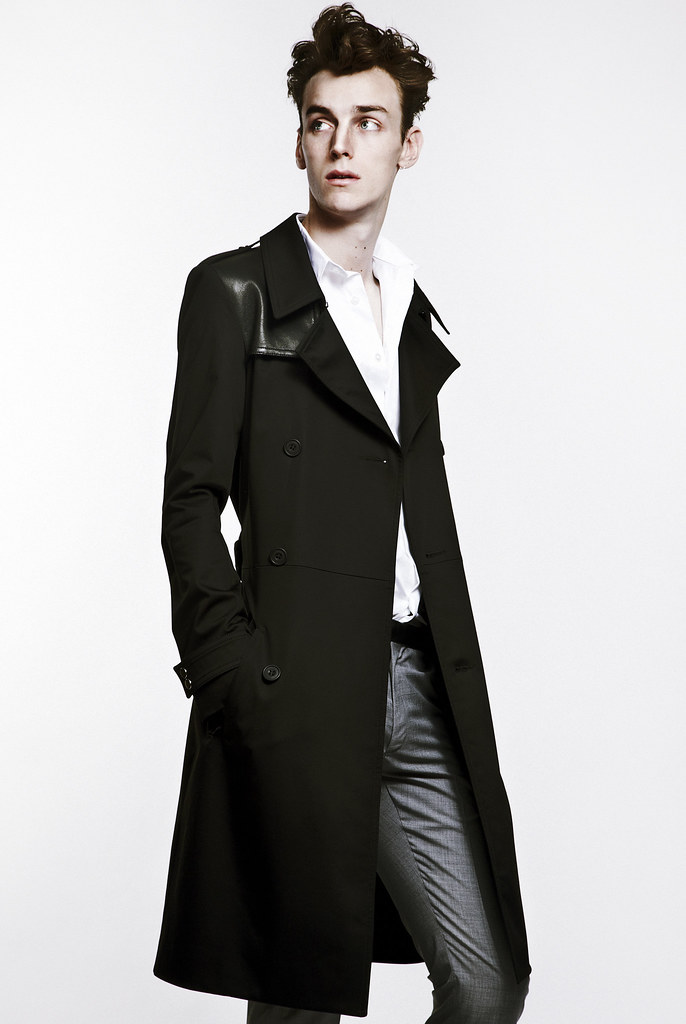
Whilst excited by the future, it is about time that I explored her highly acclaimed SS12 collection. With this in mind and long before the announcement was made, I caught up with the designer to learn more about her latest collection. Whilst researching for the season, the design talent revisited the exuberant documentary account of the rebirth of skateboarding in the early seventies Dogtown and Z boys. "I was captivated once again" and she was soon drawn in to this world of on the edge creativity. The collection itself showcases sheer fabrics and washed denims, reminiscent of the sun bleached sidewalks. Rose looked to scene icons including the legendary Zephr team and Kurt Cobain for inspiration. Her colourful mood board was a patchwork of "mostly womenswear, Kurt Cobain performing in a dress and Jay Adams." It was Kobain's ability to subvert the perception of the 20th century man, with his appearances in dresses and skirts that led to fabric and silhouette experimentation. The designer goes on to explain; "I loved the idea of men wearing womenswear and being really sexy, an almost uber male which, for me, was about conveying an attitude. The confidence and fragility of youth, the arrogance, the swagger." This duality is key for the season as Rose effortlessly bounces between soft and hard, bright and washed out, sheer and graphic. "I was looking at old Thrasher Mags from the 70's and old skated/surf footage, my research was constantly flitting between really bold and angry, to soft focus footage of sun bleached swimming pools. I used a lot of sheers, layered over highlighter coloured T's, which translated this feeling, and graphic prints, such as the Sticker print which was inspired by the skater stickers which cover the boards."

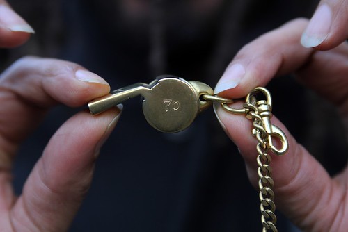
Rose's exploration of 1970’s skate culture extends to the fruits of her collaboration with Icon Brand.  "The collaboration with Icon Brand felt like a natural pairing. Having their origins as a surf brand, there were obviously lots of crossovers this season. Their jewellery was perfect as it is all about found objects, so they are beautiful objects within themselves, that we took and then hand painted with enamel paint to use as embellishments for bandanas. Pieces are featured heavily throughout as customised embellishments and jewellery components are utilised in accessories and on the garments themselves. It  looks as though this is just the start of a long term collaboration. "Working with them is fantastic, as their product is already so beautiful and fun, it has such a sense of humour. It has been fab to take their pieces and use in a different way. We are developing the collaboration into more wearable pieces so watch this space!"

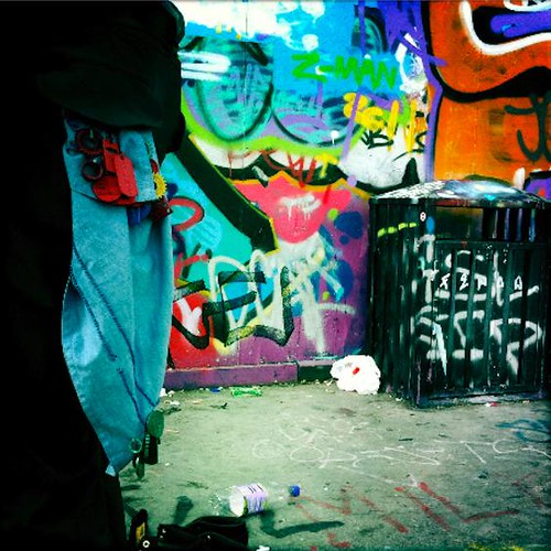
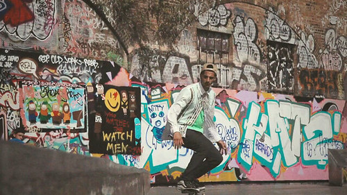
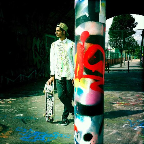
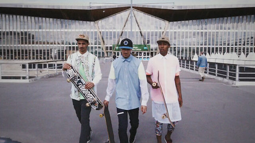
Throughout, Rose reimagines a lost but not forgotten generation, a band of the weird, a selection of rebels and outcasts that struck against the mainstream and created their own subculture. With the sheer shirts which are layered over brights and graffiti inspired print, the collection showcases fantastic fabric play and offers freedom to how the garments are worn. Rose has captured the confidence and fragility of youth quite wonderfully. However, the designer concedes that "I don't really expect someone to wear and buy a full look, I mean, fantastic if they do, but for me it's more about how they interpret for themselves what I have designed. The interpretation is the best part!"  To supplement the catwalk show and to help bring the collection to life, 
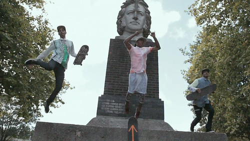
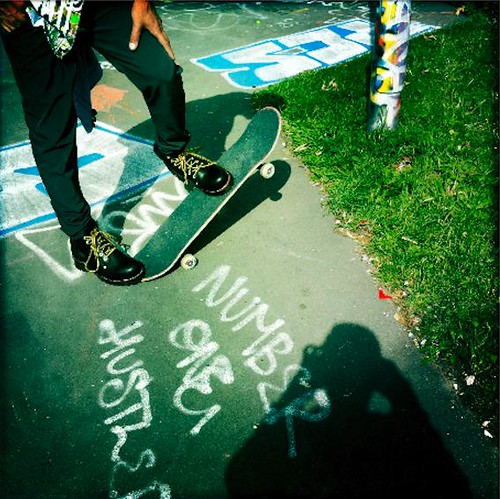
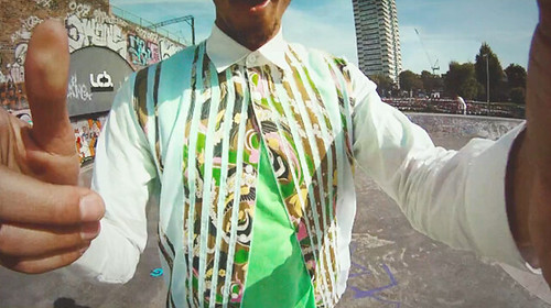
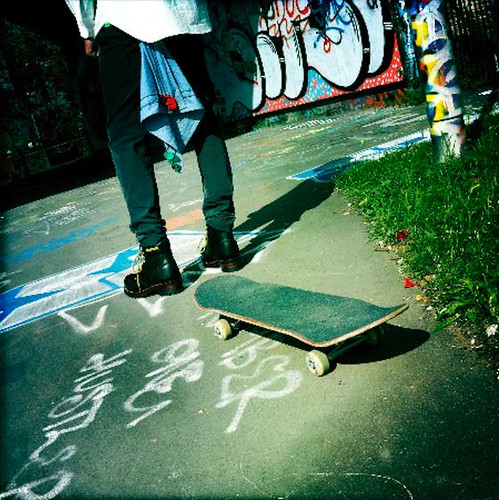
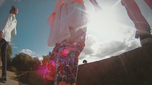
Hidden Agency created a short film that took the form of a trailer for a documentary about an imaginary skater who embodies the rebellion, vulnerability, and creativity that was central to Martine’s inspiration and SS12 collection. Below are a selection of stills that caught my eye...

Screen shot 2011-12-08 at 16.59.57
3
Screen shot 2011-12-08 at 16.59.19
2
Screen shot 2011-12-08 at 17.00.24
1
Screen shot 2011-12-08 at 17.00.46
4
Screen shot 2011-12-08 at 17.01.22
Stills from Hidden's short for Martine Rose. The full film can be viewed here.

Our conversation concluded with me asking Martine Rose how her self titled has evolved since its inception and her response is a fitting way to end this post. "For the better I hope. I feel like I am making more confident decisions, I am getting to know the 'Martine Rose man' better, and we're getting on very well, I like him." As her talent blossoms, she's not the only one enjoying getting acquainted with the Martine Rose man.

Tuesday, 6 December 2011

Sebastian Tarek SS12

Sebastian Tarek Feature Button

For me, nothing represents the diversity of menswear design talent that uniquely exists in this capital of ours quite like the NEWGEN MEN and Fashion East Menswear installations. That said, the sight of a bespoke shoemaker in amongst the emerging labels has produced a few double takes over the last two seasons. Bespoke shoemaking is a dying craft. Over the last few decades, numbers practicing this art have dropped and the products have evolved from being expensive to being truly luxurious in price which in turn makes it difficult to contemporise the market.  However, as we discovered last season, for his eponymous collection, East London based but Australian born shoemaker Sebastian Tarek took up the challenge of fusing his traditional skills as a maker of a timeless artisanal product with a more contemporary and relevant aesthetic. Seduced by his collection, I caught up with the craftsmen at his Sunbury Worskshop to talk through his label as the shoemaker wielded his pattern hammer

Tarek has worked for London’s finest shoemakers since 2003 – where he has spent years refining his skills of fit, and creating work of the highest standards to satisfy the clientele of Savile Row and beyond. With the launch of own line, he wanted to offer a bespoke service that created an altogether different type of shoe. The result was a collection that was an intriguing exploration of the bespoke market. An idea conceived and developed with his private clients in mind, a marriage of personalised service, comfort and luxury with a more relaxed and informal feeling. The debut was based loosely on classic styles, with specific detailing updated and refined to fit his relaxed aesthetic. Silhouettes are pushed into stronger, more architectural forms and have a modern look. Anachronistic extras are lost and a purity of form, and the importance of provenance is rediscovered. For his sophomore collection, presented back in September, Tarek continued along this past and introduced colour.

"The idea of working in seasons is still so bizarre to me, so the second collection is very much in the same framework as the first" Tarek admits states in his workshop, tea in hand and surrounded by the tools of his craft. "However, with this collection I had to deal with the notion of Spring/Summer and wanted to contemplate colour.  From my background, men's shoes are classic and very staged and I ask questions like 'which shade of brown would you like? how shiny would you like your black?'" As with his first collection, he wanted to create a different type of bespoke offering. "I visited Derek Jarman's garden about a month before I began work on the collection. The visit to the garden made me recognise that even in quite muted tones you can have sprinklings of colour and that they don't look incongruous." So throughout this collection Tarek introduce colour and experiment with applying it. Much of the detailing is from a similar perspective as before, classic styles with a few tweaks, but the colour is the main differentiating and ultimately surprising factor. The two coloured styles are hand coloured and that was the new process that I brought in. "Whenever I design it tends to be process driven and this was the new challenge" and a process, that despite the labour involved, the craftsmen undoubtedly enjoyed. Individual pieces are cut, stuck on newspaper and then the shoemaker sits alone with a pot of polish for company. 

"The panels are mirrored, so they are individual pieces but you can see what you're doing to enable a good correlation between left and right but beyond that, there is an awful lot of scope, some are more saturated than others" and Tarek's face lights up. It is an old fashioned technique to take a neutral piece of leather and polish it in to a colour and it allowed Tarek to have greater control and to create the desired lived in character. The pinks are taken to a certain point but not in to an opaque colour, so once you wear them they dust out a little or if the wearer prefers a stronger hue, they can always polish them. The inspiration for the striking pink itself came from Terrence Malick's Tree of Life. Like many critics, the shoemaker "thought the film was terrible but there was one tiny moment which is classic Malick and reminds you of Badlands and Days of Heaven, a moment where that little fraction of light which you can tell has been laboured over for days, is perfect. It's a golden, pinky, nostalgic light and that inspired me." With a pot of polish in hand, he laboured over the light in much the same ways as Malick did and both found that perfect hue.
seb_05a
seb_05e
seb_05c
A closer look at Tarek's Closed weave two holed derby.

seb_03a
seb_03d
seb_03c
The three hole Gibson

seb_04a2
seb_04e2
seb_04f2
The Oxford

seb_02a
seb_02e_02
seb_02d
The simply named Casual

seb_01a
seb_01c
seb_01f
Tarek's Monk, as with all of the designs, the real beauty is in the details.
"The small fixtures, fittings and detailing things are so often the hardest things to find. The buckle for the Monkstrap was the biggest challenge for this season. After not being able to find what I wanted, I ended up calling my mate Duffy and he did me a favour. I gave him an existing buckle and asked him to make something that was beautiful, worn but without it being distressed."

In addition to crafting beautiful shoes, Sebastian Tarek's aim is, in part, to contemporise the market. The mere mention of this word in an industry perceived as archaic and in decline has, in some instance, been met with laughter. "Of course it is a challenge because there is an unfortunate exclusivity about it which makes it prohibitive. It's not inclusive" concedes the craftsmen. It has always frustrated Tarek that his friends do not own more of his shoes. "However, the offering is totally experiential, it is not just a product but a service"  Everything is sourced locally, it is all hand made. Clients are individually measured and fitted for their own personal set of wooden lasts. "There are so many reasons to enjoy the process if you can afford it" and it his goal to offer a service that attracts a new customer. With the addition of these five new styles, there can be little doubt that shoemaker is crafting an enticing catalogue of possibilities whilst breathing fresh life in to his dusty industry.

Friday, 2 December 2011

Weekend Reading... It's Nice That and 032c

IMG_4946

With Susie continuing to rack up her airmiles, I too have decided to escape the capital for the weekend but am only heading as far as the Kent coast. Two days of battling the elements (particularly the wind) and elderly Christmas shoppers awaits. Accompanying me on this festive jaunt are two of my favourite publications, the recently tinkered with It's Nice That and the ever hard to put down 032c. The former has experienced something of a transformation for its seventh issue and inadvertently but rather appropriately explores the future of publishing. Features that I can't wait to immerse myself in the beautifully repackaged It's Nice That include profiles of celebrated documentary photographer Martin Parr, interviews with i-D founder Terry Jones and a free comic by the talented illustrator Sophy Hollington. Meanwhile, after more than a decade of tracing the underlying forces of today's creative, 032c takes stock and lays out the concepts that have emerged from its editorial exploration under the manifesto like umbrella of What We Believe. Whilst looking back, the issue treats the well fed mind of the reader with features on Russian tango dancer turned designer Serge Chermayeff, the original Mad Man Ivan Chermayeef and Supreme to name just a few. A weekend of stolen moments to read awaits.  

Thursday, 1 December 2011

Introducing... Breaks

IMG_8381

Apologies for the lack of posting this week. I hope you've not jumped to the conclusion that there must be a shortage of menswear material for this blog to sink its teeth in to. The truth is, it is the complete opposite and I'm struggling to find the time to give everything the attention it deserves. Damn the real world for getting in the way of a good post! Anyway, enough of my grumbles. To help fill the void, I'd like to introduce you to the London based label, Breaks.

Founded by Ryo Yamazaki and Kohji Yanagi in late 2010, Breaks instantly caught the eagle eye of independent fashion boutique Wolf & Badger with a debut collection that effortlessly fused a modern silhouette with punkish materials. The label is grounded in a shared obsession with classic punk and rock and a desire to repackage it for a new man. Somehow their accomplished debut slipped by my radar but thankfully their sophomore collection for SS12 grabbed my attention. Shortly after their impressive Yusuke Miyazaki shot look book landed in my inbox, I visited the pair at their Hackney based studio to learn more about the label and to take a closer at their designs.

IMG_8337
IMG_8358
IMG_8384
IMG_8390
IMG_8388
A look around Breaks' small but perfectly studio in the creative haven that is Netil House.

Originally from Japan, the design partnership met through mutual friends whilst studying in London. However, neither had an education in menswear design, Yanagi studied womenswear at LCF whilst Yamazaki studied economics. Despite their different paths, the pair were united in their shared dream to create menswear in their adopted city. The design aesthetic is an intriguing balance of classic, minimal, and sharp shapes fused with punk inspired materials including leather, zips and studs. For their second collection, The Pursuit of Simplicity, the pair added military influences to this already heady mix following an excited trip to the Imperial War Museum. Now, I'm scarred for life by the mere thought of this famed tourist attraction after a torturous, lengthy visit at the insistence of my Dad but the design duo were captivated by the displays of uniforms and managed to bring a surprising lightness to their reimagination of military classics.

The design duo were quite shy when confronted with my excitement for their creations but fortunately the designs themselves did the talking for them. Their sophomore effort is a light, playful, tactile, wearable yet interesting collection that manages to develop their aesthetic quite wonderfully. The studio visit was ideal because it afforded me the opportunity to inspect the extremely well finished designs and marvel at the intricate combination of well sourced fabrics and leathers. Despite my obvious support for emerging talent it is rare that I find a collection that could slip effortlessly on to store rails and in to my everyday wear. Breaks is an exception to the norm. Having said my piece, I'll follow the designers and allow the designs themselves to carry on the discussion with the help of their look book and a few of my own detail shots...

Breaks lookbook_ss2012_1
Breaks lookbook_ss2012_2
IMG_8365
Breaks lookbook_ss2012_3
Breaks lookbook_ss2012_4
Breaks lookbook_ss2012_5
Breaks lookbook_ss2012_6
Breaks lookbook_ss2012_7
IMG_8370
Breaks lookbook_ss2012_8
IMG_8348
Breaks lookbook_ss2012_9
IMG_8344
Breaks lookbook_ss2012_10
SS12 Look book credits:
Direction and Styling by Ryo Yamazaki and assisted by Jun Yasui.  Photographed by Yusuke Miyazaki
Modeled by Danny Arter @ Nevs. Hairs by Takuya Sugawara. Graphic design by Kohei Suzuki
---------

With two such accomplished and well crafted opening collections, I'm going to be keeping a keen eye on the development of Breaks.

LinkWithin

Related Posts with Thumbnails