Saturday 30 April 2011

Leitmotiv AW11: Light Motiv

Over the last twelve months or so, I have gradually found myself drawn to the previously unsettling world of prints. The mere thought of paisley, camouflage, gingham, polka dot, leopard print or digital creation used to cause sweaty palms. Something changed. One of the factors in my new found confidence was the discovery of Italian label Leitmotiv during the SS11 season of Pitti Uomo. The one thousand, four hundred and seven exhibitors who decided to preview their new collections and projects at this Disneyland of menswear tradeshows caused great excitement during my first visit but it was Leitmotiv who really left the greatest impression. I was slapped silly by the hands of the design duo behind the label and their penchant for clashing and layering of the whimsical. I've kept an excited eye on the pair ever since. 

I'm pleased to declare that Leitmotiv's AW11 collection is as playful as ever. Once more, the talented design duo, Sasso and Carro, have created a dazzling print rich collection that manages to be both familiar and new. Entitled Light Motiv, the collection is a video game that captivates our attention and shifts before our very eyes. For the new season, landmarks, characters and animals merge, mingle and dance around one another in an ever changing configuration of print possibilities. Digital camouflage pixelate and transforms in to urban compositions. The familiar animals emerge from clouds, ornamental mazes or gallop out of nowhere. The more you look, the more you see.

Leitmotive_AW11_2
Leitmotive_AW11_1
Leitmotive_AW11_4
Leitmotive_AW11_6
Leitmotive_AW11_7
Leitmotive_AW11_5

With each passing season, the design duo behind Leitmotiv narrate stories that fascinated us all throughout childhood. Today we relive them through their dazzling prints. The seemingly simple canvas of menswear becomes the canvas that unfolds a tale of dreams and the poetic whims of the pair.

Tuesday 26 April 2011

A happy ending

IMG_1546
Baartmans and Siegel x Grenson Brogue

On the 28th January 2010, during an evening packed with emerging design talent at the LCF MA showing in the ornate surroundings Raphael Hall at the V&A, I caught sight of a very special brogue indeed. Wouter Baartmans' Great Depression era inspired heady mix of tailoring, sportswear and fur was one of the real highlights from the class of 2010 and it introduced me to my dream footwear. The combination of leather and suede that strode past left me reaching, longingly from my seat. But they passed me by. A few months later and I encountered them for the second time during Amber Siegel's Oil Slick Birds inspired exploration of tailoring and texture in the LCF BA show. I fell for their charms all over again. Like all crushes, I needed to know more about them.

These beautiful brogues were indeed a collaboration between the two talented LCF graduates and  long standing British shoe maker, Grenson. A wonderful combination of craft, tradition and  innovation. With a history spanning more than one hundred and forty years you would forgive Grenson for resting on its Goodyear Welted soles. However, when compared to other classic English shoe makers, they been making the most positive and interesting moves in recent years. These brogues are certainly one of the finest examples. 

IMG_1547

During a Baartmans&Siegel studio visit, I slipped my eager feet in to the suede tipped brogues. Words are not able to describe how good they felt and looked at this time. Reluctantly, I returned my treated feet to their now insignificant, hollow leather home. And that was that for a number of months. On occasion, I thought I had seen them from across the street, attached to a passing stranger or behind the window front of a store where my eyes would light up shortly before the realisation of my mistake would surface. All other similar shoes paled in comparison. Oh the heartache.

Fast forward to this weekend and I received a very special treat from the design duo. My very own pair. Wow. As Gabrielle once sang, "Dreeeams can come true." Well, it didn't take me too long before my excited feet forced themselves in to their new favourite home. 

IMG_1552

For those of you who, like me, fell head over goodyear welted heels for the fruits of this Baartmans&Siegel collaboration, you'll be pleased to hear that a range will be released for SS12.

Monday 25 April 2011

Christophe Lemaire AW11

ChristopheLemaire_Aw11

The name Christophe Lemaire has been bouncing around my head causing excitement with every ricochet for some time now. With each passing season, the seasoned design talent honours a subtle and quiet elegance by creating a seemingly timeless collection of luxuriously simple basics. Heavy figures, with supple and full outlines, are worked in fluid fabrics that fall in an effortless manner and wrap the body without ever concealing it. Lemaire creates an essential wardrobe by putting together the clean and calm lines of western wardrobe with the sophisticated ease and generosity of volumes of traditional eastern garments. It is this very wardrobe that I long to have.

After honing his skills with Yves Saint Laurent and Thierry Mugler, as well as Christian Lacroix and Jean Patou, Lemaire launched his own label in 1991. He has since restored Lacoste's iconic image whilst being its artistic director from 2000 to 2010. Twenty years since starting his own label and the designer has remained relatively unknown. One gets the feeling that this is just how he prefers it. Lemaire is a designer far more interested in style than fashion, the trends and fanfare of fashion are far less important to him than the simple quality of his creations. However, AW11 is a significant season for the design talent. Last month saw the unveiling of his highly anticipated Hermes debut. Whilst filling the rather large shoes of Jean Paul Gaultier with widespread acclaim, Lemaire continued the quiet evolution of his own label.

The AW11 collection takes its inspiration from Serguei Parajanvov, Georgian film director and visual artist known for living elsewhere, in dreams made of myths and icons including David Byrne, Nicolas de Staël and John Luly where a love for beauty and for light in its uncertainty of location and time blend with the rich colours of his images. To mark this significant season, we were fortunate enough to ask the designer about the maturity of his label and his hopes for the future whilst taking a closer look at his latest creations...

ChristopheLemaire_AW11_1

SS:What were your inspirations, your dreams and the driving catalyst behind launching your own label? Both in 1991 and then your return to it in 2007.
Christophe Lemaire: From the very beginning to this point, I have always been driven by the same idea: trying to create in my clothes the perfect synthesis between simplicity and quality. This idea has just grown up with maturity.

SS: How has the label and your approach to it evolved over the years?
Christophe Lemaire: I strive to improve the same pieces season after season. We really push the idea that once you like a garment you want to wear it all the time . We give that possibility by offering a perfect basic in a wide range of fabrics.

SS: What were the first and last item you remember designing?
Christophe Lemaire: Uniforms!

SS:Your collections are always a wonderful blend of references. What was your initial starting point for AW11?
Christophe Lemaire: I like the idea of synthesis as well as blurring the frontiers between genres. I don’t want the references to be too obvious.

ChristopheLemaire_AW11_2

SS:How did the varied figures of Sergui Parajanov, Nicolas de Stael, John Lury and David Byrne influence your designs?
Christophe Lemaire: Serguei Parajanvov’s movies for textures and colors that mix with a very poetic and refined sensitivity. David Byrne for the effortless sharp sense of style. Nicolas de Staël for the beautiful obviousness of a black shirt and a black pleated pants. John Lury for the sophisticated ease.

SS: As a designer, would you agree that you are more interested in style than fashion. How would you describe your approach to design?
Christophe Lemaire: Observing our everyday gestures, environment, and responding to it.

SS: Your designs continually evolve to push a form of luxury fashion to new limits. Proportion, silhouette, cut, fabric and method are all central components. What is luxury to you?
Christophe Lemaire: Time.

SS: There is a definite sense of timesless-ness to your designs. Withe each collection you create an era defying wardrobe consisting of exacting basic pieces whilst experimenting with shape, cut and form. If you could go back in time and experience one moment or era of fashion, what would it be?
Christophe Lemaire: The 20’s were a fantastic innovative era, liberating the body and mind, and radically switching from the western tradition of corset to the Asian tradition of tunic and kimono, or the ancient Greece art of draping: all about shoulder and hips.


ChristopheLemaire_AW11_3

SS: The idea of a personal uniform is something that we've been mulling over since before we even started the blog. The concept of uniform is certainly an important facet of your work - do you have a personal uniform?
Christophe Lemaire: Three-pleated pants, an officer collar shirt and a double-breasted jacket as easy to wear as a waistcoat, all in the same fabric. Wool flannel for winter, linen and cotton for summer.

SS: How has the oft cited Walter Albini phrase, 'Sometimes to dress is to leave a little', influenced you as a designer?
Christophe Lemaire: To dress is to say what you would like to be, how you see yourself. There is something very playful about it, you need to dream. It is actually something quite deep.

SS: Finally, how do you see Christopher Lemaire, the brand, developing over the next few seasons, as you simultaneously take on the creative director role for Hermes?
Christophe Lemaire: We want to develop Christophe Lemaire as a lifestyle brand and edit complementary objects to the collection. Also, the Paris shop should be a unique place where people can come for advise and find a piece that will respect their individuality. Of course, collections should always improve.

Christophe Lemaire Homme
All images courtesy of Christophe Lemaire and taken by Axel Jansen

Thursday 21 April 2011

The Documentary And A Dream SS11

IMG_1191

As previously noted, 
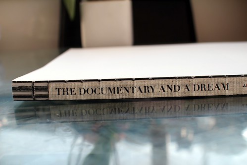
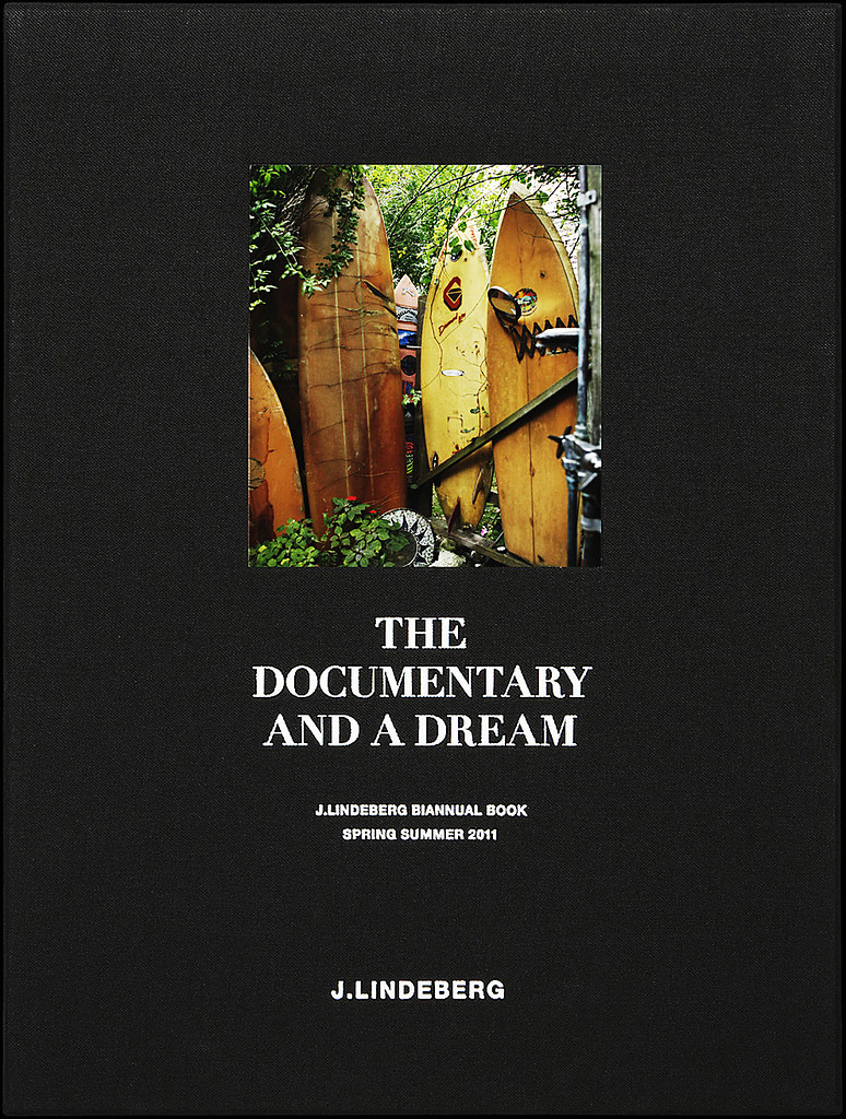
J. LIndeberg's The Documentary and A Dream biannual book was borne out of the desire to tell the complete story of the brand and share their thoughts and values on a level beyond commercial aspects of marketing principles. Each season creatives from various disciplines are invited to freely interpret the seasonal collection and capture a particular theme within the spirit of J. Lindeberg. Now in its fourth season, the SS11 edition explores the passion to master a craft, be it creating an exquisitely cut suit, building the ultimate surfboard or focusing to become the number one athlete.

The talented group of photographers, artists, writers, illustrators and stylists that joined Art Director  Jörgen Ringstrand for this season include Olivier Zahhm, Andreas Sjödin, Julia and Hannes Hetta, Skye Parrot, Carl-Johan Paulin and Andreas Carlsbecker to name but a few. On the day of its release and before J. Lindeberg's London showroom opened its doors for a celebratory launch, we caught up with Jörgen Ringstrand to talk about the inception and continued evolution of this inspiring read...

SS: What were your inspirations, your dreams and the driving catalyst behind launching The Documentary and A Dream?
Jörgen Ringstrand: I work with J.Lindeberg and also run my creative agency R67Kreative, it was a fantastic moment when together with the Global Brand Director at J.Lindeberg, Stefan Engström ,we decided to start the process of creating the Biannual Book. When we started we did not know where we were heading, both Stefan and I like to work very fast and are passionate about what we do. There were no customers surveys or meetings with marketing departments, we both love books that are made with passion, love, great printing, great binding and great contributors. We just wanted to do something that reflects our minds and the world of J.Lindeberg.

SS: For me, it is a publication which weaves together people, imagery, history, newness and takes great pleasure in information exchange and learning. What does The Documentary and A Dream mean to J Lindeberg and to you personally?
Jörgen Ringstrand: For me it’s a fantastic way of together, with Stefan Engström at J.Lindeberg, to create a book with people and thoughts that inspire us. Both of us love books and with the Biannual Book we also produce it with highest quality and craftsmanship. All the bookbinding is made by hand, it’s a privilege in this time to do a book like this, especially with people focusing online or digitally. For J.Lindeberg it is a way of doing something that shows the world around the brand. The book is not made with any business or commercial goals in mind but made from a strong interest of creating a long lasting high quality product, much like the J.Lindeberg clothes.

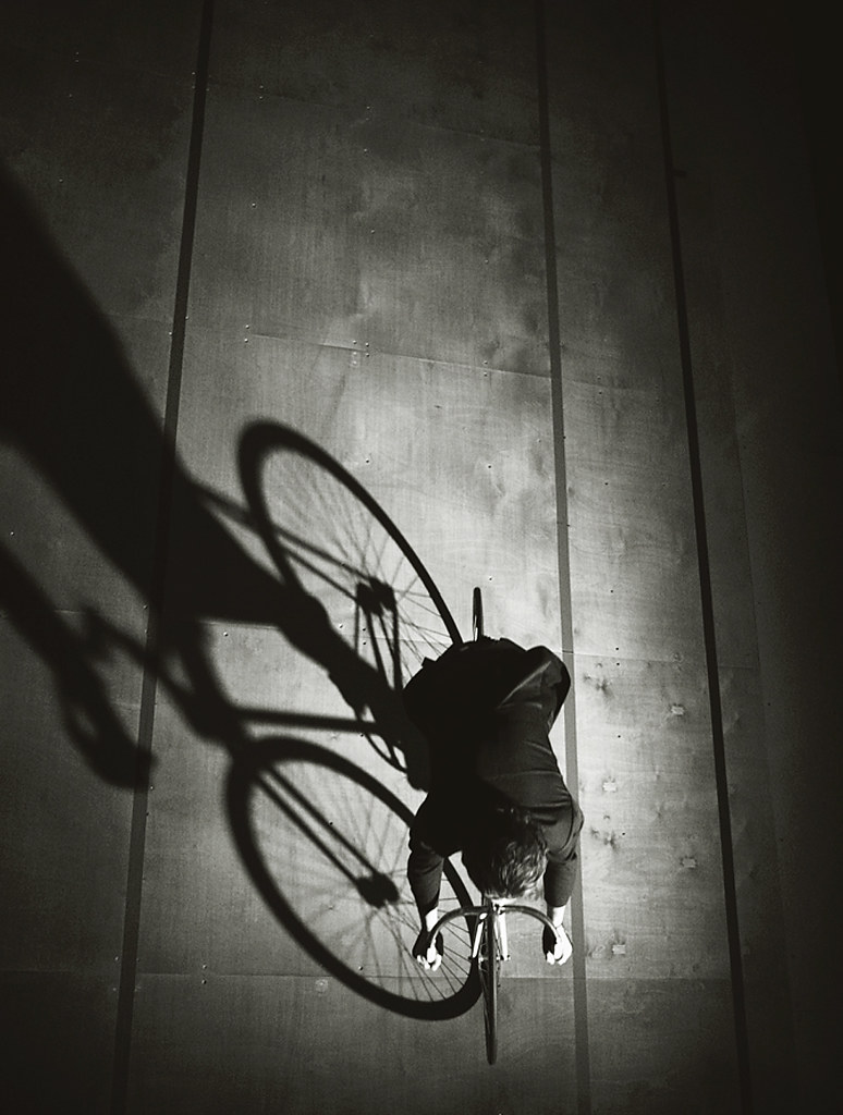
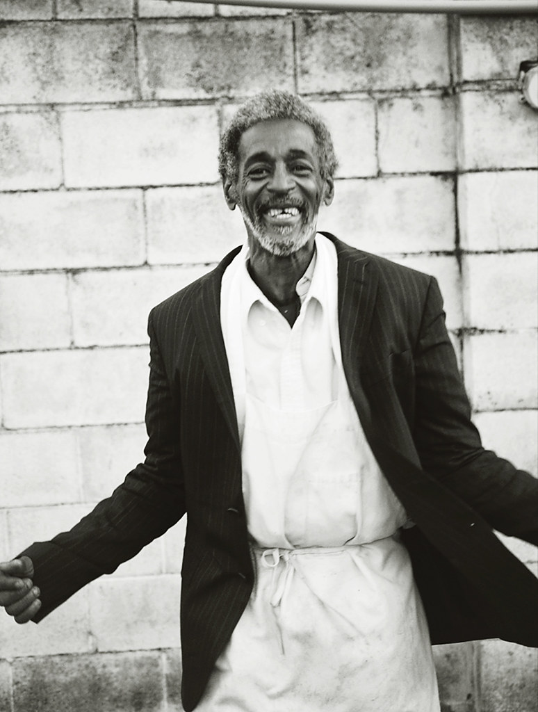
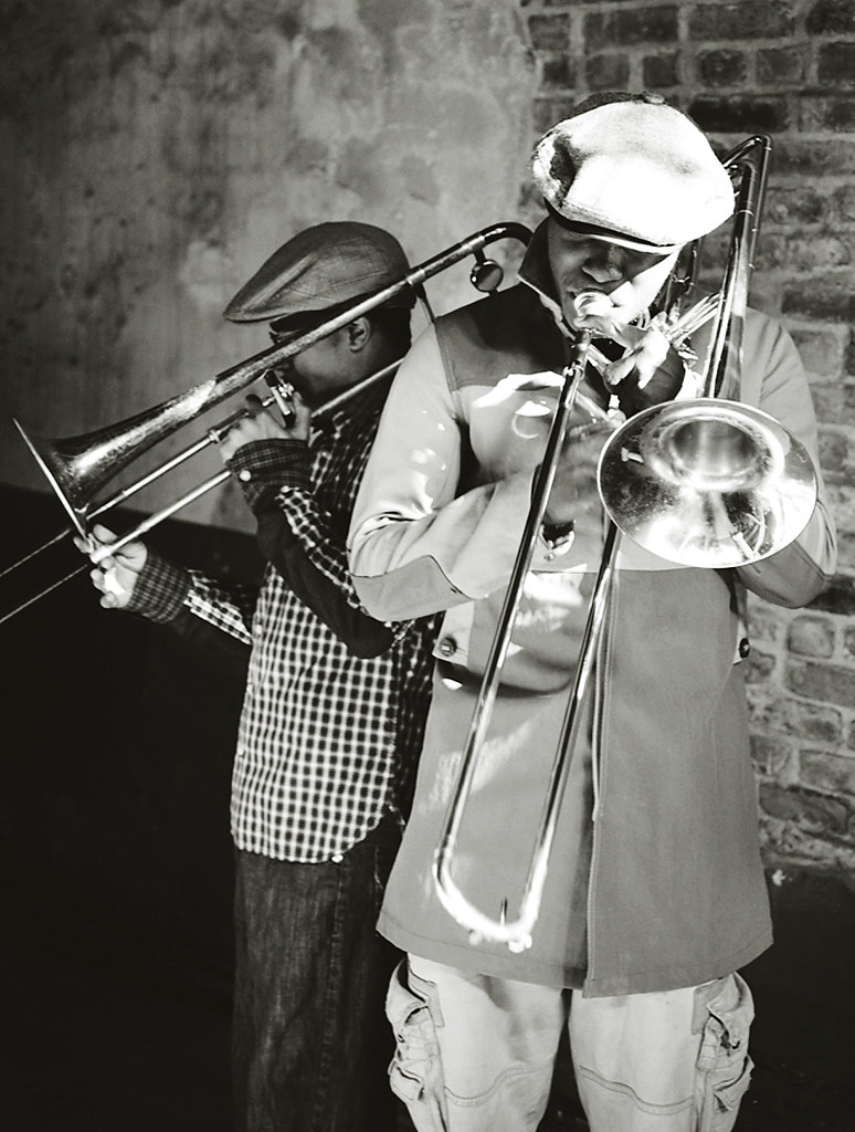
SS: Each issue is concentrated around one key idea – a timeless theme that in various ways touches all those working in the creative fields regardless of age, cultural background or social status. This latest issue explores the world of craftsmanship and you shine the spotlight on varied individuals from an aged surfer to a jazz musician, a Russian poet to a tailor. What does the word craftsmanship mean to you?
Jörgen Ringstrand: It is someone who lives through their work.

SS: Could you talk us through a few of your favourite features within the issue and the stories behind them?
Jörgen Ringstrand: All are my favourite, I have put a lot of effort into them all for them to become true.

SS: Is there anything that you are particularly pleased with or excited to show?
Jörgen Ringstrand: I think it’s nice to have Olivier on board and he will also contribute on the next with a great feature we are working on right now.

SS: The contributors list is an impressive one, Olivier Zahm, Andreas Sjödin, Julia Hetta to name but a few. How do you source people to become involved in the project? What is the dynamic of the working relationship with them?
Jörgen Ringstrand:Most of the people I have followed for sometime time and seen their work and way of visualizing things. I contact then with some ideas and then we together we work out the final story. Most of the work we do is over emails which I love. I love to have that exchange of ideas and thoughts before we meet in person.

SS: In terms of contributors, is there anyone in particular that you'd like to work with the future?
Jörgen Ringstrand: I don’t really plan like that, I haven’t got anyone in mind that I am trying to catch. It is something that happens more organically

SS: Finally, how would you like to see The Documentary and a dream evolve over the coming seasons?
Jörgen Ringstrand: I would like it to be a book which reflects the mood and minds of the people involved. A book that gives creative freedom to the contributors in a large sized format, made with passion and love, to be able show their work in a great context.
----------

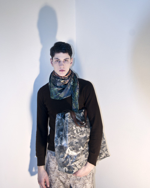
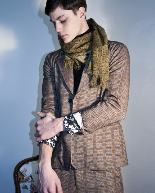
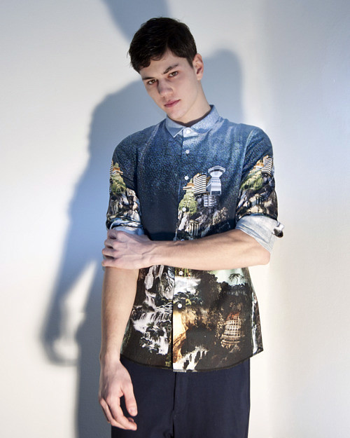
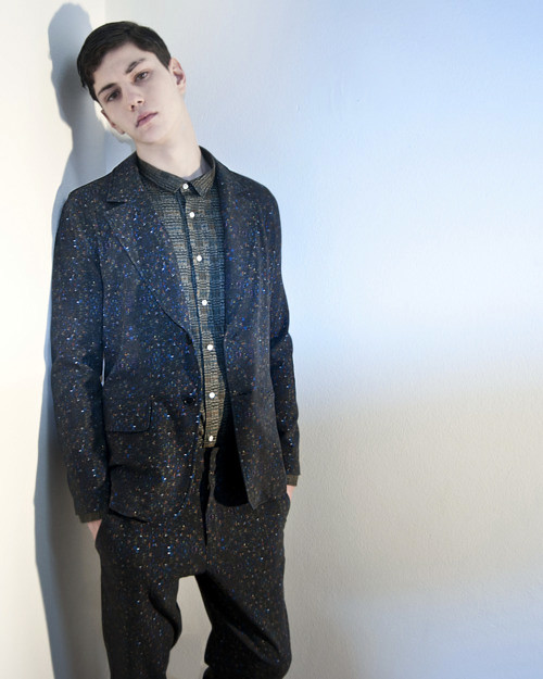
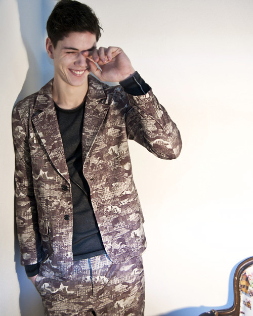
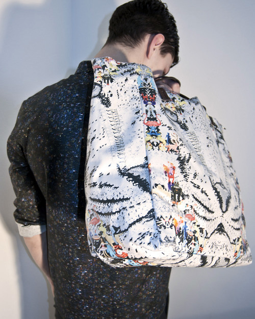
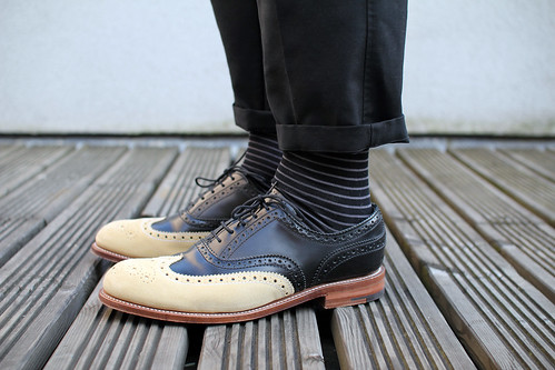
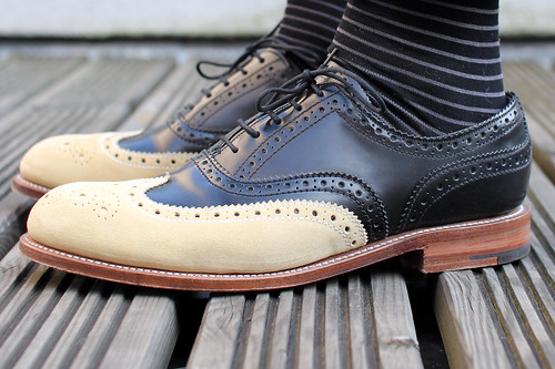
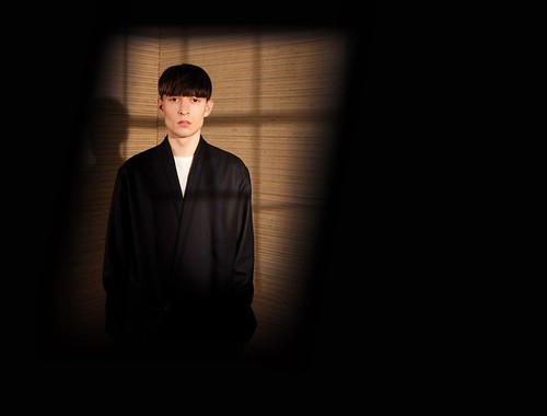
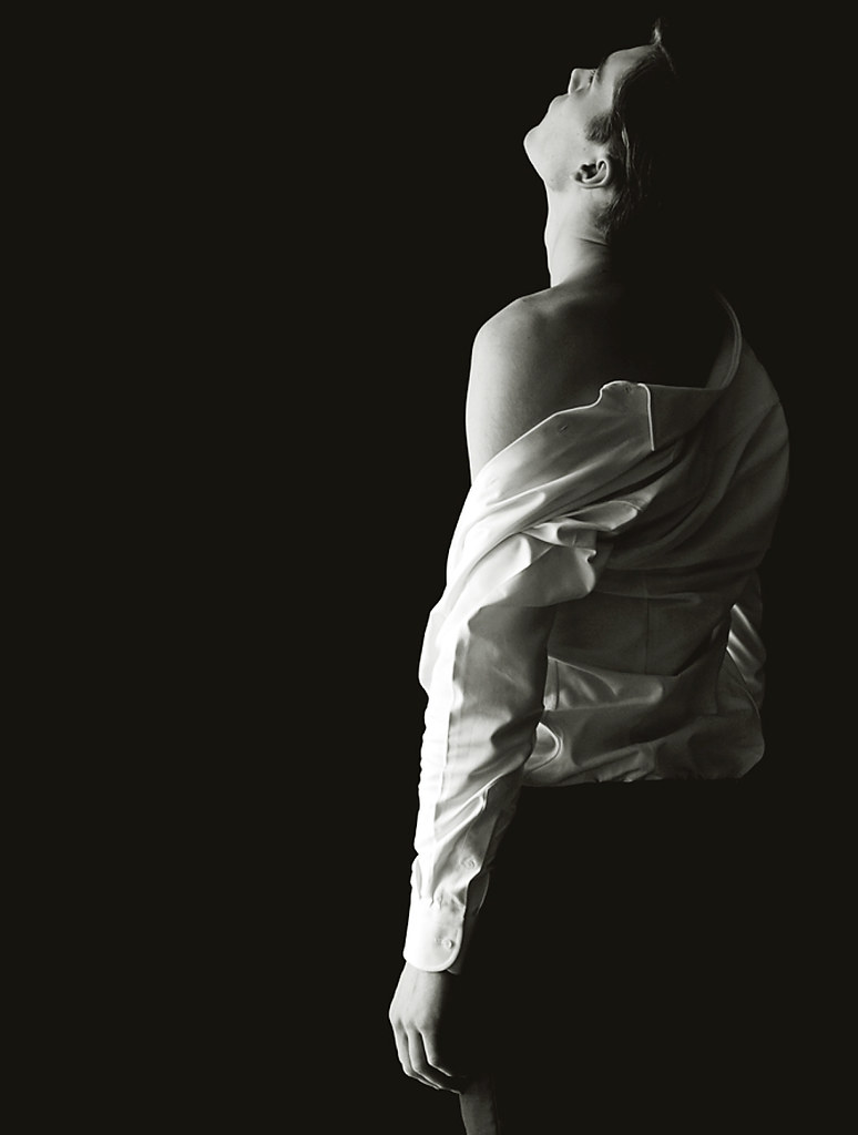
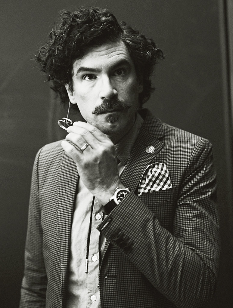
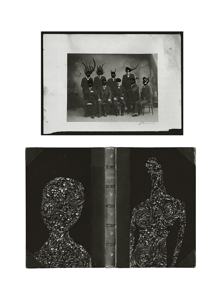
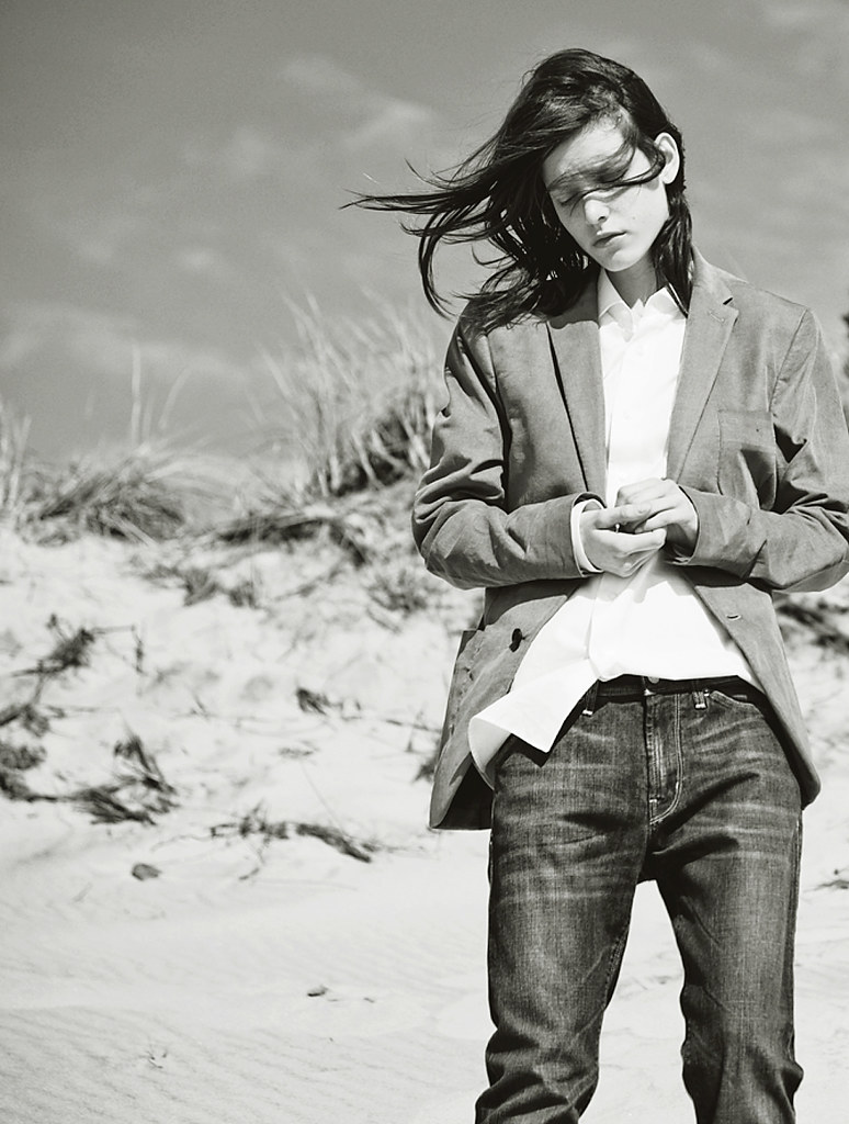
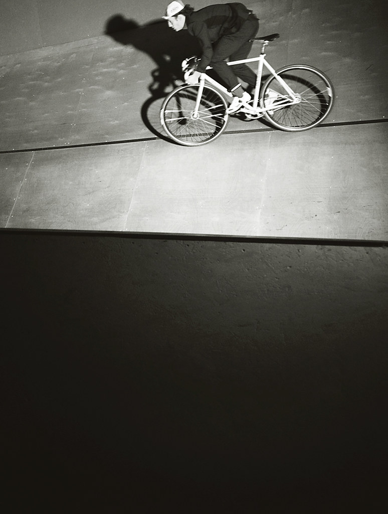
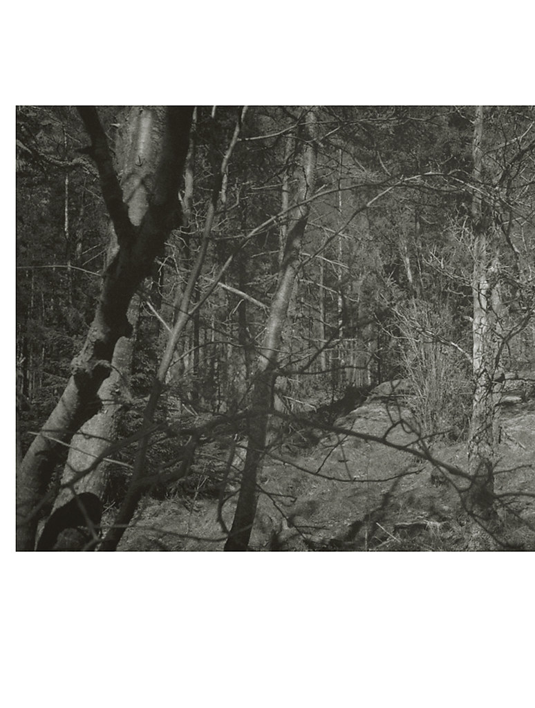
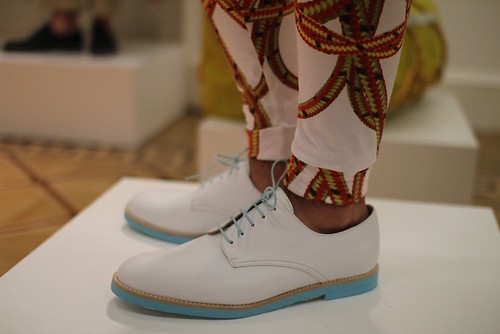
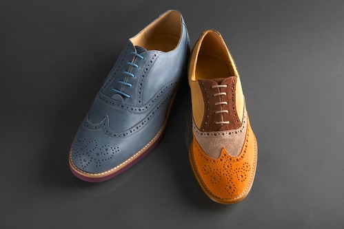
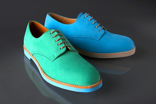
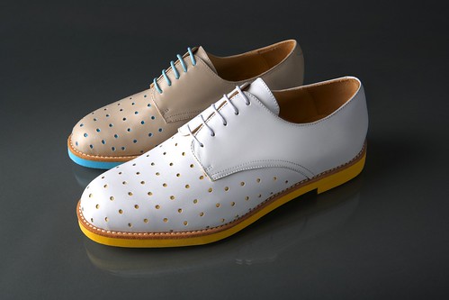
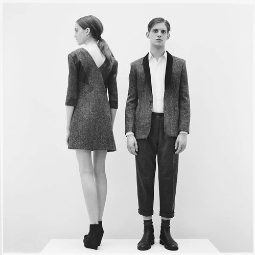
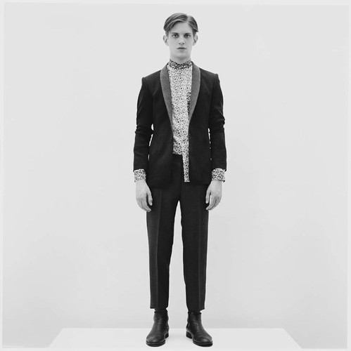
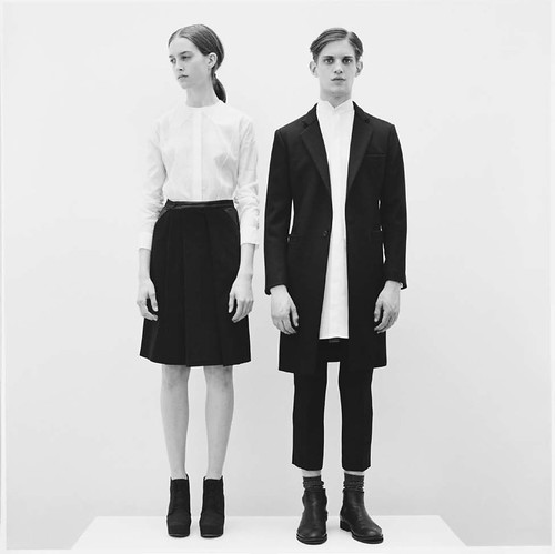
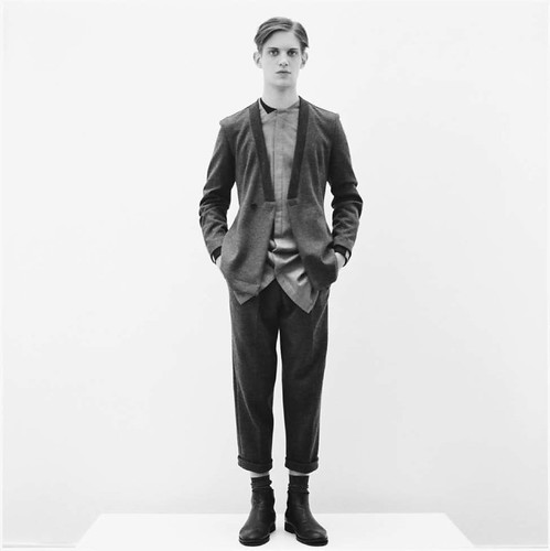
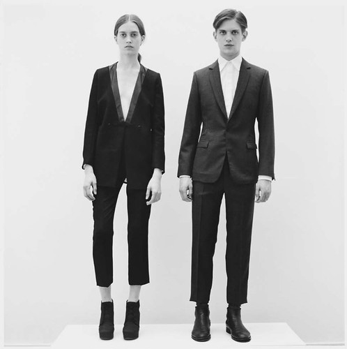
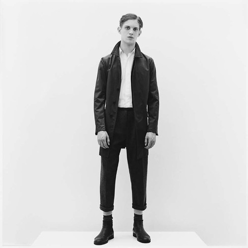
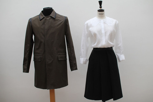
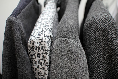
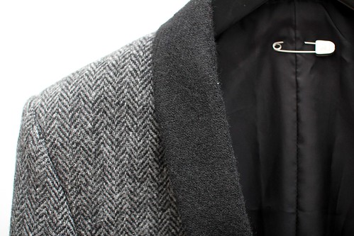
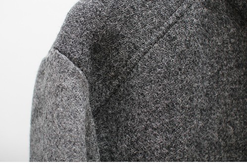
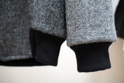
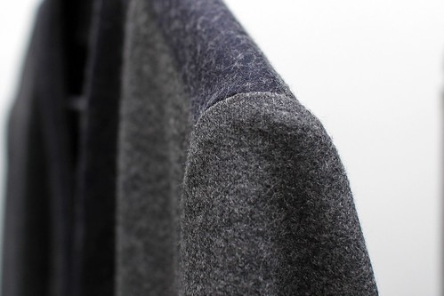
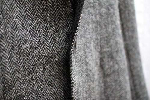
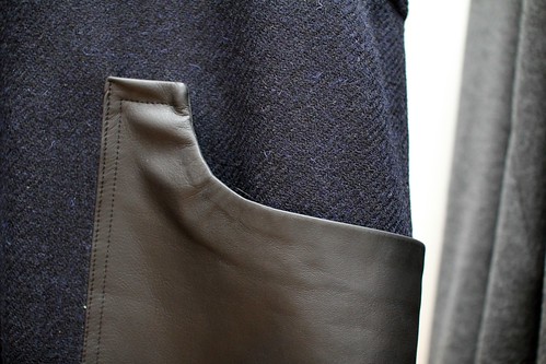
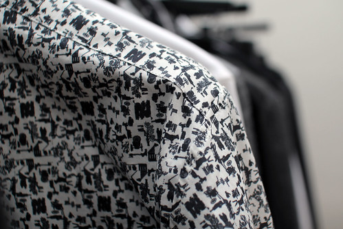
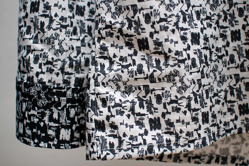
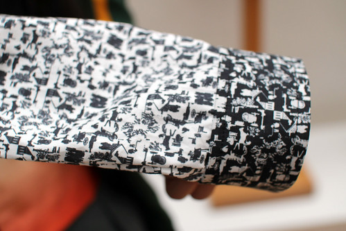
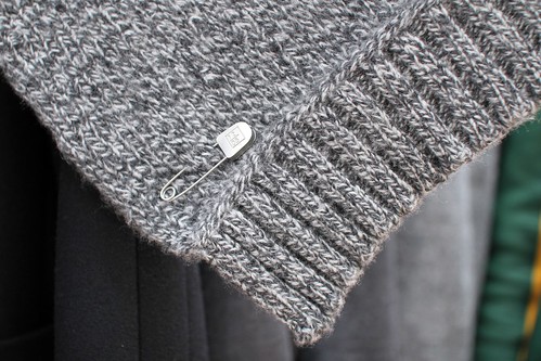
Now that the hangover sets in and memories of toasting the book thump around my brain, I'm fully aware that the book has now been released. This fourth edition is now available to view at J. Lindeberg stores and online. The narrative it weaves is one that expands way beyond the realms of the standard look book and runway views we are all accustomed to seeing. Throughout the book you are treated to inspiring art works, collages, interviews and an array of wonderful imagery. However, before you go and thumb through it I'd like to share a few of my favourite pages with you.  

Cover-01
untitled
untitled
untitled
untitled
untitled
untitled
untitled
untitled
untitled
untitled
untitled
All book images courtesy of J. Lindeberg.

Monday 18 April 2011

In discussions: Unsung designers continued

Earlier this month, we started the conversation around the great unsung of menswear design. Our aim for this month's topic is to afford a little attention to the oft over looked and forgotten designers and labels. The discussion was launched with the help of the insight of Dal Chodha, Dapper Kid and The Dandy Project. Their recommendations led to Giancinephile bringing Jean-Paul Knott and Young Chong Bak to our attention in the comments box. At Cerruti and Smalto respectively, these two talents are guided by values of the past to create modern classic menswear that particular resonates with this lover of romanticism. Then, 1972 reminded us of a band of second time round designers including Matteo Bigliardi and Kostas Murkudis. Prime examples of designers who burst onto the scene tears ago with stunning collections, then went quiet and resurfaced recently with further attention. Here, we continue the conversation with the thoughts of the ever opinionated Daniel Jenkins...

______

Each season the same few (designers) are talked about. Who do you think deserves a little more love, old and/or new and why?
______

"I have written and rewritten my answer to this question several times this afternoon. At one point we were looking at 1500 words. Unsurprisingly this is a topic I have quite strong opinions on.

Underrated is an interesting term. Sometimes something seen as underrated is simply unknown or as is unfortunately more often the case in fashion, underrated labels are often those unwilling to play the game which many of us subscribe to.

Frankly I like clothes. Some of it is trend led, some is me trying to be as obstinate as possible but, the majority of those items/labels that receive my patronage do so because when I pop on one of their garments I have a smile on my face and feel like I could take on the world.

The above mantra is what I applied when answering the question posed. Therefore it’s past and present mixed up.

The Hardwear Clothing Company. This was a British label from the late 70’s/80’s. Very under the radar but, has hugely influenced the likes of Nigel Cabourn. Their Grey Suede M65 is by far the best and most luxurious take on the M65 I’ve seen and the Flight jacket is next level. Almost impossible to get hold of now. The pieces I’m fortunate to have are being saved for when I have a son.

Early Duffer including the people and store. Without them I’m pretty sure we wouldn’t be sat here discussing what was under or overrated. I have so much respect for the guys involved and find it astonishing how one company spawned so many other labels. Duffer links in nicely to 6876 and Stansfield. Both labels are fairly well known but, create items that far outstrip many of their competitors. Kenneth and Dom are always worth having a cup of tea with as well.

Martine Rose. Firstly I should admit I think Martine is one of the nicest people in the industry. Her shirting makes me smile. It’s fun, sexy and interesting. Each time I wear one of her shirts people comment. Sometimes bad – philistines – mostly good. No-one else is really trying to do what she does.

Satyenkumar has always got me going. Whether it is the dyed black marcella and silk jacket worn over the panel sweat or his sharp highly structured tailoring which sits as on the shoulders as if construction is a dirty word. Incredible attention to detail, the best fabrics and slightly challenging shapes. Nothing else looks quite like it. Yet it works best mixed up with a bit of slightly baggier worn in clothing. I still remember the first time I saw his work and thought this is it. This has the potential to change things."
Daniel Jenkins, Retailer
______

Who are your unsung designer heroes? Do let us know below...

Saturday 16 April 2011

Time to Slack

IMG_6592
T&F Slack's five eyelet Derby used by Matthew Miller during Menswear Day.

Over the course of the last few months I have found myself admiring a kaleidoscope of brogues and derby shoes but have failed to note down the name of their maker. Blog readers, I have failed you but I will now make amends. The first time I came across the brand, T&F Slack Shoemakers was during the most recent, hectic Menswear Day as Matthew Miller collaborated with the Notting Hill based shoemaker to stunning effect. Now, I really should have followed up with the brand the moment my heart returned to its natural beat after the strain of fashion month but the name was lost somewhere in the deepest, darkest corner of my blogging mind. More recently I have seen the designs on the shop floor at both Selfridges and Liberty's and the final nudge to feature the SS11 collection came from Kuni Awai, who is undertaking an ongoing collaboration with the label. No more slacking on this brand.

Now, to the best of my knowledge, T&F Slack Shoemakers is the only shoe brand able to offer classic English styles made in the heart of Notting Hill. In a bit to revive shoe manufacturing in London, the brand began crafting shoes in their own five hundred square foot factory in  March 2008. Today, they make about one hundred and fifty pairs per month.  For SS11, the collection consists of an impressive array of vibrant Derby with two sole options, either colourful lightweight micro soles or stitched leather soles, Oxford Brogues fit for any playful Sunday Best outfit, loafers and even a punch Derby for an extra statement of lively intent. All are perfect to add a splash of vibrant colour to an outfit. I am reminded of a famous Matisse quote, "With colour one obtains an energy that seems to stem from witchcraft."  There is certainly some truth in this observation from the great master. Even if the weather is dark and gloomy, wearing colour rather than blending in with the clouds is much better. Escapism even. A splash of colour can really help lift your mood so why not start with your feet?

IMG_1506
Oxford Brogue

IMG_1535
 Derby Five

IMG_1570
 Punch Derby

IMG_1809
Derby Two.

Over the course of the coming weeks I will certainly pay a visit to T and F Slack's Notting Hill shop where in addition to showcasing their fine collection of men and women's crafted English styles, they offer a unique made to order offering. The service takes up to three weeks and designs are available in a wide range of colours and materials. Their highly skilled craftspeople, both within their Notting Hill factory and East London workshop keep the art of British shoemaking alive and well in London and I cannot wait to pay them a visit.

Friday 15 April 2011

1205 AW11

Feature Button - 1205 AW11

We have long been interested in the interplay between the social constructs of masculinity with style and menswear. On a number of occassions we have attempted to explore the myriad of influences on how men dress but tend to struggle. Thankfully a number of designers are posing and examining the questions for us and the resulting collections are full of variety and interest. Paul Garbase eloquently explores the tension between masculinity and femininity in everything she designs. She manages to capture both the femininity inside very masculine garments and the masculinity inside more feminine pieces. Now, we first introduced her label 1205 back in April last year and have kept an interested eye on the designer ever since. Fresh after the widely acclaimed debut unveiling of her designs for Woolrich Black Label during New York Fashion Week, the designer has returned to London to reveal 1205's AW11 collection. 

Once again, regardless of gender, this 1205 collection showcases Gerbase’s trademark sensitive use of luxury fabrics and erudite pattern construction for a modern, contemporary muse. When I spoke to the design talent about the evolution of the label last year, she professed that it was a natural progression from what she had learned in pure tailoring and signaled a return to her original design passion. Having learned the strict rules of tailoring at Hardy Amies and Kilgour alike, Gerbase is now in the knowledgeable position to ignore a few of them along the way. Her mantra of "I think if something is well made and the fabric is great then it should not matter whose wearing it" still echoes in my ears as I admire the latest collection...

1205_AW11Lookbook_1
1205_AW11Lookbook_2
1205_AW11Lookbook_5
1205_AW11Lookbook_8
1205_AW11Lookbook_10
1205_AW11Lookbook_12
Look book images supplied by 1205
Photography: Ben Dunbar-Brunton. Art Direction: Paula Gerbase. Styling: Jakob Brondum

The balance between menswear and womenswear or masculine and feminine has been an intriguing and thought provoking facet of each of her collections. Here, Gerbase plays with fabric in a menswear way for women and experiments in a womenswear way with cutting.  As a consequence of her menswear and couture training, quality of cut and fabric are paramount in Gerbase’s designs. The design process begins with fabric, looking at everything in a microscopic way, resulting in a unique, modern, almost clinical point of view.

For AW11, the designer has looked towards creating texture and pairing more functional fabrics with traditional fabrics. A combination of the finest English, Swiss and Italian fabrics. Earlier this week I was invited to see the latest collection of menswear, womenswear and unisex pieces at her studio space in Bloomsbury and could not resist taking a few detail shots. We have long declared that the real beauty of menswear is in the details and will never tire of taking the time to celebrate the finer details of men's style. Here, Gerbase experiments with fabric combinations and cut to create timeless and utilitarian clothing which is detail rich for both sexes.

IMG_0691
IMG_0709
IMG_0679
IMG_0672
IMG_0669
IMG_0655
IMG_0681
IMG_0666
IMG_0645
IMG_0677
IMG_0637
IMG_0712
Deatil shots of a number of items that caught my eye.

With each season you only ever really encounter a handful of collections which leave you truly excited, inspired and questioning your own current wardrobe. The return of Paula Gerbase's 1205 is certainly one for AW11. Building on the success of her first two collections and her work with Woolrich Black Label, I'm sure 2011 is going to be an even bigger year for this design talent.

LinkWithin

Related Posts with Thumbnails