Showing posts with label Fabric. Show all posts

Monday, 9 September 2013

Nicomede Talavera SS14

"As this is my first full season I wanted to move on from the Masters, to push myself and demonstrate just what I can do,” Nicomede Talavera excitedly explains as we’re both enveloped by the sculptural shake-up of the senses that is his spring/summer 14 collection. Confidently striding out from the Central Saint Martins classroom, beyond the realms of Louise Wilson’s omnipotence and the far-reaching ripples of applause that his graduate collection received, we meet a young designer ready to step onto a larger stage. Having watched him develop over the last four years, documenting his progression from eager second year design student to a fully realised label, he feels both familiar and forcibly fresh.

I'm proud of my MA collection but I do feel as though I could have injected more personality into it,” he confesses. Moving on from a measured masterpiece of monochrome modernity that teased with its textural treats and proportion play we now see the blossoming talent delighting in the juxtaposition of the everyday, tailoring, abstract graphics and minimalist colour blocking. Free to produce precisely what he wants, on his own terms, Talavera has a grin from ear to ear because this collection is him. He has grown into his talent.

"As soon as I finished my MA at Central Saint Martins, I was exhausted and felt that I needed a break but a few weeks later I realised that I had worked so hard to build something, really enjoy designing and wanted to see what could happen with the label," he confesses as we sip instant coffee in his Bermondsey base. As he turned the page on one enthralling chapter, spring/summer 14 marks the beginning of the next. There's an undeniable promise that blank pages will be filled with all manner of exciting narrative in the coming seasons and beyond. However, like everything step he's taken previously, Talavera approached the latest leap correctly. When it is all too easy to be swept away in an ocean of excitement, this young talent paused and took stock of everything before diving into the inviting waters of possibility. “One of the first things I did was write a business plan, it was so beneficial to place my label in the market place and work out just where I wanted it to be.” Having visualised the future of his eponymous label, Talavera is now carefully crafting it by taking elements from his accomplished BA and MA collections, pushing them further and taking them in entirely different directions.

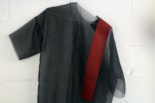
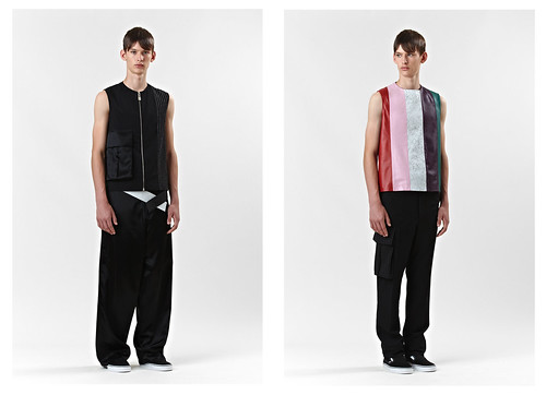
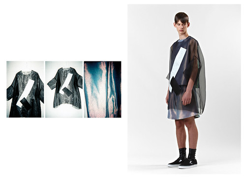
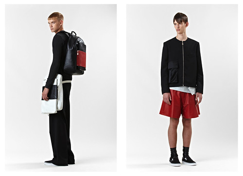
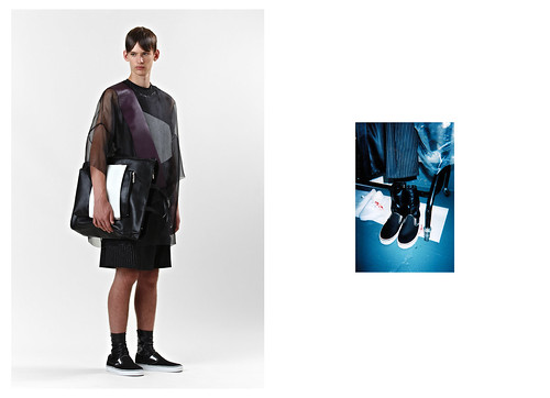
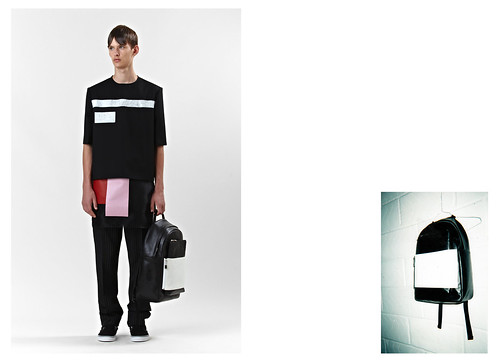
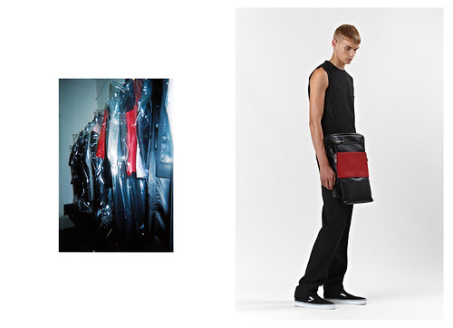
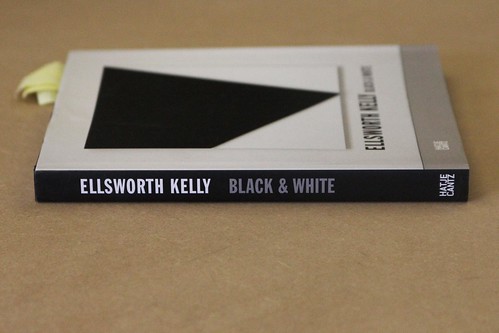
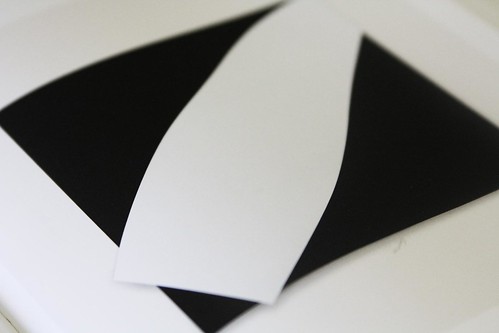
I developed my previous research of Ellsworth Kelly whilst extracting fresh elements and at the same time I became fascinated by the business men of Canary Wharf, seeing them on the tube in their pinstripe suits, trainers and a backpack. I wanted to take the tailoring and sportswear influences of the modern man and it all worked back to Kelly and his own fascination with everyday landscape. I too began to see these squares,” he explains. The result sees him transform a canvas of sheer nylon oversized t-shirts and sleeveless tops with appliquéd leather graphic elements alongside re-imagined superfine suiting fabrics. Thankfully the sartorial awkwardness of crisp tailoring mixed with gym kits is waved away by the expert hands of Talavera. Flimsy synthetic gym bags morph into luxurious objects of desire as the designer continues his fruitful collaboration with Eastpak and dull, tired, bedraggled commuter chic comes to life and reverberates with youthful energy. This is the designer applying his filter over everyday sights, just like Kelly did.

"I like to work from things that I see, whether they’re man-made or natural or a combination of the two… The things that I’m interested in have always been there. The idea of a shadow and a natural object has existed, like the shadow of the pyramids, or a rock and its shadow; I’m not interested in the texture of the rock, or that it is a rock, but in the mass of it, and its shadows," Ellsworth Kelly confided to Henry Geldzahler in 1964 in a piece for Art International 1. Surrounded by walls of Talavera product, the influence of the painter, sculptor and printmaker is plain to see. His rails mirror the artist’s masterly interplay of form, colour, and space. Moved by shapes he found in reality, Kelly’s perception is inspired by an object's external characteristics, taking interest in shadows and the texture of surfaces isolated from their contexts. Talavera’s eyes were similarly searching. "For me, inspiration will always come from what I see around me. It has to be grounded in reality. I'm drawn to subcultures, youth movements and ultimately street wear." Nicomede Talavera had explained in our last meeting. Having previously looked to the sartorial sights and cultural diversity of his childhood home of Hounslow he now looks to the commuting rat racers. A true mixologist of menswear, Talevera balances tailoring with sportswear and artistic form with function. Take a gulp.
IMG_9737
IMG_9730
IMG_9717
NICOMEDE TALAVERA SS14 LOOKBOOK_1
IMG_9692
IMG_9693
NICOMEDE TALAVERA SS14 LOOKBOOK_2
IMG_9642
IMG_9612
NICOMEDE TALAVERA SS14 LOOKBOOK_3
IMG_9656
IMG_9662
NICOMEDE TALAVERA SS14 LOOKBOOK_5
IMG_9664
IMG_9705
IMG_9701
NICOMEDE TALAVERA SS14 LOOKBOOK_6
IMG_9711
NICOMEDE TALAVERA SS14 LOOKBOOK_7
IMG_9635
IMG_9627
NICOMEDE TALAVERA SS14 LOOKBOOK_8
IMG_9604
IMG_9609
NICOMEDE TALAVERA SS14 LOOKBOOK_9
IMG_9626
NICOMEDE TALAVERA SS14 LOOKBOOK_10
IMG_9621
NICOMEDE TALAVERA SS14 LOOKBOOK_11
IMG_9603
NICOMEDE TALAVERA SS14 LOOKBOOK_13
IMG_9669
NICOMEDE TALAVERA SS14 LOOKBOOK_14
IMG_9594
NICOMEDE TALAVERA SS14 LOOKBOOK
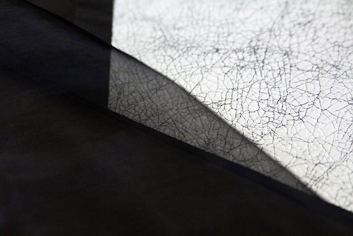
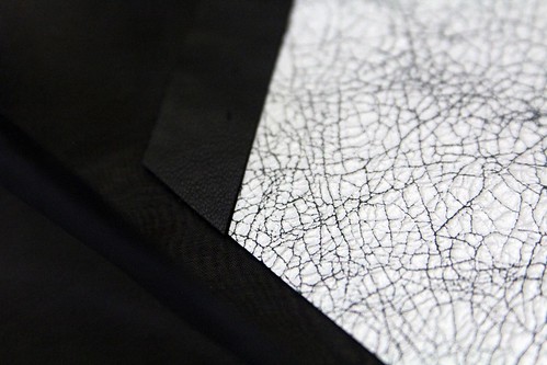
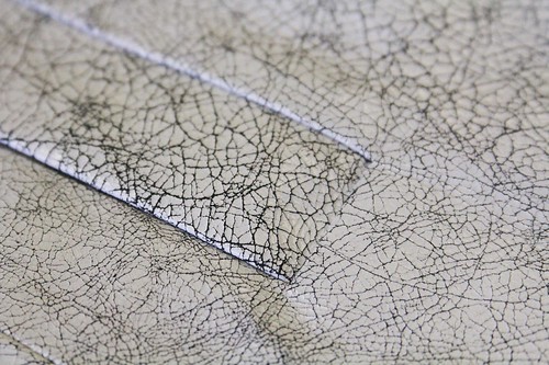
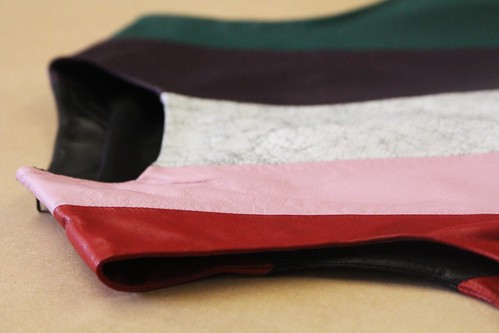
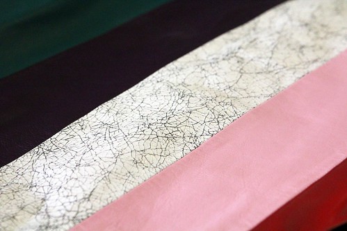
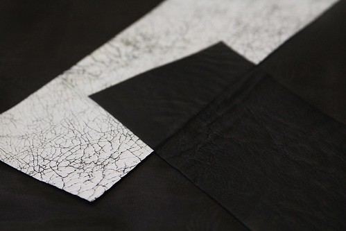
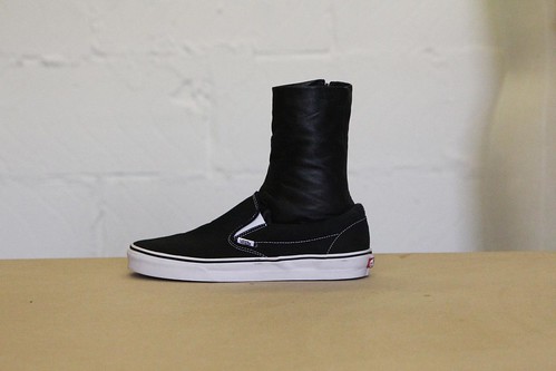
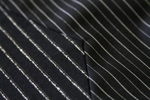
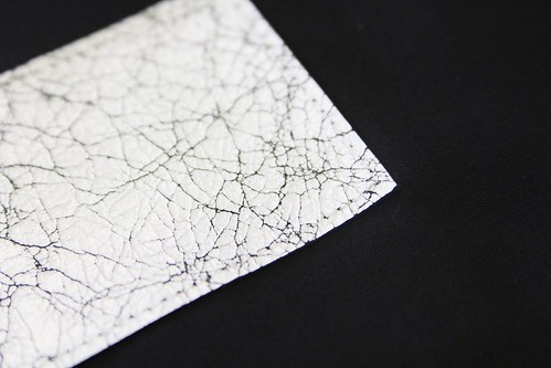
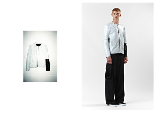
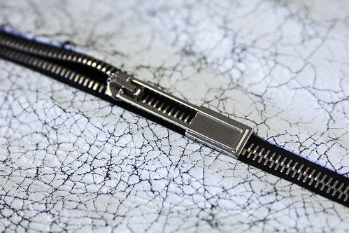
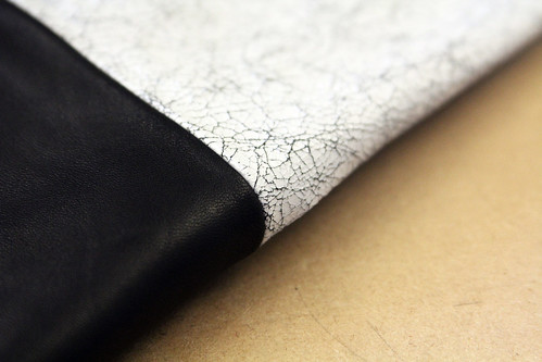
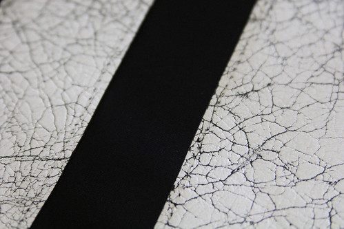
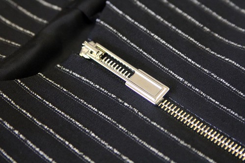
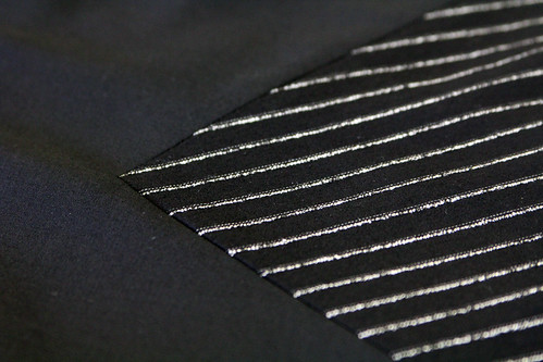
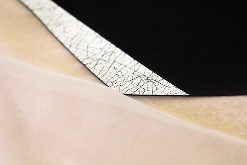
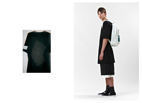
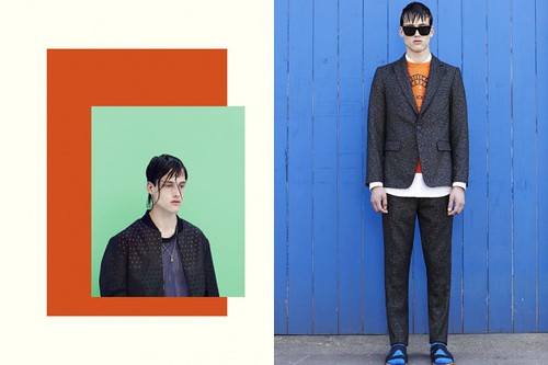
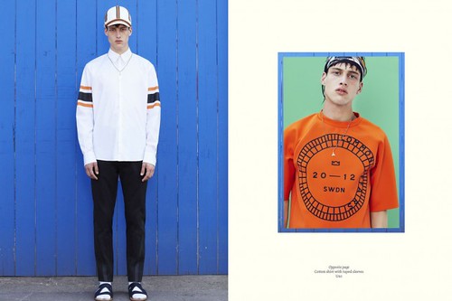
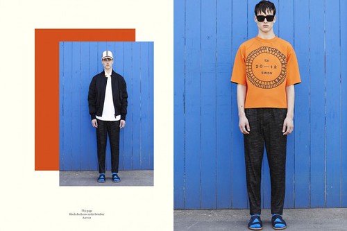
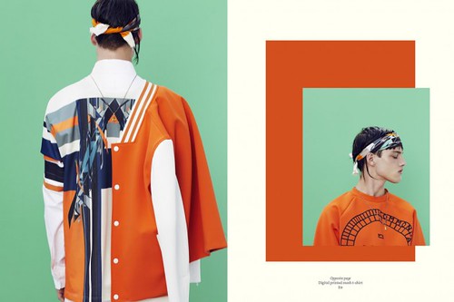
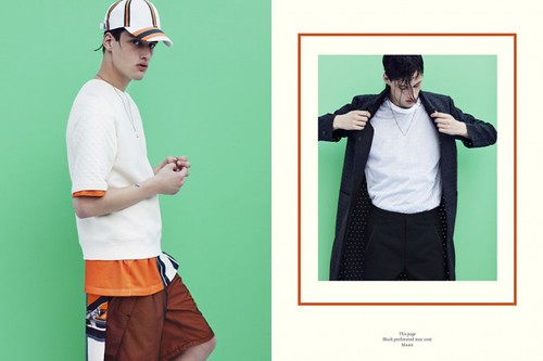
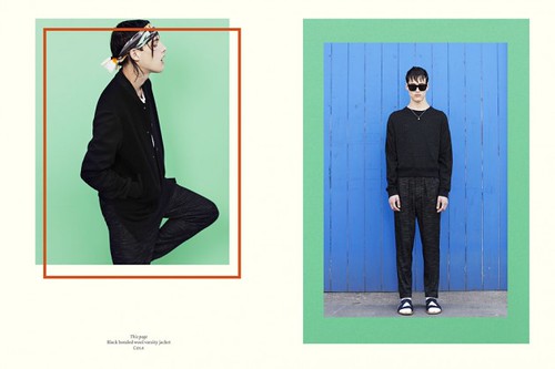
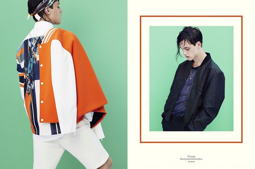
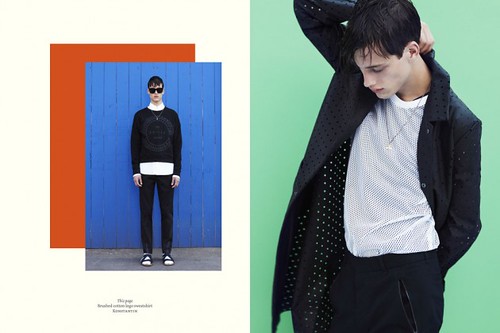
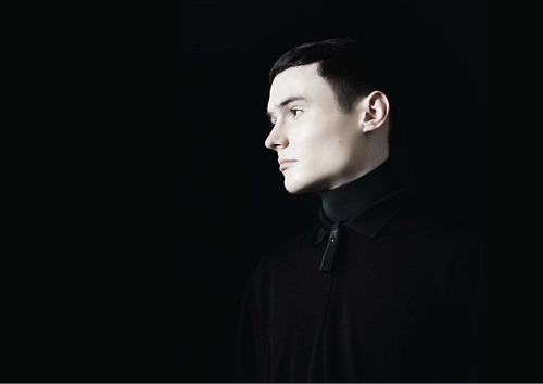
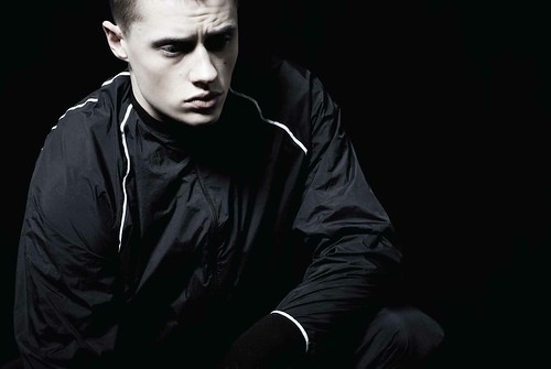
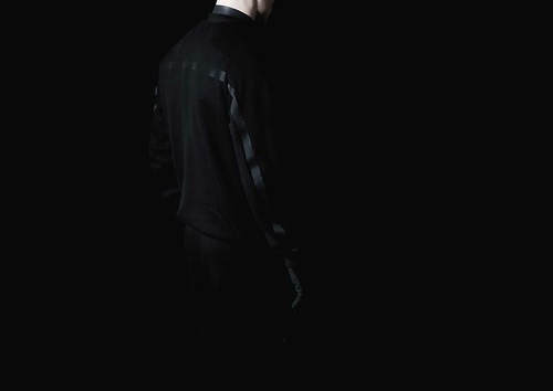
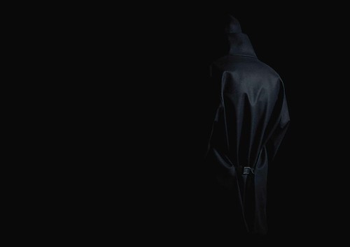
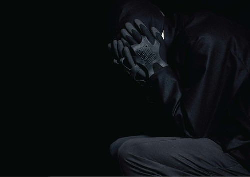
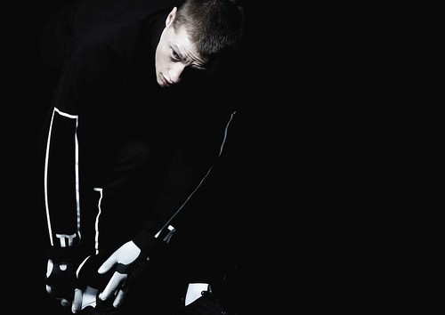
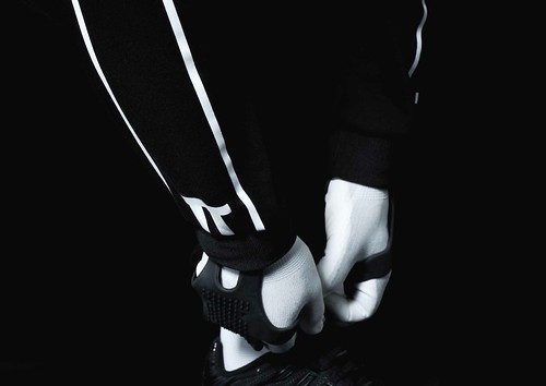
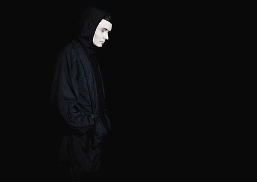
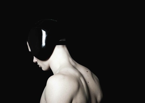
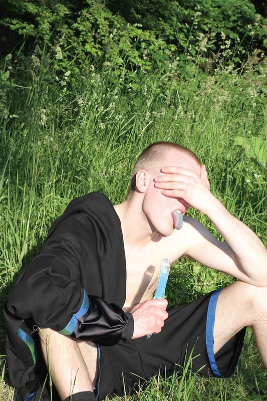
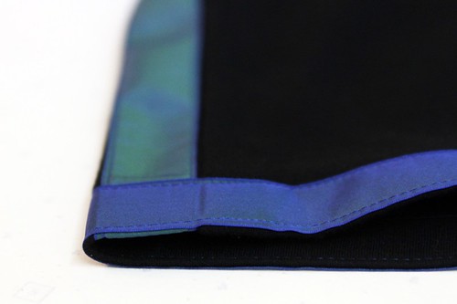
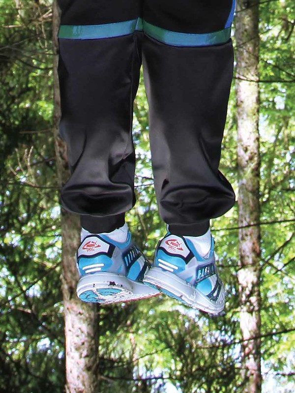
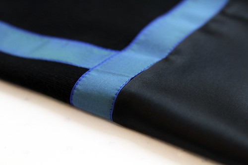
Detail photography alongside Nicomede Talavera's Andy Malone shot spring/summer 14 look book

From coated nappa leather cracking delicately to textural pinstriped suiting reinterpreted as long sleeved tailored tops and unexpected silk cargo pockets, the collection is rich in tactile treasure. Each piece has a sculptural quality. Everything has been masterfully realised by the creator's hand. Even the zips, so often uniform and ubiquitous are anything but here. "I contacted Lampo, a luxury zip maker, because they sponsored my BA collection and they expressed an interest in working together on an exclusive zip which was amazing. I looked to the work of Robert Morris because I've always been drawn to his square work, it was layering and de-layering, simplifying yet bold,” he animatedly explains whilst thumbing a puller. They provide the perfect functional finish to the outerwear and collaborative Eastpak accessories. Each and every detail has been carefully considered.

Looking through the Andy Malone shot look book alongside my own detail shots once again and having inspected the quality of the garments first hand, it is remarkable that this is Nicomede Talavera's first full collection. There's no limit to how far this talent can go. As ever, his own Van clad feet are fixed firmly to the ground.  "I’m looking to grow the label naturally, not to force it in the market before we’re ready. For this season, we're hoping to secure two exclusive clothing stockists, one London based and one in Asia," he declares. I'm in no doubt that he'll do that and more.

Friday, 23 August 2013

COMMON SS14

"We have known each other for a number of years and have been working together for the past four," Saif Bakir reminds us as he talks through the continued evolution of COMMON. Having met in the classrooms of LCF, a fruitful friendship between Bakir and Emma Hedlund has harvested a dynamic label that celebrates contractions, delights in dualism and cherishes clashes. "Our design process is very much integrated. On many occasions we end up thinking about the same thing or draw reference from same source of inspiration. It could be because we know each other so well or also because we both know what Common’s aesthetic is all about," he adds. Whether it's well tailored telepathy or just plain COMMON sense, the merged minds of Bakir and Hedlund create designs that are beautifully balanced, bouncing between minimal and maximal, tailored and casual, simple and complex. "A fusion of London edge, Paris chic and Scandinavian minimalism,’ is how the pair themselves describe the heady cocktail. Drink up.

Very few debut collections cause such a well deserved flutter as COMMON'S did for autumn/winter 12. Without doubt, the Lars Jonsson collaborative sparrow print exquisitely applied to bomber jackets set pulses soaring but it was the their mix of design cultures and desire to showcase local manufacture and craftsmanship that really captured our imagination. From this accomplished debut, the princely pair have pushed forward with a trio of collections that continue their narrative. "We want our collections to be able to sit together as one," adds Bakir. Their story is one under constant development and refinement and spring/summer 14 is the latest chapter to captivate. Entitled Let The Games Begin, the collection introduces us to a vibrant squad of athletic daydreamers clad in a hyper modern team uniform.

"Unlike our previous collection, we wanted to create something that felt lighter and brighter, we were influenced by an active season and lifestyle. We looked at friends and colleagues around us and we were inspired by their active way of life. We then looked into sports and drew inspiration from American sportswear and youth culture. We loved the idea of creating our own team colour and uniform.

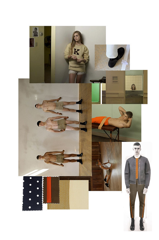
Our mood board was based around Rubins colour pallet mixed with images from Luke Smalley body of work including Gymnasium and Sunday Drive.  We took note from Smalley’s colour palette in Sunday Drive in particular. There were clippings from reference fabrics; perforated fabrics, Lightweight tech cotton, Mesh, Loop back Terry, Bonded neoprene, Boiled wool. Trims like heat seal tapes, press studs, water repellent zippers. During our design process we looked at textiles and techniques used in technical sportswear. We wanted to create the same effect and utilise some of the benefits these high-tech material. We also looked at different finishes in garments such as heat-sealed seams which we applied in a more decorative way making it part of the aesthetic of the garment as seen on our taped seam trouser Jurg..."

SS14 Mood (1)
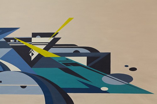
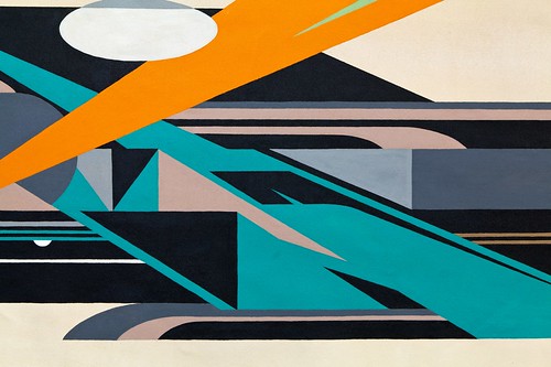
"From looking into youth culture and American sports we then into street art and current artists. We stumbled upon some of Rubin's work and we were immediately drawn to its modern, futuristic and abstract shape and style, it felt so right and perfect for want we wanted our SS14 collection to communicate. As Rubin is based in Brooklyn, NY we started off by sending him an email and he showed immediate interest in a collaboration. There was a constant exchange of mood boards and ideas during the following weeks. We sent him a colour pallet to work from but he had free reign to sketch and create two walls for us, which we later reworked into the current print."

_MG_7795-Edit-Edit
_MG_6961-Edit

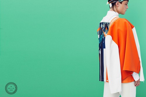
"The highlight colours were then picked up from Rubin’s signature use of pop colours. The result is a mix palette of muted, saturated colours of chalk white, cream, bronze and matt black combined with highlight of bright orange, azure and chroma green. We combined Rubin’s artwork with this season’s colours and stripes. The outcome is a futuristic print for a hyper modern team uniform. Rubin’s complex and futuristic shapes works perfectly with this seasons theme and mood and are a great complement to the modern and technical fabrics featured throughout the collection."

Ultimately, it's the label's real sense of collaboration in COMMON, both between the dynamic between the design duo themselves, their relationships with Swedish manufacturers and creative talent that they work with each season that really excites. From the Lars Jonsson collaborative sparrow print to Hans Krondahl's reimagined gallop design a creative coming together has pushed the label forward. For spring/summer 14 Common shines an abstract spotlight on street artist Rubin. Now, his majestic murals surface regularly in NYC on the streets of Brooklyn and the Bronx but his journey began in Gothenburg. Inspired by Beat Street, the concrete projects of Sweden were his first canvas and his latest are COMMOM's uniforms.

Throughout Let The Games Begin, Hedlund and Bakir balance their modern, sartorial elegance with sportswear fused and and technical focused elements. Muted minimalism is matched with vibrancy, simple lines with complex geometric shapes. Delve deeper into this season's duality with the Patrick Lindblom shot look book (just previewed on Highsnobiety)...

SS14 Sketches
COMMON-Spring-Summer-2014-lookbook-premiere-highsnobiety-07-630x420
COMMON-Spring-Summer-2014-lookbook-premiere-highsnobiety-02-630x420
COMMON-Spring-Summer-2014-lookbook-premiere-highsnobiety-08-630x420
COMMON-Spring-Summer-2014-lookbook-premiere-highsnobiety-04-630x420
COMMON-Spring-Summer-2014-lookbook-premiere-highsnobiety-03-630x420
COMMON-Spring-Summer-2014-lookbook-premiere-highsnobiety-05-630x420
COMMON-Spring-Summer-2014-lookbook-premiere-highsnobiety-06-630x420
COMMON-Spring-Summer-2014-lookbook-premiere-highsnobiety-01-630x420
COMMON-Spring-Summer-2014-lookbook-premiere-highsnobiety-09-630x420
Look book shot by Patrick Lindblom courtesy of Highsnobiety
----------

Collecting fans and players along the journey, this COMMON collection will continue to drive this enthralling label forward. Let the real games begin...

Tuesday, 6 August 2013

Discovering... Cottweiler

"It's difficult to pin down precisely when it launched," Matt Dainty confesses as he begins to talk me through the evolution of his shared concept-led menswear label, Cottweiler. "We had been designing and producing garments on a personal order basis for our mates and people that lived and worked around the area for quite a while before we were stocked anywhere," adds Ben Cottrell, the other half of its design duo. "We've only been wholesaling for two seasons and autumn/winter 13 is our first full collection going in to store. So for some people the label seems new, for others it's quite familiar," adds Dainty. Sentences might be fall from the label's mouths in Dainty's appropriated capital twang or Cottrell's West Country hum, it does not matter because they are always heard as one. From their small but perfectly formed studio squeezed into a railway arch in East London, the pair work tirelessly on growing the label in their own way and on their own terms. After first being introduced to the label on the rails of Primitive last year, my appetite to truly discover Cottweiler was whet. Serving up a feast of autumn/winter 13, spring/summer 14 and archive collections, the pair did not disappoint during my drive through visit to their studio.

"Cottweiler is driven by our friendship and what inspires us both. We've had quite different upbringings but there's so much common ground between us. We're both drawn to subculture, particularly British subculture and the label started as a creative process, an outlet from our day jobs in design and tailoring, Ben was on Savile Row for a number of years and Cottweiler enabled us to explore our love of sports and casual wear in a high end way. It was an organic process. It's stayed true to it. Looking back now over our first designs, there's been definitive continuation and evolution. We've not strayed too far from the original concept because it's been an organic process."

Meeting whilst studying Fashion and Textiles at Bristol University the pair were soon drawn to each another, swapping research inspirations and ultimately united by a shared desire to start a label with longevity that would challenge people to think about what they are wearing. Focused on simplicity, function, fit and fabrication, the resulting label deftly balances luxury fabrication and sportswear. Each Cottweiler collection is a smorgasbord of subculture, an intriguing mix iconographic references from youth movement, religious symbols, fetishism and the occult. In addition to producing seasonal collections, limited edition ranges and an ever growing made-to-measure client base, Cottweiler collaborates with cutting edge artists on projects across several mediums including film, photography and illustration.

"We practically spend twenty four hours a day together, we are always talking about next season, have a clear direction of what we want to do next. We are always looking ahead, sending each other images," begins Cottrell as he explains the effervescence of their design dynamic. "We do everything together, from bouncing around ideas at mood board stage to patterns and managing production right through to casting, commissioning look books and making the sample range here in the studio." adds Dainty.

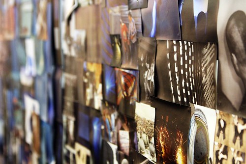
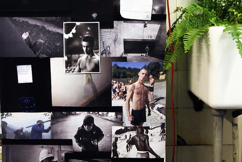
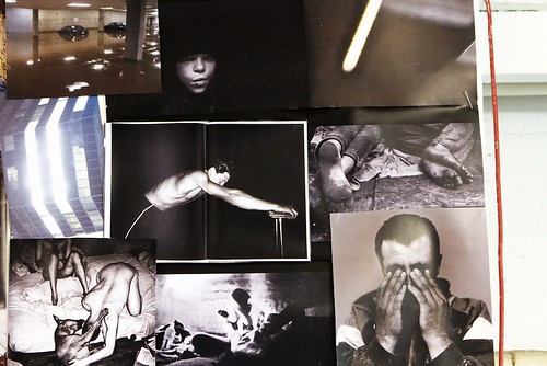
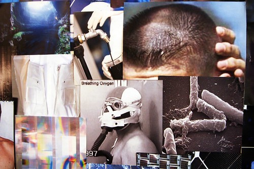
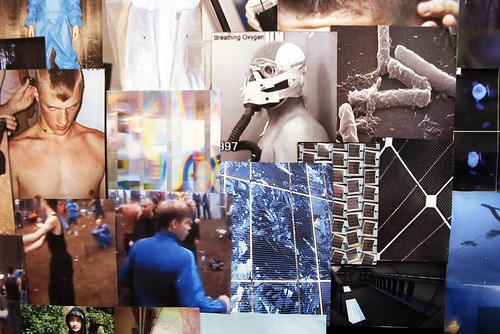
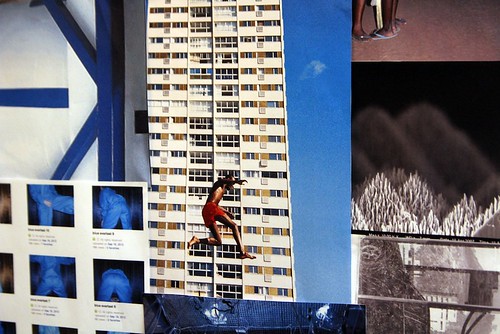
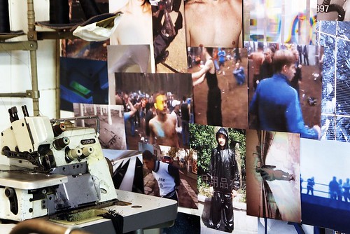
Aside from production which happens in a little factory a button's throw away from the studio, everything happens in their East London enclave. The pair are enveloped by Cotteiler. From mood boards drenched in bubbling subcultures to rails of garments, new and old, the collective heartbeat of the label races on. The last four seasons of research and campaign imagery stand together in unity. Their ideas mingle, merge and push one other forward. Their an aesthetic authenticity. Their curation of amateur photography and youtube screenshots sit seamlessly alongside subsequent look books. From prison codes to scuba diving, joyriders and tunnel dwellers to ravers, look into Cottweiler's kaleidoscope of inspiration below and on their tumblr.

IMG_0510
IMG_0496
IMG_0494
IMG_0502
IMG_0505
IMG_0512
IMG_0515
IMG_0522
IMG_0531
Snapshots of four seasons of Cottweiler's inspirations.

Away from the glare of London Collections: Men's spotlight and out of reach of the BFC's support (for now atleast), Cottweiler has forged its own path. First building up an enthused client base for personal and made-to-measure orders and then slowly but steadily adding a like-minded stockist list. "We've always enjoyed the personal order side because it's fun to offer something that's not on a rail and is made to their specific measurements," adds an excited Cottrell as he thumbs through an archive rail and imagines future fittings. "At the beginning it was the only way we could work because we didn't have stockists, there was no other option back then," confesses Dainty. "Now, it's great because alongside the key stockists that we have, a list that includes GR8 in Tokyo, Fragile in Osaka and Substance in California, there's a regular customer base who come in often. There's one guy who has the same cut of joggers in multiple fabrications, adding one or two each season. As the collections grow it can get a little crazy but it's fun. There's an investment, customers have to pick up the phone and come in to see us, the space could be perceived as intimidating in a number of ways so it takes a lot to come and place an order but it means they are truly passionate. For us, it's great to meet people and talk to them about product, how it's made and the thought and processes behind it."

"It's been gradual," echoes Cottrell. "We've not rushed ourselves to produce full collections and we've always stayed true to our original concept. Steadily the collections are growing and the technology of the fabric and finishing is being developed season on season. We are always looking to finish garments as cleanly as possible, minimal detailing. We look for supplier who can offer us something new. One day we'll have our own bonding and laser cutting machines," he declares triumphantly. "Fabric is so important to us," adds Dainty picking up the conversational baton. "We're both excited by performance fabrics and fabrics that still perform yet have the appearance of classic cloths. We've managed to build five core suppliers, some are in the UK and others in Germany, Switzerland and France, who will work with us in small quantities. The beauty of what we do is that we're drawn to a palette of black, blue and navy and most stock fabrics are in the hues we like so it makes our position easier, we tend to get everything that we want from these suppliers."

This appears to be the perfect moment to meet Cottweiler. Having lurked in the shadows of sportswear, developing and evolving collections as and when they've been ready to do so, the boys are about to step out as a fully defined, working label. Meeting the pair as they finish off production for their first full collection and close orders with their largest pool of stockists to date, they are ready to push on to the next level. Our excited eyes linger over the rail of autumn/winter 13.

"With a colour palette of black, white and carbon, Autumn/Winter 13 took inspiration from joyriders in Golf GTis and kids that live in tunnels under the streets of Eastern Europe," explains Dainty as he thumbs through the bonded tape sweatshirts, polo shirts that mix tech pique and mesh, tench coats in techno wool and hooded bibs in nylon and lycra before introducing me to the Aline and Jacqueline Tappia Reynaud shot look book.

COTTWEILER AW.13 LOOKBOOK_2
COTTWEILER AW.13 LOOKBOOK_3
COTTWEILER AW.13 LOOKBOOK_4
COTTWEILER AW.13 LOOKBOOK_5
COTTWEILER AW.13 LOOKBOOK_6
COTTWEILER AW.13 LOOKBOOK_8
COTTWEILER AW.13 LOOKBOOK_9
COTTWEILER AW.13 LOOKBOOK_10
COTTWEILER AW.13 LOOKBOOK_11
COTTWEILER AW.13 LOOKBOOK_12
COTTWEILER AW.13 LOOKBOOK_13

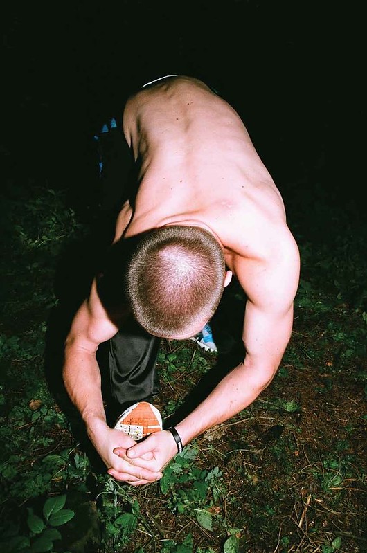
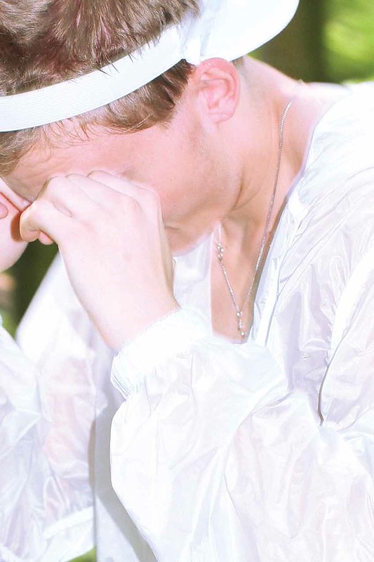
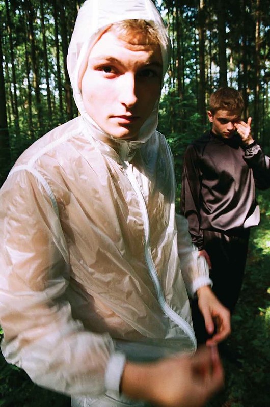
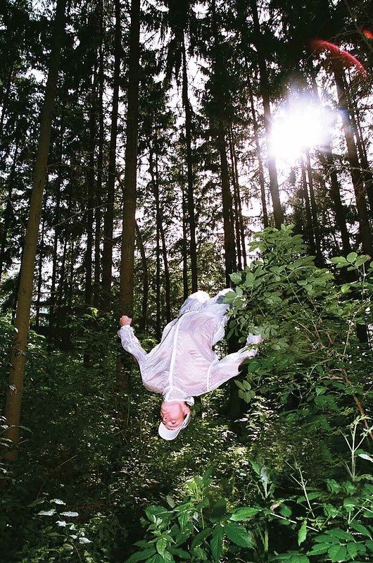
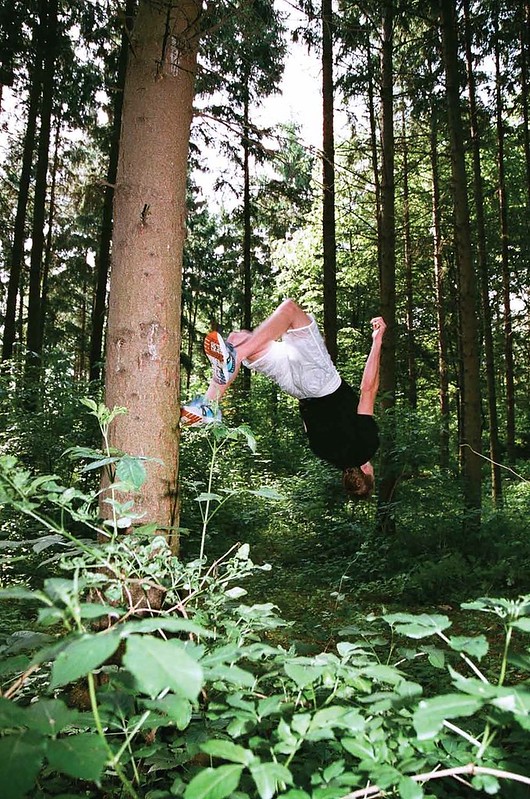
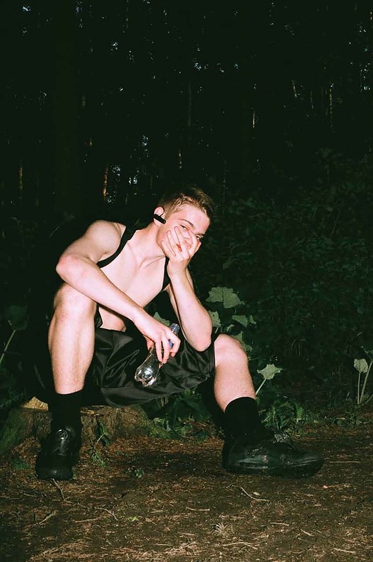
Taking inspiration from Central European forest raves, Cottweiler travelled to the Czech Republic for spring/summer 13 to work with artist and photographer Luis Artemio De Los Santos. Consisting of transparent shell suits, stretch satin sauna suits and the label's signature oversized jersey pieces, the hidden wildness of Prague proved the perfect setting.

"We had previously worked in studios trying to recreate an atmosphere for look books but this season we went to Prague with a photographer that we both hugely admire, Luis. We shot the collection on street cast parkour kids who were all part of a group that he'd be documenting for a number of years. We did an online casting and spent two days out there. it was the best shoot we've done because it was an amazing atmosphere, we went out into the forests, had a couple bottles of wine and just saw them naturally. Rather than recreate something, we shot something that was as real as a fashion shoot could possibly be. The photographer has been a massive inspiration ad influence, he just has a unique talent, he transcends this trend of net art because it's quite classic and possesses an unsaid quality. We hope to be working with him a lot more. over the next couple of years. It's great to meet someone, like our filmmaker Nick, who gets it. His skill is editing but he's an artist, the films evoke a feeling rather than show off garments," explains Dainty. "You don't have to explain or force the concept with these guys," adds Cottrell succinctly.
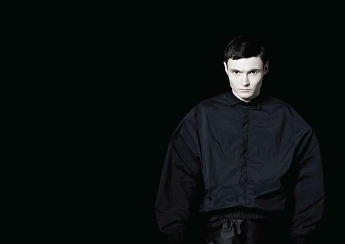
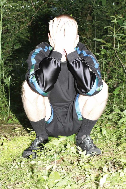
COTTWEILER SS.14 LOOKBOOK_1
IMG_0553
COTTWEILER SS.14 LOOKBOOK_2
COTTWEILER SS.14 LOOKBOOK_4
IMG_0565
COTTWEILER SS.14 LOOKBOOK_5
COTTWEILER SS.14 LOOKBOOK_8
IMG_0573
COTTWEILER SS.14 LOOKBOOK_10
IMG_0566
COTTWEILER SS.14 LOOKBOOK_11
IMG_0578
COTTWEILER SS.14 LOOKBOOK_13
COTTWEILER SS.14 LOOKBOOK_14
COTTWEILER SS.14 LOOKBOOK_16

"We've tried to develop the identity of Cottweiler without putting our names all over it. We are pretty anti-branding to be honest," admits Cottrell laughing. "That's how we dress as well, we are into sportswear but we'e not into swooshes and three stripes everywhere," adds Dainty. There is a subtlety to Cottweiler, their designs don't need a brash logo to be seen, they already stand out with their sportswear in luxury fabrics. They are just waiting to be discovered.

LinkWithin

Related Posts with Thumbnails