Showing posts with label Designers. Fabric. Show all posts

Tuesday, 12 February 2013

Details... Function and destruction

Upon the unveiling of his Spring/Summer 13 collection entitled Citations, Matthew Miller declared that "to create authenticity, beauty has to be destroyed" and invited the wearer to be part of the process. This morning, I grasped my chance. As part of their support of London Collections: Men, Mr. Porter collaborated with four designers who created four exclusive pieces. Drawn instantly to the shiny silver foil of Miller's creations, I could not resist the sweatshirt. I did however resist on pulling apart the pocket for the first couple of wears. That all changed this morning. Here are a few detail shots of before and after... 

IMG_0347
IMG_0360
IMG_0376
IMG_0368

Do I miss the red tab? I do a bit. Thankfully, always thinking, Miller provided a carabiner and key ring to utilise the removed strip to create a key fob. Function and destruction.

Monday, 24 December 2012

Inspired... Kit Neale AW13

"Fashion East Installations give the newest of the new in London menswear the chance to prove their worth in a group show of delicious controlled anarchy," proclaims Charlie Porter in the recent press release for autumn/winter 2013. Ever since they were introduced to the London fashion week schedule back in 2009, I've excitedly bounced from room to room inside its various incarnations uncovering the beautiful alongside the wonderful and even the unusual at every opportunity. The platform provides discovery at every turn for us whilst offering invaluable exposure for the designers themselves and often acts as a springboard for them. Nothing quite represents the diversity of London menswear design talent quite like the Fashion East Menswear Installations. Returning to the impressive and ornate Georgian townhouse in the heart of St. James’s alongside Meadham Kirchhoff, Bobby Abley, Joseph Turvey, Nasir Mazhar and Maarten van der Horst, Kit Neale will once again be a noisy neighbour to Buckingham Palace for the day.

Ever since I first stepped in to Kit Neale's dazzlingly printed world,  a cultural kaleidoscope that reimagined suburban and multicultural Britain, I've been eager to return. Despite being just over two weeks away from London Collections: Men, I couldn't resist popping by his new showroom cross studio located just off Shoreditch High Street for a sneak peek at how the new season is taking shape. Moving on from his Dad's allotment and the ever eccentric great British seaside, the emerging sartorial chronicler of our age looks to his design heroes and ends up sozzled in his local. Reviving him with the rustling of a bag of pork scratchings, Kit Neale talks us through his mood board and allows us to take a sip from his heady cocktail of influences...

"The real starting point was looking at three of my design heroes of Michael Clark, Ray Petri and Ernő Goldfinger. I'm always researching them. I'm obsessed. Ray Petri's 'Buffalo' book has pride of place in the studio, it's our bible and I always look through it and I know many other labels look to it as well. I'm really drawn to those Buffalo days and often look through my old issues of The Face and Arena Homme Plus. I think Petri, Goldfinder and Clark all have a level of influence over or appear in some way in every season but I wanted to delve a little deeper and fuse all three in to this collection but it wasn't possible to look at all three due to this being such a short season so I chose to focus on Clark. It's been a bit tight this season and this shows in the fact that the prints have just come back, the Friday before Christmas but I'm really pleased with them.

There's a film that Michael Clarke did with Leigh Bowery called Hail The New Puritan. It's a fake documentary, a mix of narrative, performance and fantasy. If you've not seen it, you really should watch it on youtube. The vivid colours of the film really inspired the prints for this season. There's one particular scene where they are in a typical British, slightly run down pub and the contrast and clash with these colourful characters is so intriguing. It led me to think about the role of the pub in society, they're a place where all types congregate and it also directed me to all of the pop references. I looked at so many names, signs and details of pubs but in the end we concentrated on The White Polar Bear and The Queen's Head. The prints combine the pub detailing with the vivid colours of the film and the movements of Michael's Clark's dance."

IMG_9543
IMG_9502
IMG_9532
IMG_9529
IMG_9519
IMG_9506
IMG_9599
IMG_9582
IMG_9564
IMG_9550
IMG_9570
IMG_9517
IMG_9489
IMG_9586
IMG_9590
IMG_9469
A few snapshots peering in to Kit Neale's mind.

Much like looking at Martin Parr's photography which can at first appear exaggerated, Kit Neale's plentiful prints fuse the familiar with the strange, the mundane with the extraordinary. Entering his presentation space last season I was instantly transported back home to the sandy beach of Margate and I'm looking forward to going off on a jaunt to one of the designer's locals to share a pint with his design heroes. What's your poison?

Wednesday, 19 December 2012

Inspired... William Richard Green AW13

As one of the designers headlining a new era in British menswear, William Richard Green continues to fuse his British influences with a willingness to celebrate the diversity amongst the well sourced manufacturers and suppliers of these rich isles. Over the last few seasons, each collection has showcased the craftsmanship of home grown British manufacturing whilst feeling anything but heritage. As so many have talked up the 'British-ness' of their products, Green has quietly and assuredly gone about his business of building relations with suppliers and crafting pieces that are decidedly British, both inside and out. "One of my points is that the collections are British made and predominantly use British fabric. Over the life of the label, I've amassed an extended family with the guys in Nottingham and beyond but working to the deadlines of the fashion calendar can be testing. They're all characters. I love spending time with them. I'd much rather visit them than go to your typical fashion party," confirms the designer before taking a sip of his early morning coffee.

For Spring/Summer 2013, the design talent celebrated 'Home' and explored the concept of Britishness, for Autumn/Winter 13 Green sartorially examines family. From dysfunctional households to his relationship with his suppliers to the points gangs, Green pores over and plays with ideas and dynamics of family. Before leaving his Old Street base for a day at the studio, the designer talks us through his collection of research images...

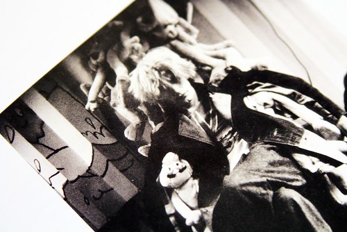
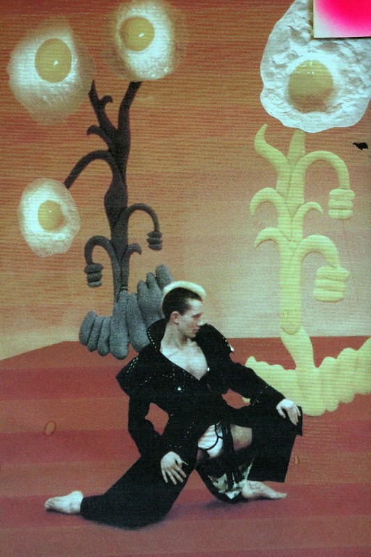
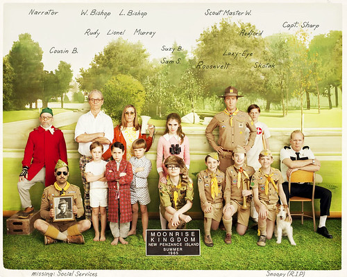
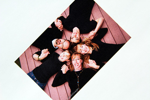
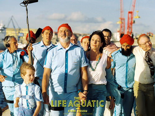
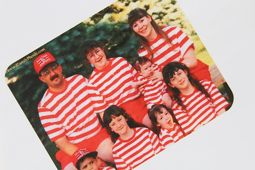
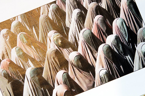
"I began thinking about odd family dynamics. My parents are in the process of deciding whether or not they want to sell the family home and move to Cornwall and there's a strange mood that's developed. My family are so close and it's full of real characters. I started by looking at Moonrise Kingdom. I don't tend to look at such obvious references but I just love how Wes Anderson's always creates these intriguing family set ups. His parents divorced at eight and I think that's one of the reason why, in every one of his films from The Royal Tenenbaums to the Life Aquatic, there's this idea of separation and dysfunctional love. I became obsessed at looking at family portraits, especially the awkward ones. I was looking at how people identify themselves through repetition and then searching for the odd bit of individuality and point of difference. 

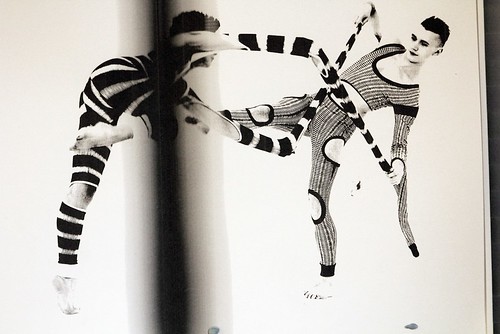
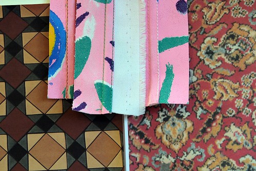
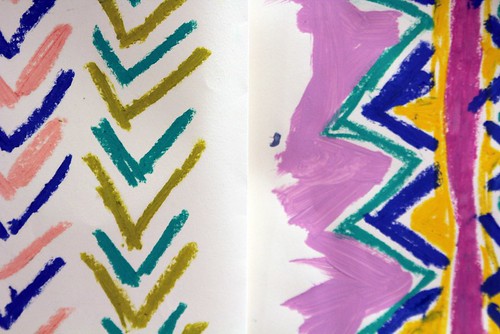
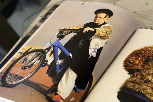
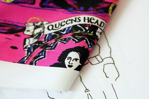
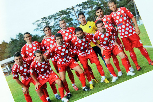
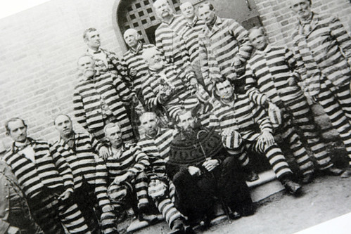
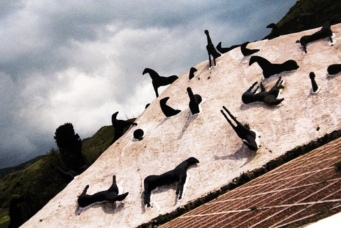
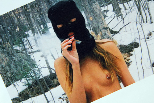
In the end, I've accumulated a vast number of images that all have an association with each other through pattern and clothing. From the uniforms of gangs to football kits that were ridiculed by friends to Lucky Luke. I've always loved Lucky Luke. Whilst I was at Central Saint Martins, I did a big project around it. I just love how clumsy the lines are and how graphic it is.

I'm really looking forward to showing this season. I'm in the process of working on a film with Morgan O'Donovan that will help tell the story of the different characters in the collection. As long as the garments come back from the factories in time, we'll be shooting between Christmas and New Year in the countryside. Despite the early start for this season I'm prepared and just waiting on production."

IMG_9374
IMG_9412

IMG_9398
The-Life-Aquatic
IMG_9376
IMG_9394
IMG_9408
IMG_9396
IMG_9377
IMG_9406
IMG_9405
IMG_9401
A snapshot of William Richard Green's visual research for AW13.
----------

Monday, 30 July 2012

Baartmans & Siegel 'Cuban Crab Catchers' SS13

B&S_SS13_Feature Button

"We wanted the SS13 collection to feel romantic, effortless and to take you on a journey," purrs Amber Siegel as she stands in the label's PR showroom and reflects on Baartmans and Siegel's on schedule debut. From the moment we excitedly showcased the degree collections of the Dutch/English design halves that make up the label we knew we had discovered a couple of gems. Self described as modern-traditionalists, Wouter Baartmans and Amber Siegel’s work focuses on beautiful fabrics that seduce, and shapes that are accessible yet distinctive. In a few short seasons the talented pair have developed a signature of innovative, refined menswear that balances wearability with a heightened luxury and irresistible tactility. Their designs are made to be worn, stroked and loved. Building on this success and in front of the eager audience of London Collections: Men, the duo delivered a sumptuous presentation that had us all daydreaming of beach holiday. Rather than merely reminisce about my summers spent on the golden sands of Margate aimlessly searching in vain for the smallest of crabs as they lurked in the pool, Baartmans and Siegel take my outstretched hand and whisk me off across the Atlantic to watch the (tongue twist worthy) Cuban Crab Catchers in action. Here Siegel introduces the collection as we reach out to play with the crustaceans and revel in the subtle beauty of faded glory...

"We really enjoyed the recent Autumn/Winter collection because it was dark and textural but we wanted to completely change for this Spring/Summer and to have fun with new fabrics, we really pushed it. We were watching a documentary on Cuban crabs who cross from one side of the island to the other and we were inspired by this blanket of movement captured on the show. A journey of thousands of crustaceans shelled in blue, pink and coral and just so tropical. We were then drawn in to Cuban marine culture, their fishing styles and then on to the nostalgic faded Miami feel of Cuba and the countries links with the work of Hemingway. We were keen on marrying the relaxed atmosphere of the island with the nostalgic hues and colours, mixed cultural influences and retro styles. Working away in our studio on Mare Street we daydreamed of being transported to the Deco Raleigh Hotel in Miami Beach or room 511 of Hotel Ambos Mundos in Havana where Hemingway stayed in the 1930s. 

We really like the idea of faded glory whilst still creating something that is playful and vibrant. Along with the palette, this is probably best seen in our use of the reverse side of skins which creates a softer effect. There's a lot of texture with snake, crocodile, jacquard, abstract leopard print. Elsewhere, we stayed true to theme throughout for example we have scalloped knitwear, coral and ocean scene prints and the buttons are Bakelite to keep that 50s feel. Looking at the collection again now, it's clear that ultimately we want a holiday but unfortunately the closest we got to Cuba was the documentary."

IMG_1496
IMG_8324
IMG_8240
IMG_1470
IMG_8228
37_baartmanssiegel007
IMG_8223
37_baartmanssiegel002
IMG_8278
37_baartmanssiegel001
IMG_8236
37_baartmanssiegel014
IMG_8263
IMG_8247
37_baartmanssiegel006
IMG_8301
IMG_8291
37_baartmanssiegel008_v2
IMG_8333
37_baartmanssiegel004_v2
IMG_8266
My own shots from the presentation and a few detail shots alongside the official look book by Simon Armstrong.

"This season we wanted it to feel frivolous, playful and to express a sense of freedom in every sense," Siegel states as she bounces from piece to piece on the collection rail. "Given that we were part of the new platform of London Collections: Men we were keen on showing something that was equally as fresh." Fresh it most certainly is. Subtle yet complex, muted yet full of colour and life, boundary pushing yet wearable. Just looking over the above array of shots my nostrils are filled with sea air and my limbs are longing to jump in to a beachside pool in Miami. Unsurprisingly, I'm not the only one who fell for the charms of this season as Siegel explains; "Obviously this was our first time on schedule and we were unsure how we'd be received but we were blown away. The format worked really well because you could see the texture, from the knitwear to the broderie anglaise. On a quick flash of a catwalk some of the details may have been lost but the presentation enabled people to take a long and close look." I love a considered presentation format that allows time to really digest the designs and Baartmans and Siegel delivered a collection that had me reaching for my net and dreaming about a holiday.

LinkWithin

Related Posts with Thumbnails