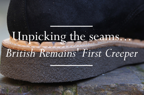
Following years of discussion centred around aspects of Britain that they like, hate and mourn, Daryl Saunders and Andrew Bunney launched British Remains. Unveiled last summer, the debut range of t shirts and totes set the tone by celebrating facets of Britain and localised symbols that would ordinarily not be known outside of these shores. Amongst the neglected and the forgotten rubble of Britain, London brickwork, toilet signage and Generation X were all highlighted. In offerings since, the pair have focused their design attention on the Royal Wedding and most recently celebrated the sneering youth spirit of 'them' and 'us'. For AW11, they reveal their first shoe - First Creeper.
Adopted by various youth tribes and factions of the British underground throughout the last half century, the wonderfully named shoe still has the ability to excite by providing quite the visual statement. A heady mix of comfort and rebellion. Traditionally a suede shoe with thick crepe soles, the creeper was borne out of necessity in the years following World War II. British soldiers returning from the desert wars had worn suede boots to which they had attached improvised rubber soles made from old rubber tyres. It is a Mary Shelley tale of a shoe. Returning to London, unsurprisingly the ex-soldiers were attracted to the most desirable undesirable “night spots”of Kings Cross and Soho. As they found their pleasure, they were still wearing this rubber sole footwear or derivatives that had been put together by their cobblers. Creeping around brothels was enough to give the shoes their name. Now, the brothel creeper immediately evokes images of youth, musical movements and hints at the more rebellious corners of society.
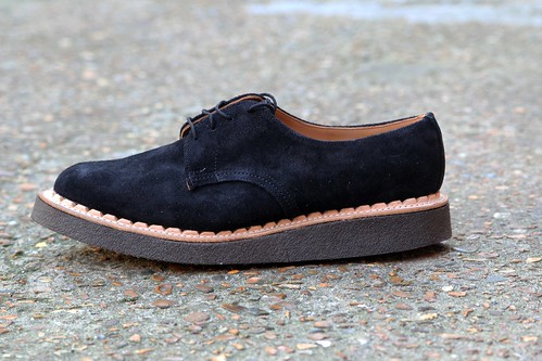
With the mere mention of brothel creepers today, one immediately thinks of George Cox. Therefore, it should come as little surprise that the First Creeper was made in its spiritual home. In 1906, George James Cox founded his shoe company in the heart of England's traditional shoe making region, Northamptonshire. Crafting high quality traditional footwear at first, the company quickly gained fame for the iconic styles that would come to inspire generation after generation of subcultures. From the brothel creepers of the 1950s to the winkle pickers of the 1960s, George Cox have still produce delightful underground styles. Not interested in costume, British Remains wanted to create a creeper that stayed true its tradition whilst making creating a far more accessible shoe. With the thick crepe sole and aggressive notched leather welt softened by the simple suede leather derby upper, their First Creeper undoubtedly pulls it off. From the moment Bunney posted an image of the initial sample back in May over on honeyee, I just knew my ever growing shoe collection needed them. I've obsessed and dreamed about them ever since. Yesterday, following a quick visit to Goodhood my feet's dreams came true. To mark this happy moment and even before I took them out for a pavement stomp, I caught up with Bunney to learn more about my latest fixation...
----------
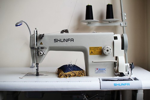
British Remains' First Creeper
SS: The First Creeper marks British Remains' first foray in to footwear design. What attracted you to the creeper?
Andrew Bunney: As the name suggests, the label is an exploration into the rubble of Britain. Amongst the neglected and the forgotten there are often gems, and the Creeper shoe represents something really exciting. The nature and shape of the shoe, the nefarious associations that it had, and connotations today make it something quite challenging to wear.
SS: What was your starting point/initial inspiration?
Andrew Bunney: Thinking about British style and British youth cultures, there is always an exciting moment where the looks start to merge and change into something new. What I believe in is creating products that different kinds of people can wear in their own unique way, something that I've done throughout my career. To make something with character that captures the imagination of people into all kinds of things is very special.
SS: Could you talk us through your research and how it impacted on the design? For example, I recall that you mentioned that the sole is the same height as many vintage styles.
Andrew Bunney: It's always interesting to see how things have progressed or changed over the years, and many of the creeper soles today are very high - very cartoon-ish. The classic styles didn't always have soles this high, and of course the idea was always to make this more accessible for today. We used the same height of sole that was used in the past, which would have been sold in places like 'Let It Rock' - one of the most important places for styles to butt up against one another.
SS: How did you go about stamping your take on this iconic shoe?
Andrew Bunney: The most important thing is to push forward - we're not interested in making costume. There are many things I like about vintage Creeper styles, but I want to make something that is relevant to what we're wearing today. The thick sole or aggressive looking welt are very much a 'Creeper', but the simple derby upper makes it much more wearable, and more modern.
SS: Craft and local manufacture are obviously very important to you. Collaboration with local craftsmen and heritage is an integral facet of your brand identity. Here you teamed up with George Cox, how did you identify the individuals to help realise your design?
Andrew Bunney: In some ways today, I think many have lost sight of the manufacturer or have a very hazy understanding of what that means. Of course, we want to find the best factory or the manufacturer for anything that we're making. Despite the many copies by other brands, this style is synonymous with the manufacturer George Cox - there is no other company to go to. However, I don't really think of this as a collaboration - simply using the 'correct' place to make a certain product.
SS: What items can we look forward to in the near and far future from British Remains?
Andrew Bunney: We want to make things that are surprising, and things that make one think a little. It's not interesting to make something unwearable, but for those that are sensitive to details, something challenging - even if it is slight - makes you feel a little more alive.
----------
I could happily listen to Bunney all day, everyday. Following this discussion I could only love my latest acquisition even more. This morning, I took a closer look at them before eagerly jumping straight in to them for the first time...
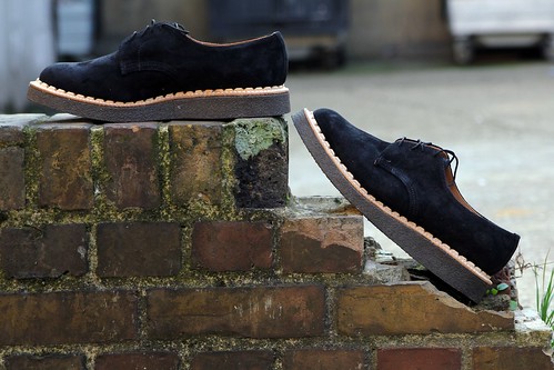
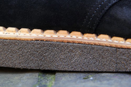
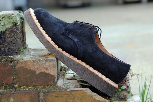
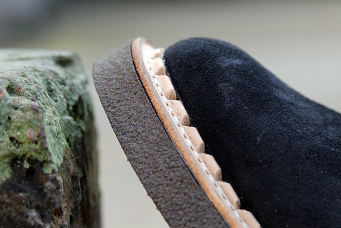
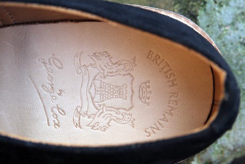
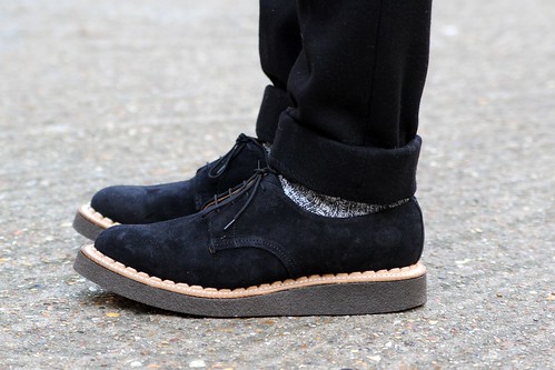
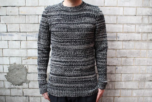
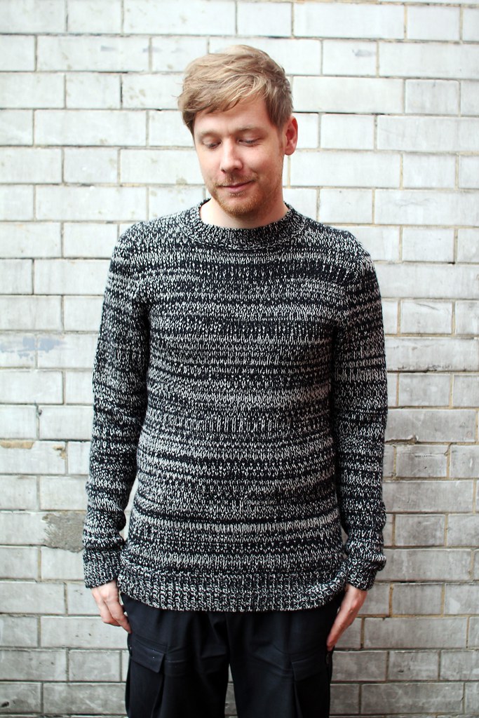
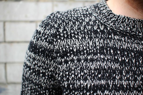
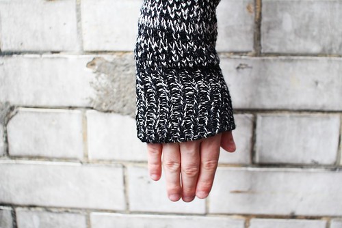
A closer look ar British Remains' First Creeper with the help of a few detail shots. In the last shot, I teamed them up with black wool trousers by Topman Design and socks by Wigwam.
Through tits exploration of Britain, past and present, British Remains stirs up odd feelings about this island of ours. What it means to be British, what it once meant and how it has evolved. The class struggle, the rise and fall of subcultures, everyday symbols that are often overlooked. These are all things that make Britain so interesting. With its gradual evolution, I'm looking forward to watching this label continue to grow.