Sunday, 20 November 2011

Weekend Reading... A long sit down with LAW

IMG_2576

Just one week ago I poured myself a cuppa and excitedly flicked through two printed finds, LAW and The Travel Almanac. As the latter has received a fair bit of attention already, I'd like to return to the former. LAW is a platform to portray the beautiful in the everyday. This limited edition bi-annual magazine revels in revealing what others miss. A self titled 'bomb shelter for creative collaboration between the talented youth of today with grit in their teeth and something to say.' For its editor John Holt, style is everywhere. Far away from a runway or glossy publication, it can be an act or a gesture, an accent or slang. It is simply everywhere, all one has to do is look. To help fund the title, John Holt sold his dream car, a 1974 Ford Escort Mark 1. Fittingly, a classic of British style sacrificed to celebrate the wider everyday. LAW is a title concerned with documenting the over looked and giving people a sense of belonging and recognition that they ordinarily might not receive. The aim is to make fashion accessible by challenging perception that it's an elitist world by showing that it surrounds us all. Throughout its fifty three page, it pauses to shine the spotlight on a patchwork of everyday eye catchers including passionate shop owners, matchmakers, tailors, brand devotees, dilapidated funparks and cursed football kits.

In amongst the grey concrete walls, LAW is a window to the world of of the current and undercurrent. A cross section of people, places and items that others blindly walk past, making it even more important to document. The bi-annual shines the spotlight on facets of Britain and localised symbols that would ordinarily not be known outside of these shores. Lets press our noses to the glasses and see...

IMG_2578
John Holt sold his dream car, a 1974 Ford Escort Mark 1, to make his dream magazine. A classic of British style sacrificed to celebrate the wider everyday.

IMG_2581
The featured sneaker collection of Rob Prentice. "There's almost a Nike culture in sneaker collecting", he notes with a smile. From ebay finds to splurges, this collection details Prentice pure elation for kicks.

IMG_2583
Forgotten dreams of an English Summer featuring Christopher Shannon and Air Max 90s.

IMG_2585
Dean Powell's Adidas archive. "When I was a kid everybody had Adidas Santiago football boots and I think the first trainers I had were black and white Adidas Kick." Three stripes, a wealth of knowledge and a fortune of stories.

IMG_2588
Shirley Webb's editorial is close to home. Dreamland is a waiting to be restored themepark in my hometown of Margate. 

IMG_2590
The famous grey Manchester United away shirt. United's record in this kit was as follows. Lost 4 and Drew 1.  A furious Ferguson demand that his team change out of it at halftime at The Dell. They were 3-0 down at Southampton. 

IMG_2592
From Dave Imms series Butchers.

IMG_2594
Giles Peacock has kept every pair of boots he has worn since he was seven. Above is a just a taster of the collection.

IMG_2595
Beauty in the everyday right through to the back page. LAW's pebble dash print.

Here's hoping that LAW will continue to archive real characters and document a cacophony of historic British traces as they shift, evolve and disappear from our surroundings. I'll leave you with words uttered by Jason Evans...

"I differentiate between fashion and style, I think fashion is an industry and style is an inherent quality and I'm much more interested in style than fashion"

Friday, 18 November 2011

The Documentary And A Dream AW11

IMG_8306

The Autumn/Winter 2011 edition of J. Lindeberg's ‘The Documentary and A Dream’ is the fifth in their series of Biannual Books. The weighty publication was borne out of the desire to tell the complete story of the brand and share their thoughts and values on a level beyond commercial aspects of marketing principles. Each season creatives from various disciplines are invited to freely interpret the seasonal collection and capture a particular theme within the spirit of J. Lindeberg. Here, the talented team have strived to capture the dualism that the label revels in. The quintessentially Scandinavian competing and complimenting the quintessentially continental. Hard clashes with soft, worn against new to create fascinating encounters.

Once again, the contributors list is an impressive one. Joining Creative Director Jörgen Ringstrand are new collaborators David St John-James, Robbie Spencer, Gerry Johansson and Carlotta Manaigo working alongside existing team members including Olivier Zahm, Skye Parrot, Andreas Sjödin, Carl-Johan Paulin, Hannes Hetta, Marine Braunschvig, Marcus Dunberg, Göran Åkestam, Tinka Luiga, Eric Guillemain, Andreas Carlsbecker and Lars Johnson.

The book was launched last night in J. Lindeberg's stunning office and showroom. Now that the hangover sets in and memories of toasting the book thump around my brain, I'm fully aware that the book has now been released. This fifth edition is now available to view at J. Lindeberg stores and online. The narrative it weaves is one that expands way beyond the realms of the standard look book and runway views we are all accustomed to seeing. Throughout the book you are treated to inspiring art works, collages, interviews and an array of wonderful imagery. However, before you go and thumb through it I'd like to share a few of my favourite pages with you...

IMG_1009-Redigera-Redigera
_MG_7929-Redigera-Redigera
OZ_LINDEBERG_CF025436_Adb98
OZ_LINDEBERG_CF025155_Adb98
19_110520_JL_009
Book images supplied by J. Lindeberg. The full book is now available online to view.

Tuesday, 15 November 2011

Treasured Items... Dapper Kid

The much appreciated art of wardrobe building is not a fast or haphazard activity: instead it is developed and nurtured over time. Now, as you all know, the ever changing pursuit of building the perfect wardrobe is a lifelong one and wholly personal. Of course, there will be the odd irrational purchase or taste questioning gift but over time these and desire will be forgotten and you'll be left with a true indication of your style and a wardrobe of items that perfectly balance need, function and desire. A wardrobe to be savoured and enjoyed is much more than a piece of future housing hanging possessions. Clothing is there to be worn but items should be filled with emotion and narrative. Over the course of the Summer, our fellow blogger dapper kid, found himself disassociated with his own wardrobe and embarked on crafting a new one (more on this endeavour here). After purging ninety five per cent of his possession, dapper kid was left with a core set of things that he actually found some personal value in. A solid core to build on. So, we thought now was the perfect moment to ask him to reveal his most treasured of items...   

----------

Dapper Kid and the 'Cheeky Monkey' sweater

IMG_2800

"The garment in my wardrobe that I cherish most is one that I never actually wear. Not because it is too precious to be worn, but because it is a sweater made for a two year old, which does present slight issues for a six foot frame. It is a bright red acrylic sweater with an image of a yellow primate and the words "Cheeky Monkey" sewn on in the form of a patch. Aside from family photographs and my memory box, it is the only material object I own that I would go out of my way to save from a fire."
----------

Dapper Kid and the new wardrobe

IMG_2801

"In terms of garments that I actually wear, the item I treasure most is perhaps not the most interesting or exciting I own, but it is one I view as marking a personal turning point. The piece is a long black hoody from the first Silent by Damir Doma collection. It serves as a reminder of a feeling and a decision.

I got to a point where I looked at my possessions, and whilst certain garments or objects triggered associated memories, they were in and of themselves entirely meaningless to me. They were garments that were nice enough, but they were not ones I loved. I was not happy with the idea of owning so many things that I could essentially do without, so I got rid of it all. I gave away, donated and sold 95% of my possessions, trying to edit down to a core set of things that I actually found some personal value in. I would rather own only a handful of things that I truly cherish, than a house full of things that are 'nice enough'. The hoody was one of those items I found value in. Even when I stop wearing it I intend to keep it as a reminder to myself that sometimes a little less can be better than a little more." Dapper Kid
----------

Christopher O'Brien AW11

O'Brien Feature Button

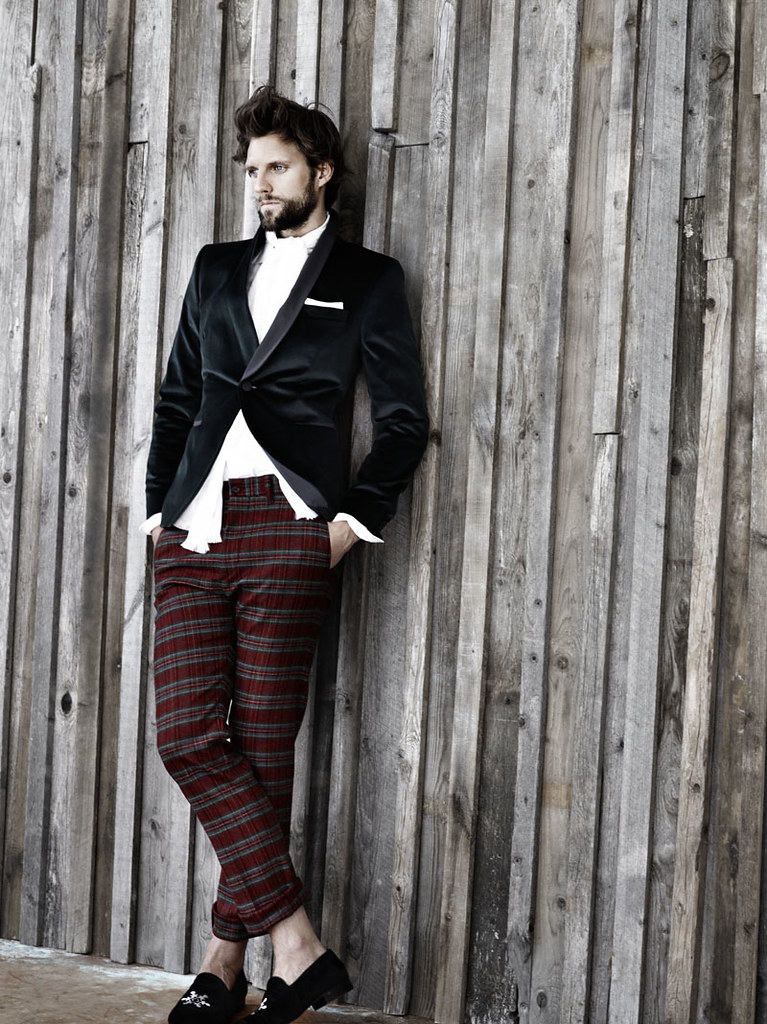
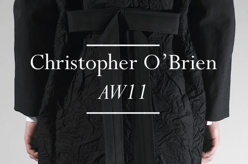
Each year the various graduate shows scattered throughout the calendar and country remind us all that there is so much young talent out there in the UK. For us, there is little better than discovering it before watching it develop with us. However, despite our ever present eagerness a few talents are missed. Now, Central Saint Martins' MA graduate show is undoubtedly one of the most exciting places to discover the fashion stars of the future but this years crop passed me by. Months have passed since the show and I've only just stumbled across the obvious talent of Christopher O'Brien thanks to the designer's pro activeness and a keen buy from LN-CC. O'Brien's crinkled, minimal wardrobe of well tailored staples might have slipped past my blogging radar but it certainly caught the trained retail eye of John Skelton who duly bought the collection for his forward thinking store. 

As well as working as a freelance stylist and costume designer during his studies at Central Saint Martins, O’Brien honed his skills with placements at Jonathan Saunders, Jens Laugesen and E. Tautz. That's quite the education and the fruits of these experiences and influences can be seen in his accomplished MA graduate collection. At its wrinkled heart the abstraction of the male silhouette through the manipulation of fabric and layering in a distinctive yet restrained manner. The use of distressed and crinkled fabrics throughout his accomplished graduate collection creates individual subtleties and sense of life. I'm instantly reminded of the collection that saw Christopher Bailey emerge as one of the best menswear designers of his generation, Burberry's Cumpled Classics collection for SS09. However, here the real spirit of the collection is grounded in ideals of minimalist menswear and traditional tailoring but O'Brien develops the theme by exploring the creative potential of inherited shapes and textures. Before we take a look at the collection itself, we had to sit down with the designer to learn more about his work and his hopes for the future.
----------

SS: What were your inspirations, your dreams and the driving catalyst for launching Christopher O'Brien?
Christopher O'Brien: I think there are a few reasons for starting Christopher O'Brien, chance being a big factor in that John Skelton saw my look book and decided to stock my collection. I also think that my drive comes form proving certain people wrong that told me I wouldn't do it. My inspirations and reason for Christopher O'Brien is to hopefully gain recognition within the industry and for people to like what I do.

SS: Aside from it being your name, what does Christopher O'Brien mean to you?
Christopher O'Brien: I'm not to precious about myself, I am lucky enough to enjoy my career and hope that Christopher O'Brien develops into something natural and easy for people to connect with.

SS: Describe the moment you realized you wanted to be a menswear designer?
Christopher O'Brien: I started out as a womenswear designer and always had a very androgynous style that I felt would suit men. It was while I was working for Jens Laugesen that I decided I would be a lot more comfortable if I transferred to menswear so I applied the the MA to help me build a portfolio.

SS: What were the first and last items you remember designing?
Christopher O'Brien: The first thing was a very tragic dress made out of orange peel, I was on an Art and  Design foundation and it seamed like a good idea (at the time). The last thing, tech pieces for E. Tautz

SS: While studying for your MA in menswear design, you worked as an intern for large periods of time for Jonathan Saunders and Giorgio Armani. More recently, you worked for design advisor firm Jens Laugesen and as you were about to graduate, you worked for E. Tautz who duly offered you a designing position. What did these experiences teach you? How did these experience shape you as a designer?
Christopher O'Brien: I think that internships are a very important part to your education, I learnt more at Jonathan's in my spell there than probably my whole BA, it is reality and shows you how the industry really works. I wasn't actually going to go to my interview at Jens because I thought I had bagged a job at Jil Sander but it was probably the best career move I ever made as Jil fell through and I think I learnt so much more working in close proximity to him than I ever would in a big company. He was a very demanding boss but helped me to develop my design process more than anyone, we constantly worked on different projects. I think he is a true designer in the sense that every project we did was integral and stuck to a concept. In terms of how these experiences have shaped me, I think they taught me a pretty good work ethic, and just to try things, if they don't work, move on and don't worry.

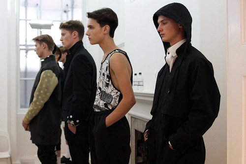
SS: In your eponymous debut collection, you take a progressive stance on conventions of layering and minimalism, and draws on influences from art to sportswear to photography. Can you talk us through the inspiration for the collection?
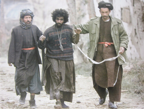
Christopher O'Brien: The main point of inspiration was a photo of some refugees in the paper, I just really liked the different layers they were wearing and it made me think about the way we wear clothes. When we put a jacket or coat on it often crinkles the garment under and I just wanted to look at bringing that effect to the top layer where you wouldn't expect it. I took it pretty extreme but as it was my MA collection with no restraints I figured it was a good time to push notions of what a man would wear.

SS: How would you describe the collection in your own words?
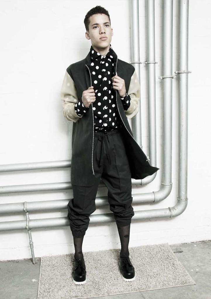
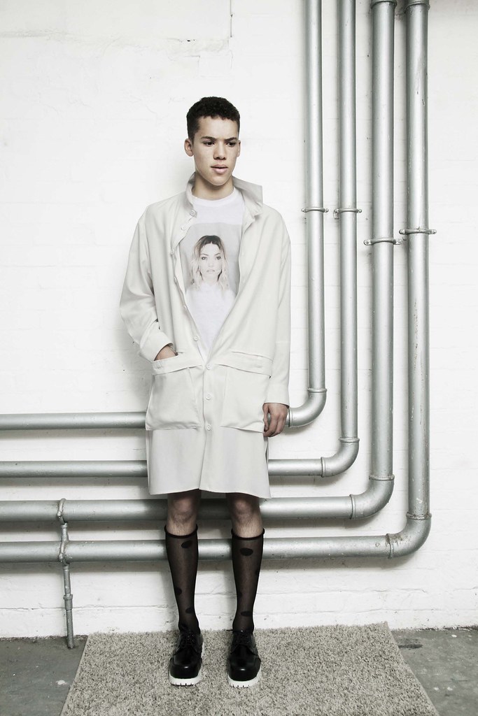
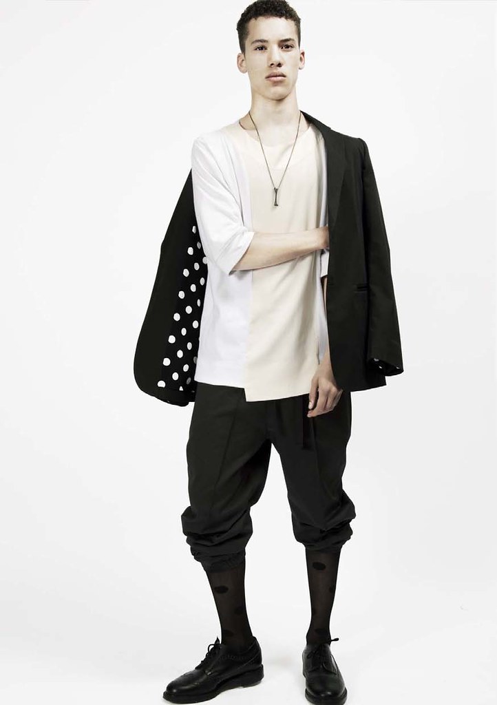
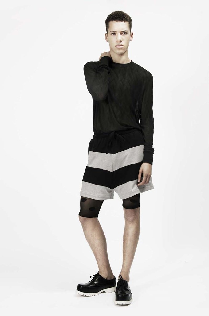
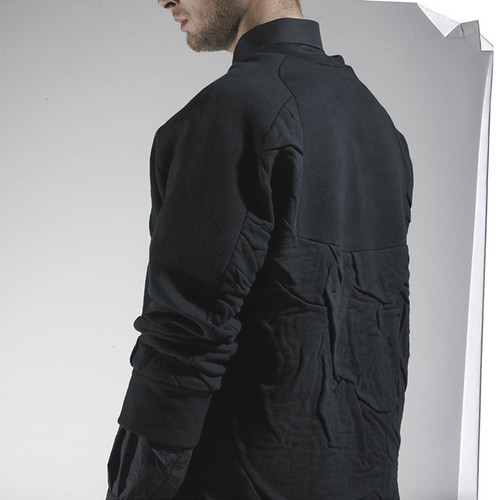
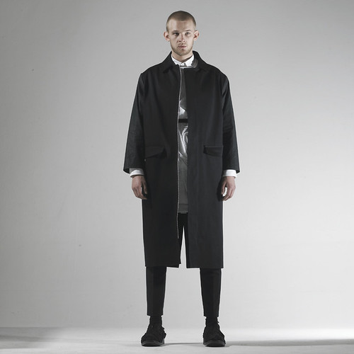
Christopher O'Brien: The collection has at its heart the abstraction of the male silhouette through the manipulation of fabric and layering in a distinctive yet restrained manner. The use of distressed and crinkled fabrics throughout each design creates individual subtleties and elements of awkwardness, which at first glance are not immediately apparent. Whilst the spirit of the collection is in tune with ideas of minimalist menswear and traditional tailoring, albeit in a disassociated way, it develops its theme by amalgamating these conventions with styles drawn from elsewhere.

SS: Were you taken aback by LN-CC's interest in the collection?
Christopher O'Brien: I really like the guys at LN-CC and like the whole concept to the shop, I think they push boundaries with what they stock and don't want to be like any other shop which gives opportunities to designers like me. I'm happy it happened so hopefully it will go well.

SS: What excites you about the future of menswear?
Christopher O'Brien: Being involved in some kind of capacity.
----------

REFUGEES
A scan of the image that sparked O'Brien's collection.

Throughout, the design process O'Brien looked to sportswear to art and photography, especially Derek Ridger’s brilliant pictures and to wartime images from the middle east. These images showcase garment layering in unconventional ways and hint at the effects of using a constricting layer within the garments make them appear disturbed. This idea became a way of bringing an uneasy and crinkled effect to the top layer of the silhouette. This in essence creates a textile that becomes the garment itself, encouraging a different view to the normal conceptions of menswear and preconceived ideas on layering. Taking further inspiration from Francis Bacon's 'Man in blue' series, the collection takes muted blue and aligns it against the contrast of striking white in order to convey further the angular composition that the manipulation of fabric and layering offers in abstracting the male silhouette.  Now, I could continue to wax lyrical about the collection but it really is high time that I shared his look book with you all...

CHRISTOPHER O'BRIEN AW_11_MA_1
CHRISTOPHER O'BRIEN AW_11_MA_3
CHRISTOPHER O'BRIEN AW_11_MA_5
CHRISTOPHER O'BRIEN AW_11_MA_6
CHRISTOPHER O'BRIEN AW_11_MA_7
CHRISTOPHER O'BRIEN AW_11_MA_8
CHRISTOPHER O'BRIEN AW_11_MA_9
CHRISTOPHER O'BRIEN AW_11_MA_10
CHRISTOPHER O'BRIEN AW_11_MA_11
CHRISTOPHER O'BRIEN AW_11_MA_12
CHRISTOPHER O'BRIEN AW_11_MA_13
CHRISTOPHER O'BRIEN AW_11_MA_14
CHRISTOPHER O'BRIEN AW_11_MA_15
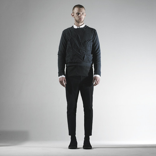
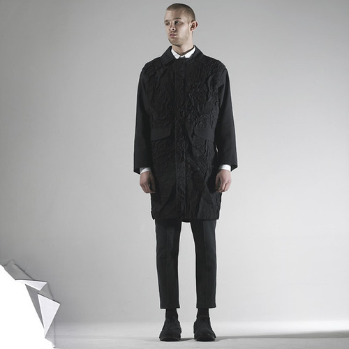
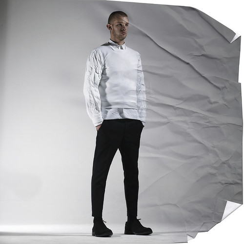
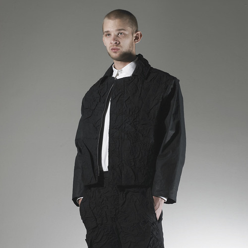
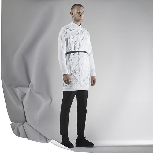
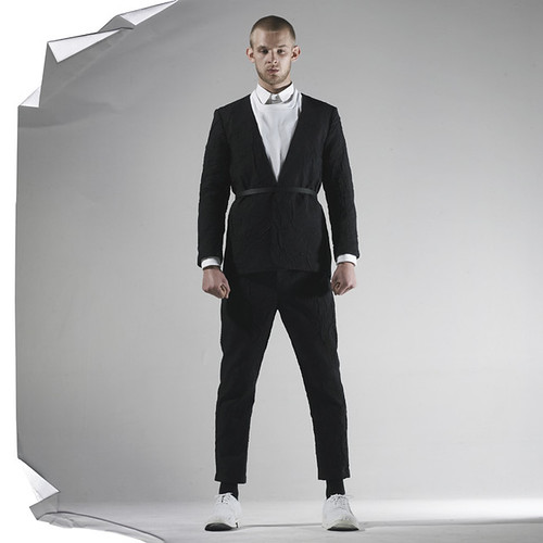
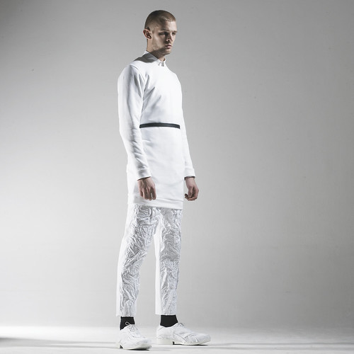
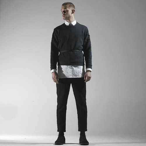
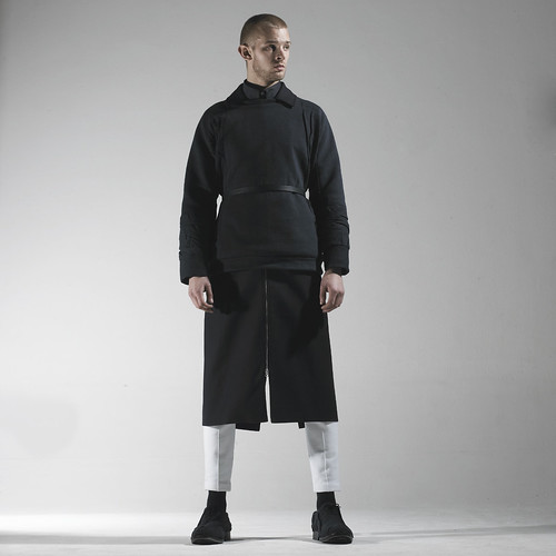
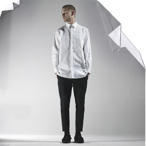
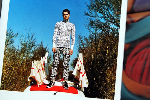
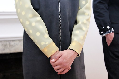
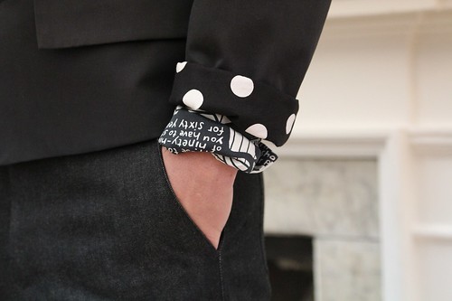
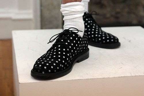
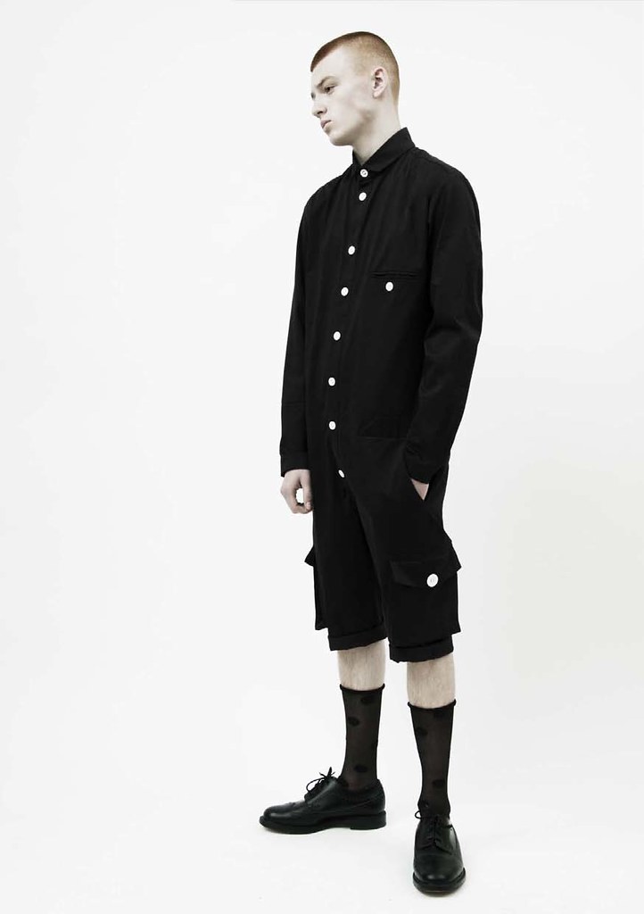
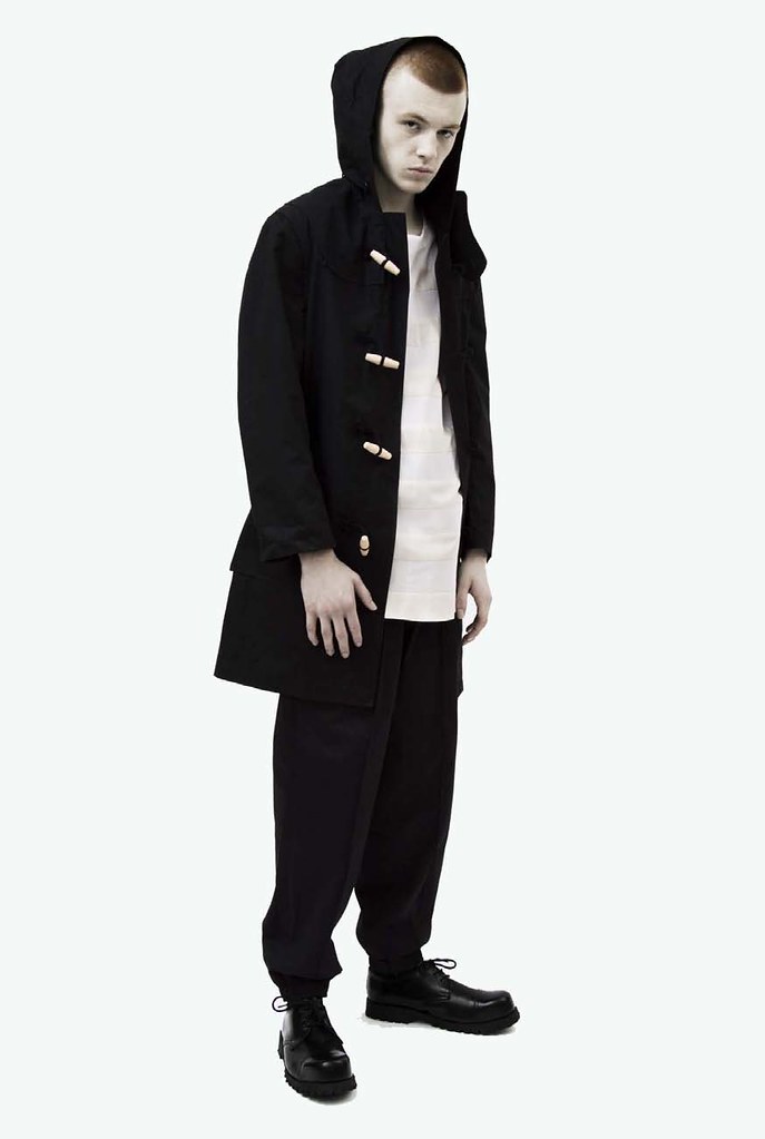
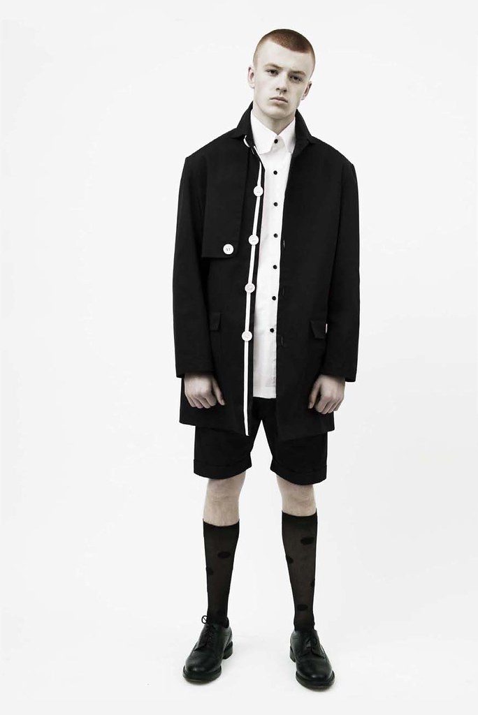
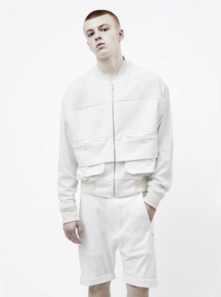
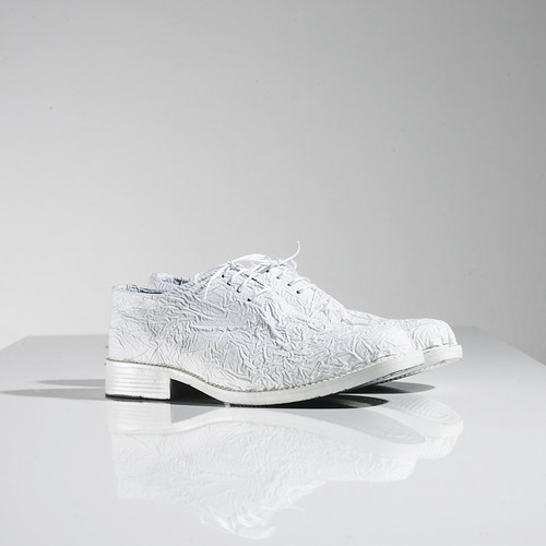
Look book images supplied by Christopher O'Brien

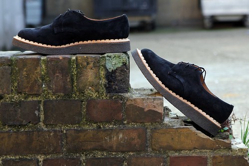
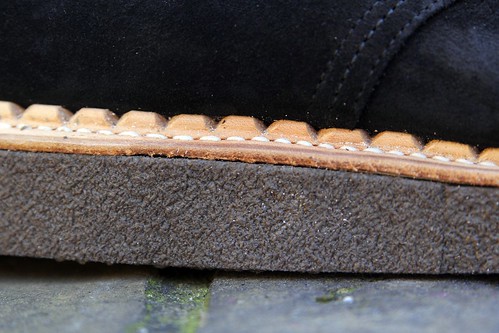
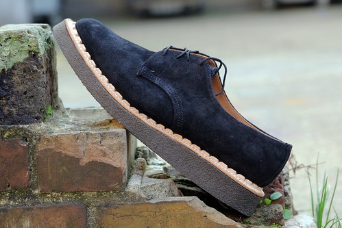
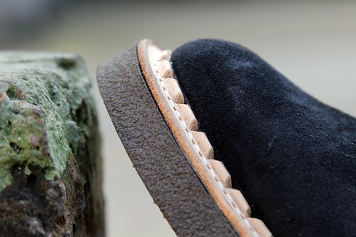
Despite my obvious support for exciting graduate talent, it is extremely rare that I encounter a collection that could easily slip in to my everyday wear. I'd happily add Christopher O'Brien to my wardrobe and it should come as no surprise that a number of pieces have already sold out over on LN-CC. I'm sure we will be hearing the name  Christopher O'Brien a great deal in the coming seasons and beyond.

Monday, 14 November 2011

Details... Fabric mix

IMG_1956
A closer look at one of my recent purchases. Henrik Vibskov reimagines a single breasted cotton blazer with the addition of high shine quilted fabric detailing and ribbed cuffs.

Sunday, 13 November 2011

Unpicking the seams... British Remains' First Creeper

First Creeper Feature Button

Following years of discussion centred around aspects of Britain that they like, hate and mourn, Daryl Saunders and Andrew Bunney launched British Remains. Unveiled last summer, the debut range of t shirts and totes set the tone by celebrating facets of Britain and localised symbols that would ordinarily not be known outside of these shores. Amongst the neglected and the forgotten rubble of Britain, London brickwork, toilet signage and Generation X were all highlighted. In offerings since, the pair have focused their design attention on the Royal Wedding and most recently celebrated the sneering youth spirit of 'them' and 'us'. For AW11, they reveal their first shoe - First Creeper.

Adopted by various youth tribes and factions of the British underground throughout the last half century, the wonderfully named shoe still has the ability to excite by providing quite the visual statement. A heady mix of comfort and rebellion. Traditionally a suede shoe with thick crepe soles, the creeper was borne out of necessity in the years following World War II. British soldiers returning from the desert wars had worn suede boots to which they had attached improvised rubber soles made from old rubber tyres. It is a Mary Shelley tale of a shoe. Returning to London, unsurprisingly the ex-soldiers were attracted to the most desirable undesirable “night spots”of Kings Cross and Soho. As they found their pleasure, they were still wearing this rubber sole footwear or derivatives that had been put together by their cobblers. Creeping around brothels was enough to give the shoes their name. Now, the brothel creeper immediately evokes images of youth, musical movements and hints at the more rebellious corners of society. 

With the mere mention of brothel creepers today, one immediately thinks of George Cox. Therefore, it should come as little surprise that the First Creeper was made in its spiritual home. In 1906, George James Cox founded his shoe company in the heart of England's traditional shoe making region, Northamptonshire. Crafting high quality traditional footwear at first, the company quickly gained fame for the iconic styles that would come to inspire generation after generation of subcultures. From the brothel creepers of the 1950s to the winkle pickers of the 1960s, George Cox have still produce delightful underground styles. Not interested in costume, British Remains wanted to create a creeper that stayed true its tradition whilst making creating a far more accessible shoe. With the thick crepe sole and aggressive notched leather welt softened by the simple suede leather derby upper, their First Creeper undoubtedly pulls it off. From the moment Bunney posted an image of the initial sample back in May over on honeyee, I just knew my ever growing shoe collection needed them. I've obsessed and dreamed about them ever since. Yesterday, following a quick visit to Goodhood my feet's dreams came true. To mark this happy moment and even before I took them out for a pavement stomp, I caught up with Bunney to learn more about my latest fixation...
----------

IMG_1714
British Remains' First Creeper

SS: The First Creeper marks British Remains' first foray in to footwear design. What attracted you to the creeper?
Andrew Bunney: As the name suggests, the label is an exploration into the rubble of Britain. Amongst the neglected and the forgotten there are often gems, and the Creeper shoe represents something really exciting. The nature and shape of the shoe, the nefarious associations that it had, and connotations today make it something quite challenging to wear.

SS: What was your starting point/initial inspiration?
Andrew Bunney: Thinking about British style and British youth cultures, there is always an exciting moment where the looks start to merge and change into something new. What I believe in is creating products that different kinds of people can wear in their own unique way, something that I've done throughout my career. To make something with character that captures the imagination of people into all kinds of things is very special.

SS: Could you talk us through your research and how it impacted on the design? For example, I recall that you mentioned that the sole is the same height as many vintage styles.
Andrew Bunney: It's always interesting to see how things have progressed or changed over the years, and many of the creeper soles today are very high - very cartoon-ish. The classic styles didn't always have soles this high, and of course the idea was always to make this more accessible for today. We used the same height of sole that was used in the past, which would have been sold in places like 'Let It Rock' - one of the most important places for styles to butt up against one another.

SS: How did you go about stamping your take on this iconic shoe?
Andrew Bunney: The most important thing is to push forward - we're not interested in making costume. There are many things I like about vintage Creeper styles, but I want to make something that is relevant to what we're wearing today. The thick sole or aggressive looking welt are very much a 'Creeper', but the simple derby upper makes it much more wearable, and more modern.

SS: Craft and local manufacture are obviously very important to you. Collaboration with local craftsmen and heritage is an integral facet of your brand identity. Here you teamed up with George Cox, how did you identify the individuals to help realise your design?
Andrew Bunney: In some ways today, I think many have lost sight of the manufacturer or have a very hazy understanding of what that means. Of course, we want to find the best factory or the manufacturer for anything that we're making. Despite the many copies by other brands, this style is synonymous with the manufacturer George Cox - there is no other company to go to. However, I don't really think of this as a collaboration - simply using the 'correct' place to make a certain product.

SS: What items can we look forward to in the near and far future from British Remains?
Andrew Bunney: We want to make things that are surprising, and things that make one think a little. It's not interesting to make something unwearable, but for those that are sensitive to details, something challenging - even if it is slight - makes you feel a little more alive.
----------

I could happily listen to Bunney all day, everyday. Following this discussion I could only love my latest acquisition even more. This morning, I took a closer look at them before eagerly jumping straight in to them for the first time...

IMG_1858
IMG_1797
IMG_1855
IMG_1848
IMG_1832
IMG_1963
A closer look ar British Remains' First Creeper with the help of a few detail shots. In the last shot, I teamed them up with black wool trousers by Topman Design and socks by Wigwam. 

Through tits exploration of Britain, past and present, British Remains stirs up odd feelings about this island of ours. What it means to be British, what it once meant and how it has evolved. The class struggle, the rise and fall of subcultures, everyday symbols that are often overlooked. These are all things that make Britain so interesting. With its gradual evolution, I'm looking forward to watching this label continue to grow.

Saturday, 12 November 2011

Weekend Reading... LAW and The Travel Almanac

<span class=

With a jetlagged and exhausted Susie sleeping off her New York travels I was eager to make use of a quiet weekend by immersing myself in the printed word. Having started my weekend with a trip to Goodhood (future blog post in the works) I took advantage of the store's excellent array of difficult to source publications and zines. Somewhat spoilt for choice I turned to Kyle Stewart for his recommendations. I left with the debut issue of LAW and the second issue of the The Travel Almanac.

Now, I had already heard positive murmurings around the latter given the features on musician Will Oldham, artist and former fashion designer Helmut Lang, and actress Juliette Lewis which sit alongside various excursion fodder in a aesthetically pleasing and thought provoking package. However, Brighton based John Holt's LAW is a new discovery. This bi-annual is concerned with documenting the overlooked and giving people a sense of belonging and recognition that perhaps they would not normally receive but in no way shape or form less deserve. Where The Travel Almanac explores the beyond and inspires a sophisticated generation of travellers, LAW portrays the beautiful in everyday and focuses on what's right under our noses. Time to put the kettle on and enter these two worlds...

Friday, 11 November 2011

William Richard Green SS12

With a well crafted design signature of playful, utilitarian, masculine clothing ever livened up with polka dots it was only a matter of time before I fell for the charms of William Richard Green. The design talent grew up on an English farm and loves traditional things like solid, well made shoes, proper knits, and well constructed coats. However, before you start envisaging the world painted on your Grandmother's biscuit tin, he's also one half of DJ act Joe and Will Ask, who play banging techno and house, and likes staying out until lunchtime the next day. Intrigued, I finally visited the designer at his Dalston studio to talk through his latest collection for SS12 entitled I Hope I die Soon.

The moment I walk into his small but perfectly studio base, I am confronted with two pattern cutters and the sight of Green transfixed by his other love, music. Before graduating from London's Central Saint Martins, a place Green confesses he attended more in the hope of meeting interesting people than anything else, he honed his skills on Savile Row where he learned tailoring, craftsmanship, and interned at David David to be introduced to his world of colour and print. Quite the education. Soon after graduating however, rather than rush in to the world of fashion, he opted to tour Japan with his band. Upon his return and somewhat bored, Green made a collection. Today, it is clear which passion he takes more seriously. Thankfully for us it is menswear design.

Three seasons in and William Richard Green has grown to produce a wearable label that reveals more subversive aspects on closer inspection. It is a heady cocktail of traditionally utilitarian mixed with hints of flamboyant menswear including leather fisherman shorts, rubber jackets and techno detailing. The beauty is in the detail after all. "With each season I think Central Saint Martin's is diluted from my design aesthetic, I'm moving towards designing items that I personally like and would wear" he states proudly. "The fashion aspect of fashion gets to me at times. Ultimately it is the design element of fashion that appeals to me." Whilst so many of his contemporaries aim to create the theatrical and the shocking, Green is content producing garments that men, himself included, would want to wear. "You have to be your own brand, always true to yourself. It is particularly important in menswear for garments to have a story. It's great to be able to go down the pub and show your mates a detail or talk about a fabric - it's a sweatshirt but a cool sweatshirt."

"Men tend to be quite brand loyal so it is important as a designer to have some continuity through collections and also, it really isn't about inventing the wheel with each season. For example many of the patterns are carried through and tweaked slightly. In terms of fabric I use a lot of waxed cotton and wool. I've developed quite a utilitarian style whilst sportswear and knitwear have come in more recently." As a developing label, it is important for Green to respect provenance whilst celebrating the craftsmanship of home grown British manufacturing. "One of my points is that the collections are British made and predominantly use British fabric. It has been a case of building relationships over time and the quality improves." On the subject of sourcing mills and suppliers, the designer admits that "it was hard to begin with but my eyes were opened during a visit to the British Fabric Expo. From early on, Alex from the Centre of Sustainable Fashion has been really helpful, the CFE have also helped out and it has also been the case of working with friends. William Kroll of Tender is a useful guy to know in this department as well. I love this artisan world but I'm far from pursuing heritage. I want to take the morals and use the skills of this world but still create a design led collection." William Richard Green aims to push it forward rather than reminisce about the past. "I'm enjoying this ongoing research project of finding British sources and manufacturing, so I'd like to build up this list of contacts. Ultimately, I would love to collaborate with British made labels and so far the wish list includes New Balance, Brady Bags, Tender and even Dashing Tweeds." Here's hoping Green is able to turn this dream in to a reality.

<span class=
<span class=
<span class=
<span class=
A selection of presentations shots I captured on Menswear Day

For SS12, William Richard Green presents a melancholic collection inspired by suicide and depression. "I know, not a common Spring/Summer theme," concedes the developing design talent. "In previous collections I've tended to be drawn to an overtly masculine muse and even next season I've been drawn to fans of Millwall football club but SS12 was a bit of a deviation, more of a feeling than anything else." Throughout he demonstrates a fascination with the paradox of suicide – caused by a post-recession Weltschmerz on the designer’s part, whilst the mood is obviously set for the label’s darkest collection to date. Albeit a touch bleak for a balmy June day, the sartorial alchemy is little short of overwhelming regardless of the season.

A print of sketches portraying post-suicide characters in their eternal ‘waiting room’ surroundings, illustrated by Martin Wollerstam, appears on a silk shirt and vest. "I'm a huge fan of Martin's work, he is best known for the Wet Yourself flyers. With the collection's monotone and graphic leanings, I knew that his style of drawing would work well. We did it as a repeat so it is more of a texture. From afar it almost looks like an old Moschino shirt," something that obviously excites the designer. The result print hints at the designer's humour and ironic distance to the topic in question. "I'm actually working with Selfridges as part of their Bright Young Things promotion and initially I wanted to blow up the print and use it as wallpaper within the window display. It has certainly shocked a few people but I guess I'm not a very sensitive person."

Acting as inspirational filmic backup, Pier Paolo Pasolini’s gory masterpiece from 1975, Salò, enters into the all black-and-white collection in the shape of fetish-like pieces ticking off Green’s signature boxes, such as a cotton satin blazer with harness, or a zip up black rubber coat with a contrasting trans rubber sleeve. An un-dyed rubber t-shirt with contrasting black rubber stripes allude to classic convict suits, and the idea of limbo as God’s prison. This is also seen in a sweatshirt-jersey trouser covered in individual panels resembling stripes. The now Green trademark, polka dot lining appears throughout the collection and even appear on a brogue produced by Underground for William Richard Green – the second collaboration between the designer and the legendary English footwear label.

<span class=
<span class=
<span class=
<span class=
<span class=
<span class=
<span class=
<span class=
<span class=
<span class=
Lookbook images supplied by William Richard Green

In addition to catching my eye, SS12 marks something of a new beginning for the designer. "This is my first proper season where I actively sought sales. Previously, I would only do things if they came to me but for this season I felt ready and therefore was a bit more active." Over the course of writing this blog and meeting with a wealth of British menswear designers, it is clear to me that it is always a struggle to convert talent in to a viable business. The business side of fashion cannot and should not be rushed. "If you do it in an organic way, the right amount of people see it at the right time." With solid foundations in place, Green is now ready to push on. Having impressed in the sweltering heat of the London Showrooms in Paris, William Richard Green has been selected as one Selfridges' Bright Young Things for January and thanks to a personal recommendation from Kim Jones, will be stocked in Tokyo store Eliminator.

With the foundations of the label in place, I'm looking forward to watching William Richard Green grow. "In addition to making the core pieces perfect and slowly developing the label, I'd like to work on a show. At the moment I am designing purely for sales, so I've not been creating showpieces but I'd like to because it would bring out more extravagant pieces," confesses the designer. Alongside the likes of Agi & Sam, Astrid Andersen and Baartmans & Siegel to name but a few, there can be little doubt that competition between emerging talent for an on schedule show slot is fierce but Green must be close to making the step up. I'm just glad that I don't have to make the decision and can instead, support the blossoming menswear talent that exists in this capital of ours.

LinkWithin

Related Posts with Thumbnails