Tuesday, 13 March 2012

In discussion with Becky French

Indiscussion_Becky

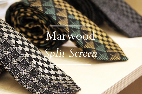
The desire to develop a dialogue around men's style and fashion has always been one of our key motivations to spend so much of our free time blogging. Of course it is quite easy to get distracted by all the new shiny product releases and latest collections along the way but we are frequently left wanting. The topic is of course much greater than pure consumerism. With this in mind we introduced the simply titled 'Discussion' series in which we invite a cross section of thoughts on and around a given subject. It started well and we heard from the likes of Carolyn Massey, Tim Soar, b Store's Matthew Murphy and many of you answer all manner of queries but we allowed the chat to trail off somewhat. No more. To breathe fresh life in to the series and introduce fresh thought in to the discussion, we're are asking a few additional individual to add their thoughts to the topics discussed thus far. First up, Marwood's very own Becky French.
----------

What is the best piece of style advice you have ever received, given or heard?
Tuck your shirt in! Although i don't think that can be classed as "best advise" really, more of a strict rule enforced at school.

Tell us about your most stylish moment or memory.
The AW'04 Ralph Lauren Purple Label show. It was my first design job working in NY and they took me to Milan with the rest of the design team. The clothes, the fabrics, the days it took to prep the looks, the preciseness of every detail and fit was the first real eye opener in to luxury menswear. I learnt to tie bow ties so fast and pin collars 'just so' - everything had to be finished to perfection. When I saw the line-up of the models going out all impeccably styled to an almost unachievable level that you only see realised in films, the result of an uncompromising vision, it was definitely admirable.

Each season the same few (designers) are talked about. Who do you think deserves a little more love, old and/or new and why?
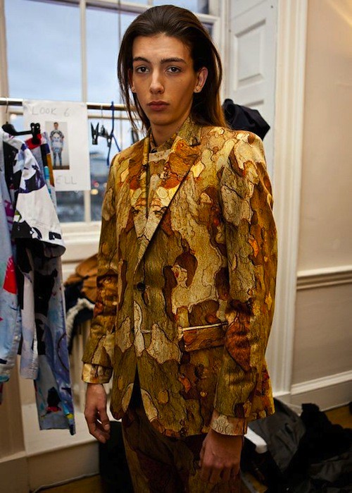
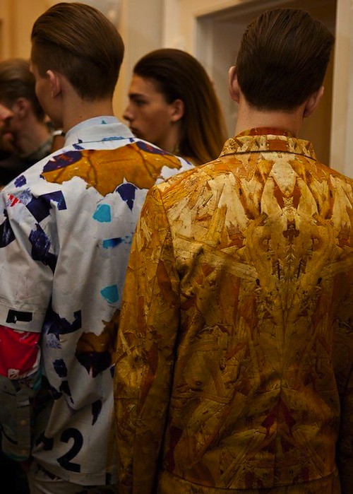
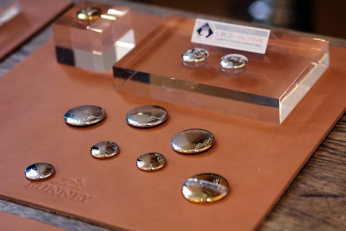
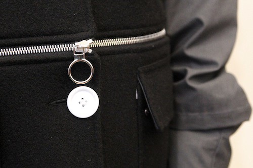
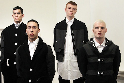
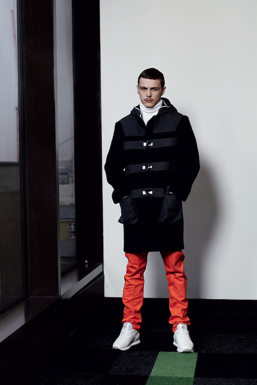
Berthold. I recently tried on some of his menswear and love it all. It's not for girls (officially) but I just think it makes his clothes even better that they cross over. Attentive cut and unusual fabrications with a minimal, sporty aesthetic. I like that style in contrast to 'traditional' menswear.

Tell us about the most stylish man you've ever known
I don't think I've met him yet ...however I do have vivid memories of my Grandad. He always wore a tie and cardigans or a jacket every day. He and my grandma would take us to their favourite pub for Sunday roast but every day he wore what could be seen as Sunday Best. That (restricting) commitment to society dress rules has gone now so it's good to have memories of that generation first hand.

Is there a neglected item of clothing or accessory that you'd like to see more men wear?
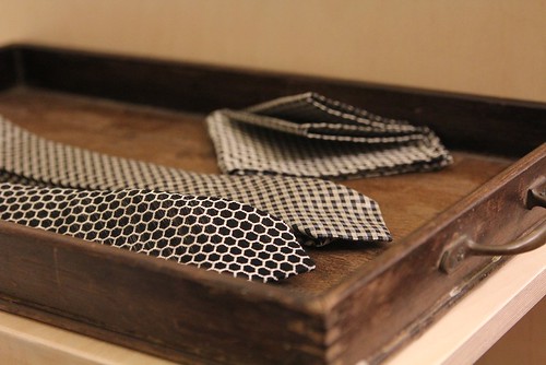
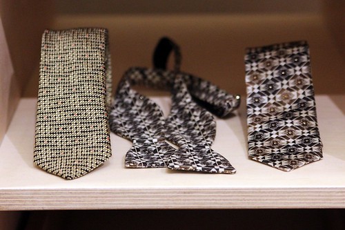
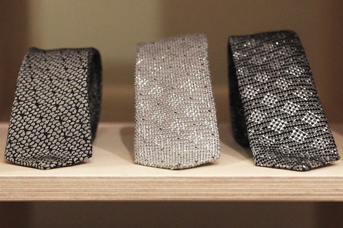
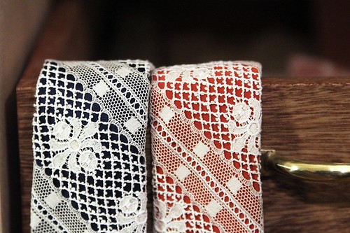
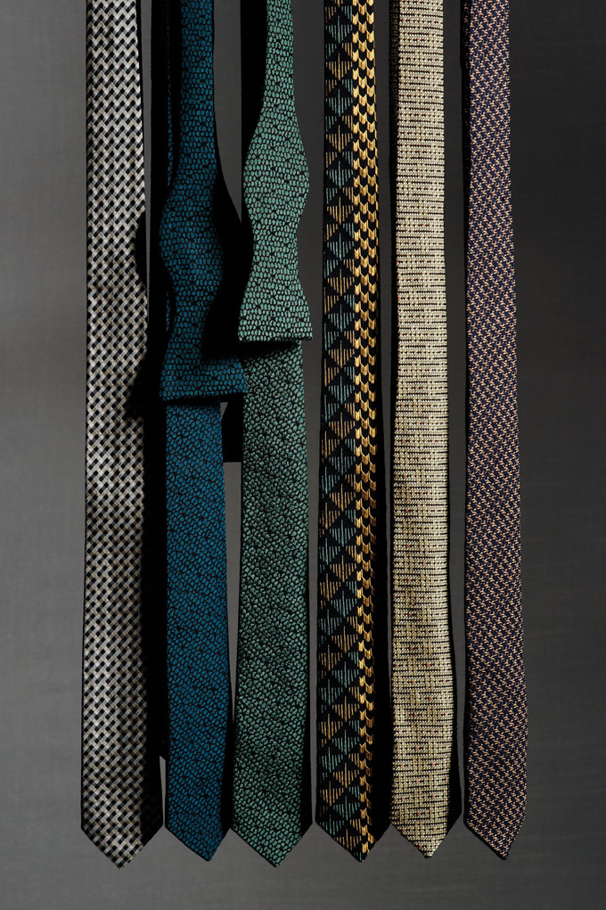
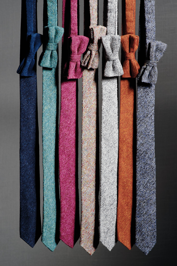
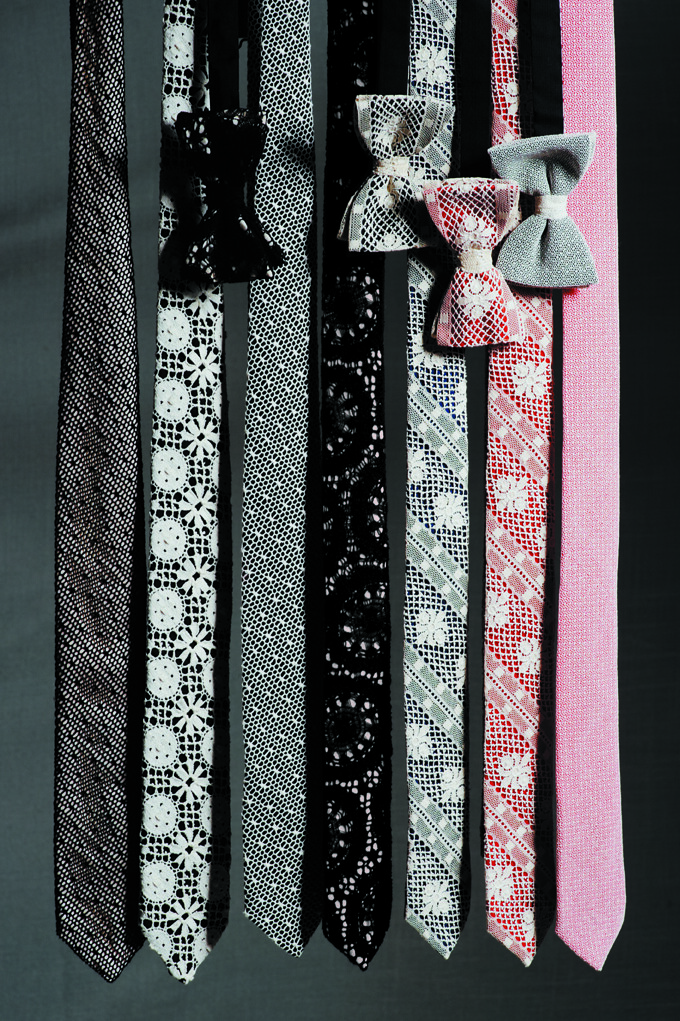
Ties/neckerchiefs/gentleman's jewellery accessories that you only come across in antique shops - but worn inventively.

If you could go back in time and experience any fashion moment, what would it be?
When women started to wear trousers.

What does the word masculinity mean to you?
Confident, purposeful and an assertive of a point of view.
----------

Over the coming weeks we will set new topics to explore but before we move on, it would be lovely to hear from a few of you on the above.

Monday, 12 March 2012

AW12 Print Picks: Matthew Miller's Expedition

Restlessness, irritability, paranoia, irrational frustration and exhaustion are just a few of the common symptoms of the cabin fever experienced by designers following the long and often lonely hard slog of finishing a collection. Shortly after making his accomplished on schedule LFW catwalk debut as part of MAN, Matthew Miller broke free from the shackles of work at every opportunity he could. After each hardworking day spent in the studio Miller ventured beyond the confines of his studio and explored his adopted city. Rather than travel from a to b and ignore his environment like so many of us do, Miller looked about him and focused in on key changes in his environment. This daily routine saw him tread across the centre through to its industrial and suburban outskirts, taking photographs as and when he encountered something interesting during this series of inner city journeys. From tree bark in Hyde Park to chip boards in Chancery Lane to well worn bill boards in Shoreditch and under the magnifying glass of the designer's eye, his chronicled snapshots evolved in to his AW12 collection. 

Entitled 0.05 Expedition, the collection reimagines man made and naturally formed patterns and textures into digitally printed garments. By taking its inspiration from the environment Miller's man lives around, from the city to the country, the young designer has created a wardrobe fit for all manner of adventures.


"The communication of surfaces that we see everyday but are forgotten beauties."
Matthew Miller on the inspiration behind AW12


Given Miller's (almost) obsessive attention to detail and love of technology, it should come as little surprise that each design is accompanied by a QR code that informs the wearer of the exact co-ordinates of its geographical. With the addition of QR codes, Miller invites the wearer to interact with and respond to the piece. As his series of prints have captured one moment in time and by sharing the location, the design talent offers the opportunity for us to revisit the surfaces to see how they've altered, naturally or not. Eager to take a closer look but far too lazy to go out exploring ourselves, we invited the talented Little Doodles to reinterpret a few of Miller's prints to help us celebrate these otherwise forgotten beauties... 

Hyde

MatthewMiller_AW12_PrintFeature3
MatthewMiller_AW12_1
51.506109 - 0.16278
----------

Gainsborough

MatthewMiller_AW12_PrintFeature1
MatthewMiller_Backstage_2
51.534682 - 0.087163
----------

Inner City Riot

MatthewMiller_AW12_PrintFeature2
MatthewMiller_Backstage3
51.518644 - 0.113815
(Illustrations by Little Doodles for us, shown alongside surface shots by Matthew Miller and backstage shots by Robin Sinha for Dazed Digital) 

Sunday, 11 March 2012

Treasured Items... Daniel Jenkins

Over the course of this series we've had all manner of cherished wardrobe item shared with us. Little surprises us. From Paul Vincent's indispensable tortoiseshell spectacles to Dapper Kid's long outgrown childhood sweater, Steve Sane's emblematic rings to Dal Chodha's treasured charity shop find, the picks, although devise are no less loved by their owners. Here, Daniel Jenkins manages to surprise us by picking an item that he no longer possesses. His first designer purchase might be lost but his tale proves that it is anything but forgotten...

----------

Daniel Jenkins and the ghost of the Paul Smith T shirt.

IMG_0765

"It only took a second to pick my treasured item. I knew already. It is a burnt orange long sleeve Paul Smith t-shirt, with signature on front and in reverse on back, purchased with my beloved Grandmother when in London aged 12. Fantastic. Now sadly lost. Bugger.

I have searched my flat, searched my sisters flat, searched parents house, contemplated phoning the ex and asking her to search anywhere I’ve laid my head. Then laughed. I've realised that losing it was perfect. It’s still my most treasured possession. It’s just not mine anymore. I was inspired by it. It was the first piece of ‘designer’ clothing I ever bought. Wore it to play football, teach myself the guitar parts of Blur albums, chat to girls. I thought I was invincible in it. Last time checked it still fitted me. Suppose, it was an enduring reminder that I’m still the same skinny Welsh boy I always was.

Like everyone else all I truly want is to be happy. Sometimes, the people, items and places that did so no longer exist. Losing a t-shirt doesn’t matter, the fact I enjoyed it and perhaps in some small way it set me on the path I am on now does." Daniel Jenkins
----------

Italian stylist and journalist Anna Piaggi talked about the animiso of an object. Here, she is not referring to its essence but its afterlife and in particular the afterlife of the previous owner carried within an object. Upon reading Jenkins account it is clear that despite being lost, the t shirt lives on in some capacity within its previous owner. I'd like to think that the t shirt is having a similar influence on its new wearer, wherever it might be.

Saturday, 10 March 2012

Weekend Reading... The Blizzard

IMG_0769

The Blizzard is a quarterly publication - part magazine, part book - that is currently providing my fashion fatigued mind with nourishment on my other love, football. Like many great ideas it was conceived in a pub and was born out of the frustrations with mainstream media. Put together by a cooperative of journalists and authors, its main aim is to provide a platform for to class writers from across the globe to enjoy the space and the freedom to write what they like about the football stories that matter to them. The fourth issue which now enticingly sits on my coffee table close to a full pot of my trusty weekend companion contains many treats including David Lynch exploring the role of Ahly and Zamalek's Ultras in Egypt's 'Arab Spring', Nick Szczepanik reminiscing on South London's early 90s heyday and Patrick Dessault in conversation with Didier Deschamps and Claude Suaudeau. One hundred and ninety odd pages of tales, analysis, detailed reportage and history to get lost in. I'm trying to think if there is a  similar publication dedicated to fashion and I cannot. There really should be.

Thursday, 8 March 2012

Details... Scandinavian Simplicity

IMG_3600
This snapshot taken at Filippa K's AW12 presentation on the opening day of StockholmFashion Week  back in February encapsulates the simplicity that is key to this Scandinavian fashion brands continued success. Less is more.

Saturday, 3 March 2012

Marwood's Split Screen

Marwood AW12 Feature Button 2

One year on from its seductive debut, Becky French took her place at the NEWGEN MEN and Fashion Installations for the third consecutive season to unveil her latest collection of innovative neckwear as Marwood. For its hattrick appearance, French approached sculptor and furniture designer Greg Cox to create a bespoke unit to display the collection that wonderfully echoed the signature ‘staircase’ tipping cloth used in all Marwood neckwear. As in previous seasons, this is a true celebration of quality fabrics, interesting textures and the best of British craftsmanship. It was a pleasure to discover deep inside the East Wing of Somerset House.

Entitled 'Split Screen,' French looked to the filming technique that allows the visible division of the screen to provide a seamless view of two realities or perspective and drew inspiration from a couple of the ‘Asakusa Portraits’ by Hiroh Kitai. Over the past two decades, Kikai has created an extensive and unforgettable series of street portraits from the enormous flow of people passing through a Tokyo district that embraces a stubbornly independent popular culture that encompasses traditional comedy theatre and houses of erotic entertainment. Drawn in to Kikai's snapshots, unusual proportions, textures and experimentation then became the foundation for creating the new range of Marwood neckwear. After manipulating portraits and patterns with cuts and folds and applying the split screen technique, the new vertical split designs were created and achieved by technical Jacquards.

The result and mood for AW12 is a spectrum of early twentieth century eccentricity and modern day rustic luxury. Lurex yarns woven in with English wool, honeycomb graphics, jewel coloured slubby silks and the new seasonal Marwood lace featuring a historic crest motif make up this ever growing and ever more diverse neckwear offering. However, as in previous collections, 'Split Screen' allows the wearer unique and playful options for those infrequent yet important special events as well as everyday attire. Everyday could and indeed should be a time for Marwood. To inspire you on this grey Saturday morning, I'd like to share the Eddie Jacob shot and Hanna Kelifa styled look book alongside a few of my own shots from Menswear Day...

Marwood_Split_Screen
IMG_0341
Marwood_3_new
IMG_0354
Marwood_4
IMG_0356 copy
Marwood_6
IMG_0351
Marwood_7
Marwood_9
Marwood_10_use
Marwood_11
IMG_0342
IMG_0331
Marwood_13
AW12 lookbook shot by Eddie Jacob and styled by Hanna Kelifa
----------

The season also saw the unveiling of a useful collaboration with illustrator Sam Kerr. French worked with Kerr to create a soon-to-be fully series of 'How to…' posters. Having come across many instructions for tying a bow tie, Marwood decided to create their own. The technique is a craft in itself and one that everyone is proud to use, when they know it. This season shares the first two posters… “how to tie your bow tie” and “how to box your tie”. Ties are delicate objects and these posters encourage a sense of care and pride in caring for your tie. There will be more projects to come with Sam Kerr including the production of limited edition screen prints and I'm sure the first of the 'How To...' series will whet your appetite for more....

HOW TO TIE YOUR BOW TIE-1
HOW TO BOX YOUR TIE-2

----------

In the curious world of fashion blogging with the fanfare of collection unveilings, product launches and so much more, time almost becomes meaningless. There is little opportunity to sit and take stock because the incessant conveyor belt of images and accompanying sound bites just does not allow reflection. At the beginning of last year, thanks to an enthused tip from b Store's very own Matthew Murphy, I stumbled upon the intricately spun laced world of Becky French's Marwood. One year from its acclaimed debut, we should take the time to toast the considered and thoroughly well deserved rise of this innovative neckwear brand. Its debut collection for AW11 showcased a beautifully crafted range of ties and bow ties made with the finest fabrics such as woven silk, wool and traditional English Leavers lace. Modern and highly considered, Marwood created a range of neckwear that celebrated the traditions and techniques of a rich and distinguished heritage and made use of the most skilled, historic factories and fabric mills across the UK. The Marwood approach is to create products that ignite excitement from discovering something new and unusual, whilst maintaining a strong sense of tradition. We, along with man, fell for its obvious charm. Having gained international stockists including b Store, Barneys, Harvey Nichols (HK) and Tomorrowland in Japan to name just a handful, the rise of Marwood demonstrates that although times are tough, brands with a strong concept and product can still prosper.

Friday, 2 March 2012

The Bunney and Derek Ridgers

Riding the design storm that is Menswear Day at London Fashion Week, crashing from show to presentation to installation, moments of calm are are there be treasured. For the last few seasons, the sight of Andrew Bunney calmly and confidently standing behind his cabinet of jewellery has continuously offered such a rare, welcome moment. The circus of fashion blurs in to the background when Bunney speaks. As Gary Warnett recently posted, he has a tendency to suck you in to his world, and what a world it is. As previously discussed on the pages of this blog, jewellery line Bunney was launched after its creator was drawn to the idea of coming up with something everybody or anybody could wear...even nervous wearers like myself. Bunney longed to create objects that look like something one may be used to yet recast in a new light with precious metals, becoming new, yet at the same time, familiar. Ultimately, he wanted to make something precious that anybody could use. 

Each carefully crafted objects celebrates the personal and the special. Alongside his cabinet of treasures, Bunney presented a selection of works by Derek Ridgers and a newspaper that celebrated the photographer's iconic work. The synergy between Bunney and Ridgers is obvious. Now, for those of you unfamiliar with his work, from the mid seventies through to the late eighties, Ridgers captured some of the most significant movements in British youth culture history by aiming his lens at often namely, always authentic individuals who made up those scenes. As Jason Jules notes in the introduction to his utterly absorbing conversation with the London based photographer, 'through his body of work, Ridgers captures the potential of expression through style, the potential of individuals to communicate powerful statements using the body - clothes, hair, tattoos, as the medium. It's a language that goes beyond fashion and beyond trend.' It is the same language that Bunney himself speaks fluently.

"These works are an important record of an ignored history, they are a record of how we looked, what we wore and how we work it. Derek has captured the non-famous, the ordinary, and no matter how sullen the face, the personality is there. In every photo we can see aspects of personal style and through these glimpses learn a little more too - this is what interests me most. Capturing how someone wanted to be different to their friends, in most cases not a grand statement, simply about a touch of personality or flair." Andrew Bunney on the work of Derek Ridgers

IMG_0423
IMG_0414
IMG_0752
IMG_0757
IMG_0419
IMG_0756
IMG_0753
A selection of shots from the presentation and the newspaper.

Over the course of a few seasons, whilst seeking out the last bastions of British craftsmen and learning all about their trade, he has been quietly navigating an elegant and refined men's jewellery offering that have grabbed my attention and left me experimenting. In truth it is near nonsense to talk about the line in seasons because the considered design talents adds to his magpie's haven as and when the desire and opportunity arises. The latest additions include the Colette exclusive Je t’aime padlock and a set of Diamond Jubilee badges. Here's a closer look at a few of the pieces that caught my eye...

IMG_9568
IMG_9563
IMG_9576
IMG_9564
IMG_9578
IMG_9567
IMG_9583
IMG_9599
IMG_9587
A selection of Bunney pieces shot at The Showroom Next Door.

'With my work I want to create products that are precious, sometimes things that aren't typically seen that way but pieces that can always endure. While I design with a use in mind, I would love to see people interpret or wear in ways that I have never thought of. UK style has often been about reappropriation, and I think what males people find that so exciting is that the wearer really dictates how something can be worn." Andrew Bunney on his eponymous line.
----------

Thursday, 1 March 2012

William Richard Green AW12

WRG AW12 Feature Button

One of the main attractions inside the creative pot that is NEWGEN MEN and Fashion East installations was William Richard Green's firm of table football playing hooligans. In a collection titled ‘Hooligans Against Acid’, Green drew on the 1989 arrival of the rave scene in England for AW12. Dubbed 'The Second Summer of Love', this benign form of revolution was born at the time of Thatcher losing her firm grip, the excess of the Yuppies, The Stone Roses and Madchester scene, Jason Donovan leaving a pile of overcome girls in his wake, the first celebrity marriage covered in OK of Bill Wyman and his sixteen year old bride, a Merseyside derby FACup final coming months after the Hillsborough Disaster and me at many a fifth birthday party frolicking in the ball pond. For those a few years older than me at the time, the scorching summer of 1989 was one long party from beginning to end as people threw themselves in to a hedonistic rush of new music and new drugs. Rather than take inspiration from the strange Jason Donovan effect, Green looked to how the violent pastimes of football hooligans were replaced and calmed by drug induced raves. The loved up vibe summoned up by rave culture was infectious, softening even the most hardened football hooligans. At 180 BPM and the cloak of ecstasy, the enemy became just another person to hug. It wasn't long before the firms themselves were organising parties with the intense rivalry between Millwall and West Ham forgotten on a Saturday night in the middle of a field, as fans from both side enjoyed one big love in..

“In the final days of the yuppie decade, the summer of ’89 saw a new type of youth rebellion rip through the cultural landscape, with thousands of young people dancing at illegal Acid House parties in fi elds and aircraft hangars around the M25. Set against the backdrop of ten years of Thatcherism, it was a benign form of revolution, dubbed the Second Summer of Love – all the ravers wanted was the freedom to party... The rave scene, along with the drug Ecstasy, broke down social barriers and even football hooligans were ‘loved up’, solving a problem the government had never managed to crack.”
Taken From BBC documentary ‘Summer of Rave’ (available to watch online).

It was a revolution that paved the way for the modern British youth culture that rules the generation to which Green belongs. "With each season I think Central Saint Martin's is diluted from my design aesthetic, I'm moving towards designing items that I personally like and would wear" he stated proudly in our last interview before continuing, "the 'fashion' aspect of fashion gets to me at times. Ultimately it is the design element of fashion that appeals to me." Whilst so many of his contemporaries aim to create the theatrical and the shocking, Green is content producing garments that men, himself included, would want to wear and the results are certainly paying off.

As one of the designers headlining a new era in British menswear, Green fuses his British infl uences with a willingness to support the manufacturers and suppliers of England. Each collection celebrates the craftsmanship of home grown British manufacturing whilst feeling anything but heritage. "One of my points is that the collections are British made and predominantly use British fabric. It has been a case of building relationships over time and the quality improves." With wools milled in Yorkshire and cotton drill from the same area used next to Jersey knitted in Leicestershire, wax cotton from Lancashire, shirting from Cumbria, and knitwear in Shetland wool, Green has created a collection, which – bar zips – is decidedly British, both inside and out. Shortly before presenting the collection over a few games of table football and being a real standout of the day, it was and filmed by Morgan O'Donovan and shot by Kate Cox. So without further commentary from me, here's the look book mixed with a few of my own shots from the day including a few details.   

IMG_0288
IMG_0230
WRG_AW12_1
IMG_0259
WRG_AW12_2
Untitled
IMG_0270
WRG_AW12_4
IMG_0211
WRG_AW12_5
IMG_0257
WRG_AW12_6
IMG_0237
WRG_AW12_7
WRG_AW12_9
IMG_0251
Lookbook courtesy of William Richard Green, presentation shots are our own.

A country lad himself, the outdoorsy, boyish air, that acts as a backdrop to the William Richard Green design signature is mixed effortlessly with elements from sportswear and utility dress throughout the collection. Performance pieces including a  grey wax cotton bomber or cashmere trousers with waxed kneepads unite the wardrobes of the terrace and the rave, not unlike the combination of navy, black, grey and orange in the colour palette. A blend of these two worlds is further manifested in the use of drawstrings, zips and double collars, which run through out the collection. A sense of functionality is introduced in a transformable Melton wool coat with hidden detachable mittens, a storm ap, waxed raglan sleeves, and a waist zip, which unzips the coat into a cropped jacket, revealing pocket details. The final Menswear Day saw the designer shuffle his New Balance forward and I cannot wait to see this label continue to blossom.  

LinkWithin

Related Posts with Thumbnails