The last few weeks have whizzed by and left an ever blurring vapour trail of memories of catwalk parades, presentations and tradeshows as designers and labels scattered across our fashion capitals unveiled their AW12 collections. As the 'fashun menswear machine' takes a much needed rest following its exploits in Florence, Milan and Paris, we thought it was the right time to pause the conveyor belt of look books and show reports and take stock.
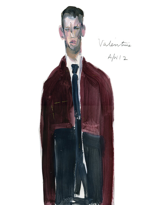
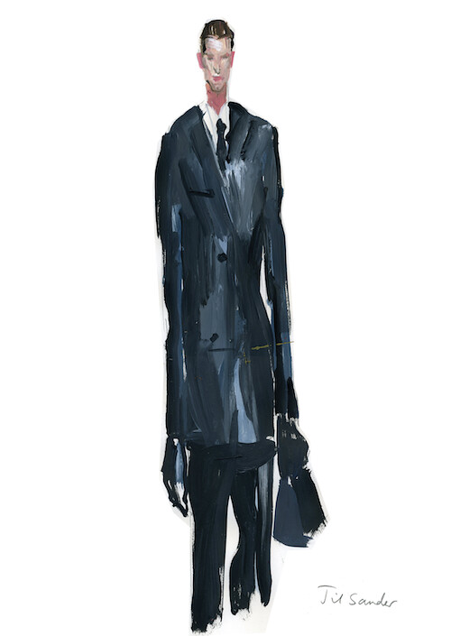
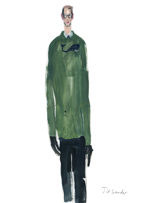
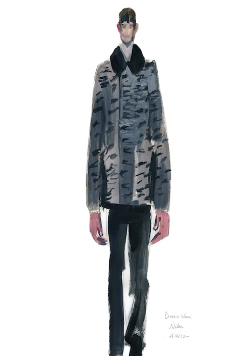
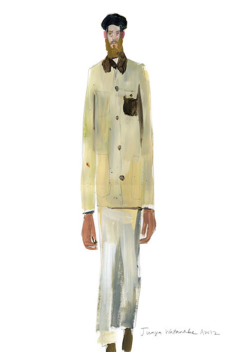
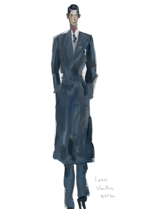
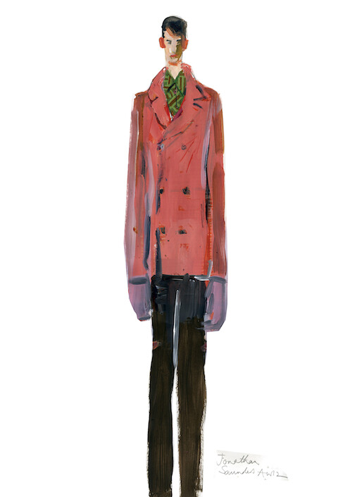
Over the coming weeks we will take our time to explore and examine our favourite collections but first we'd like to offer a quick visual reminder. Now, going to the shows is a wonderful experience but looking over catwalk photos and reading somewhat tedious analysis afterwards can be a bit mind numbing. So, to help bring the day to life we enlisted the help of recent graduate Anne-Marie Jones (check out her blog if you can) to illustrate our favourite moments of the season so far. Highlights include Claire Malcolm's kaleidescopic celebration of grey flannel for Hardy Amies, Raf Simons' corporate army cloaked in leather for Jil Sander, Dries Van Noten's well tailored canvas showcasing his collaboration with Dutch graphic artists Gijs Frieling and Job Wouters, Kris Van Assche's uniform of sartorial sportswear for Dior Homme and Jonathan Saunder's eye poppingly printastic sophomore menswear collection. Here, the immediacy of Anne-Marie's artwork brings back a real sense of each show and captures just why each look was selected...
Earlier this week Cathy Horyn noted that "there is such an emphasis these days on high-end luxury that many collections lack energy and certainly risk-taking" which wonderfully summarises the prevalent mood but, as captured by Anne-Marie, there were still moments that excited. The wheels of menswear have hardly been reinvented this season but a number of designers have polished the spokes...







3 comments:
her style is really intriguing, quite eerie and the proportions are as mad as a box of snakes. i'm off to her site now.
love these. assuming they were done from memory, they kind of remind me of artists' impressions from court hearings: capturing transitory catwalk moments in a medium other than film.
also, they make you work backwards, trying to imagine what the clothes really look like and that process breaks down the designs to bring out the ideas behind them. looking forward to part 2!
Viewing her work reminds me of Lucian Freud. Have you seen Thom Browne's A/W 2012? Seems to be the physical counterpart to these illustrations.
http://www.bkrw.com/thom-browne-catwalk-fw-2012/
Post a Comment