"A shark's fin, a storm drain, plastic coverings and scar tissue" are just a few of the descriptions that trickle from Raimund Berthold's mouth as we sit in his central London studio to discuss Autumn/Winter 2013/14. Seemingly disparate and certainly peculiar, Berthold's latest ingredients list might unnerve a few but given his ability to balance and create beauty from the unexpected, most will be justifiably excited. As many other London designer's toil right down to the wire, praying that factories deliver missing garments in time for the big unveiling on Monday, one feels that Berthold has been ready for some time, quietly refining and perfecting his vision. Now, just days away from the launch of the new season with London Collections: Men, the blossoming design talent is keen to take another confident step forward.
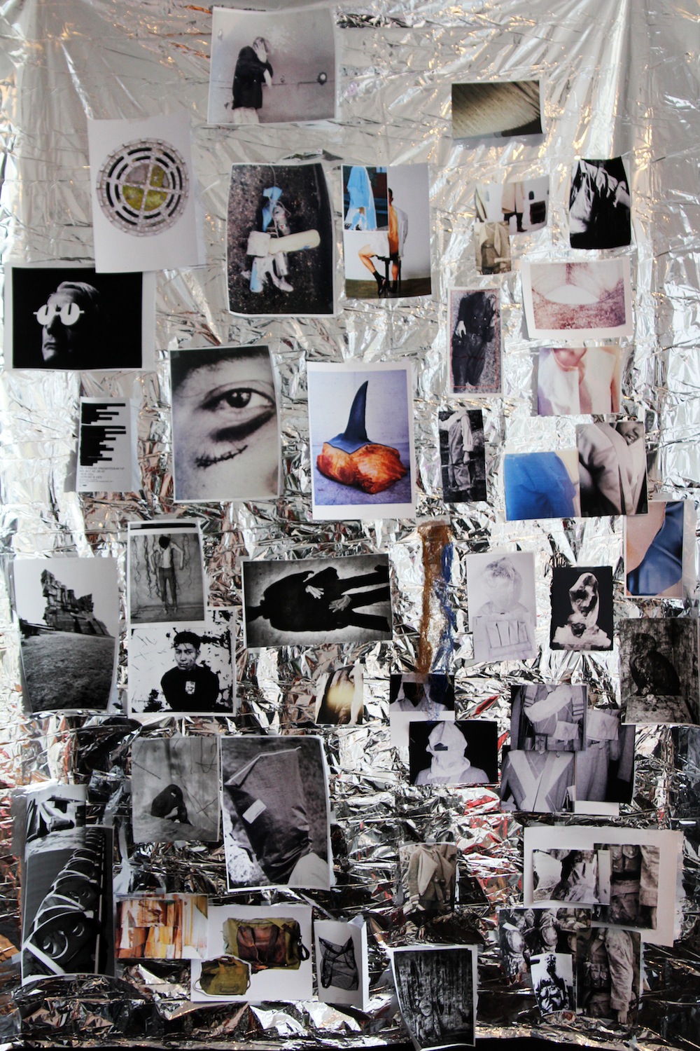
To further whet our appetite, Berthold discusses his methods, updated us on his progress and allows us to take a close look at his latest shimmery wall of curiosities. Rich in detail shots and all manner of found imagery, the mood board came to life with excited narrative from the designer himself and it was impossible to leave the studio anything but inspired and excited for the fruits that the new season will bring.
"I would describe my design process as quite organic. First, my research either entails discovering a catalyst that sparks the thought process or in other instances, I approach it with a clear mind and spend a day in the library going through book after book, collating images that do something and inspire me to start sketching. I'm drawn to anything that catches my eye and provokes a reaction, both good and bad and I see where it takes me. If something grabs my attention, I stick it on the wall and begin sketching but I sketch away from the image itself. I always keep the design quite loose initially. It is always more about a feeling, a silhouette, shape, a length or rough details. If I get bored with it, I move on but often mutates in to something else entirely through a number of different sketches.
This season it was all about that combination of something that is strong and protective with something that is raw and softer. This idea was sparked from an image of a shark fin. It was such a powerful image, seeing the fleshy meat under the dark, thick skin. I had to put it right in the centre of the mood board as I found myself frequently returning to it. Elsewhere, I was looking at street images to help with the mood, finding things that had been discarded, walked over because I didn't want the collection to be too pretty and this ties in with the print. I'm always drawn to images of things that are covered in plastic. I like the variation and you can see a similar effect in the collection with the use of waxed cotton and nylon There's a story of crossing out and removal which evolved from a flyer. The collection is dark but rather than having a contrast of black and navy, I wanted the prints to be quite light.
The print came from a bike ride. I was riding around Westminster close to Victoria and Scotland Yard, looked down and noticed the storm drain. It was just so beautiful. The colours were vivid and I actually had to change them a little to make the print lighter. I wanted it to feel more like a grey and wet day rather than a beautiful sunny day. To satisfy myself, we've experimented a little with a few variations throughout the collection, from small tiling to blowing it up quite large. From the orange juice of last season to the storm drain, I have no idea what will catch my eye next season. I've probably got about twenty images that I could use but I might work with the Patternity girls agin but this time, give very little input and just see what comes back, that could be fun because they've got so much energy.
I wanted to play with proportions a little bit more this season. The oversized trousers were inspired from an image that I found of a little boy in waders and there are a lot of frock coat shapes because I liked the look of garments being longer at the back than the front. They create such an interesting silhouette. Also, I was inspired by the shoulder detailing on hunting jackets but rather than be able to rest a shotgun on them, I wanted them to be functional oversized pockets and instead of leather I used a number of different materials throughout the outerwear and sweatshirts. I intentionally didn't research hunting jackets because I wanted the pieces to be very different and not copied from something quite obvious but I was drawn to a snapshot of that detail...
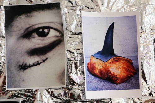

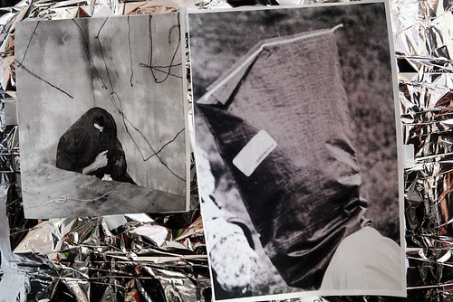
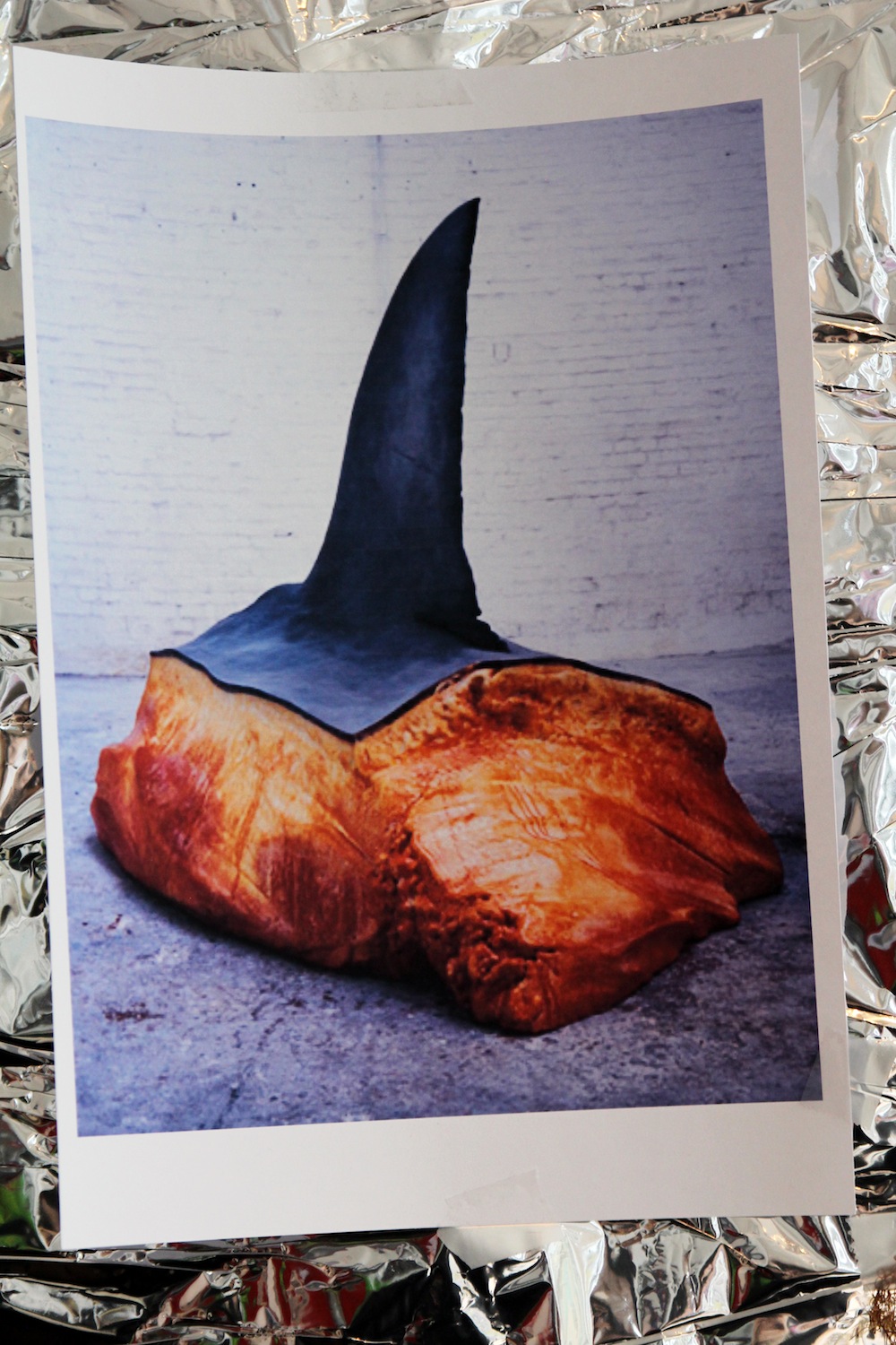
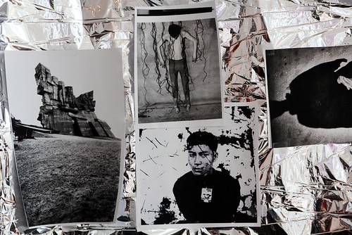

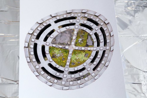
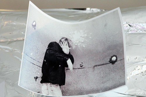
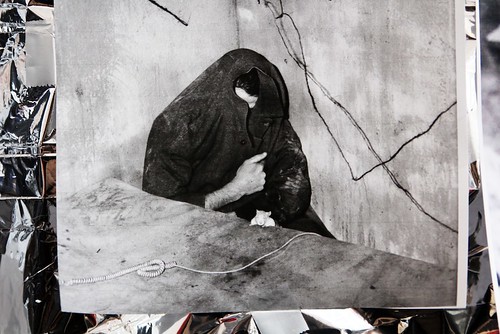
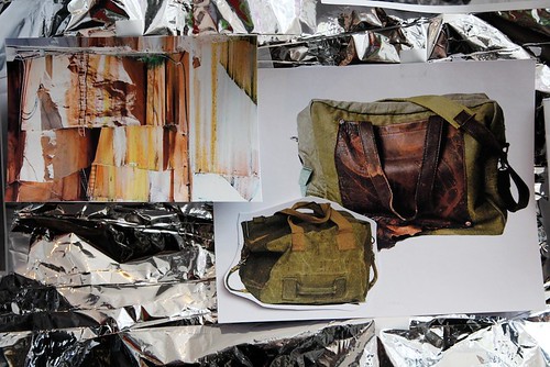

Snapshots of Berthold's shimmery wall of curiosities for AW13
Ideas often mutate between the garments themselves and I find that exciting. When you start working on a garment you often uncover clever additions or notice amendments that elevate it, then of course it can all change again during the first fitting. This ability to change is important to my design process. There is only finality when the last toile is made." Raimund Berthold.
----------

2 comments:
Wow! Such a beautiful pictures
------------------------------------
http://augustyle.com
Lovely vintage collections for elderly man with just a classic look and the perfect couture outfits the one that perfectly suits on personality. Custom dress shirts
Post a Comment