Monday, 7 January 2013

Inspired... Agi&Sam AW13

From the moment we first looked through their kaleidoscope back in 2010, Agi&Sam have dazzled, delighted and most importantly developed season after season. Ever pushing the other forward, the print princes soon graduated from their starring roles inside the Fashion East Installations on to the stage of MAN and now stand at the forefront of all that is exciting about London Collections: Men. Despite winning plaudits and stockists alike with their vivid prints, eye for colour and particular sense of humour, the design duo continue to refine and mature. For Autumn/Winter 2013 they will take another leap forward.

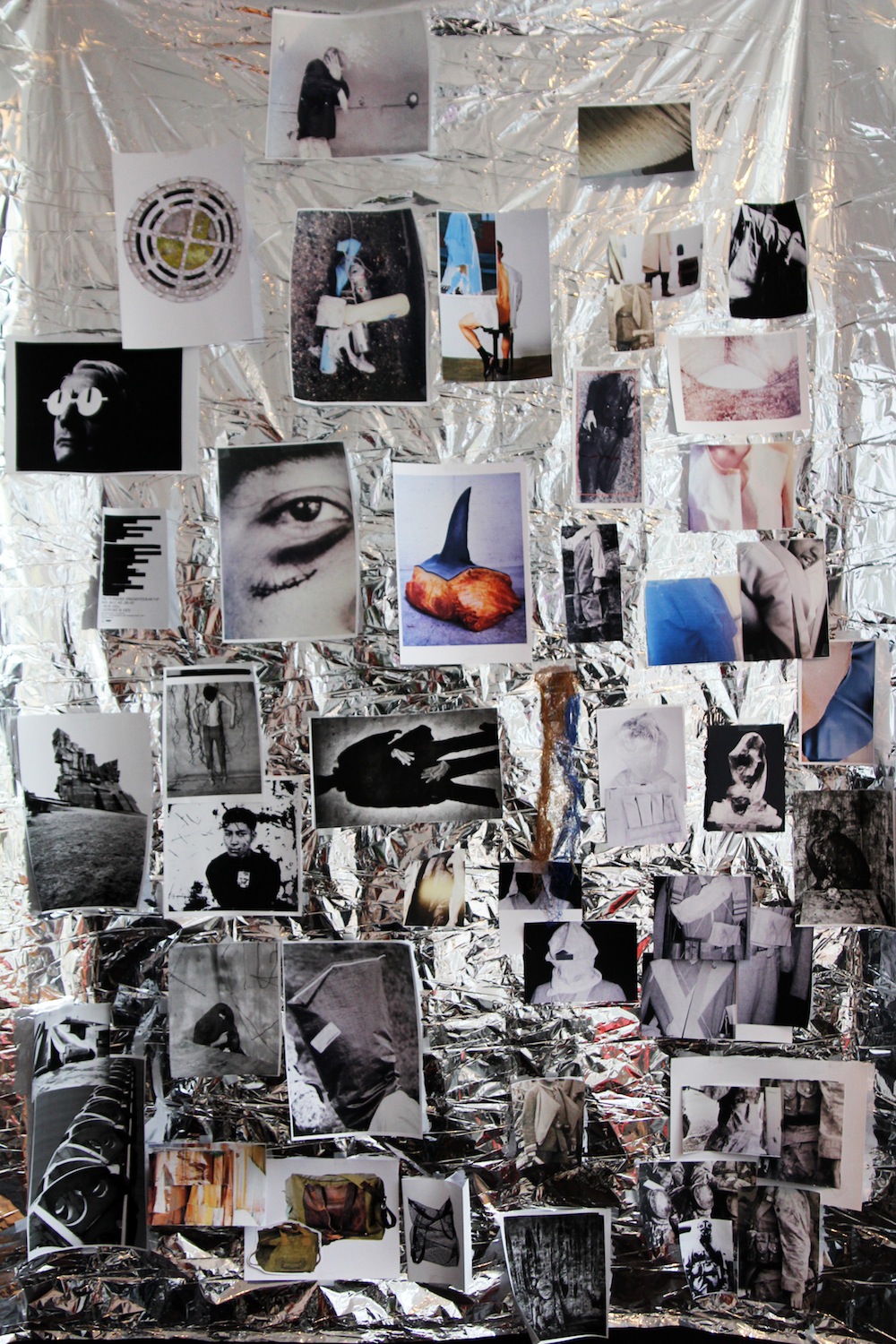
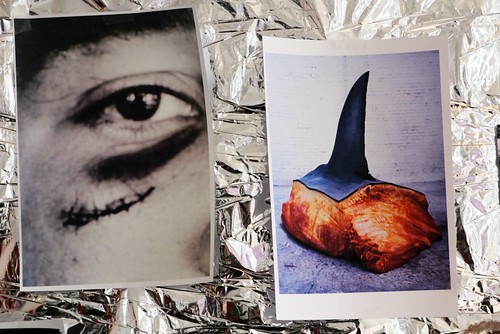
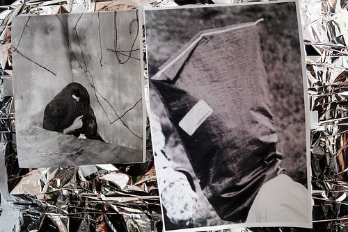
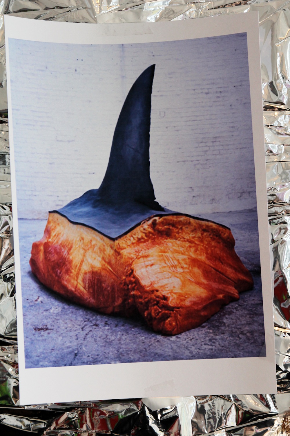
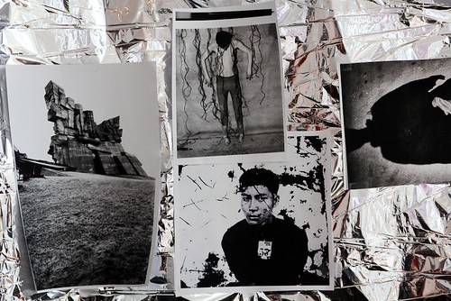
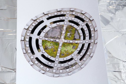
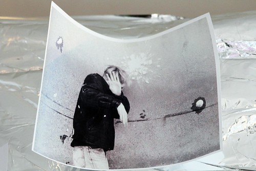
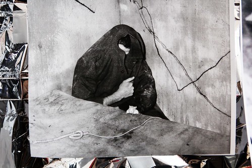
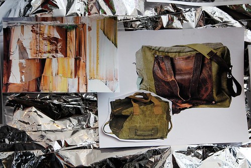
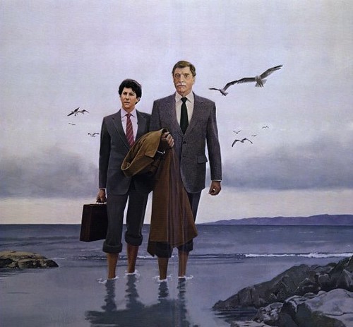
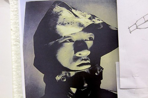
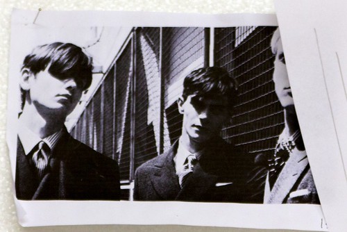
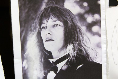
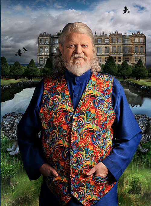
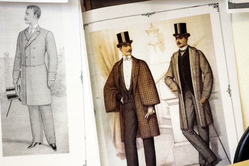
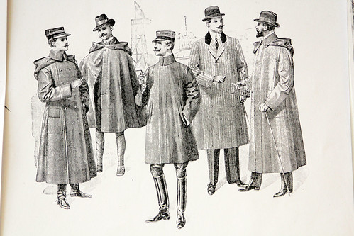
Given that we're only a few hours away from the show, we couldn't resist diving headfirst in to their heady cocktail of inspirations before sampling from the smörgåsbord of the familiar with the surprising. From the Fresh Prince of Bel-Air to the Day of the Dead, 80s detectives to the eve of the apocalypse, we're used to wandering the disorientating landscape of their shared mishmash mind. For their latest concoction, Agi&Sam were drawn to the eccentric world of the Marquess of Bath, wandered the rooms of stately homes and admired the soft furnishings whilst daydreaming about David Hockney before duly reimagining their own English aristocracy. Here, the duo allow us to press our eyes against their latest well crafted kaleidoscope and talk us through the mood board...

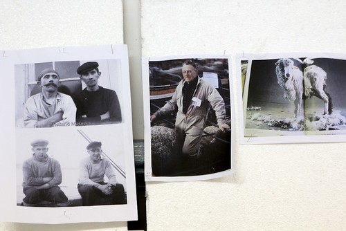
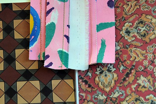
"We were looking at The Marquess of Bath and Longleat and bohemian Detmar Blow. We were sucked in to his colourful world of eccentricities, from his seventy 'wifelets' that live around his estate who fight over his affections to his own style and the furnishings of the home. The first time I encountered him was on the Grayson Perry documentary, In the Best Possible Taste but I'm sure that Sam had mentioned him a few times beforehand. We actually had the idea of exploring a British heritage collection before our last autumn/winter season but we had to hold off until it felt right. Now it does. We looked at the stately homes of the aristocracy and the different roles played within them. There have been shifts in how the aristocracy have dressed but we were drawn to different elements from each era. We tend not to take anything too literally. Coming from our different backgrounds, our inspirations are always a constant mix of things that come together to create Agi&Sam..." Agape Mdumulla

Lord Bath
IMG_0079
rug6ft
IMG_0077
IMG_0081
IMG_0066
Picture 3
4
shooting 22.0114
IMG_0072
clpost_game_large
IMG_0086
David_Hockney_p__Lo_533461a
421024_575662302447573_1732904180_n
IMG_0093
IMG_0088

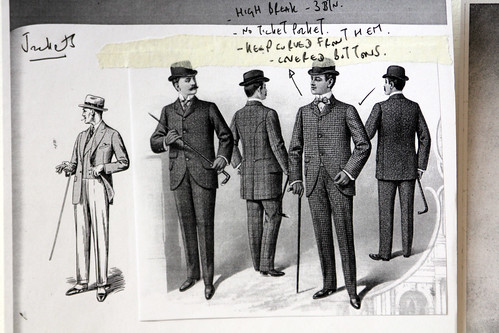
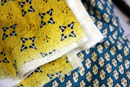
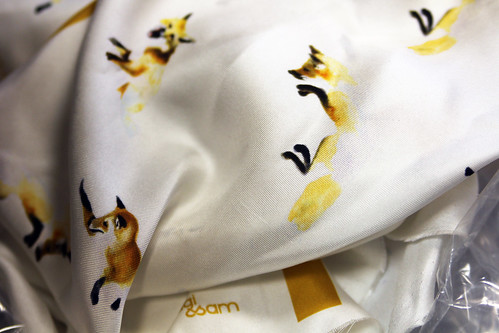
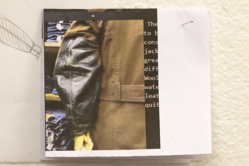
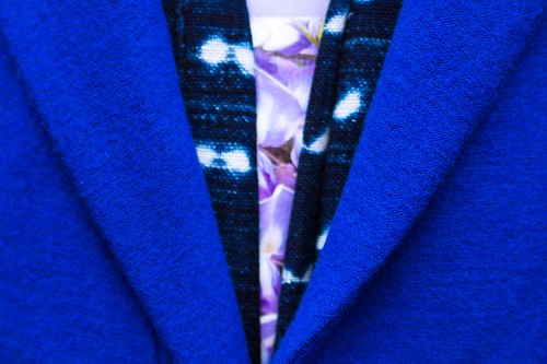
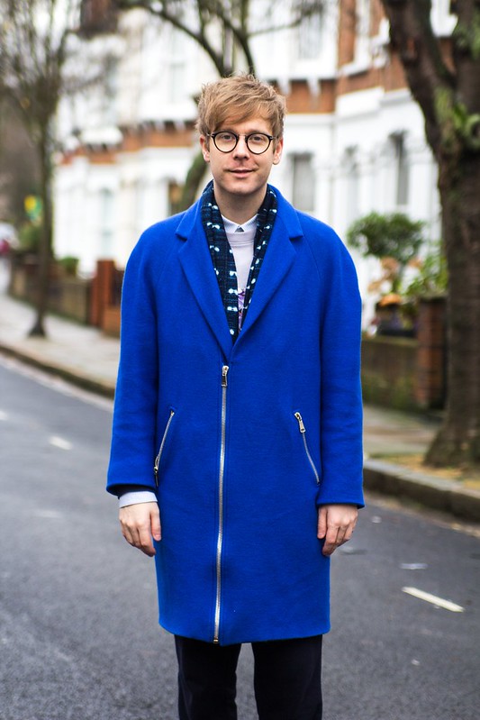
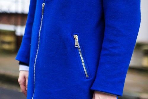
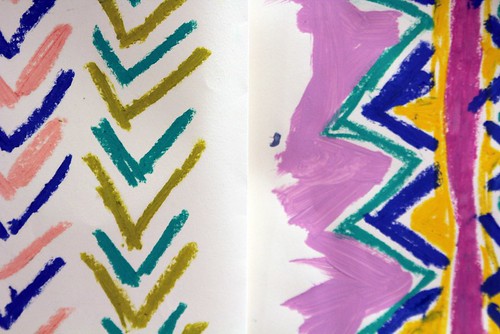
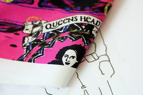
We really stepped it up with the tailoring this season to make sure it is on point. It's always a development process but we really pushed ourselves this season. We're not competitive people but we always want to out do ourselves each season and improve on the last. From spending a lot of time on the little things like the fusing, finding the right canvas and the finishing on the inside including the labels, everything had to be as good as it can be. Now, we've become known for our loud prints but we wanted to tone it down this season. We've probably created more prints than ever but they are more subtle and hopefully that little bit more wearable alongside the more plain pieces. Also, it was great to return to more hand drawn prints and we had fun subverting traditional ones. Many prints appear quite small from a distance but really pop in the styling. There is so much detail this season from pocket squares to engraved tie pins - there are so many more finishings. The collections is bright and colourful but in a more mature way." Sam Cotton
----------

Saturday, 5 January 2013

Inspired... Berthold AW13

"A shark's fin, a storm drain, plastic coverings and scar tissue" are just a few of the descriptions that trickle from Raimund Berthold's mouth as we sit in his central London studio to discuss Autumn/Winter 2013/14. Seemingly disparate and certainly peculiar, Berthold's latest ingredients list might unnerve a few but given his ability to balance and create beauty from the unexpected, most will be justifiably excited. As many other London designer's toil right down to the wire, praying that factories deliver missing garments in time for the big unveiling on Monday, one feels that Berthold has been ready for some time, quietly refining and perfecting his vision. Now, just days away from the launch of the new season with London Collections: Men, the blossoming design talent is keen to take another confident step forward.

To further whet our appetite, Berthold discusses his methods, updated us on his progress and allows us to take a close look at his latest shimmery wall of curiosities. Rich in detail shots and all manner of found imagery, the mood board came to life with excited narrative from the designer himself and it was impossible to leave the studio anything but inspired and excited for the fruits that the new season will bring. 

"I would describe my design process as quite organic. First, my research either entails discovering a catalyst that sparks the thought process or in other instances, I approach it with a clear mind and spend a day in the library going through book after book, collating images that do something and inspire me to start sketching. I'm drawn to anything that catches my eye and provokes a reaction, both good and bad and I see where it takes me. If something grabs my attention, I stick it on the wall and begin sketching but I sketch away from the image itself. I always keep the design quite loose initially. It is always more about a feeling, a silhouette, shape, a length or rough details.  If I get bored with it, I move on but often mutates in to something else entirely through a number of different sketches.

This season it was all about that combination of something that is strong and protective with something that is raw and softer. This idea was sparked from an image of a shark fin. It was such a powerful image, seeing the fleshy meat under the dark, thick skin. I had to put it right in the centre of the mood board as I found myself frequently returning to it. Elsewhere, I was looking at street images to help with the mood, finding things that had been discarded, walked over because I didn't want the collection to be too pretty and this ties in with the print. I'm always drawn to images of things that are covered in plastic. I like the variation and you can see a similar effect in the collection with the use of waxed cotton and nylon There's a story of crossing out and removal which evolved from a flyer. The collection is dark but rather than having a contrast of black and navy, I wanted the prints to be quite light. 

The print came from a bike ride. I was riding around Westminster close to Victoria and Scotland Yard, looked down and noticed the storm drain. It was just so beautiful. The colours were vivid and I actually had to change them a little to make the print lighter. I wanted it to feel more like a grey and wet day rather than a beautiful sunny day. To satisfy myself, we've experimented a little with a few variations throughout the collection, from small tiling to blowing it up quite large. From the orange juice of last season to the storm drain, I have no idea what will catch my eye next season. I've probably got about twenty images that I could use but I might work with the Patternity girls agin but this time, give very little input and just see what comes back, that could be fun because they've got so much energy.

I wanted to play with proportions a little bit more this season. The oversized trousers were inspired from an image that I found of a little boy in waders and there are a lot of frock coat shapes because I liked the look of garments being longer at the back than the front. They create such an interesting silhouette. Also, I was inspired by the shoulder detailing on hunting jackets but rather than be able to rest a shotgun on them, I wanted them to be functional oversized pockets and instead of leather I used a number of different materials throughout the outerwear and sweatshirts. I intentionally didn't research hunting jackets because I wanted the pieces to be very different and not copied from something quite obvious but I was drawn to a snapshot of that detail...


IMG_0042
IMG_0033
IMG_0020
IMG_0025
IMG_0012
IMG_0031
IMG_0036
IMG_0051
IMG_0052
IMG_0030
IMG_0028
IMG_0045
Snapshots of Berthold's shimmery wall of curiosities for AW13


Ideas often mutate between the garments themselves and I find that exciting. When you start working on a garment you often uncover clever additions or notice amendments that elevate it, then of course it can all change again during the first fitting. This ability to change is important to my design process. There is only finality when the last toile is made." Raimund Berthold.
----------

Monday, 31 December 2012

Inspired... Lou Dalton AW13

Since launching her own line in 2005, Lou Dalton has refined a well crafted reputation for rebellious English sportswear with a keen eye for and attention to detail whilst establishing herself as the real shining starlet of British Menswear. As London menswear has demanded an ever increasing presence at LFW and respect far beyond the perimeter of the capital, evolving from an afternoon in to three full days of shows, presentations, previews, installations and exhibitions under the umbrella of London Collections: Men, Dalton has matured in the spotlight, built a brand and helped pave the way forward. 

One week today, all eyes will be on the blossoming design talent once more as she opens the sophomore edition of London Collections: Men. Having had a sneak preview of the collection which includes an exciting shoe collaboration, tactile knitwear and soft tailoring to obsess over and further evolved signatures,  I'm certain she will take more confident and assured steps forward, beckoning the rest of London menswear to do the same. As a little teaser to what Dalton will unveil in seven days, we sit down with the designer to talk through the narrative and influences behind the season. Sitting in her East London studio I was quickly transported six hundred odd miles to the coastlines of Shetland as the designer excitedly talked me through her mood board. Escape with us...

"This season I returned to one of my favourite films, Local Hero. I had watched it a while back but shortly after showing Spring/Summer 2013, my partner Justin was away and I rummaged through all of my old DVDs and found it again along with Ryan's Daughter. I have referenced Ryan Daughter to a small extent, there's just one scene from the film where the freedom fighters are on the beaches pulling in the illegal arms and they're wearing these oil skins in the pouring rain and I was drawn to the scene's rawness and how dark it was, in particular the Irish terrain and the backdrop that it is set against. The small village that the film is set shares characteristics to that of Shetland as captured in Bill Forsyth's feature. For me, Local Hero is one of the best films that I've ever seen, set in a place that I have such fond personal memories of. I met Justin in Shetland over nine years ago and I spent three years commuting back and forth from the area during the early years of our relationship. It it is quite simply one of the most amazing places that I've been to. I think Laurence Ellis' film (that he shot for my autumn/winter 2010 collection) captures the essence of how Shetland is, it's this open, amazing, wild place but it is so warm and welcoming. I absolutely loved spending time there and I have this crazy dream of owning a croft at some point. It will always be an inspiring place to me.

When I watched Local Hero again with Burt Lancaster playing a Texan oil worker who goes out to this rural town in the Scottish highlands with the desire to build a whopping big oil rig but soon falls in love with the special place. Theoretically, that's what happened to Shetland. At one point, it was the biggest oil port in Europe. I latched on to this development in a sense but it had much more to do with the characters, the terrain, the rawness and everything about the area. I loved everything about the film and it reminded me about my own experiences. I started pulling references from there, from utility and work wear after looking at the boy on the rig, the city boy in the country feel influenced the tailoring and there's a particular fabric that we've pulled from an Italian mill that reminds me of the flock and rawness of the sheep whilst the knitwear takes inspiration from the identification markings on the sheep which has this form of branding. 

I know that when I talk about being inspired by Shetland, people will think "oh, this is Lou being right country, a heritage feel' and there might be an element of that but once you see the collection, you'll see that there's much more to it than that. This particular collection feels even more personal whilst the fit and shapes are very much from spring/summer. I want the guy that is buying Lou Dalton to feel confident and trust in the continuation from season to season..."


Lou Dalton_AW13_Local Hero - Movie Poster
IMG_9647
IMG_9671
Lou Dalton_AW13_Ryan's Daughter_Storm
IMG_9656
IMG_9650
IMG_9651
IMG_9658
IMG_9667
Snapshots of Lou Dalton's mood board for AW13.

"I do feel the pressure of showing first (at London Collections: Men). Everyone has been so supportive and I never do anything half heartedly. This collection means an awful lot and there's shedloads of work still to do. I won't settle until it is all done, to the level that I want it to be at. I said it to Charlie Porter previously but if I could get the label the point of being a self financed menswear designer from the UK that can compete with those big boys then that would be a massive achievement. It's unchartered territory. I think the label is at the point at which it could soar to the next level or stagnate and I desperately want it to fly on. I feel as though I've pushed myself harder than ever for this collection and we've also been pushing at the same time with production of Spring/Summer 13 which was the largest that it has ever been. It'll be quite special if I pull everything off."

I have every confidence that she will. Long may London menswear follow the lead of Lou Dalton. Here's to London Collections: Men and beyond.

Friday, 28 December 2012

All because the man loved...

"We wanted to look at an iconic figure that had a nostalgic retro feeling, that wasn't James bond but had a similar feeling, sensibility and nature. The Milk Tray man was a character that was instantaneously recognisable yet shrouded in mystery and so we wanted to build, update and evolve this character that was assumed rather than known," excitedly purred Amber Siegel as she introduced the autumn/winter 2012 collection of Baartmans & Siegel back in March. From Jules Verne to Blade Runner's Deckard, the design duo have revelled in exploring a character created and established in popular culture and last season they focused their refined menswear eye on the late 1970’s British Menswear and cinema. Resting on Cadbury's iconic Milk-Tray man, his sartorial style and air of mystery provided a sense of playful indulgence, romance and adventure to the accomplished collection. They undoubtedly built, updated and evolved the character and dressed him accordingly in a wardrobe of lux tailored sportswear in a rich and inviting spectrum of blues. It was a coming of age season for the talented twosome. It was one of those collections that left my heart racing, my mind wandering and my wardrobe aching for additions.

After I calmed down, I picked up a few pieces. To combat the blanket of grey drizzle that has refused to leave London for the last few weeks and subconsciously inspired by Grace Coddington's i-D cover, I've been wearing the below coat continuously. All because the man loved... 

IMG_9823
IMG_9850
IMG_9830
IMG_9856
IMG_9845
The coat by Baartmans & Siegel worn with shirt by Patrik Ervell, scarf by A Long Time Gone picked up at Anthem, sweatshirt by Christopher Shannon, trousers by Stephan Schneider, socks by Ayame and trainers by Missoni x Converse.
----------

Monday, 24 December 2012

Inspired... Kit Neale AW13

"Fashion East Installations give the newest of the new in London menswear the chance to prove their worth in a group show of delicious controlled anarchy," proclaims Charlie Porter in the recent press release for autumn/winter 2013. Ever since they were introduced to the London fashion week schedule back in 2009, I've excitedly bounced from room to room inside its various incarnations uncovering the beautiful alongside the wonderful and even the unusual at every opportunity. The platform provides discovery at every turn for us whilst offering invaluable exposure for the designers themselves and often acts as a springboard for them. Nothing quite represents the diversity of London menswear design talent quite like the Fashion East Menswear Installations. Returning to the impressive and ornate Georgian townhouse in the heart of St. James’s alongside Meadham Kirchhoff, Bobby Abley, Joseph Turvey, Nasir Mazhar and Maarten van der Horst, Kit Neale will once again be a noisy neighbour to Buckingham Palace for the day.

Ever since I first stepped in to Kit Neale's dazzlingly printed world,  a cultural kaleidoscope that reimagined suburban and multicultural Britain, I've been eager to return. Despite being just over two weeks away from London Collections: Men, I couldn't resist popping by his new showroom cross studio located just off Shoreditch High Street for a sneak peek at how the new season is taking shape. Moving on from his Dad's allotment and the ever eccentric great British seaside, the emerging sartorial chronicler of our age looks to his design heroes and ends up sozzled in his local. Reviving him with the rustling of a bag of pork scratchings, Kit Neale talks us through his mood board and allows us to take a sip from his heady cocktail of influences...

"The real starting point was looking at three of my design heroes of Michael Clark, Ray Petri and Ernő Goldfinger. I'm always researching them. I'm obsessed. Ray Petri's 'Buffalo' book has pride of place in the studio, it's our bible and I always look through it and I know many other labels look to it as well. I'm really drawn to those Buffalo days and often look through my old issues of The Face and Arena Homme Plus. I think Petri, Goldfinder and Clark all have a level of influence over or appear in some way in every season but I wanted to delve a little deeper and fuse all three in to this collection but it wasn't possible to look at all three due to this being such a short season so I chose to focus on Clark. It's been a bit tight this season and this shows in the fact that the prints have just come back, the Friday before Christmas but I'm really pleased with them.

There's a film that Michael Clarke did with Leigh Bowery called Hail The New Puritan. It's a fake documentary, a mix of narrative, performance and fantasy. If you've not seen it, you really should watch it on youtube. The vivid colours of the film really inspired the prints for this season. There's one particular scene where they are in a typical British, slightly run down pub and the contrast and clash with these colourful characters is so intriguing. It led me to think about the role of the pub in society, they're a place where all types congregate and it also directed me to all of the pop references. I looked at so many names, signs and details of pubs but in the end we concentrated on The White Polar Bear and The Queen's Head. The prints combine the pub detailing with the vivid colours of the film and the movements of Michael's Clark's dance."

IMG_9543
IMG_9502
IMG_9532
IMG_9529
IMG_9519
IMG_9506
IMG_9599
IMG_9582
IMG_9564
IMG_9550
IMG_9570
IMG_9517
IMG_9489
IMG_9586
IMG_9590
IMG_9469
A few snapshots peering in to Kit Neale's mind.

Much like looking at Martin Parr's photography which can at first appear exaggerated, Kit Neale's plentiful prints fuse the familiar with the strange, the mundane with the extraordinary. Entering his presentation space last season I was instantly transported back home to the sandy beach of Margate and I'm looking forward to going off on a jaunt to one of the designer's locals to share a pint with his design heroes. What's your poison?

LinkWithin

Related Posts with Thumbnails