Tuesday 28 June 2011

Woooyoungmi SS12

Woooyoungmi_FeatureButton

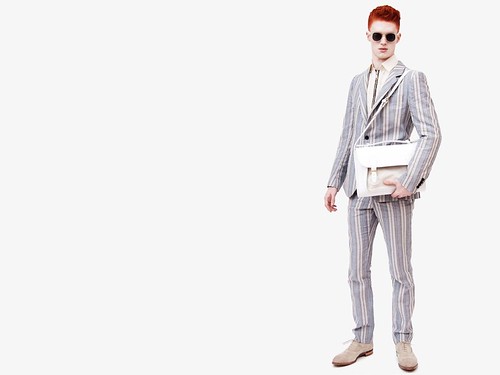
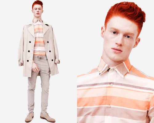
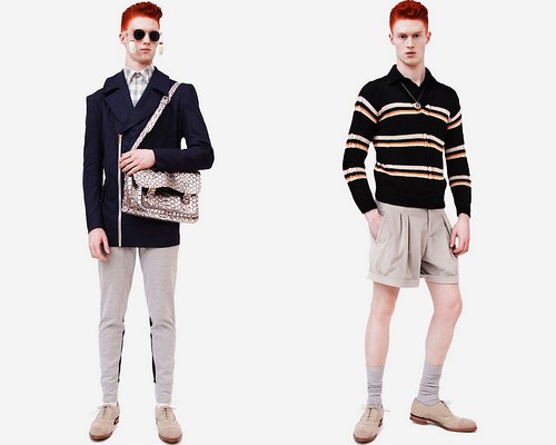
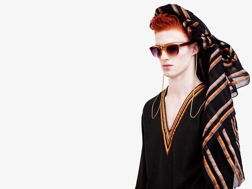
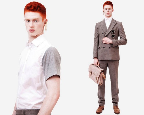
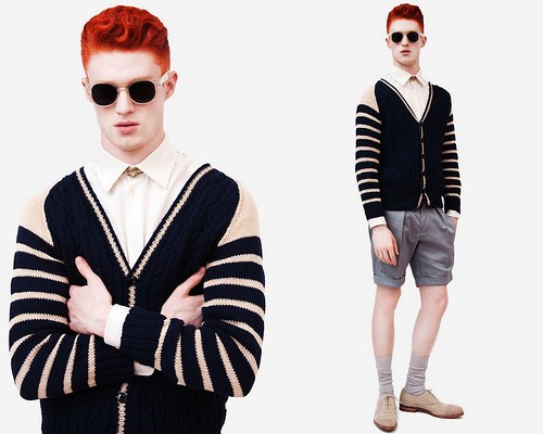
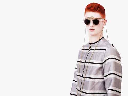
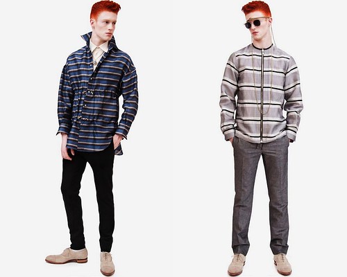
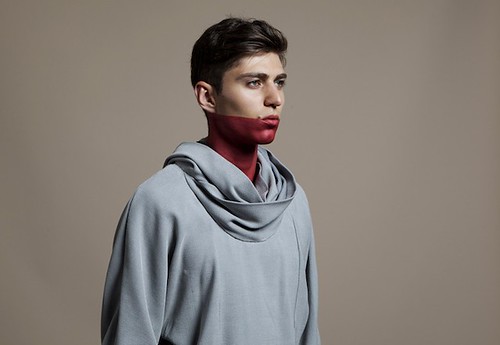
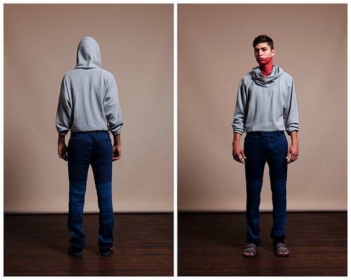
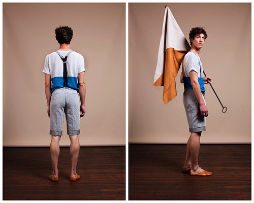
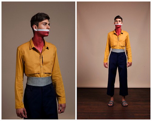
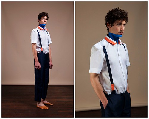
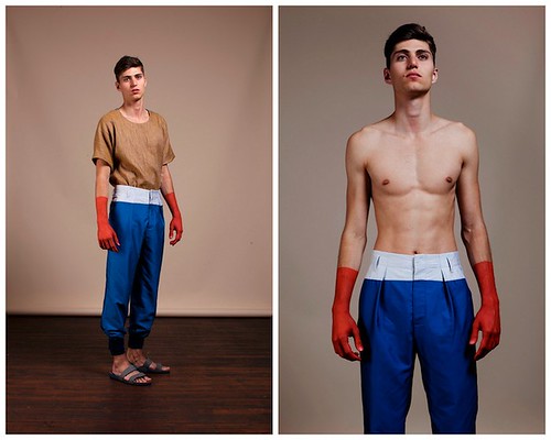
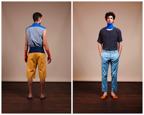
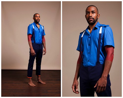
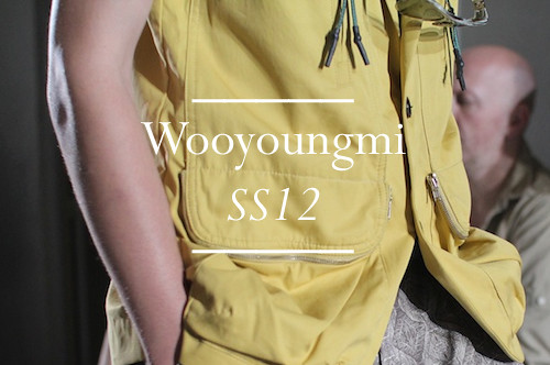
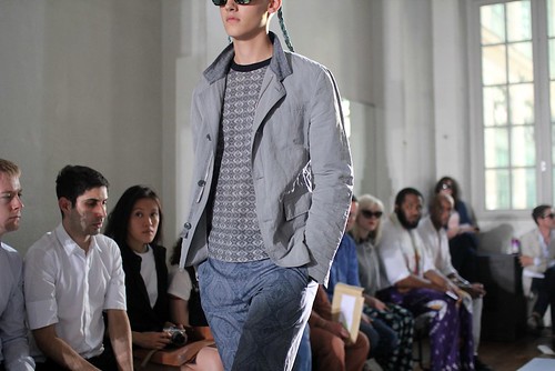
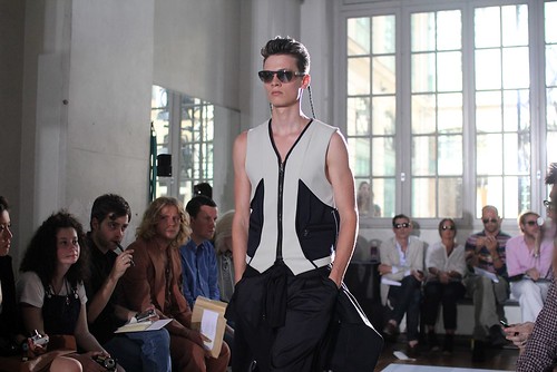
It has been a couple of days since my whistle-stop weekend tour of Paris menswear fashion week and as temperatures soared, I needed this time to take stock off all that I had encountered. Despite focusing most of my attention on tradeshow and showroom visits, I was fortunate enough to take my seat at one of the real highlight shows of the season so far, Woooyoungmi. Now, we have long admired how this label's garments are streamlined and enriched with details and styled finishes but for SS12 vibrant colour and print are added. This heady mix provided a most agreeable summer friendly cocktail.

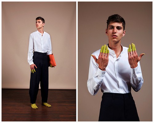
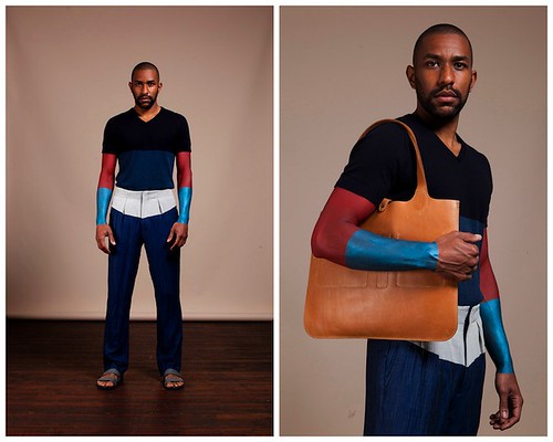
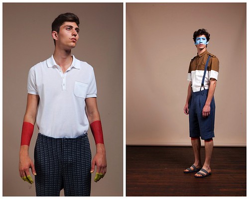
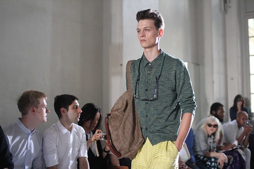
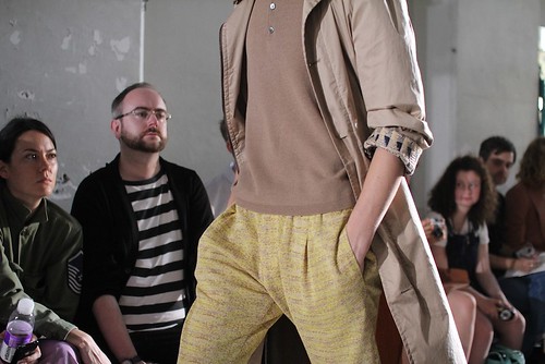
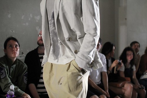
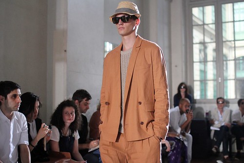
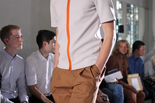
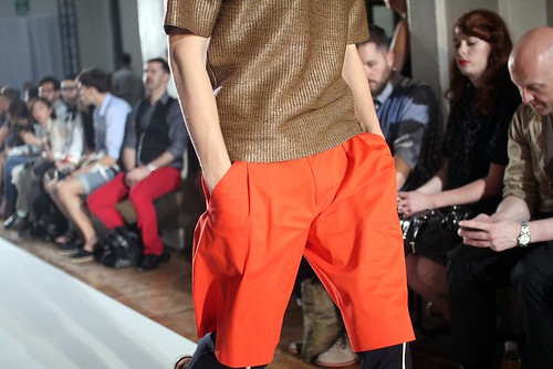
Here, Woooyoungmi continued along its path of quiet revolution, as it looked to reinvent the wardrobe for men without frightening them but introduced dazzling colour and prints for the first time. The bright orange, lemon sorbet, acid yellow and watermelon green palette was certainly a surprise. It might have whisked me back to the gelato cabinet of my favourite ice cream parlour Morellis, but these bright hues were equally at home within this holiday wardrobe. Like most of us do when the warmer months approach, Wooyoungmi and her sister Woojanghee looked to the film The Talented Mr Ripley for inspiration. However, here they take the traditionally stylish wardrobes of the Minghella masterpiece and inject a dash of modern quirkiness to help create their sophisticated resort wear and undoutedly injected more energy in to the season.

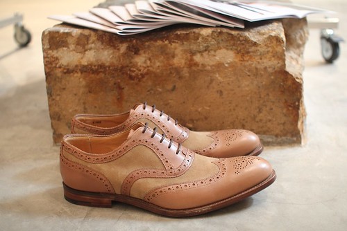
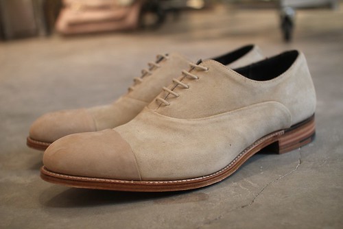
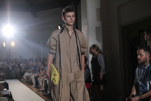
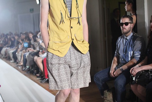
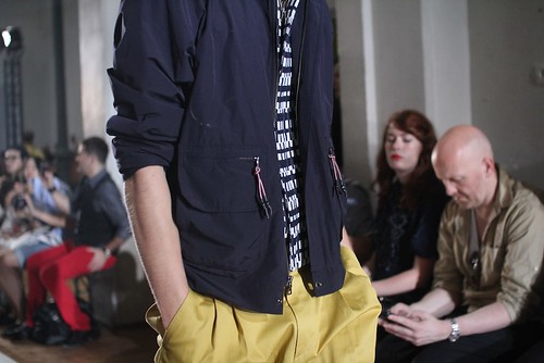
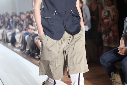
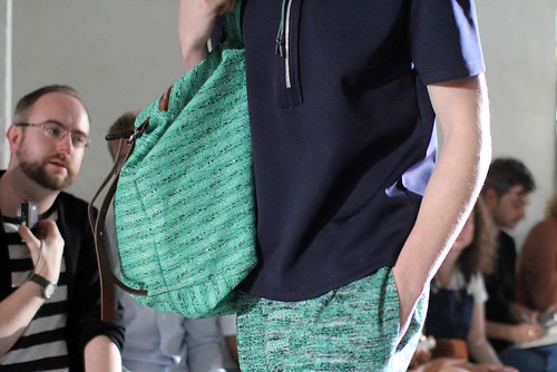
A raffia theme runs throughout, visors, bags and tops in the fabric capture a playfulness that is offset by the sophistication of relaxed tailoring. By embracing unique prints for the first time and experimenting with elements of active wear. a graphic edge is added to the easy silhouette. Furthermore, accessories highlight the easy summer mood with bags that are designed to be strapped across the back or worn around the waist for leisure time. Hats and visors keep the sun off the face and jelly soles bring freshness to more altogether classic shoe styles.

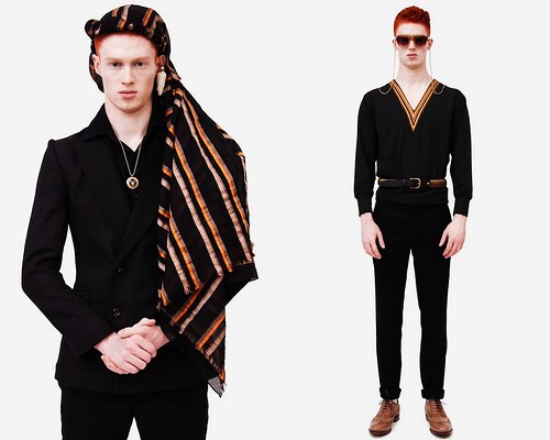
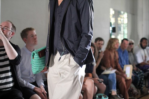
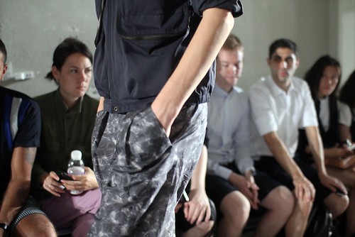
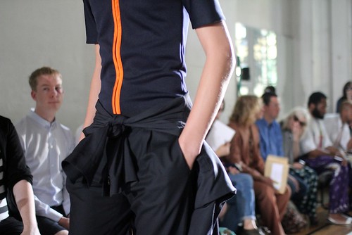
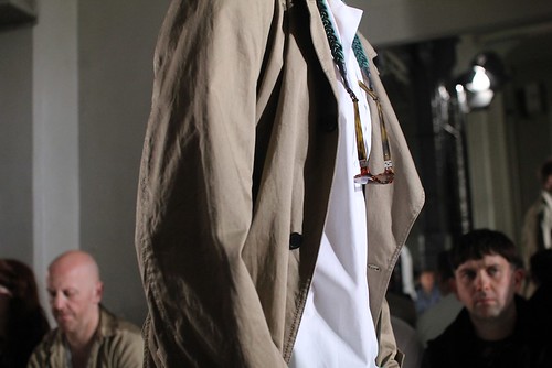
The now signature Woooyoungmi detailing was evident throughout, if just with a little more subtlety than in previous season. This blogger excitedly snapped away as the models paraded down the runway and captured just a selection of the them. Now, gorge on the detail... 

IMG_9332
IMG_9330
IMG_9337
IMG_9344
IMG_9347
IMG_9349
IMG_9352
IMG_9354
IMG_9362
IMG_9370
IMG_9368
IMG_9372
IMG_9376
IMG_9385
IMG_9380
IMG_9365
IMG_9351

Now, if you need to see more of the collection than my excitedly snapped detail shots allow then please do watch the video show below.


Details: The familiar fox in Paris

IMG_9408
The striding fox has been featured on the E. Tautz logo since its founding in 1876 and echoes the label's rich hunting and sportswear heritage. It was a familiar sight during my weekend in Paris as these fabulous silver pins were handed out to visitors at the London Showroom Men. Here, one member of the BFC team wears it very well indeed.

Friday 24 June 2011

Baartmans and Siegel SS12: Dust Drifters

The moment we excitedly showcased the degree collections of the Dutch/English design halves that make up Baartmans and Siegel we knew we had discovered a couple of gems. The design duo first met whilst at Viktor & Rolf, and were united in their belief of beautiful craftsmanship and imaginative design. The resulting label instantly became one to watch, recognisable by the pairs use of interactive texture and sharp tailoring. In a few short seasons, they've become synonymous with interesting details and menacing masculinity winning fans and plaudits alike. Now, as they prepare their Paris showroom, we can provide the first look at their impressive SS12 collection, Dust Drifters.

Now, the design duo tend to start at more of a thematic start point, with a character created and established in popular culture, for example the Jules Verne SS11 collection and most recently the Blade Runner inspired Deckard collection for AW11. However, this season they've looked at a more tangible, imaginary character, that of a modern nomadic man. A reflective nature and nod to romanced exploration and travel. A character conjured from the dust, and one that belongs to multiple landscapes. Before we take a look at the collection itself, Amber Siegel introduces and shares their visual references.. 

"For the SS12 collection we wished to look at the idea of a person connecting with a remote, powerful landscape, which they are reborn from. A mutual connection between man and landscape. The collection reflects this simplistic harmony. Accessible yet alters one's sense of self. We were looking at a sort of nomadic soul and atmosphere, and the deserts of Egypt and North America."
Amber Siegel on the inspiration for SS12

moodboard SS 2011-12-1
moodboard SS 2011-12-2
moodboard SS 2011-12-3
moodboard SS 2011-12-4
moodboard SS 2011-12-5
moodboard SS 2011-12-6
moodboard SS 2011-12-7
A look at their SS12 mood boards.

For SS12, Baartmans and Siegel look at the creation of a character derived from an arid landscape. A character that has risen and been re-absorbed by a transitory and harsh atmosphere. They continue to look at a classic, internally generated masculinity, one which travels to an outward, defined aesthetic of individual aspects, particles, fibres, grouping together to form a unity. Dust Drifters concentrates on the unity of physical representation of man and the unseen, silent insertion into an isolated natural landscape. This sedimentary building of character is literally translated and represented through the use of defined stripes. Washed out, frayed, fine cotton shirts draw inspiration from the sun-fired Arabian terrains. While crème silk crepe shirts provide a nomadic flexibility of comfort, style and functionality.

Throughout, the design duo showcase their characteristically refined, classic cuts, and have developed charmingly nostalgic slim fit pure wool and soft Irish linen suits, which are well suited for the modern traveller. Fine silk-ribbed shirts with flashes of gold hardware explore indulgence and luxury, while one can find comfort and confidence in hand-knitted Breton striped and cable-knit glace cotton sweaters...

Baartmans&Siegel_SS12_1
Baartmans&Siegel_SS12_2
Baartmans&Siegel_SS12_3
Baartmans&Siegel_SS12_4
Baartmans&Siegel_SS12_5
Baartmans&Siegel_SS12_6
Baartmans&Siegel_SS12_7
Baartmans&Siegel_SS12_8
Baartmans&Siegel_SS12_9
Baartmans&Siegel_SS12_10
 SS12 lookbook images courtesy of Baartmans and Siegel

Self described as modern-traditionalists, Wouter Baartmans and Amber Siegel’s work focuses on beautiful fabrics that seduce, and shapes that are accessible yet distinctive.  Key items that instantly catch the eye include beautiful, lightweight organza linen shirt-jackets with a Nile-like sheen: perfect breeze-catchers. Water-resistant taupe trenches with butter nappa leather collars and polished horn buttons that provide pure masculine allure.  Whilst Irish linen summer parkas ensure shelter and protection, with leather visor details.
  

IMG_9329
IMG_9324
The latest fruits from the collaboration with Grenson.

Furthermore, Dust Drifters marks the continuation of their fruitful collaboration with renowned English shoemakers Grenson by presenting a new shape in two very contrasting styles presenting. The ‘Classic Gentlemen’s Brogue’ in chestnut suede and leather and the ‘Classic Raider Brogue’ in sandstone suede. Streamlined, simplistic, comfortable and classic. As they grow as a brand, Baartmans and Siegel will continue to develop their range of shoes with Grenson. For winter they are already looking to produce a beautiful loafer, boot and town shoe, which shall include fabric as well as leather. I look forward to watching the continued rise of this design duo but first, I will toast their stunning SS12 collection in Paris.

Bracing oneself for SS12 with 10A

We have long declared that the real beauty of menswear is in the details and 10A is a line that reacquaints us with that often overlooked detail, braces. The chaps over at Street Etiquette have recently posted about this stylish alternative to a belt but I've been contemplating braces ever since I first encountered 10a at Pitti this time last year. I then pinged the label once again for AW11. One season on and the label has deservedly been awarded a Special Mention at Who is On Next? by Pitti, Altaroma and Vogue. What I love about this label is that, when creating each item the design duo focus on creating it slow and well. They cannot and should not be rushed and the end results are always something to savour. 

In 2008, 10A created only ten pairs of trousers each month, on request of the pairs friends and through word of mouth. After two years, the success verified the brand, Daria and Matteo then decided to produce a collection of trousers in six sizes. 10A was born. Following a long search to sharpen the quality of the details, the refinement of the materials and the formal, a union between classic taste of the brace and the contemporary style of the trouser. With each passing season, the design duo build on the strengths of previous seasons and now offer a more complete contemporary interpretation of classic styles. For SS12, Dazzan and Cibis present eight outfits that mix classic tailor patterns with high security oil workwear uniforms and showcase colour blocking inspired by the colour and rhythm of the world's flags. Here, 10A reflect on the meaning of national identity. Bold and vibrant the colours may be, but thankfully this is a collection more akin to Jil Sander than the opening ceremony of the Olympics...although, there is a little flag waving in the below look book...

10A_SS12_1
10A_SS12_2
10A_SS12_3
10A_SS12_4
10A_SS12_5
10A_SS12_6
10A_SS12_7
10A_SS12_8
10A_SS12_9
10A_SS12_10
10A_SS12_11
SS12 lookbook courtesy of 10A.

Tuesday 21 June 2011

Treasured Items... Dal Chodha

As snapshots from tradeshows and faraway catwalk accounts whizz before my tired eyes at breakneck speed, I have to confess that a momentary change of pace and focus is needed for my sanity. As we are all shown glimpses in to the future with the unveiling of the SS12 season it is all too easy to become muddled and confused about the present and the past. As a needed respite (for me atleast), I'd like to unveil our latest feature series, Treasured Items. 

Now, I've refrained from using the term 'new' to describe this series because it has been appropriated from the second issue of b magazine. In a feature entitled Wardrobe Stories the likes of Harris Elliot, Charlotte Mann, Tim Blanks and Lulu Roper-Caldbeck all revealed their most treasured sartorial possessions and told the story behind them. Cherished items included a Christopher Nemeth jacket, an APC dress, a Junya Watanabe Hawaiian shirt and a Camilla Staerk clutch. It was a pleasure to read these wardrobe tales and it is something I'd like to regularly replicate here.  Instead of consulting his lawyer, b magazine's very own Dal Chodha has agreed to kick start our series and helps us realise that there's more to menswear blogging than the goings on at the latest fashion week.

----------

Dal Chodha and the treasured charity shop find

SS_dal

"Peering through my closet, looking for something that I ‘cherish’ was difficult and through the process, I was forced to recognise that I’m not the sort of person that gets very emotional about objects (especially not clothing.)

This seersucker, grey and navy stripe shirt was bought in a charity shop about six years ago for only a few pounds and it has gone on to define a lot of my sartorial choices. The shirt itself was once made by hand – maybe as a part of some costume – it has no care label or washing instructions and the shape is somewhat mistaken, which is the reason I love it so much. It’s very short on the body and cut very square, the sleeves are very stunted too, reminding me of something Jacques Tati might have worn. As Ian Batten told me recently, ‘menswear is all about proportion.’" Dal Chodha

----------

LinkWithin

Related Posts with Thumbnails