In the midst of fashion week it is quite easy to become a little bewildered by it all. There are just so many collections to view, designers to discover and pieces to add to your dream shopping list. Of course there have been a number of highlights already from Christopher Bailey revealing his darker design aesthetic to Dries Van Noten's graffiti covered quayside to Lanvin's body con knitwear. There is just so much to say, so for the start of SS11 I've decided to take stock of the season before jumping in with show reports and roundups. As with last seasons First Look series, I have really enjoyed Another's Menswear Confidential Milan and Paris coverage. In Menswear Confidential, top designers share the visual references and making of stories behind their latest collections. This type of coverage taps in to our inquisitive nature and really helps see the collections in a new, brighter and altogether more agreeable and understanding light. None more so than Dunhill...
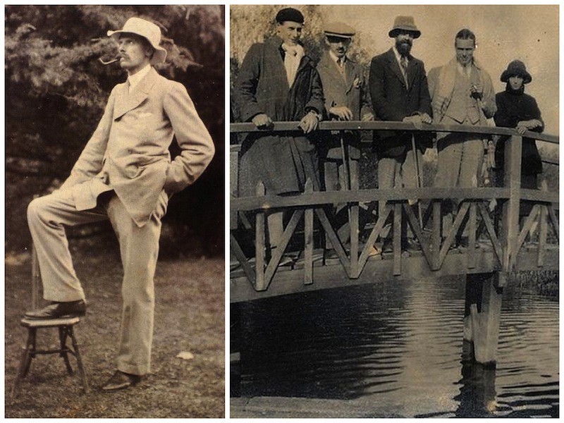
Dunhill's SS11 collection was once again a fusion of heritage with modern day luxury. It confirms what I have previously said about Jones, he obviously takes great delight in investigating the brands archives before adding his own innovation to create the Dunhill of today. The heritage of Dunhill is so broad and so darn British, from its beginnings with the birth of the car to creating luxury accessories for motorcycling, aviation and the oh-so-fashionable smokers in the Roaring Twenties. For AW10, the central inspiration was the journey of Dunhill's very own Clement Court but for SS11 Jones looks at the similarities between Alfred Dunhill and the Bloomsbury group of artists in the 1920s and 30s. Experimentation and English Modernism are the core themes.
"Both Alfred and the Bloomsbury circle were forward thinking, challenging the norm. The Bloomsbury group's work influenced literature, aesthetics, criticism and economics as well as challenging modern attitudes."
Kim Jones speaking to Another
The Bloomsbury Group provide the chief inspiration, both in terms of an ease of dress and a distinctly English take on tradition and subversion combined with an artistic experimentation in the detail and attitude of the clothing and the wearer. There is also a notion of subversion and tradition that is inherited by other English groups post-Bloomsbury and this collection is a nod to them as well, particularly to McLaren and Westwood. So whether it is the 1920s or the 1970s or right now there is always a maverick spirit in Englishness, and this is something that always applies to Dunhill.
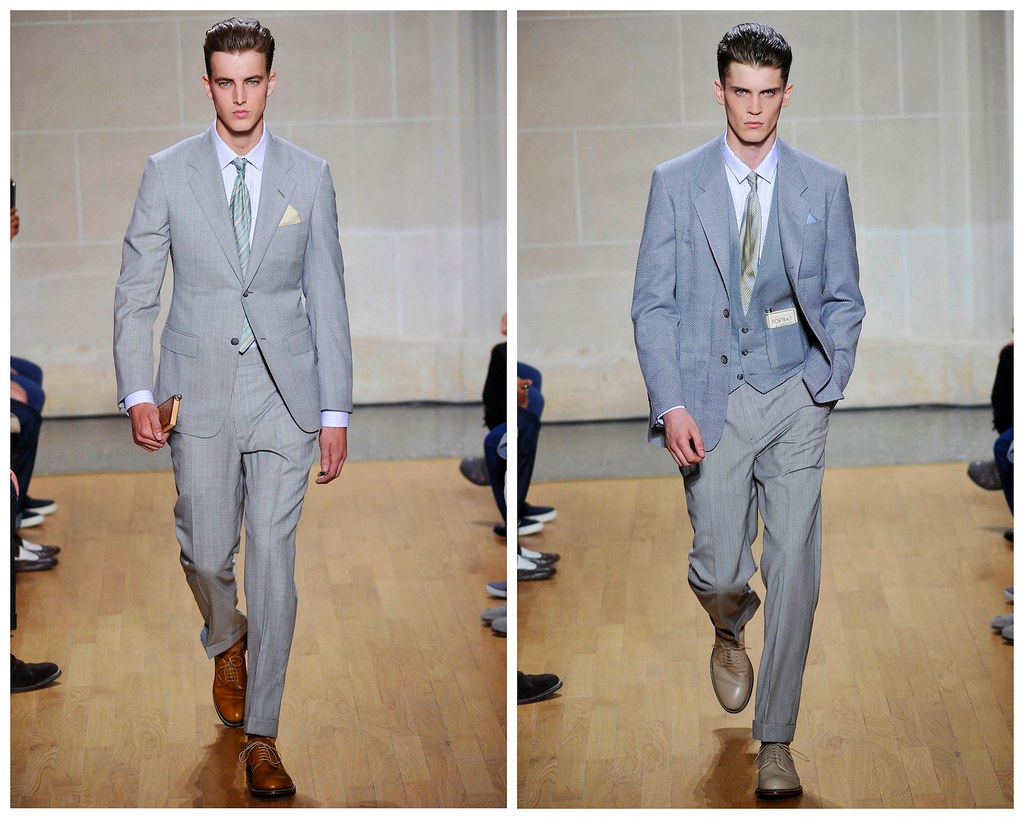
Ever since he took over the reigns at Dunhill, Kim Jones has looked a man at home but with this collection you get the sense he really is enjoying himself. For a brand with such strong roots, any steering by Jones has been to emphasise them – those being the characteristics of classicism and understatement but his challenge was to present these with a wholly modern personality too which he has surely done with this collection...
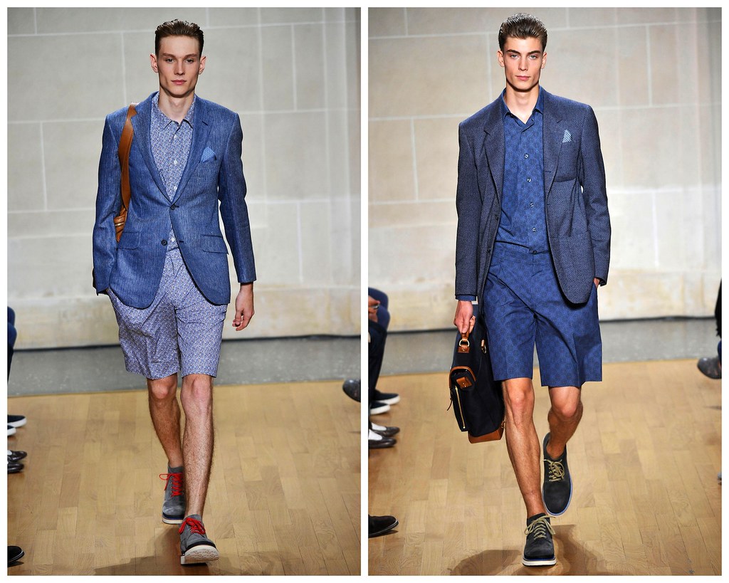
Jones is skillful at fine detail. A stylish etched rosewood brief case containing artists’ tools took inspiration from a cigarette lighter etched by Picasso with an image of Dora Maar. Throughout, he developed the artistic and aristocratic Bloomsbury Group, updated in suits and jackets that were double-breasted but with a single breast-bone button. The revised blazer made the strongest statement and gave that touch of eccentricity. Many of the key items of clothing in the collection are inspired by garments worn by Bloomsbury members such as the economist John Maynard and a jacket worn by the artist and critic Roger Fry in particular. The flannel blazer, wide lapelled, high double breasted with a single set of buttons and almost a flared shape is a recurring motif in the collection. There is a concentration on soft, unstructured tailoring throughout, often double-faced and unlined. Whether this is in jackets inspired by artist’s smocks with big patch pockets or in soft collared shirts and roomy straight legged trousers, there is a feeling of fluidity and elegance throughout the collection. Clashing print inserts are placed subtly in the shirting as a nod to the make-do-and-mend attitude of the British artistic elite. It is also a reminder that Dunhill clothes are for life, to be passed down to successive generations. Such precious items as signature sterling silver buttons should reinforce this point.
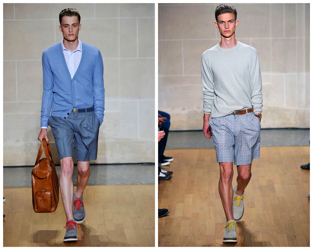
Ever since we featured E. Tautz's SS10 collection, I have been obsessed with the idea of an Englishman abroad. For SS10, E. Tautz were inspired by just this very idea but not just by any Englishman, the Duke of Windsor to be precise. When Patrick Grant and his team were creating the collection they were thinking about what the English like to do during the Summertime; they like to go to the Mediterranean, sit on beaches and wear hankies on their heads. However, with this Dunhill collection I get a strong sense of celebrating the great British summertime. Who needs the sand and sunshine of the Med when you can enjoy our very own sporadic sunshine at a garden party in Bloomsbury? Tea and cucumber sandwiches anyone?

Alfred Dunhill's heritage is never far from Jones' references as the designer is committed to creating a contemporary wardrobe for the modern Dunhill customer. Once again, Jones has been strongly influenced by the Dunhill archive and the pieces that Alfred himself created. Alfred Dunhill himself was obsessed with innovation and new technology, which means that there are pieces in the archive that are just as relevant today. When Jones trawls through the extensive archive with his excited eyes, he sees there is little ‘old’ about it but rather it is wonderfully modern.
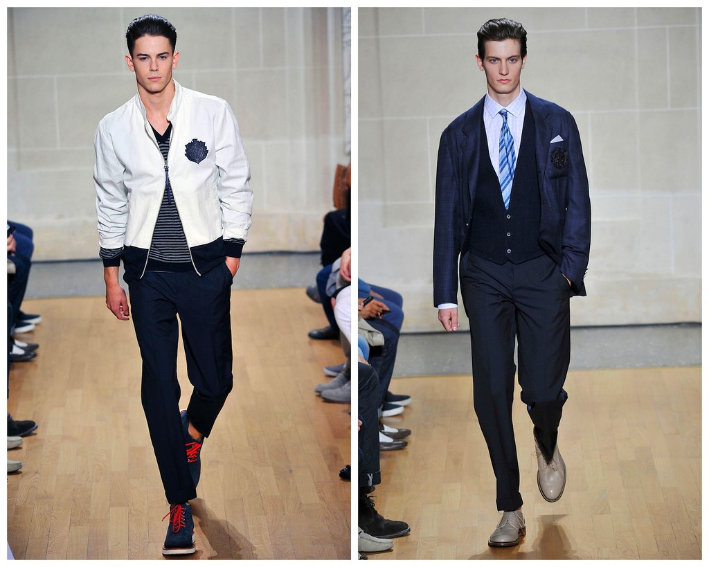
Alfred Dunhill himself was an innovator and had a very modern approach to life and Jones undoubtedly brings a similar feeling to the Dunhill of the future. When thinking about moving the company forward and how he fits into that process, Jones always consider what would inspire and drive Alfred Dunhill if he were alive today. Here he has has picked out key inspirations from the past and repackaged them for the new era of luxury. One hundred years might have passed since they were first designed but for Jones they are as relevant and exciting now as they were then, made all the more so by Jones' touch...

A good example of this is the captive clock - for which ornate, beautiful shutters were designed in order to protect the watchglass beneath it was worn with eveningwear. It is a classic and well-known piece from the late 1920s. This image represents what is great about Dunhill — the attention to detail and beautiful workmanship is still evident in the watches and pens that they produce today. As ever, with function comes great aesthetics.

A good example of this is the captive clock - for which ornate, beautiful shutters were designed in order to protect the watchglass beneath it was worn with eveningwear. It is a classic and well-known piece from the late 1920s. This image represents what is great about Dunhill — the attention to detail and beautiful workmanship is still evident in the watches and pens that they produce today. As ever, with function comes great aesthetics.

This is a collection that celebrates Dunhill's golden era while forging a new one at the hands of the latest innovator, Kim Jones.

2 comments:
i think Dunhill's collection was the best show in Paris.
I am very proud to say that I am one of CF Court's eleven grandchildren. I remember him as a man with a very dry sense of humour, who told me a wonderful a wonderful story when I was a child, about an accident prone dog, called Rover.
Also, my sitting at the dining table en famille, when I was about 4yrs old, and him repremanding me by saying 'little girls should be seen and not heard'. I asked 'what is heard', and his reply, 'cows of course', shut me up for the rest of the meal!
Penny Smale.
Post a Comment